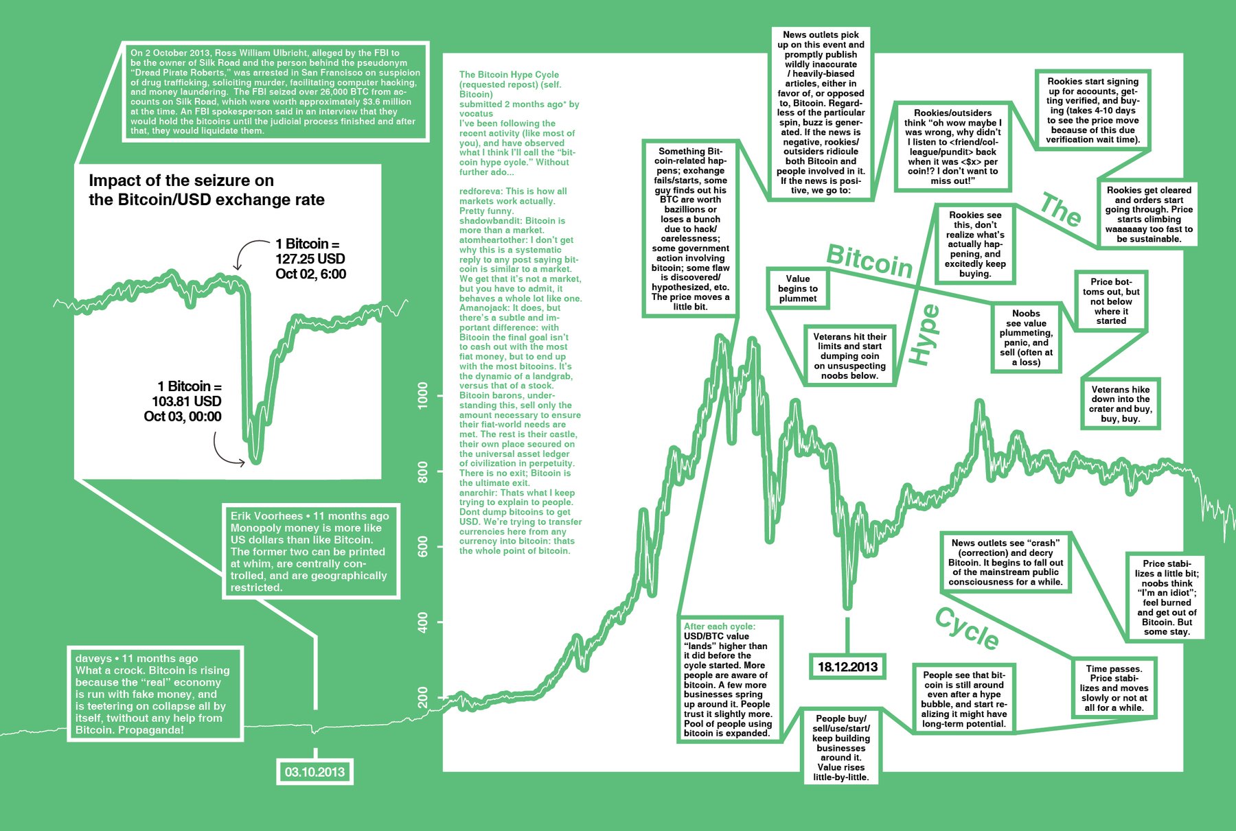
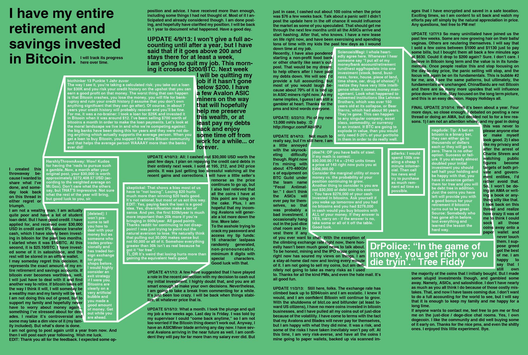
Sooo…these are maybe the first spreads that I actually like from this magazine: Two of three double pages about Bitcoins. I just like using only three colors. It’s so…clean. And you can do a lot, surprisingly. Maybe there was a reason that the original two dotview issues were designed in only black, blue and paper white.