Before delving into data vis, I studied print design for six years – you can find some of these older works if you scroll all the way to the bottom. Further up: Data visualizations I've created for newsrooms, in my free time, and especially for the Datawrapper blog.
Projects
✦
May 2025
for Datawrapper
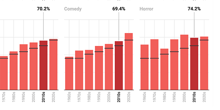
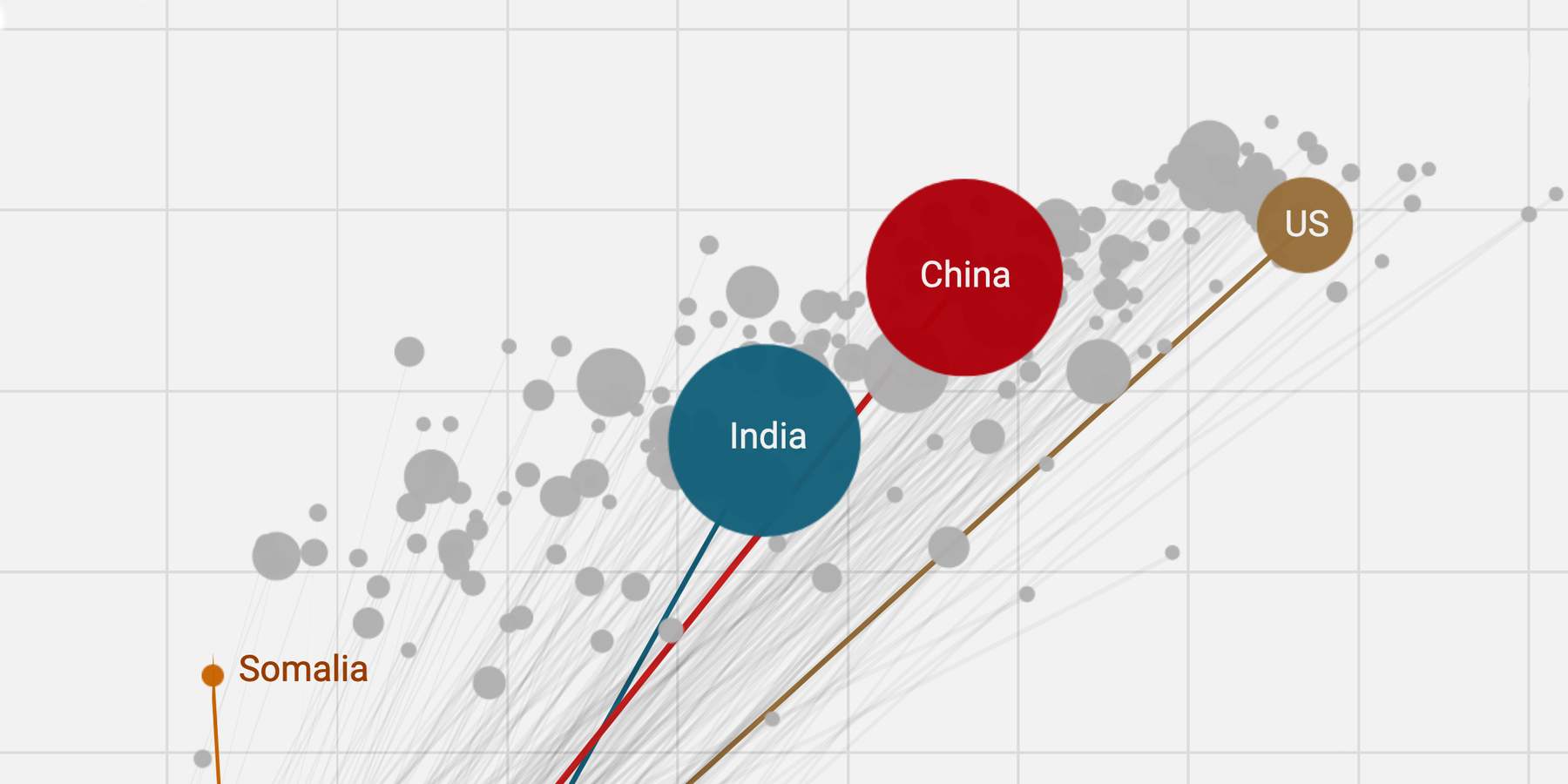
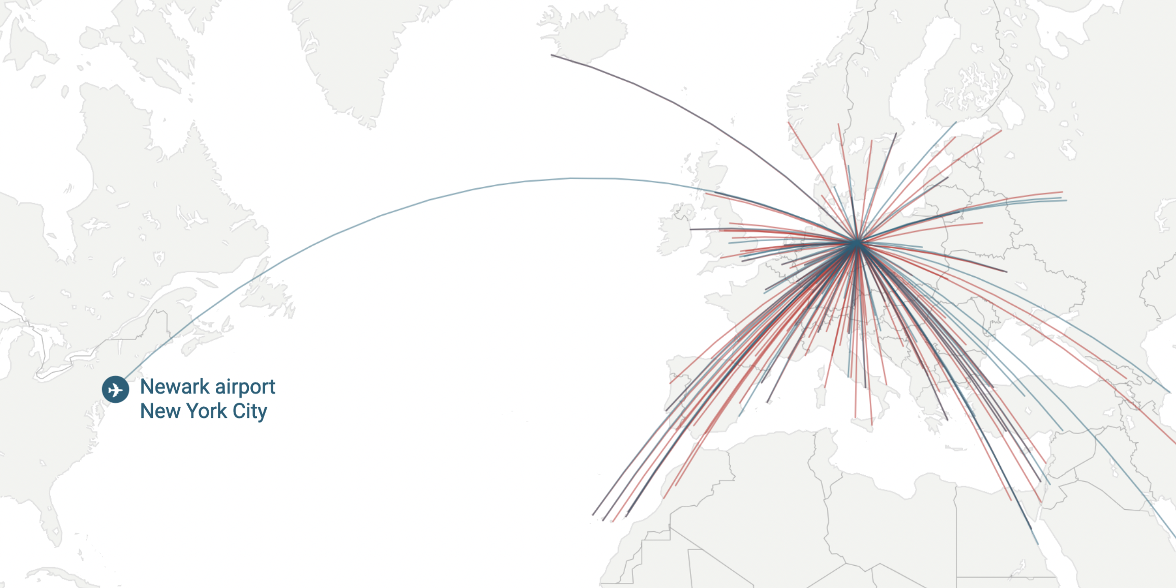
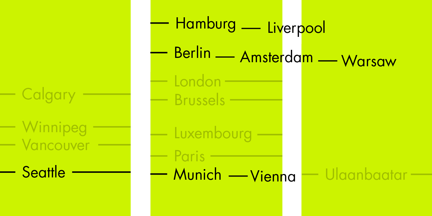
Datawrapper visualizations I created in 2025 (so far)
World records, population growth, and German baby boomers: What I visualized for Datawrapper in 2025.
December 2024
for Datawrapper
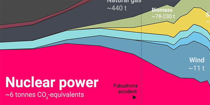
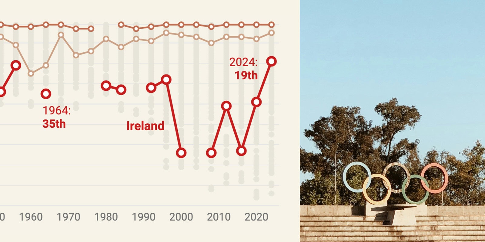
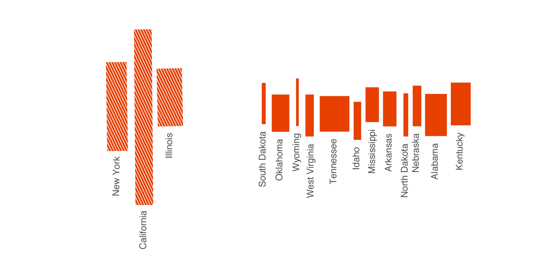
Datawrapper visualizations I created in 2024
Nuclear power, English proficiency, and the height of men: What I visualized for Datawrapper in 2024.
✦
November 2024
on Datawrapper ↗
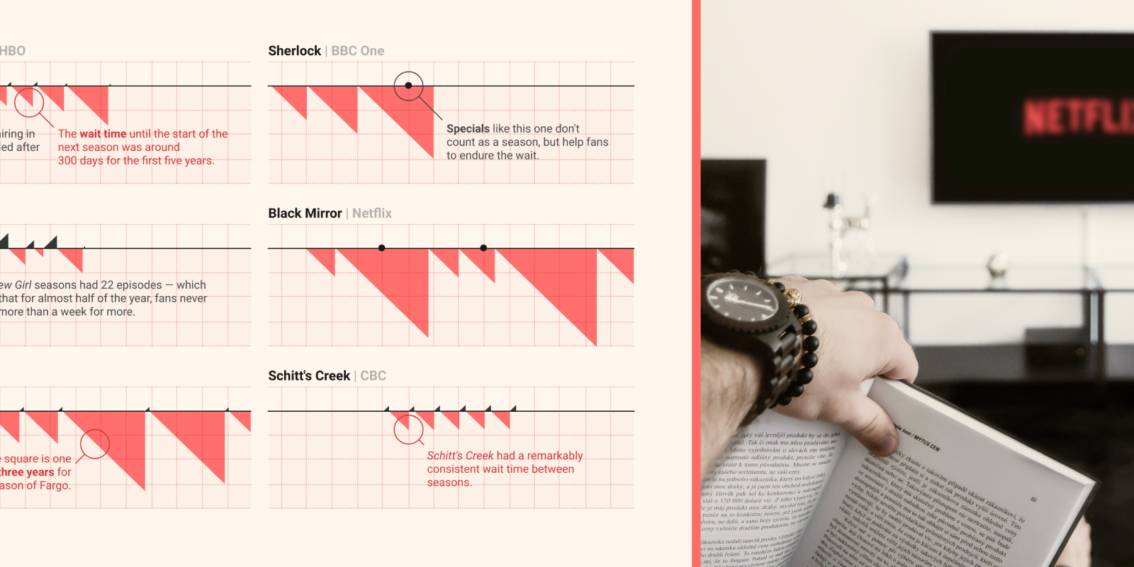
We’re waiting longer than ever for our favorite TV shows to return
Since the early 2000s, wait times between seasons have gone up.
August 2024
on Datawrapper ↗
A bad chart got better – and then bad again
"But is that last chart overkill? Probably."

October 2023
on Datawrapper ↗
The Nobel Prize-winning theory on why the gender gap is still a thing
Why the gender gap is widening within age cohorts in the U.S.
August 2023
on Datawrapper ↗
The “new normal”: Charts on how we at Datawrapper slowly return to the office
Remote? Hybrid? On-site? These charts show.
✦
June 2023
on Datawrapper ↗
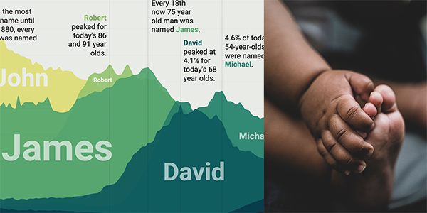
The most common baby names are far less common these days
In 1880, every 12th boy in the U.S. was named John. Things have changed.
January 2022
on Datawrapper ↗
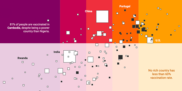
More money, more COVID-19 vaccinations? Let’s look at the outliers with a bivariate map.
Solving a color riddle.
October 2021
on Datawrapper ↗
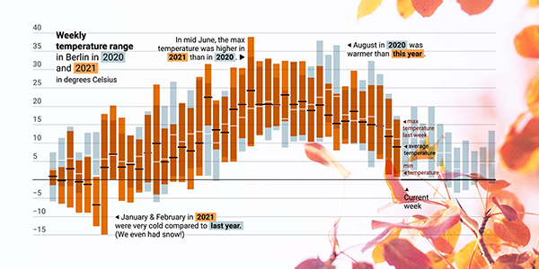
Plotting fall temperatures with range & value overlays
"Wait, that chart above is a column chart?" I hear you asking. Yes – and no.
✦
September 2021
on Datawrapper ↗
Years, months, days, and hours — in one chart
A chart experiment: Different time scales in a single time series.
September 2021
on Datawrapper ↗
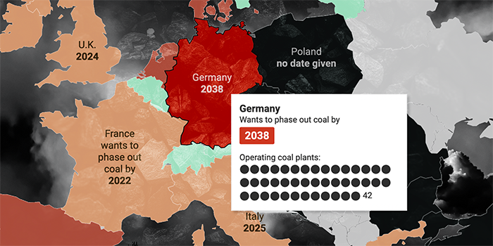
When will Europe phase out coal?
A map is great to see spatial patterns, a table is great to show more than one number in an overview – so I used both.
September 2021
on Datawrapper ↗
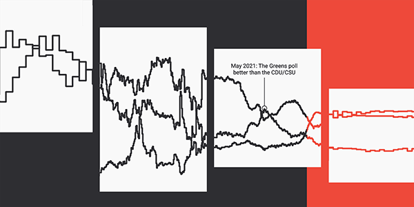
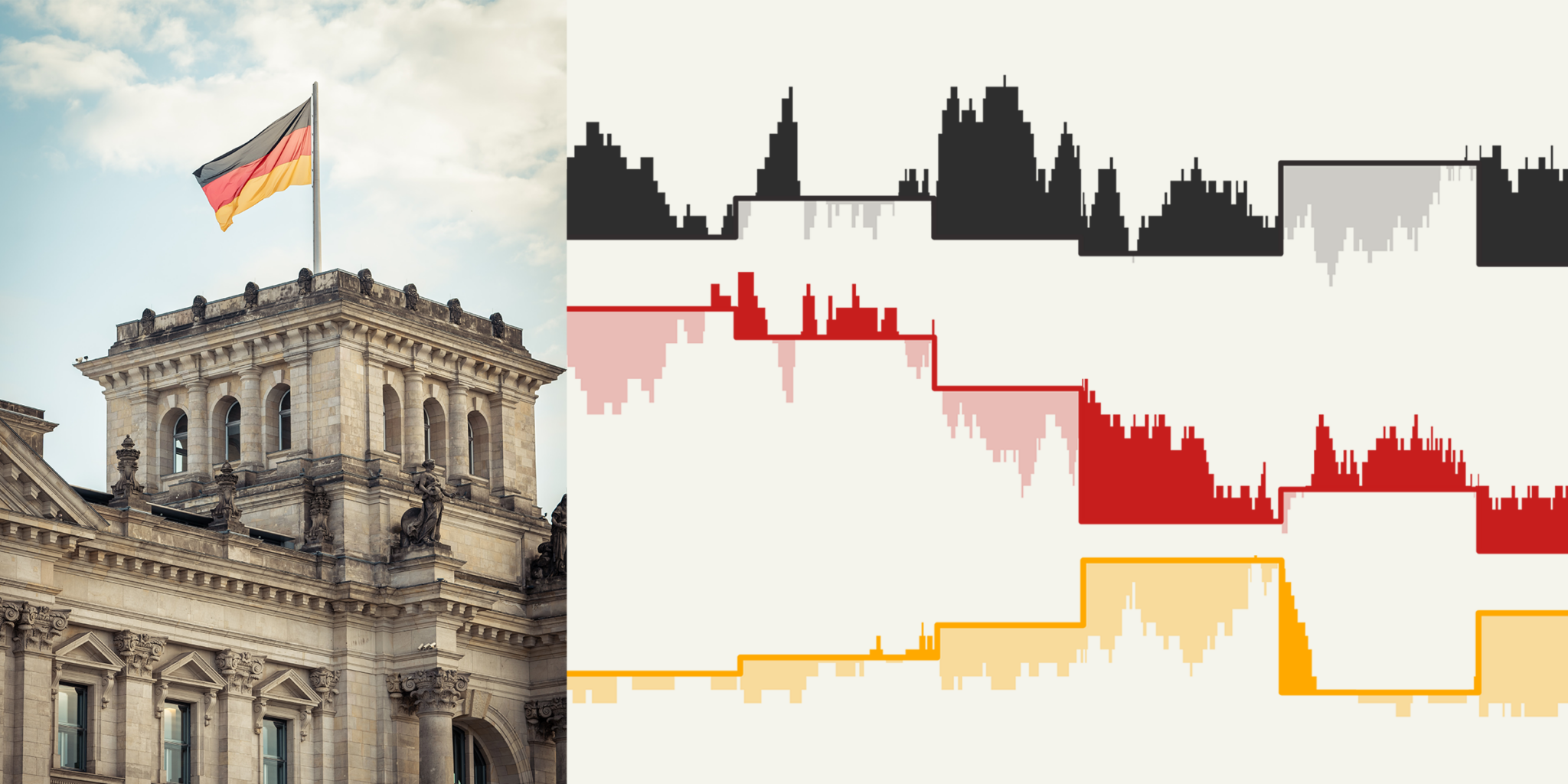
Which German party is the most unlucky when it comes to election dates?
Which party sees the most polls in their favor, just to then get a mediocre vote share at the election itself?
June 2021
on Datawrapper ↗
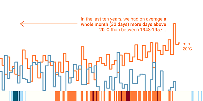
A full month more above 20°C
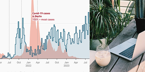
Just because we can't see something in a chart, doesn't mean it's not there.
May 2021
on Datawrapper ↗
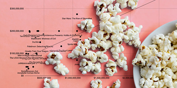
Does a higher budget make a movie more successful?
Only very expensive movies fail occasionally – *extremely* expensive ones don’t.
March 2021
on Datawrapper ↗
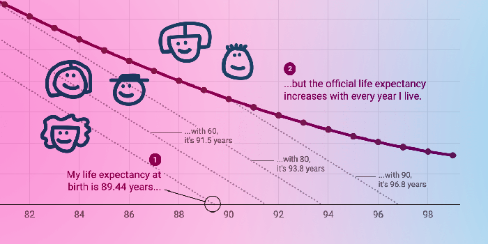
The older you get, the higher your life expectancy
Our life expectancy increases with every minute we live. Here's why.
February 2021
on Datawrapper ↗
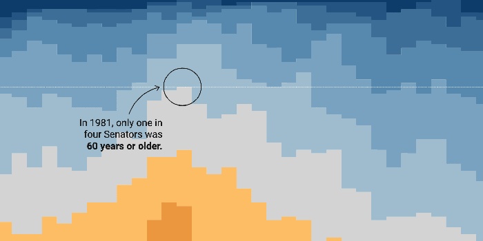
The oldest U.S. Senate to date, but not the least representative
I had the big urge to do an un-fun thing. And to do some math to calculate representiveness.
December 2020
for Datawrapper
Datawrapper visualizations I created in 2020
2020 was packed with corona charts. Besides that: US elections, university degrees, public holidays, and lots of tooltip charts.

January 2020
for Datawrapper ↗
Datawrapper workshop materials
Training slides & exercises I prepared for others to teach Datawrapper.
December 2019
for Datawrapper
Datawrapper visualizations I created in 2019
Greenland ice, life expectancy, EU elections, subway stations: What I visualized for Datawrapper in 2019.
December 2018
for Datawrapper
Datawrapper visualizations I created in 2018
In November 2017, I started to blog for Datawrapper and to create charts, maps & tables with the tool.

April 2017
sin(x), cos(x)
Generating charts in R based on trigonometric functions like sin(x) and cos(x). Lots of fun.

February 2017
on Twitter ↗
Study Know Act, a Twitterbot
You got to believe in something. Tweeting mottos from universities, military, nations, states, cities, brands.
November 2016
The US Election 2016 in Popular Votes
The US election results 2016 in popular votes. Featuring my favorite chart type, the Marimekko chart.
✦
June 2016
Which Cities Are On Similar Latitudes?
A simple visualization that removes data to let us see more.
April 2016
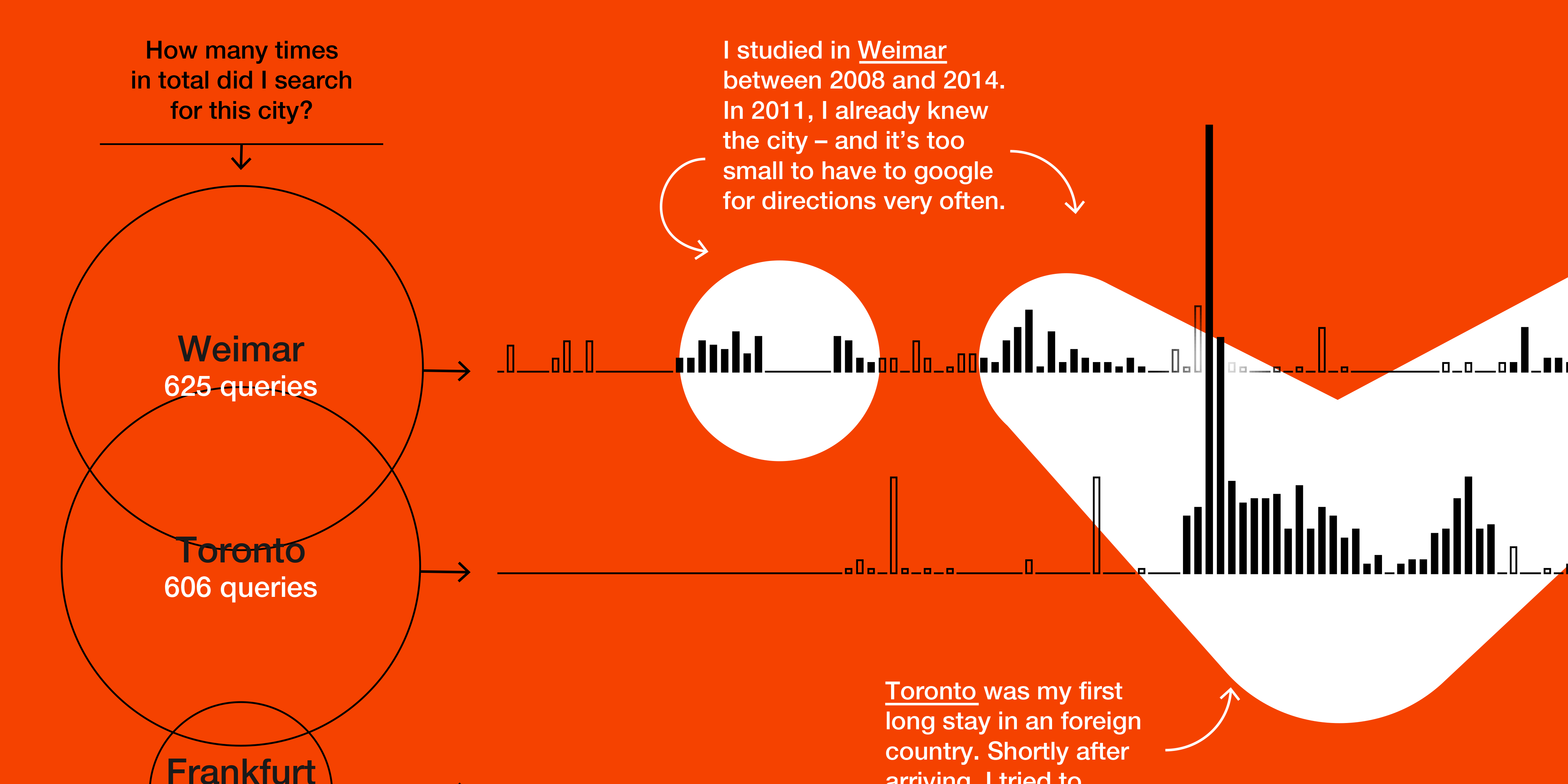
My Google Location History
What Google knows about in which cities I lived, based on my Google searches.

✦
January 2016
for SPIEGEL
Back then, everything was worse.
Illustrating a weekly graphic for a column in the German magazine DER SPIEGEL.
✦
June 2015
My Google Search History – visualized
I visualized the 40,000 search queries I asked Google between June 2010 and April 2015.
November 2014
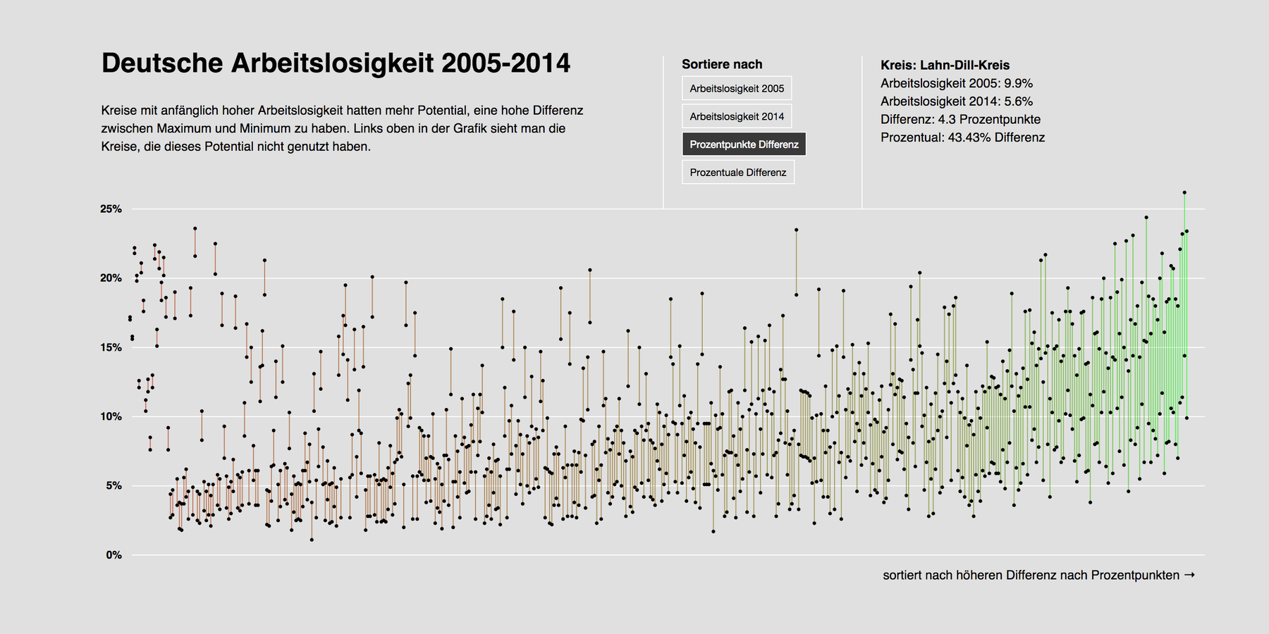
Unemployment Rates in Germany – The d3 Version
"That was the most complex coding experience I have ever had where I still understood what I am doing."
✦
August 2014
Data Vis in my Master's Thesis
During my master's thesis, I redesigned three magazines in three different styles. Here are the pages that involve the best infographics.
August 2014
Documentation of my Master's Thesis
Visualizing how I work, what my design principles are and what I've learned during the process of my Master's Thesis.

October 2013
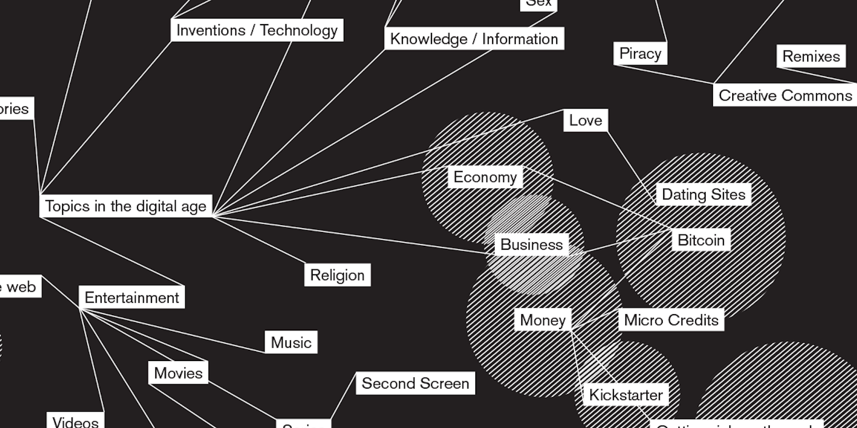
The Dotview magazine about Edward Snowden
A magazine about Edward Snowden, bringing all the voices of the web into print.
✦
July 2013
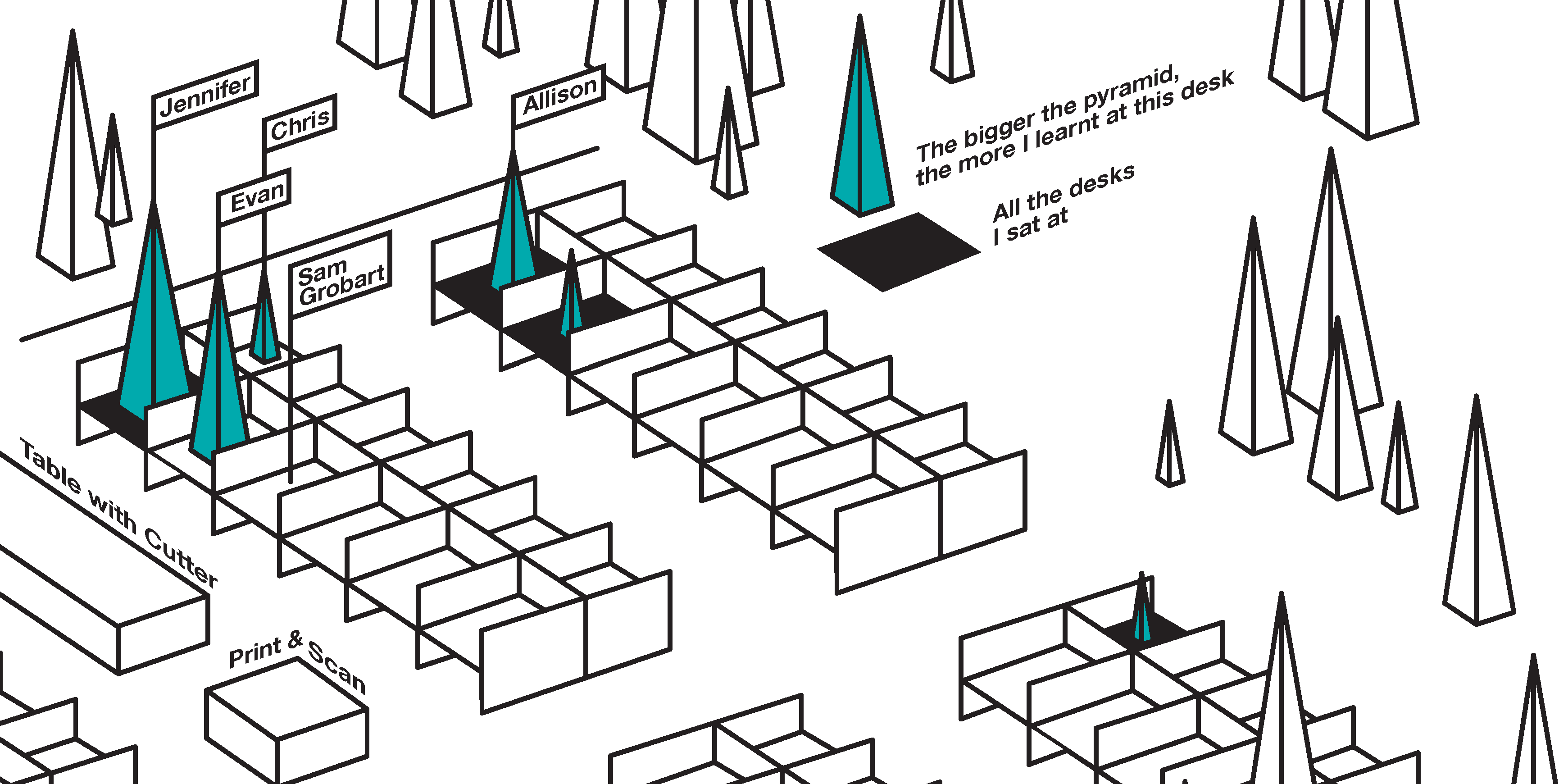
Documentation of my internship at Bloomberg Businessweek
In spring 2013, I spent eleven wonderful weeks as an intern at the Bloomberg Businessweek in New York City.
May 2013
for Bloomberg Businessweek
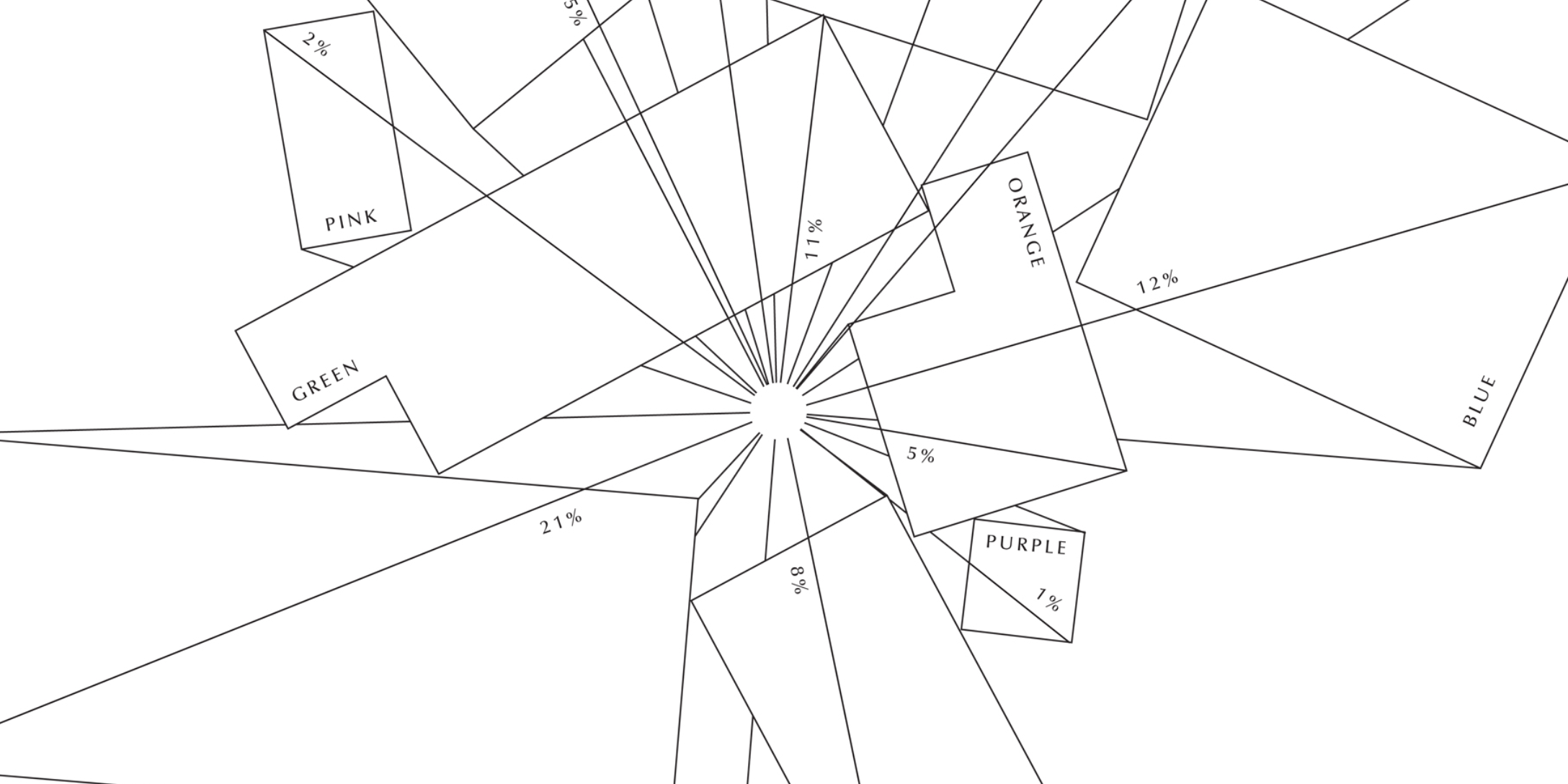
American Illustration 32
Highly designed, unreadable Information design for the 32nd American Illustration Book.