In November 2017, we published the first Weekly Chart on the Datawrapper Blog – and since then, every single week. In the beginning, it was only me who visualized some dataset and wrote a few words about it. In June this year, that changed: All of my coworkers are writing Weekly Charts these days; every one of them at least once a year.
Still, I got to build some charts in the past two years, for the Weekly Charts I wrote and for feature announcements. Here they are. Most of them show the underlying data when you hover over the data points. I apologize in advance for the long loading time…these embedded iframes need some time to express themselves.
→ Datawrapper website
→ Datawrapper Blog (incl. Weekly Charts)
From my Weekly Chart “Greenland’s ice is melting, but without an OMG moment”. Read it here.
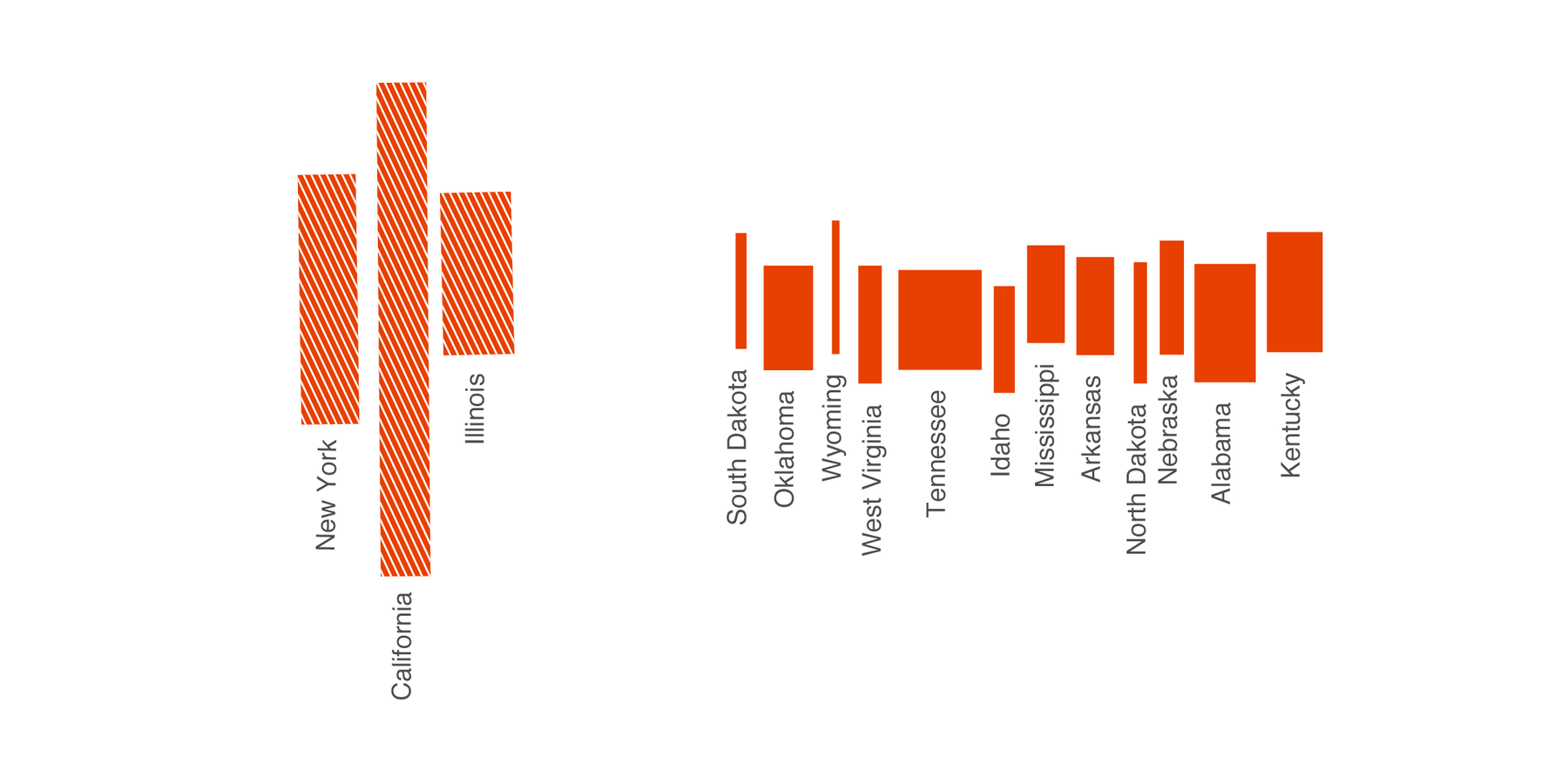
From my Weekly Chart “Two charts in one”. Read it here.
From my Weekly Chart “A too complicated map”. Read it here.
From my Weekly Chart “A black & white table about parties (you know, without the party colors)”. Read it here.
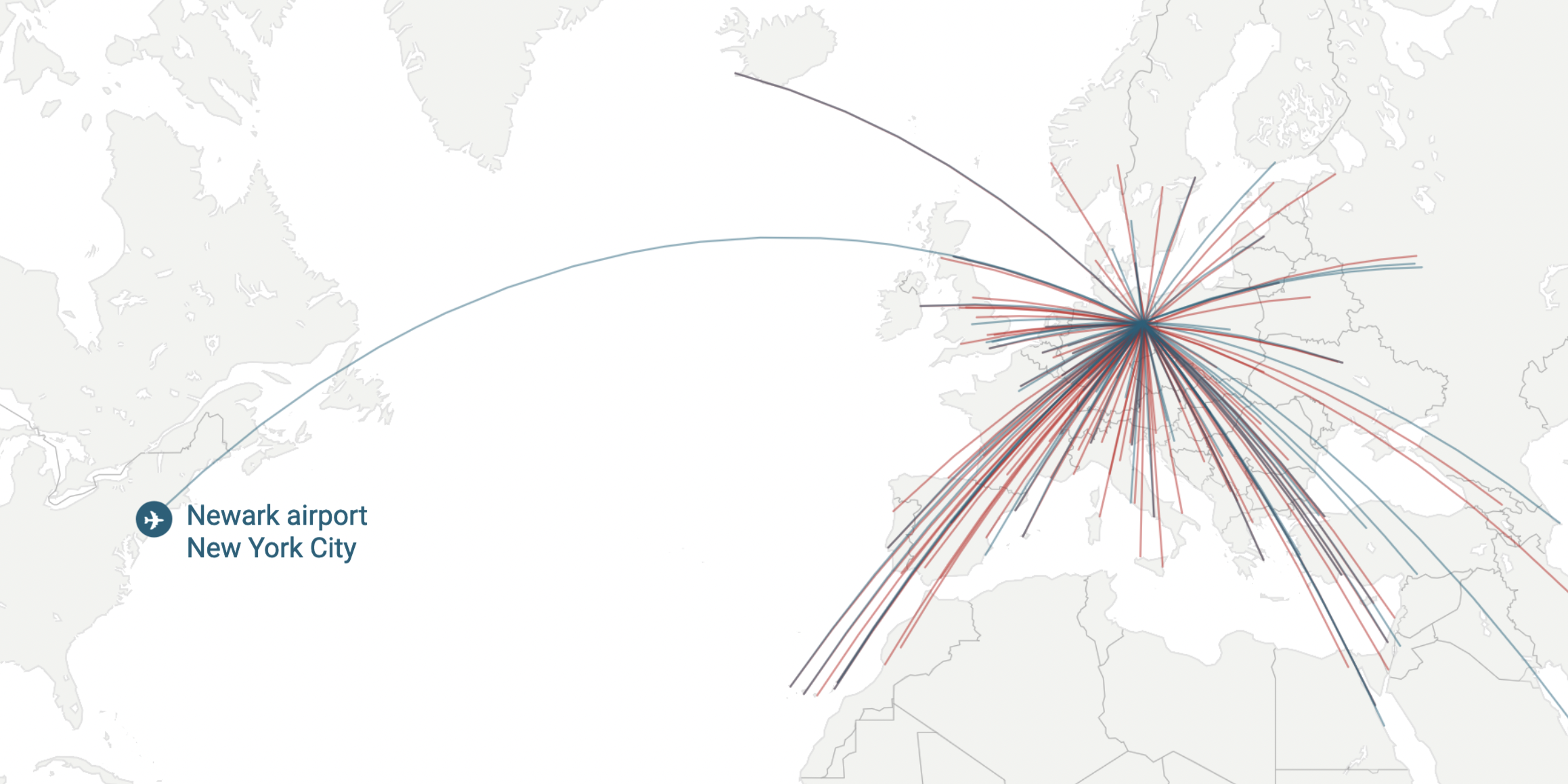
From my Weekly Chart “Three jobs of a callout line”. Read it here.