If you work at a charting tool, you create some charts. In November 2017, I started to blog for Datawrapper. Since then we’ve been posting a Weekly Chart in which one of us (or a guest author) explain chart design tricks. Here are some of the best charts I created in 2018 for and at Datawrapper. Most of them show the underlying data when you hover over the data points.
→ Datawrapper website
→ Datawrapper Blog (incl. Weekly Charts)
From my Weekly Chart “The not so worldwide worldwide web”. Read it here.
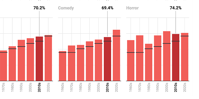
From my Weekly Chart “Climbing higher, one step at the time”. Read it here.
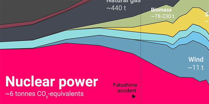
From my Weekly Chart “Less smoke in the Western world”. Read it here.
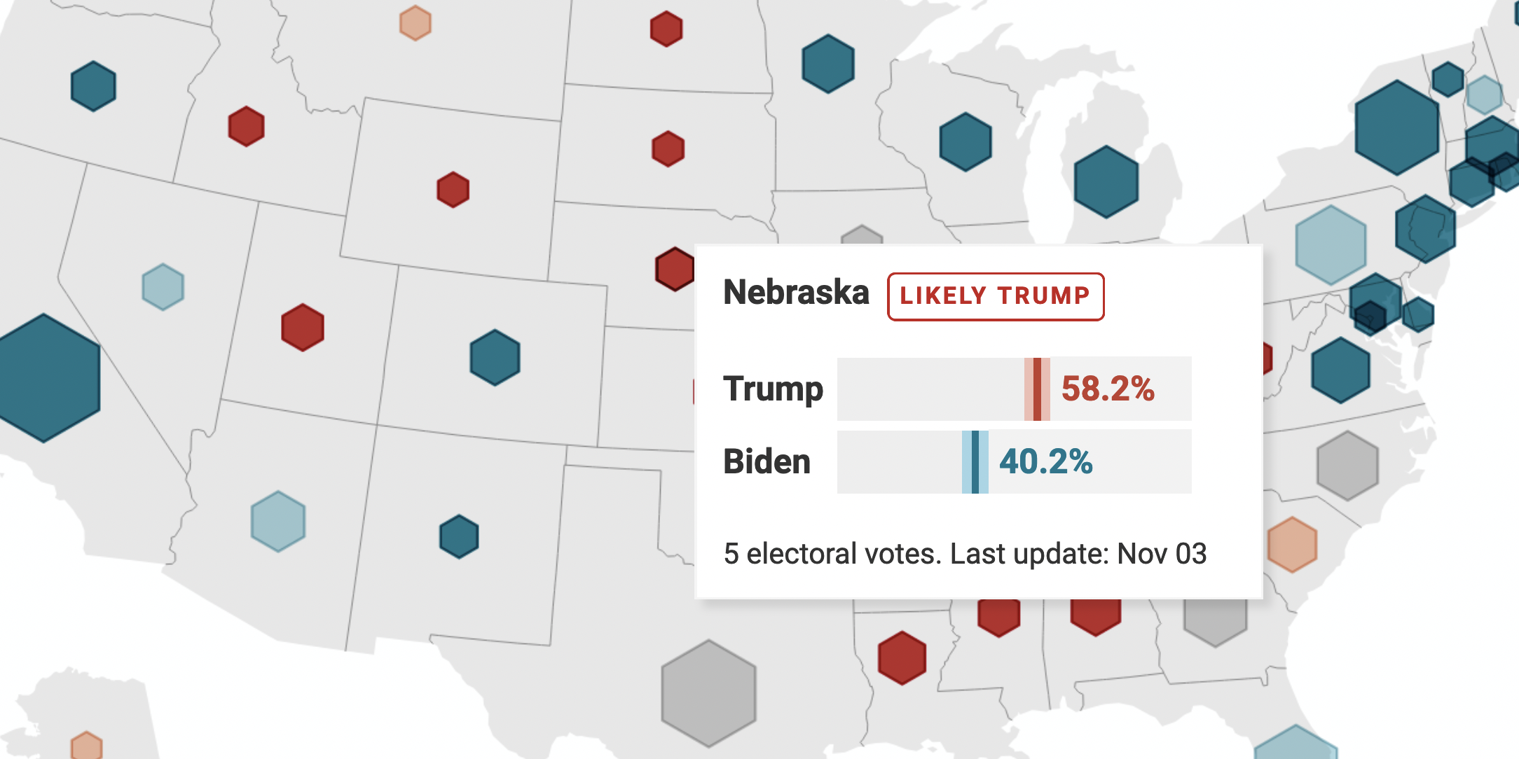
From my Weekly Chart “Conceptually close vs physically close”. Read it here.
From my Weekly Chart “‘This is so good you wouldn’t know it was done by a woman.’”. Read it here.
From our feature announcement “Our deliciously new pies & donuts – also as small multiples”. Read it here.
From our feature announcement “Introducing Cartograms in Datawrapper”. Read it here.
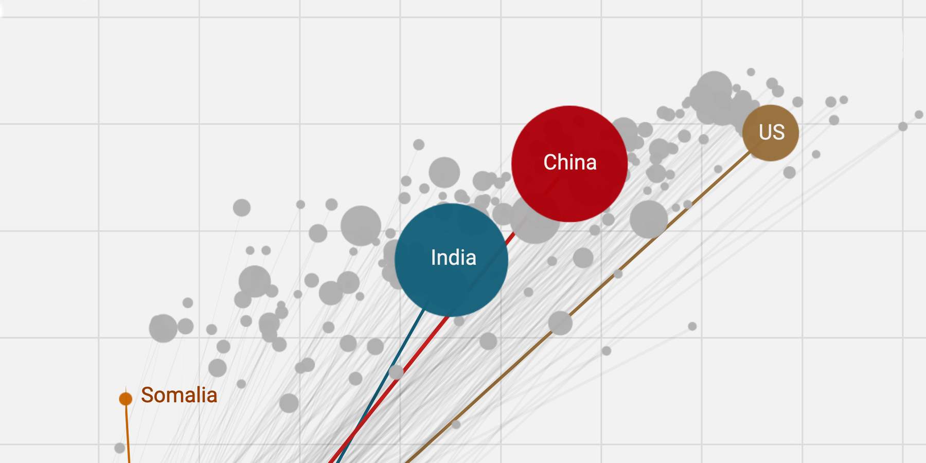
From my Weekly Chart “China begins just east of Finland”. Read it here.
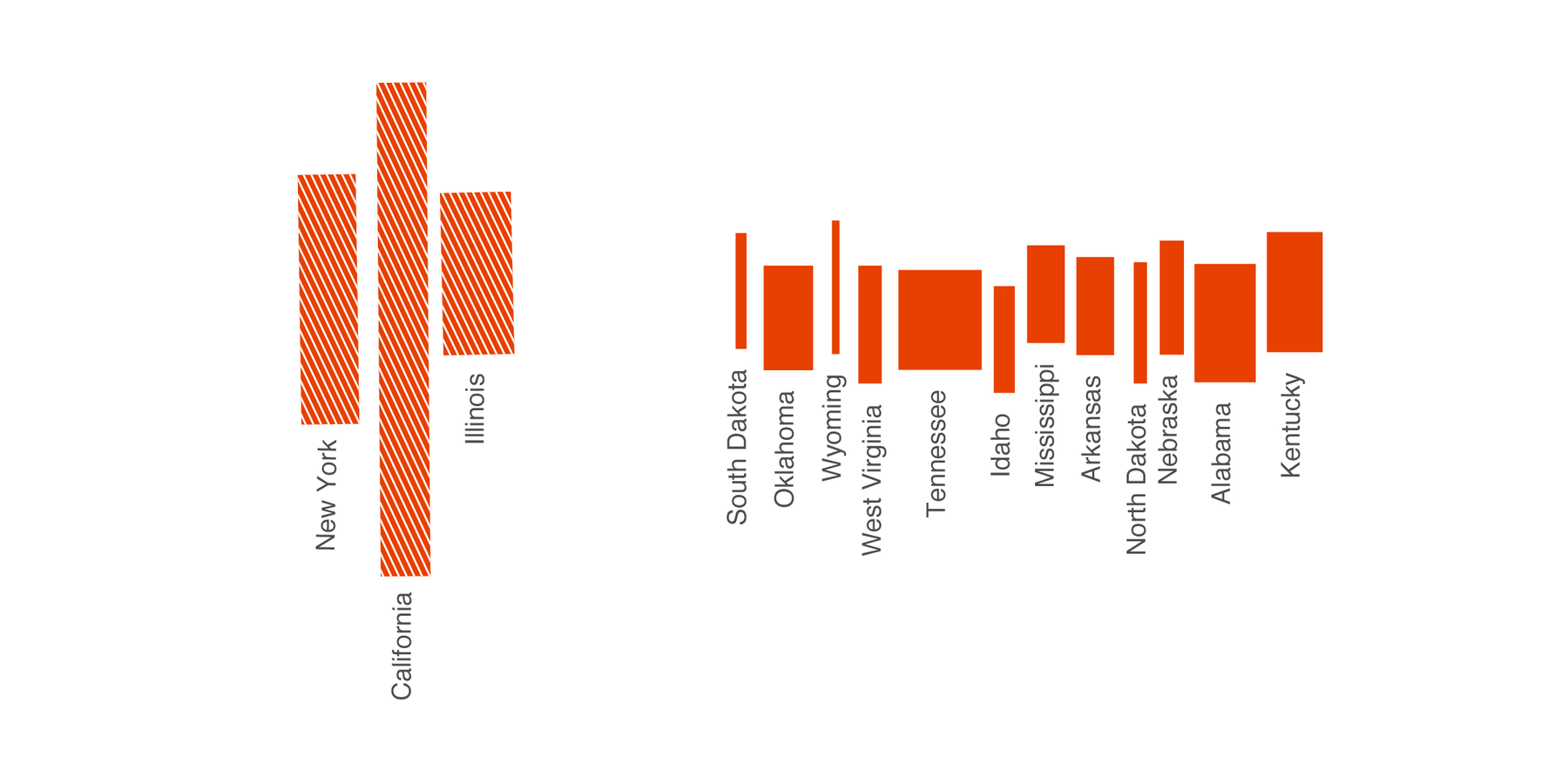
From my Weekly Chart “Depth and breadth in charts”. Read it here.
From my Weekly Chart “A shrinking surplus of women”. Read it here.
From our feature announcement “You can now import areas & lines to locator maps (plus other improvements)”. Read it here.