"To understand something, write about it," they say. I started writing on my personal blog about data vis & related topics when entering the field around 2014. Since November 2017, I get paid by Datawrapper to do just that: Figuring things out, and taking you all on a tour with me:
Articles

March 2026
I’m bringing everything back to my website
I built two new spaces for my website, Notes and Everything. Here's what to expect from them.

March 2026
How I use RSS to quickly post on my Jekyll blog
How I use the RSS feed of an old Tumblr blog and GitHub Actions to write Jekyll posts on my phone.
December 2024
on Datawrapper ↗
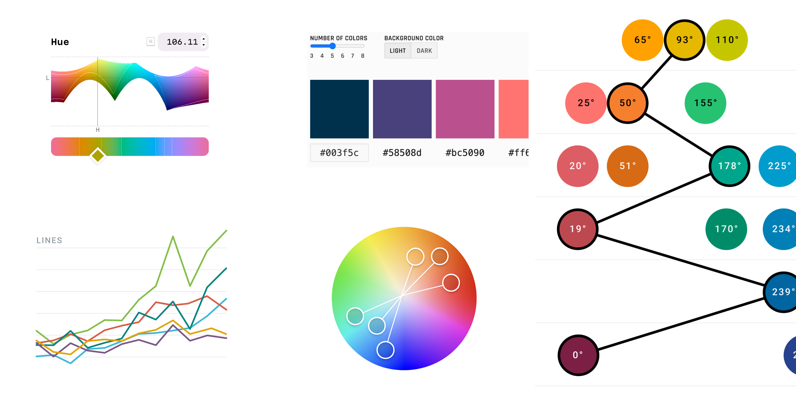
How to find and create good color palettes
Which tools and approaches you can use to find, come up with, or extend a color palette.
October 2024
on Datawrapper ↗
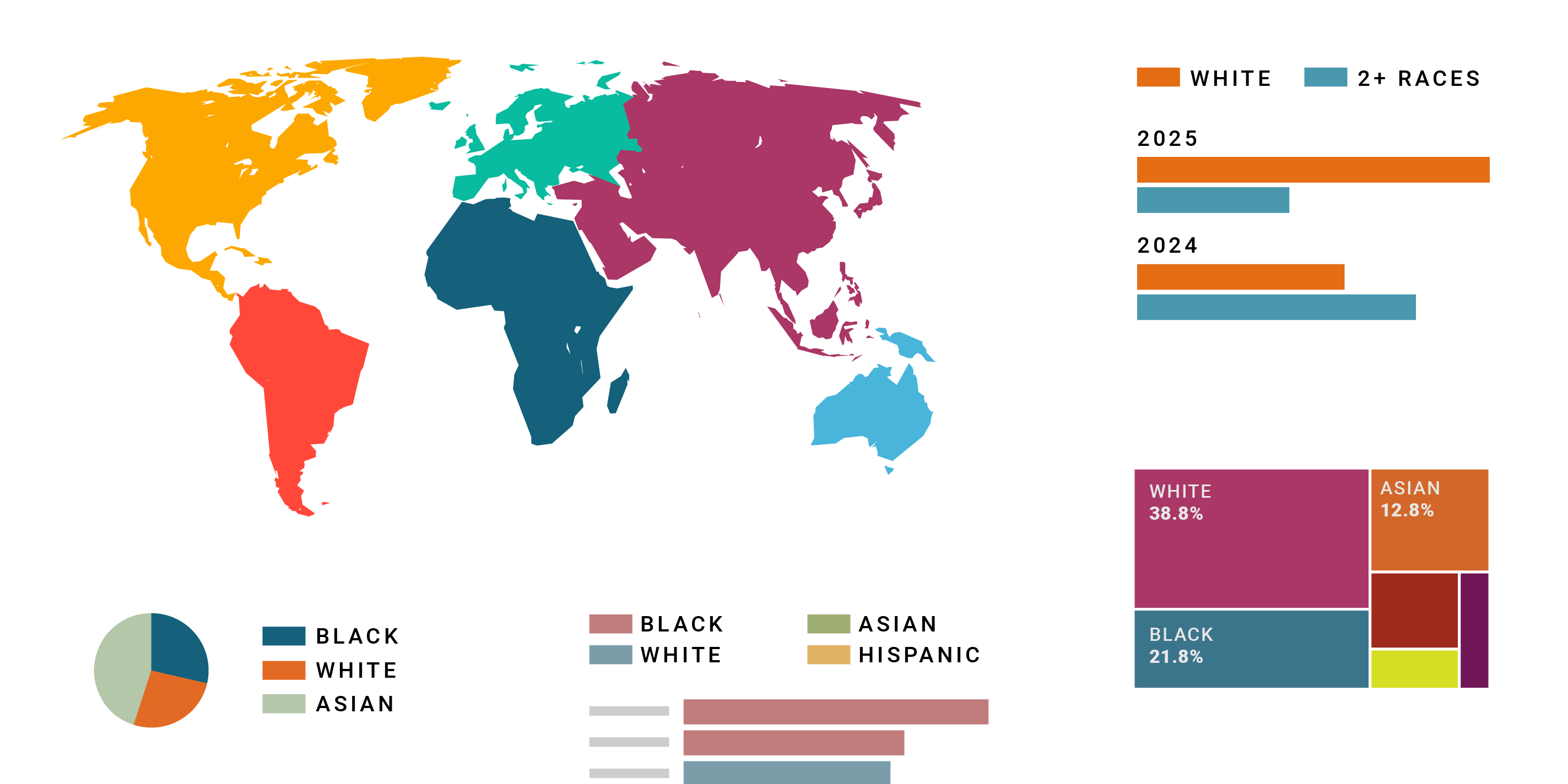
What to consider when choosing colors for race, ethnicity, and world regions
...so that all readers feel respected.
February 2024
on Datawrapper ↗
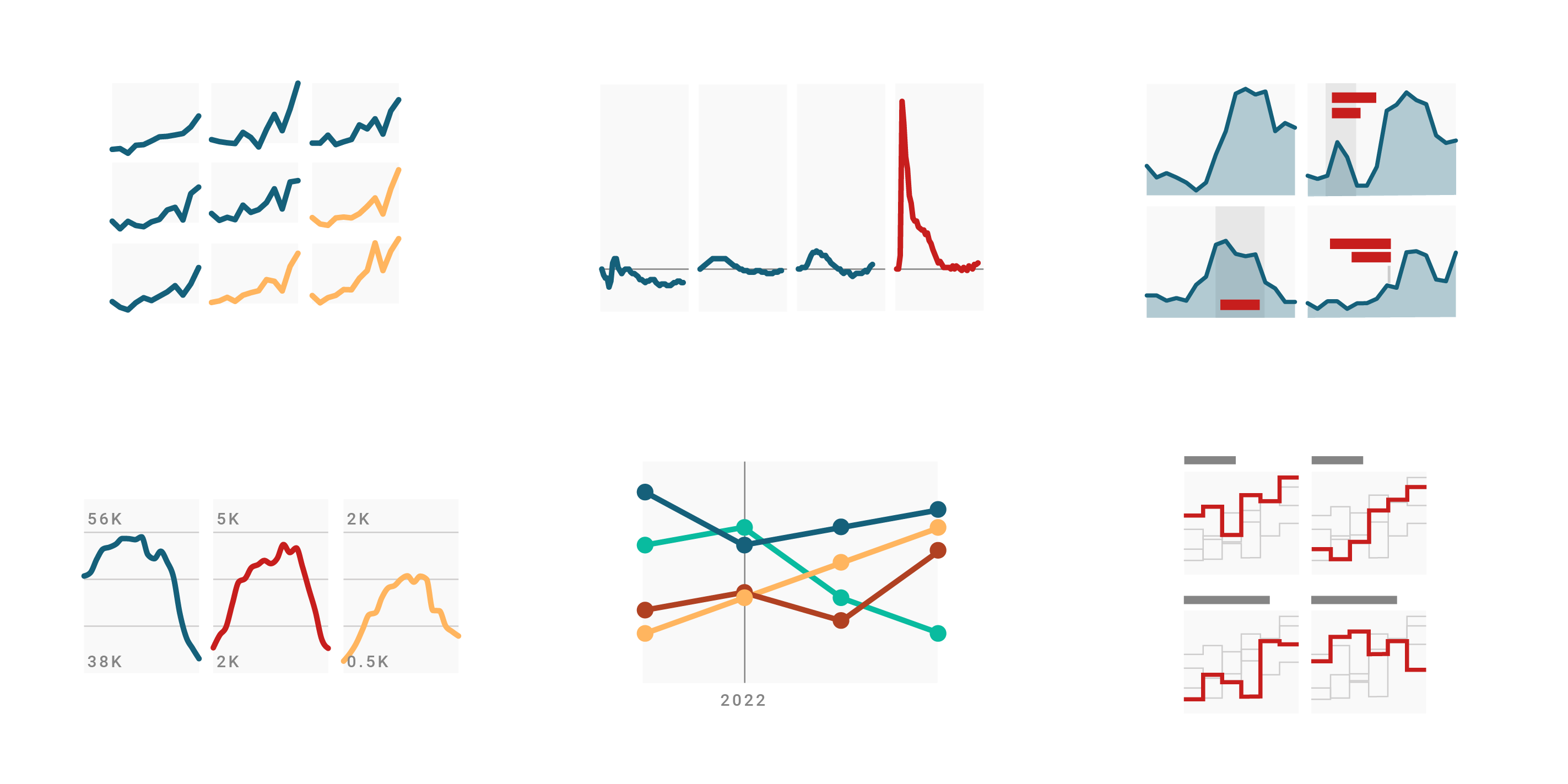
What to consider when creating small multiple line charts
When should you use line charts and when small multiple line charts?
✦
November 2023
on Datawrapper ↗
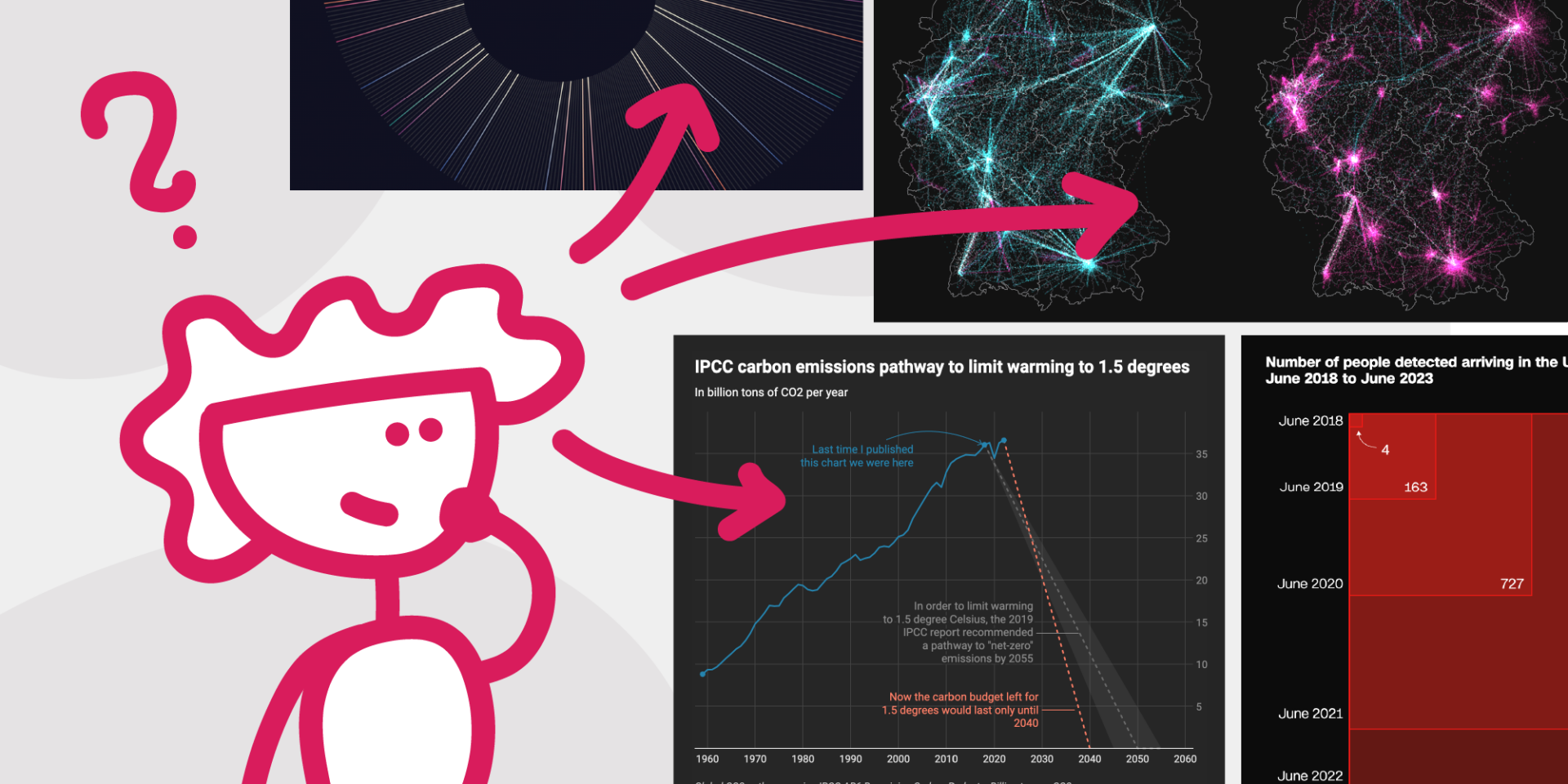
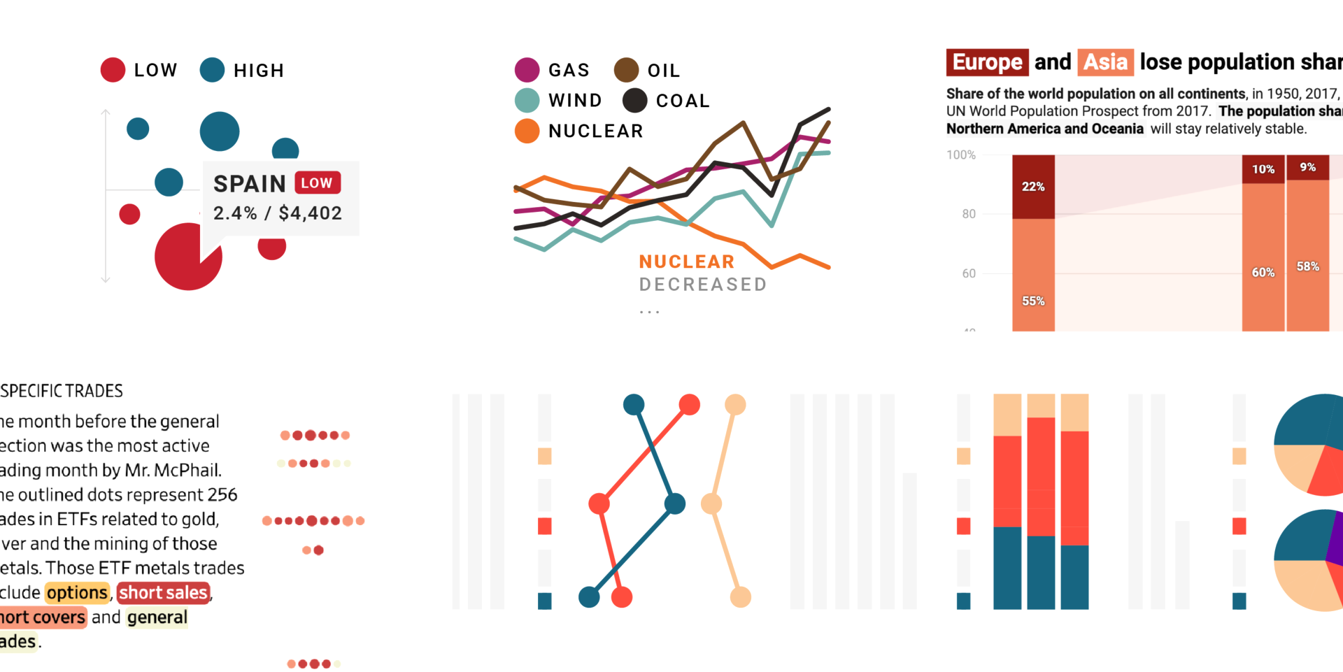
How to get started with data visualization
A very subjective but practical guide (with exercises!) about what to do when you want to get into data vis.
October 2023
on Datawrapper ↗
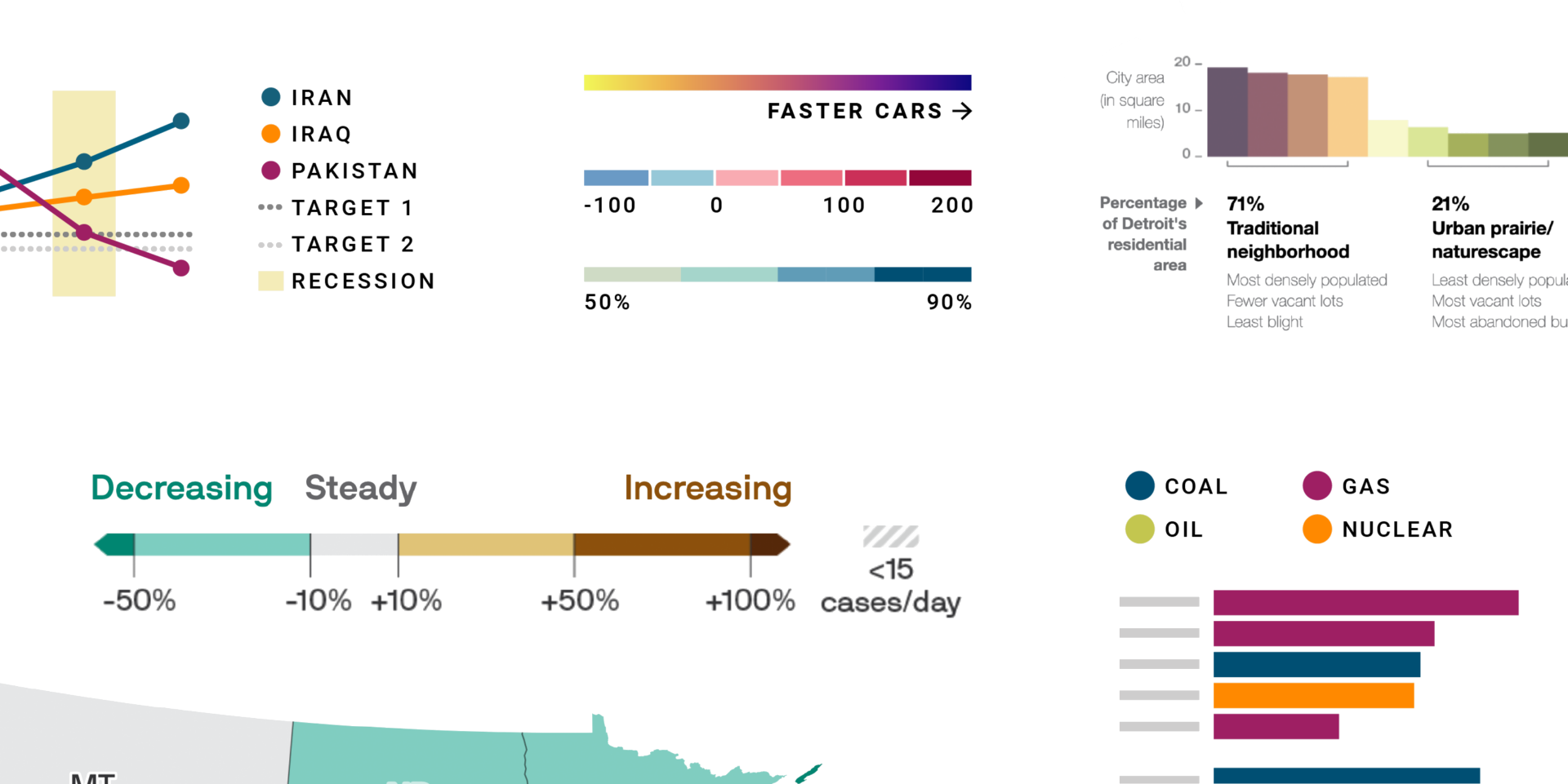
Remind readers of the colors in your data visualization
How to remind your readers which colors mean what in your data visualization.
August 2023
on Datawrapper ↗
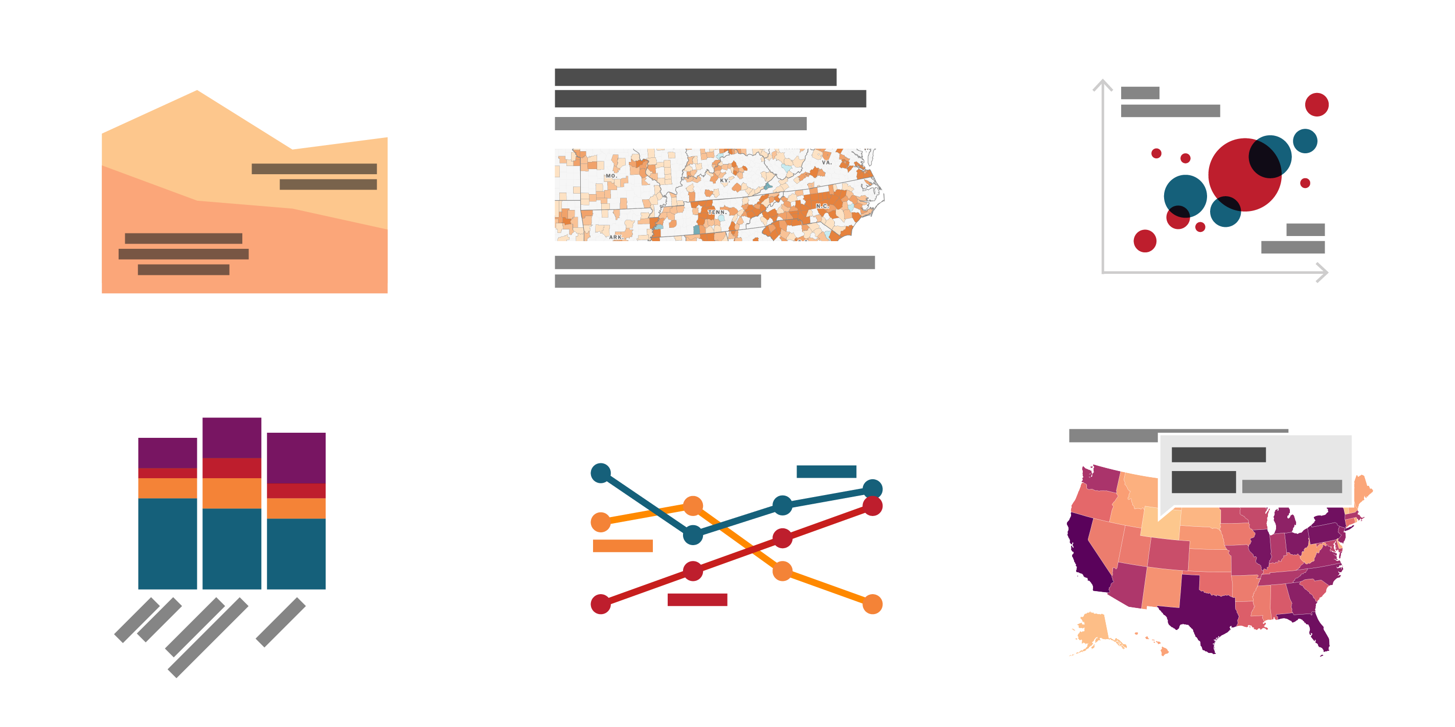
How to design a useful (and fun!) color key for your data visualization
How to create useful, truthful, easily skimmable color keys for categorical and quantiative color scales
July 2023
on Datawrapper ↗
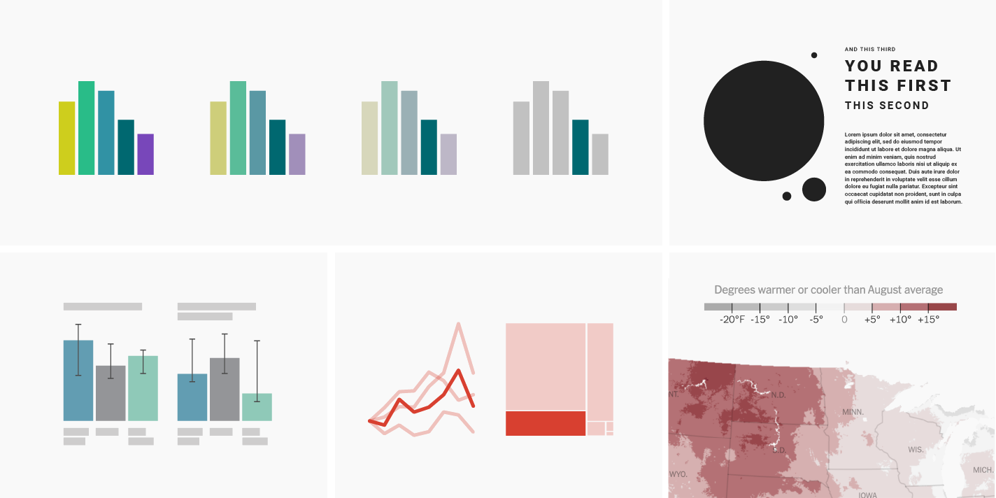
Emphasize what you want readers to see with color
Use colors to decide which information readers should see first, second, third, or last.
September 2022
on Datawrapper ↗
What to consider when using text in data visualizations
Text might be the most neglected part of data viz. Here's how to use words well in your next chart or map.
September 2022
on Datawrapper ↗
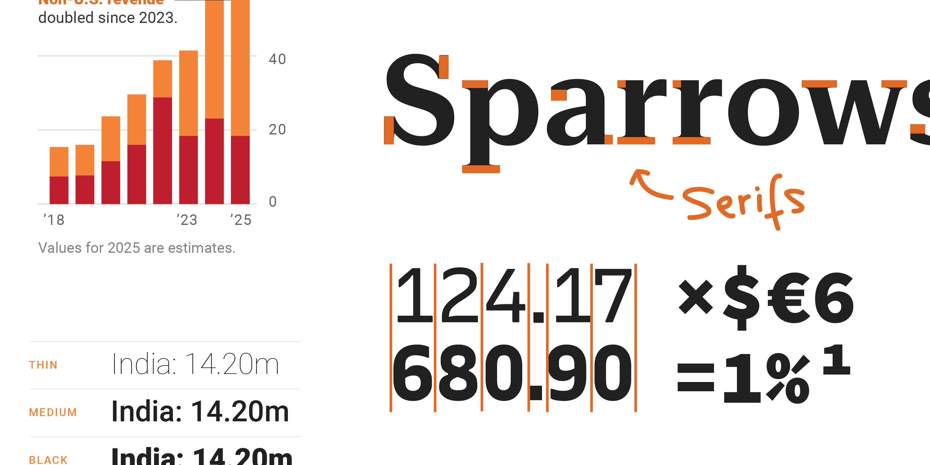
Which fonts to use for your charts and tables
Sans-serif or serif typefaces? Lining or oldstyle figures? Here's which fonts and customizations work best for your charts & tables.
✦
July 2022
on Datawrapper ↗
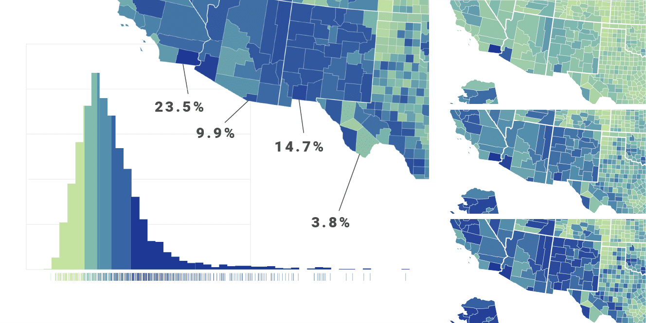
How to choose an interpolation for your color scale
How to assign each of your data values to a certain color.
March 2022
on Datawrapper ↗
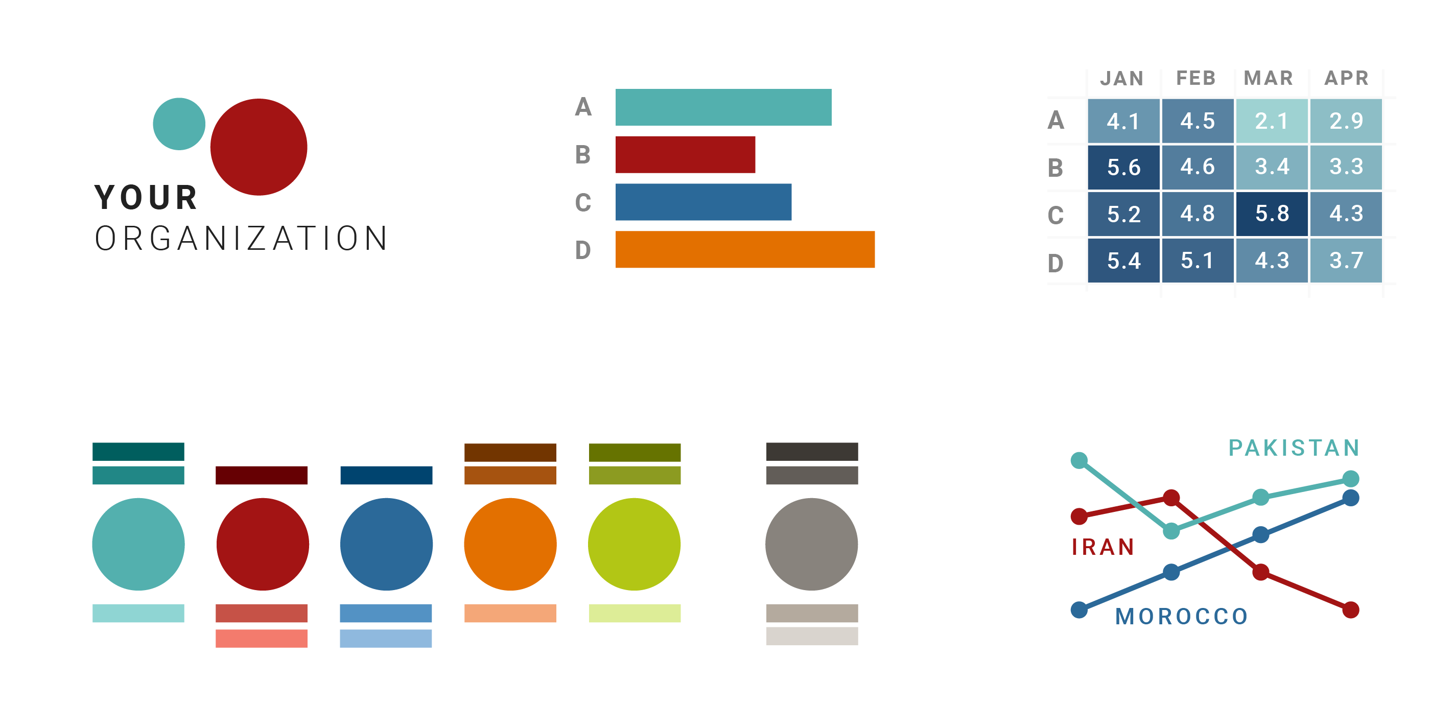
A detailed guide to colors in data vis style guides
A very, very detailed guide on how to create an organizational color palette
February 2022
on Datawrapper ↗
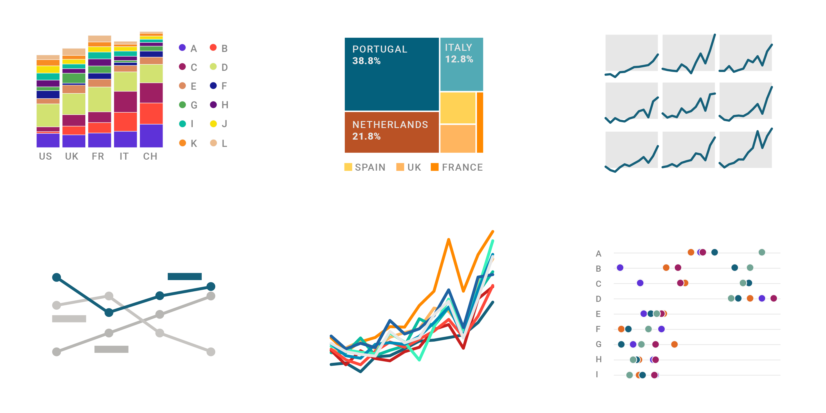
10 ways to use fewer colors in your data visualizations
How can we avoid using twelve or so colors in a chart? Here are a few options.

August 2021
I'm called Lisa Charlotte Muth now
I got married 🎉 – and took on a new last name. Here's why.
✦
July 2021
on Datawrapper ↗
In defense of simple charts
I’m here to tell you that simple charts are great. That they’re necessary. Underappreciated. And that you should be proud of yourself if you create simple charts.
March 2021
on Datawrapper ↗
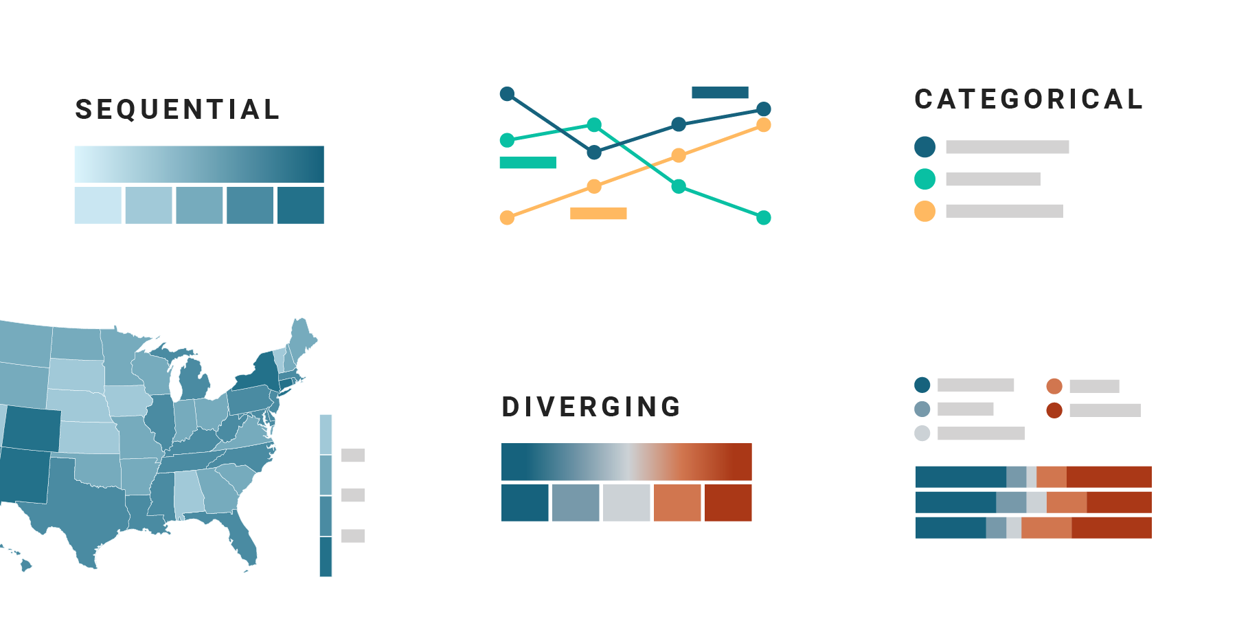
Which color scale to use when visualizing data
A short overview of the different color scales (diverging, sequential, categorical) that you can use to visualize your data.
March 2021
on Datawrapper ↗
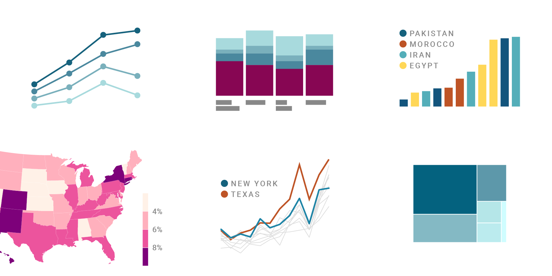
When to use quantitative and when to use qualitative color scales
When should you use a gradient (light blue to dark blue), and when should you use hues (red, yellow, blue) when visualizing data?
March 2021
on Datawrapper ↗
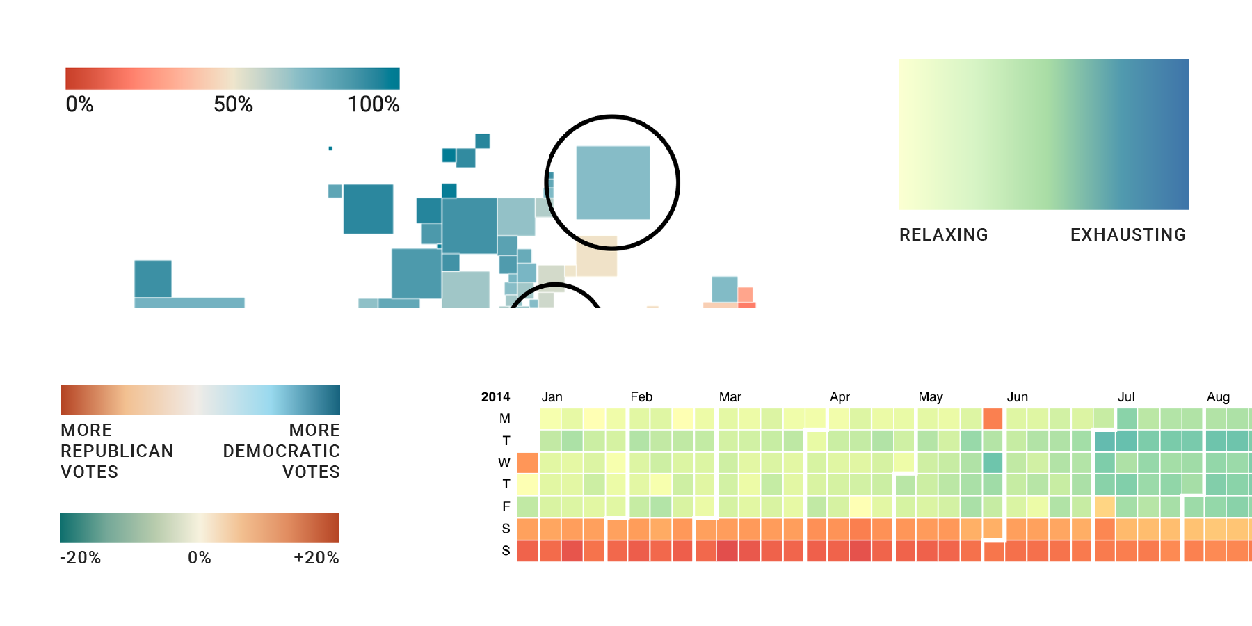
When to use sequential and when to use diverging color scales
Here's when (and when not) to use diverging gradients when visualizing data.
March 2021
on Datawrapper ↗
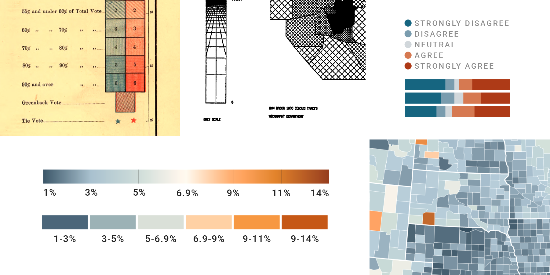
When to use classed and when to use unclassed color scales
Here's how to decide if you should use a discrete or continuous gradient to visualize your data.
February 2021
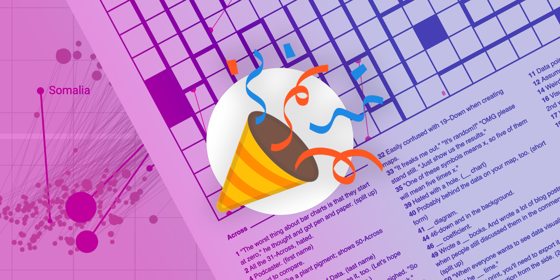
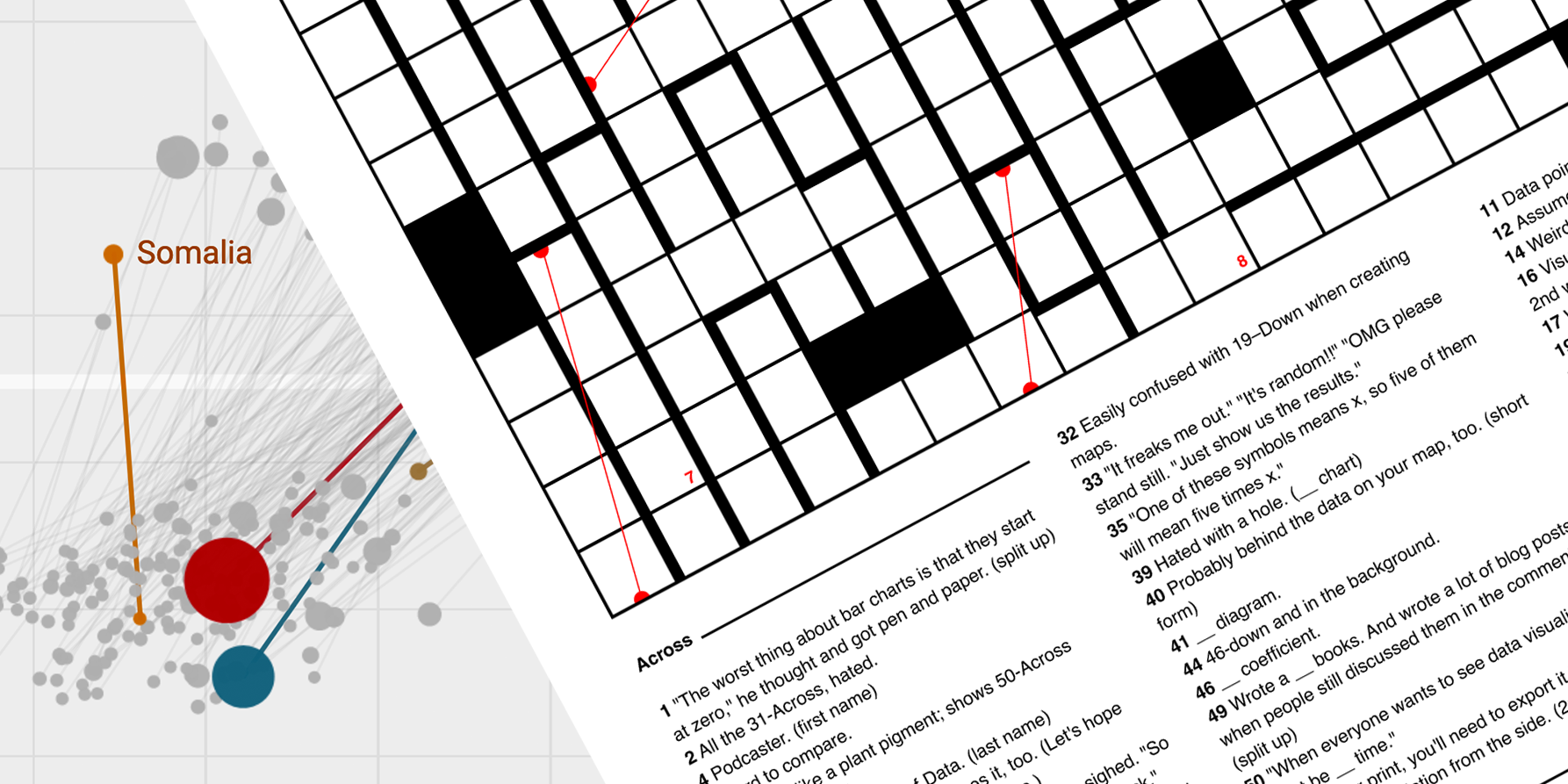
A data vis crossword puzzle! The solution.
Here are all the correct words in the data vis crossword puzzle from last week.
✦
February 2021
A data vis crossword puzzle!
Find the 13 vis types, 5 tools, 14 people, and 22 concepts from the field of data vis and win a data vis book.
November 2020
at SHOW
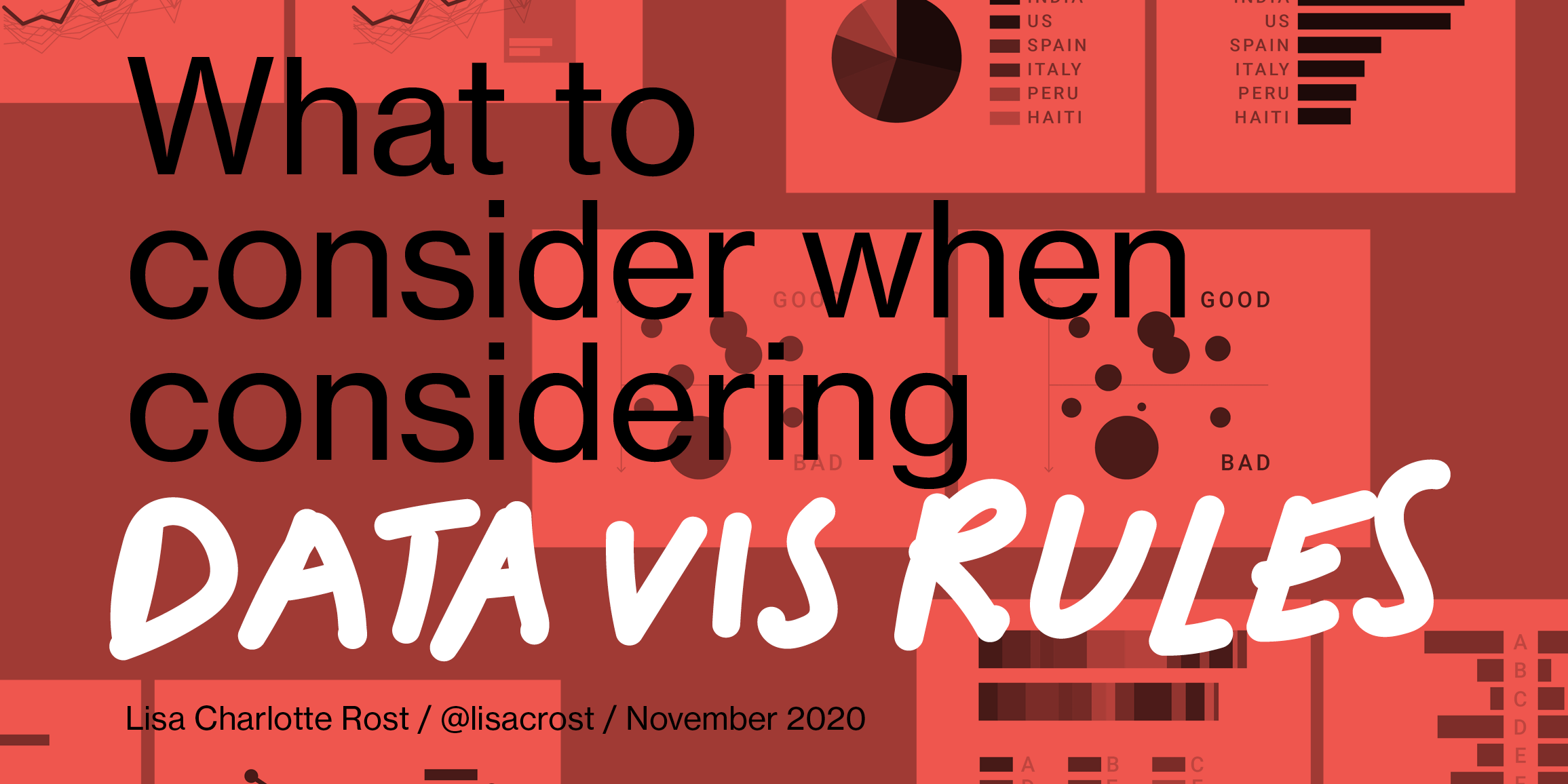
What to consider when considering data vis rules
Which kind of data vis rules I like, and how the theory of art can explain why rules contradict each other.

✦
September 2020
on Datawrapper ↗
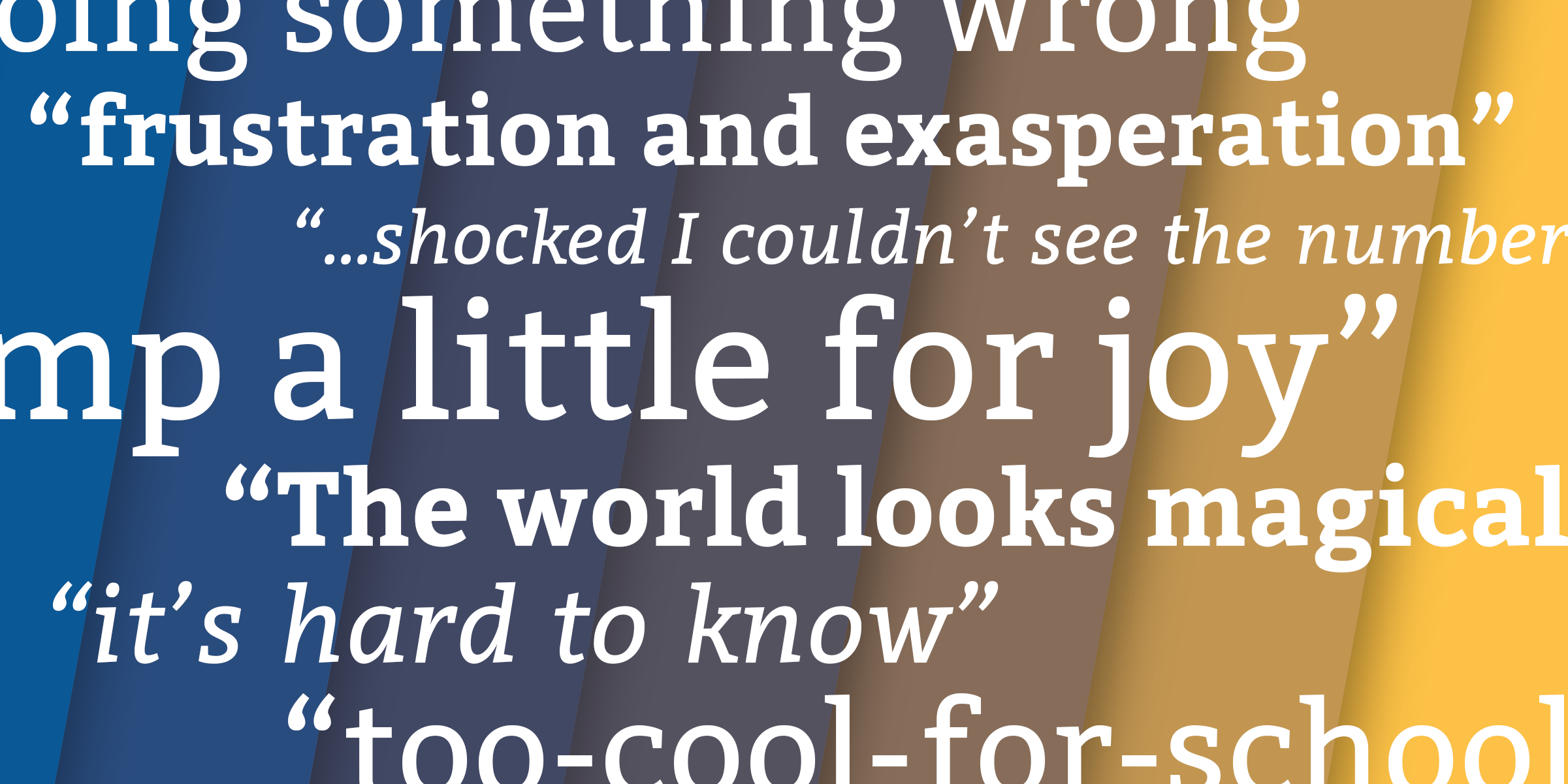
How to pick more beautiful colors for your data visualizations
Common color mistakes and how to avoid them
June 2020
on Datawrapper ↗
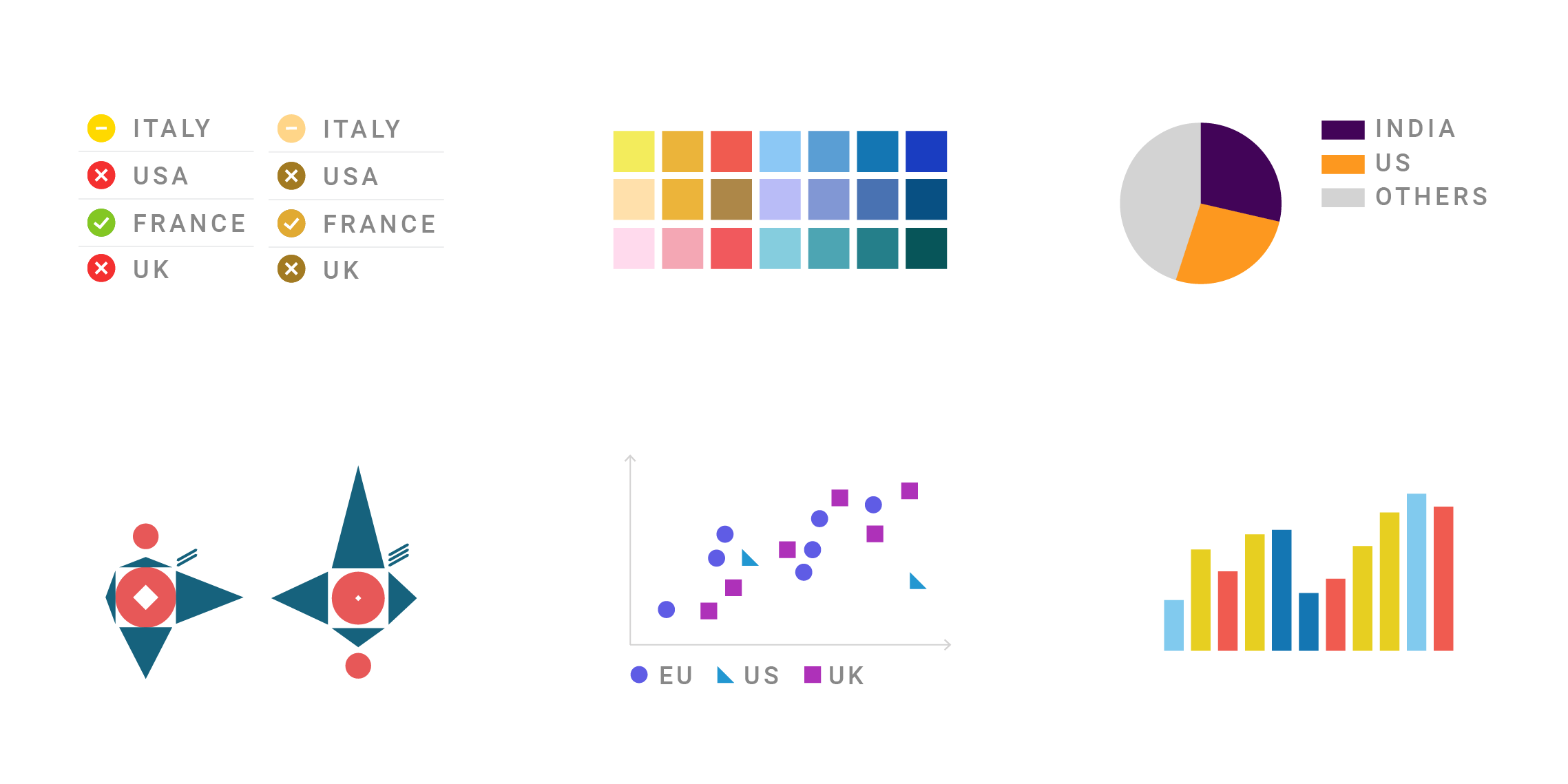
What’s it like to be colorblind
Experiences from ten colorblind people & three in-depth interviews with two cartographers and one Datawrapper CEO.
June 2020
on Datawrapper ↗
What to consider when visualizing data for colorblind readers
Everything you can use to make your charts and maps decipherable for colorblind readers.

June 2020
on Datawrapper ↗
How your colorblind and colorweak readers see your colors
What’s the difference between colorweak and colorblind people, and how they see the world.
March 2020
on Datawrapper ↗
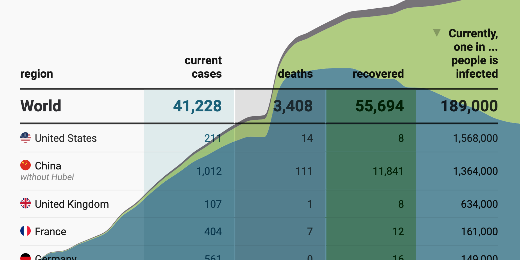
17 (or so) responsible live visualizations about the coronavirus, for you to use
The most visited article on the Datawrapper blog, by far.
October 2019
on Datawrapper ↗
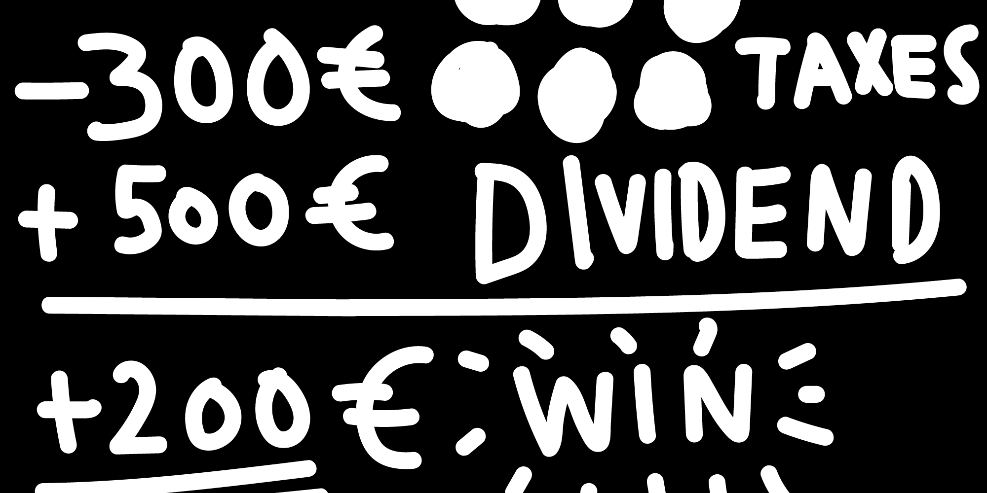
How to save the world while making people better off
Explaining the Carbon Fee & Dividend.
October 2019
on Datawrapper ↗
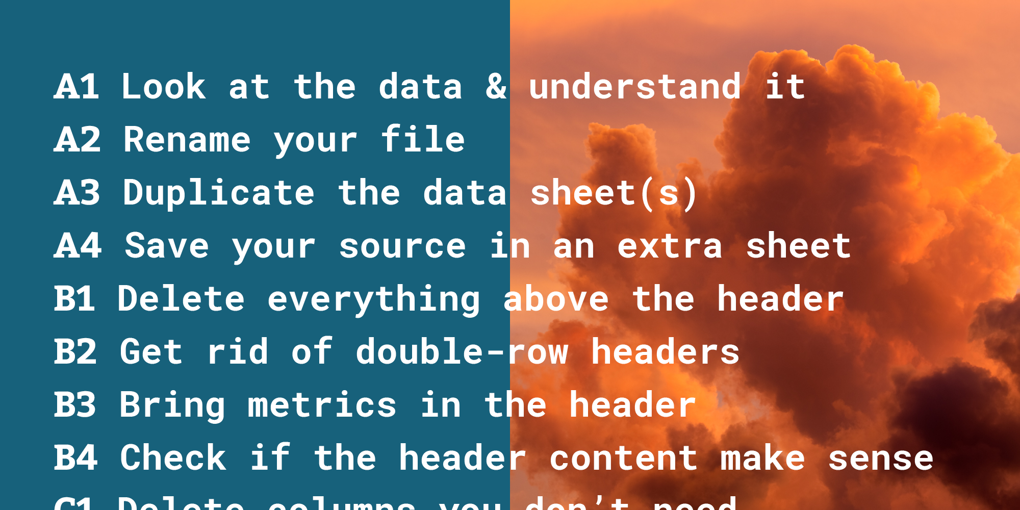
How to prepare your data for analysis and charting in Excel & Google Sheets
The Excel methods and formulas you’ll need most often to get your data ready to analyze or plug into Datawrapper.
July 2019
Oh look, Lisa has a new website!
How it looked like before the redesign, and why I decided to change it & built everything from scratch.
June 2019
on Datawrapper ↗
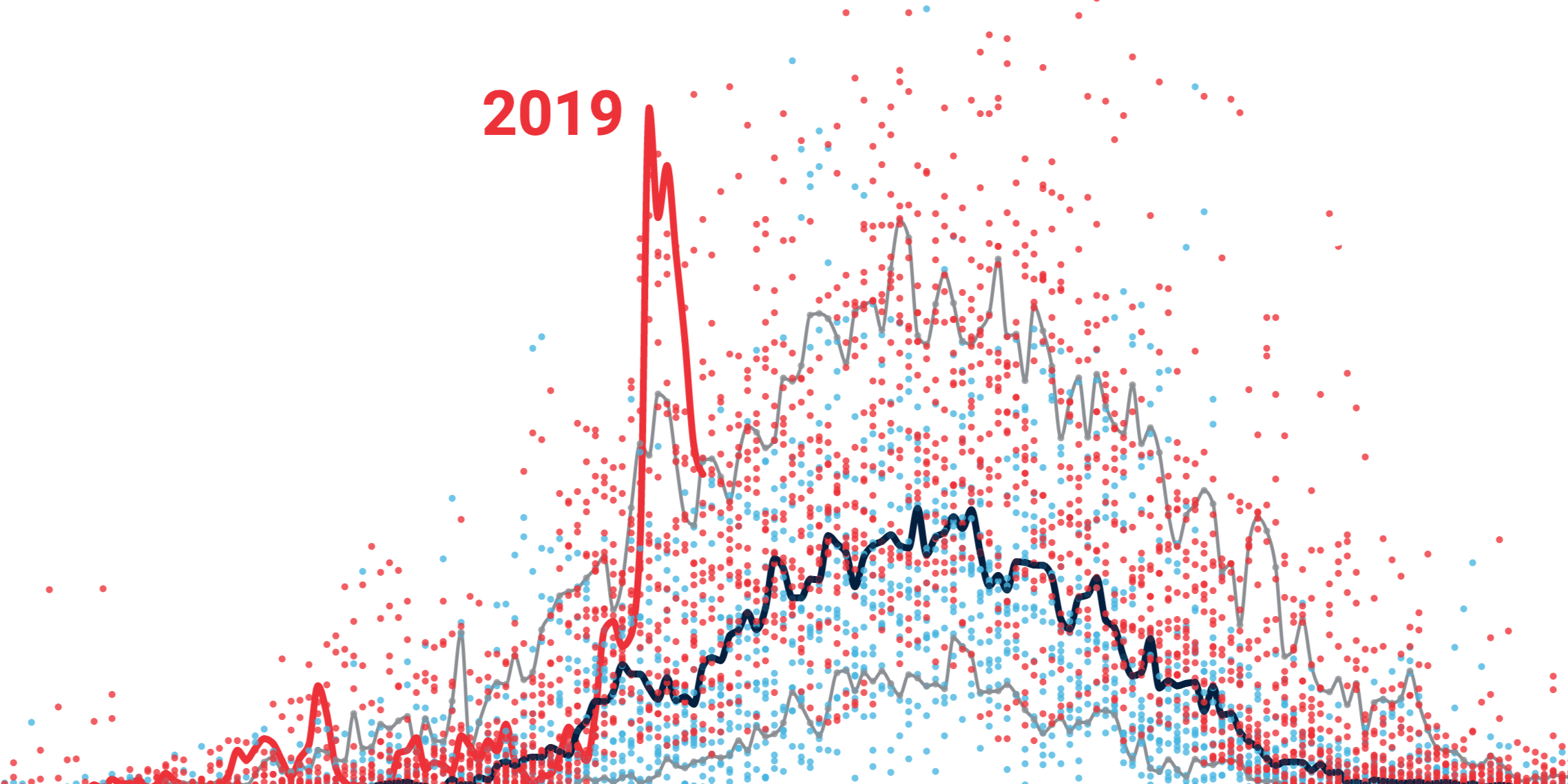
Greenland’s ice is melting, but without an OMG moment
I felt uncomfortable writing this article.
May 2019
on Datawrapper ↗
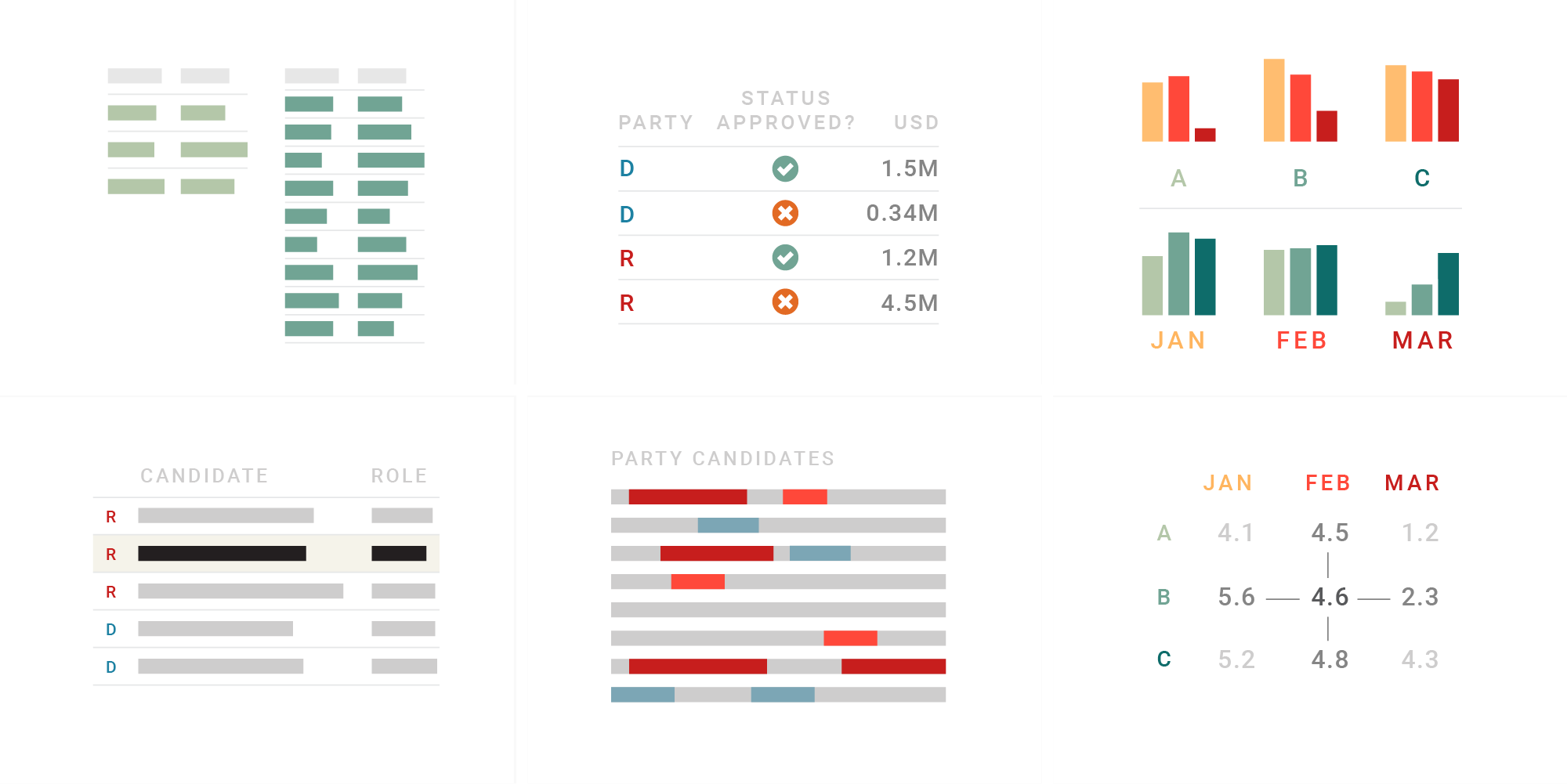
What to consider when creating tables
When to use a table instead of a chart and how to improve table designs.
✦
October 2018
One Chart, Nine Tools – Revisited
2.5 years ago I recreated the same chart with 24 different charting tools. It's time to revisit some of them.
September 2018
on Datawrapper ↗
Dollars for Booze
I explain why the word “nominal” should make your internal alarm system blink dark red, and how the consumer price index can help.
August 2018
on Datawrapper ↗
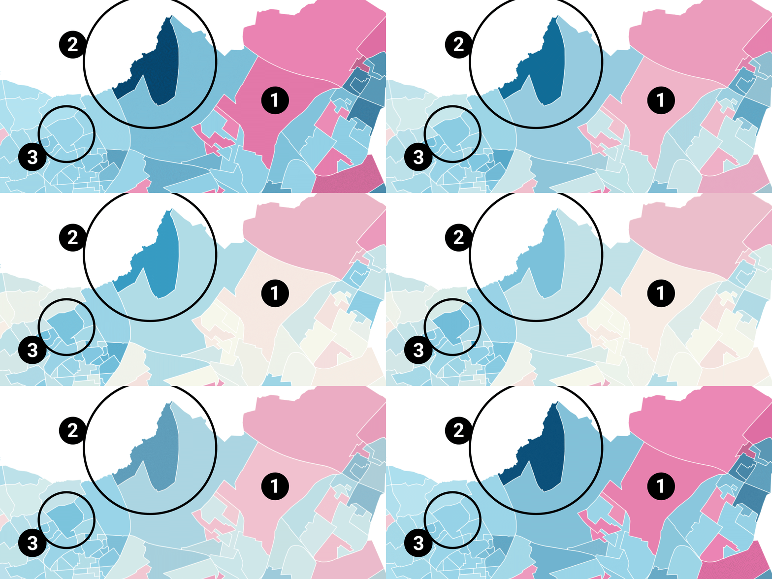
Election results in pink & blue
What to map: Vote shares? Differences? Ratio? A comparison.
August 2018
on Datawrapper ↗
Election reporting: Which color for which party?
Which party colors do we choose when reporting election results? I explain three approaches.
August 2018
on Datawrapper ↗
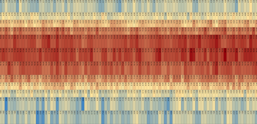
The challenges of visualizing climate change
Small temperature increases of a few degrees Celsius are not a huge deal for us in the short-term, but in the long-term. How can we show that?
July 2018
on Datawrapper ↗
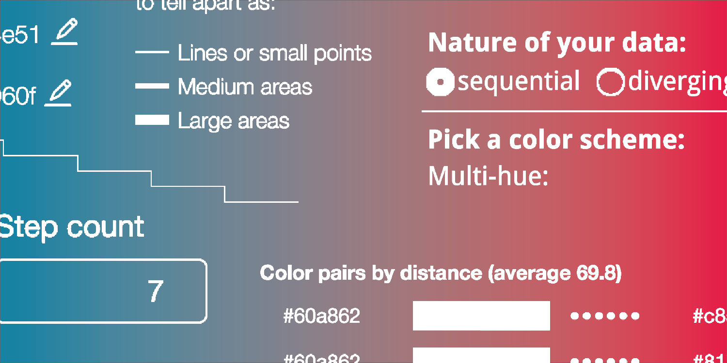
Your Friendly Guide to Colors in Data Visualization
A collection of tools that help you deal with color gradients and color palettes.
July 2018
on Datawrapper ↗
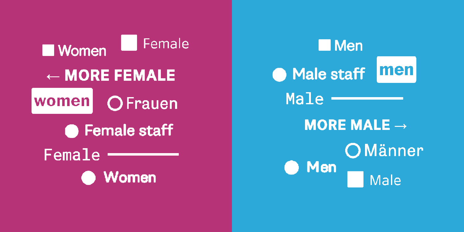
An alternative to pink & blue: Colors for gender data
A reality check which colors newsrooms use to present gender data. Spoiler: Pink & blue are not dead, but there's lots of hope.
✦
May 2018
on Datawrapper ↗
How to read a log scale
The same distance on a log scale shows the same growth rate. I explain what that means.
May 2018
on Datawrapper ↗
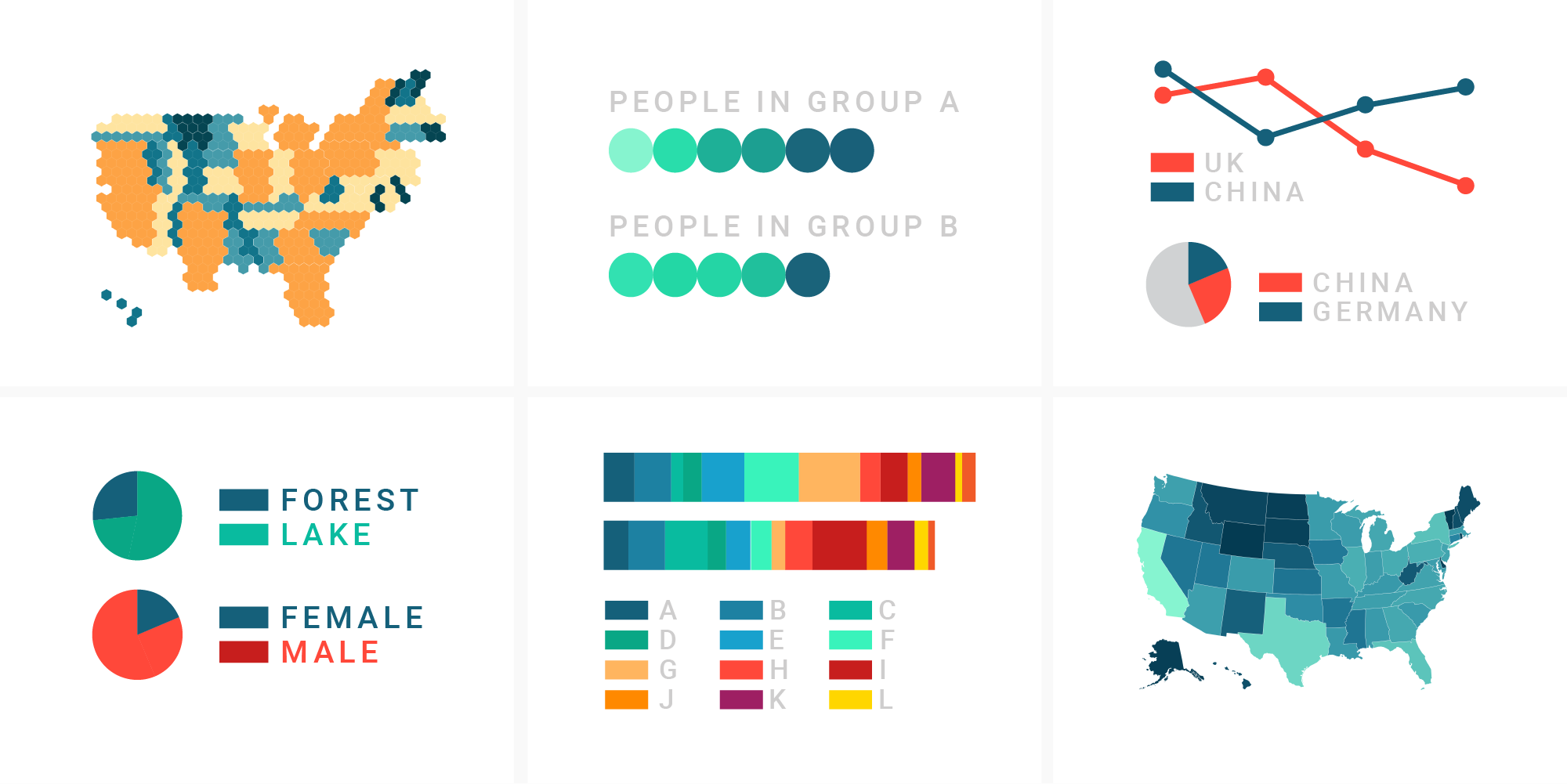
What to consider when choosing colors for data visualization
No matter what data vis looks like, it needs to have a color.
May 2018
on Datawrapper ↗
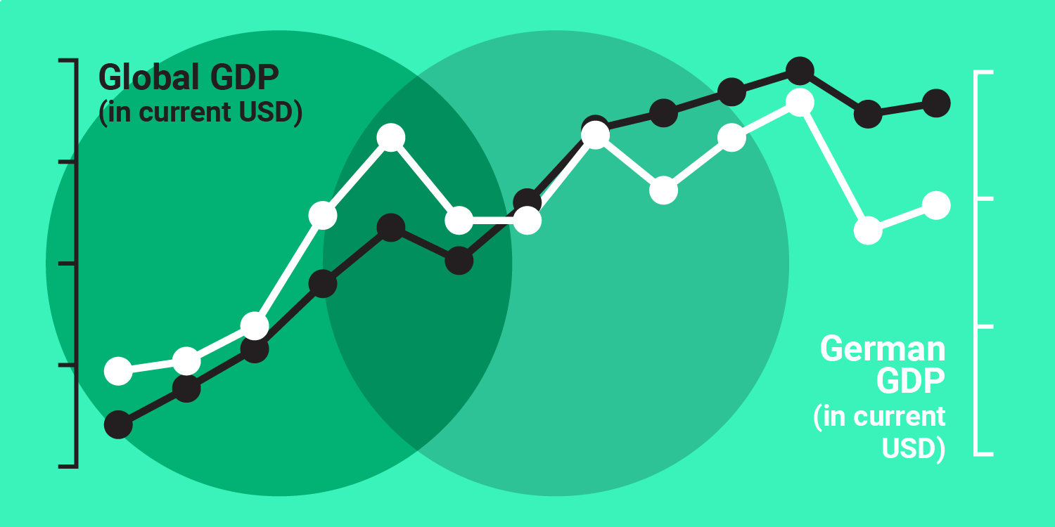
Why not to use two axes, and what to use instead
The case against dual axis charts
March 2018
on Datawrapper ↗
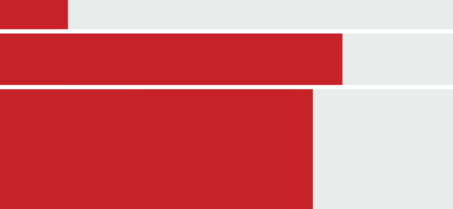
Absolute vs Relative: Who lives in the capitals?
I explain my favorite chart: The Marimekko chart. It looks simple & accessible, but contains a lot of information.
March 2018
on Datawrapper ↗
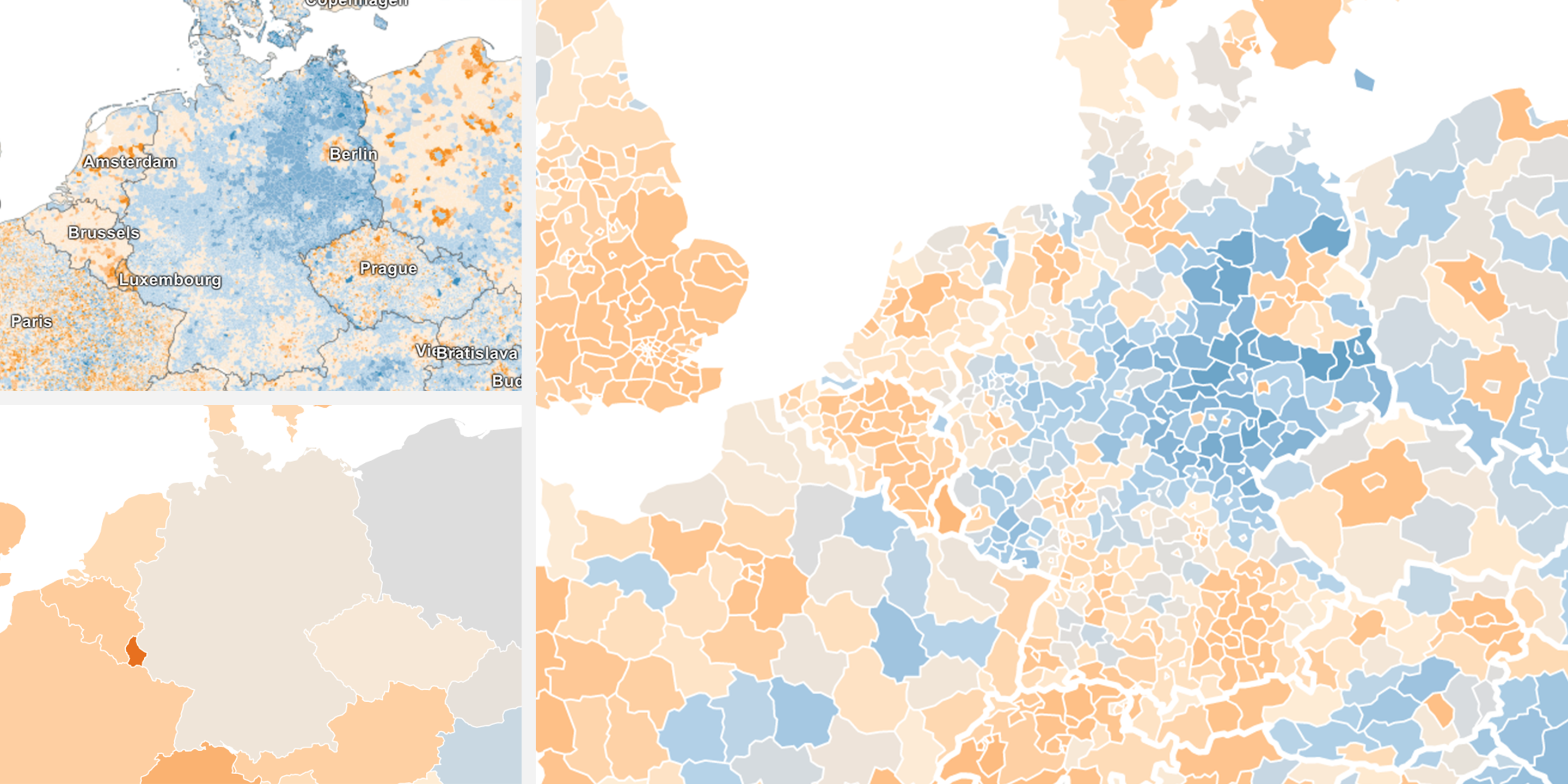
Different units, different patterns
The same data tells a different story depending on the level of detail you choose.
March 2018
on Datawrapper ↗
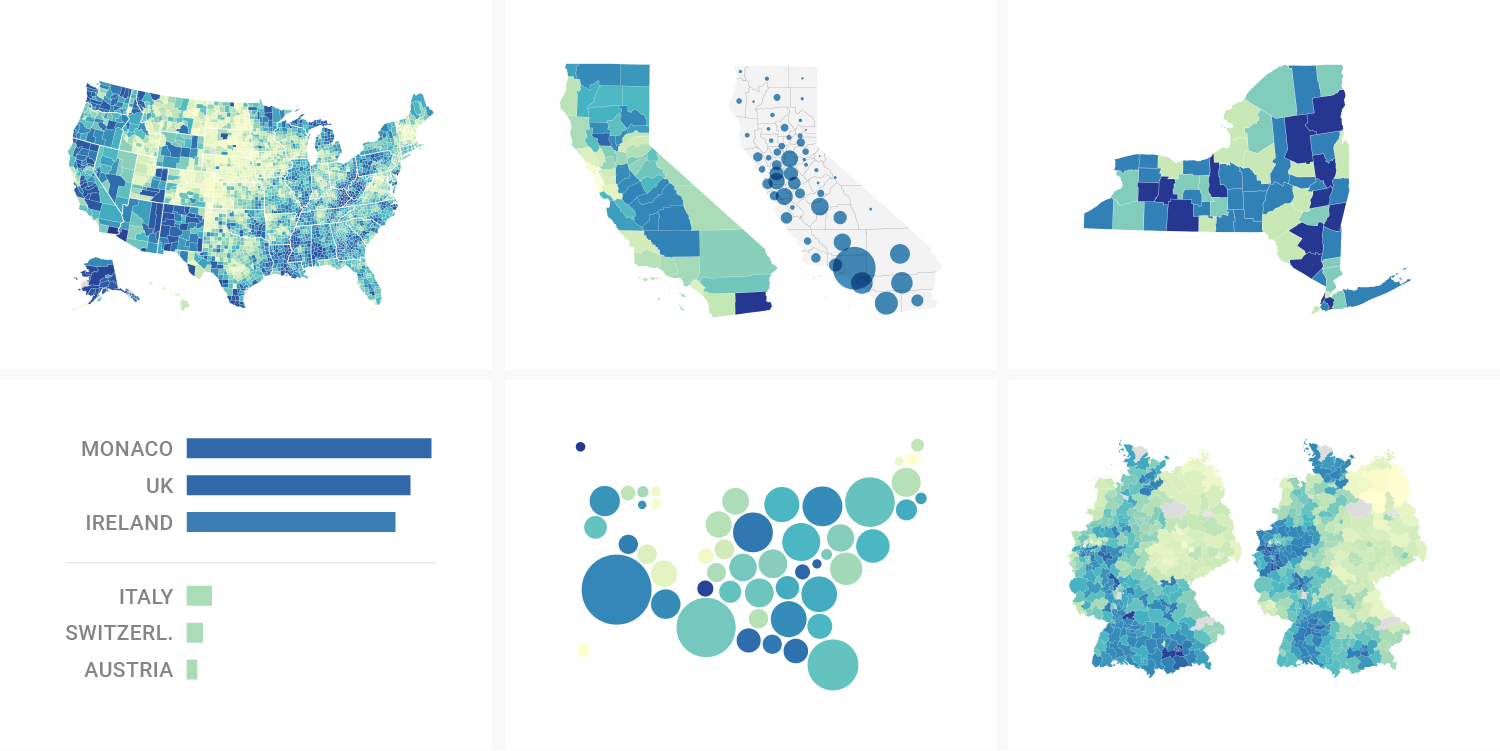
What to consider when creating choropleth maps
What to map, how to map and whether or not to use a map in the first place.
February 2018
on Datawrapper ↗
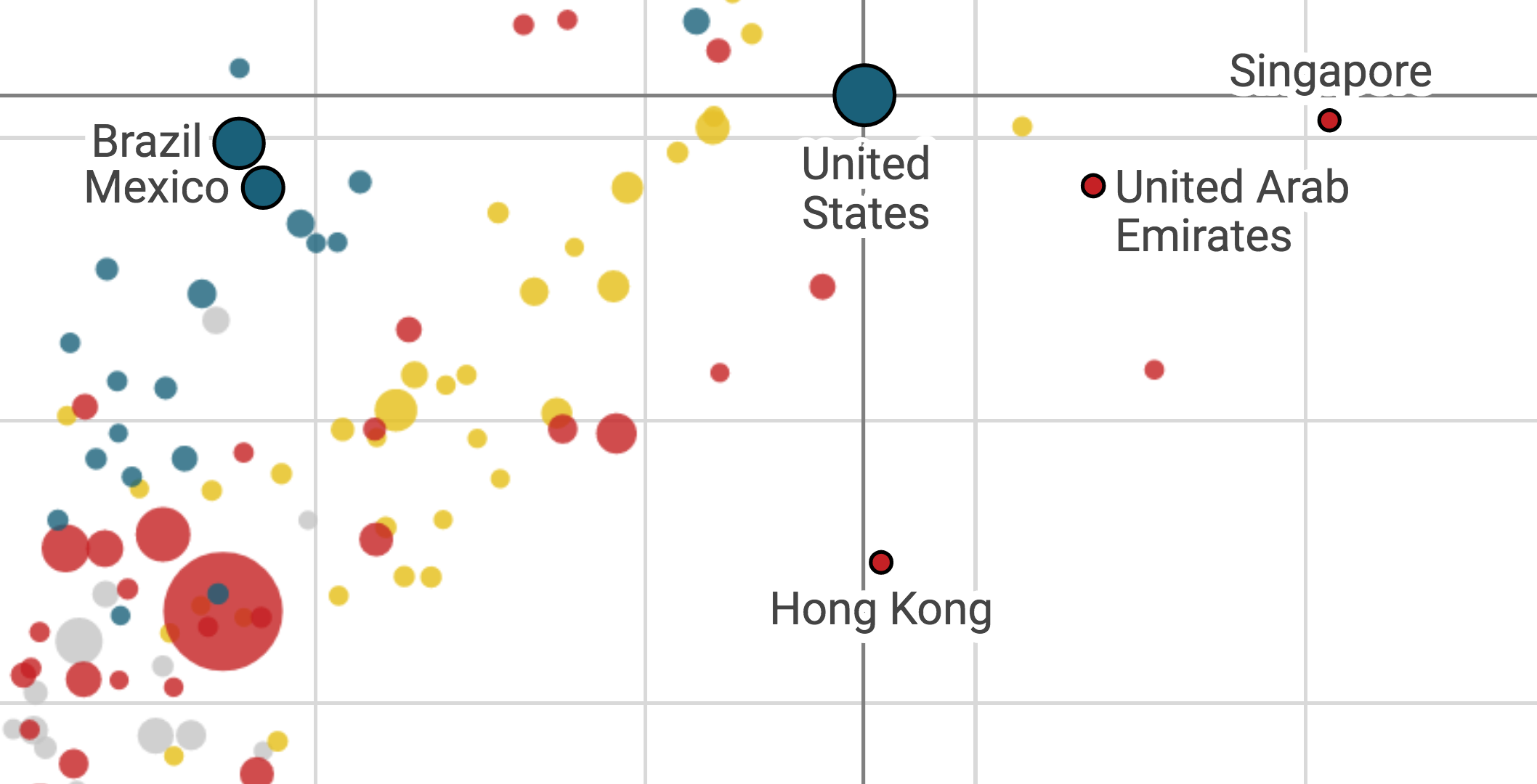
Five ways to read a scatterplot
Scatterplots: You can stare at them and always find something new. How to stare well.
January 2018
on Datawrapper ↗
What the difference between mean and median tells us about income inequality
The most thorough explanation of mean and median I'll ever write in my life.
✦
January 2018
"You want them" vs "They want you"
Which conferences to speak at – some thoughts.
January 2018
on Datawrapper ↗
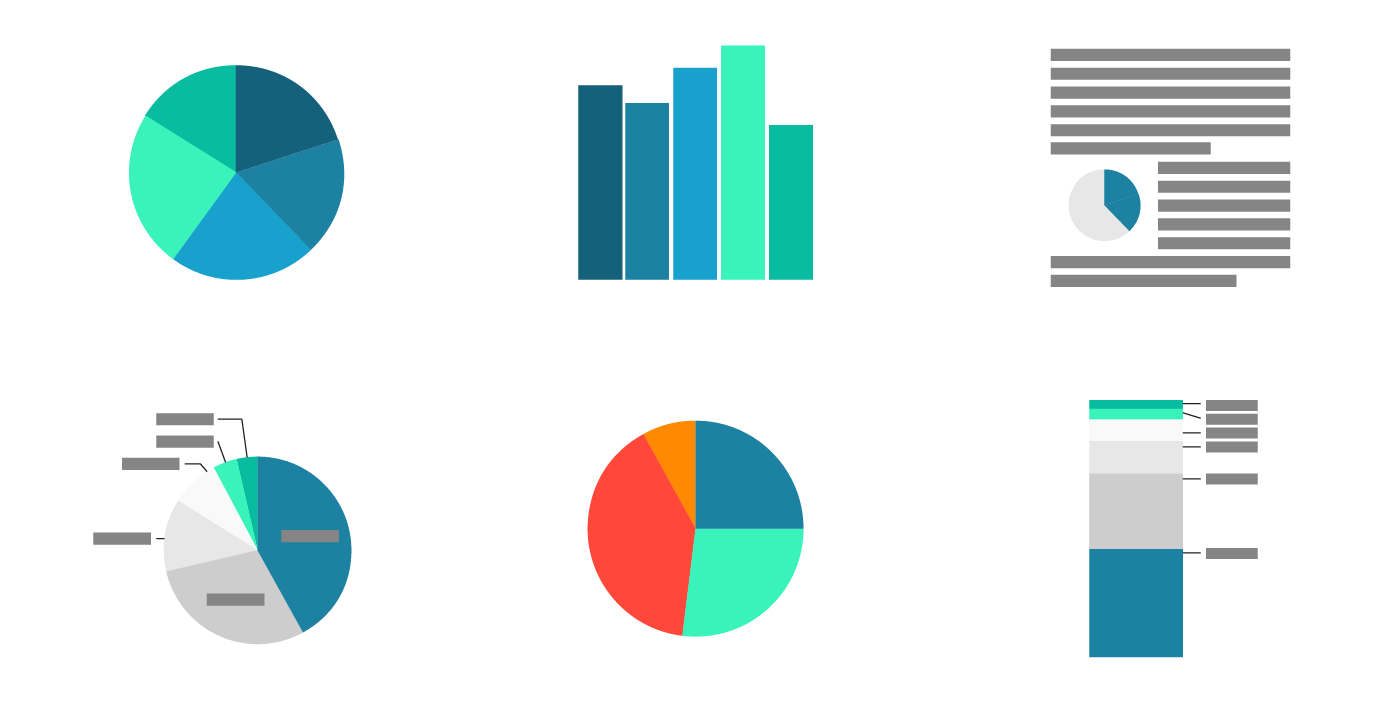
What to consider when creating pie charts
A closer look on pie charts to understand when and when not to use them.
November 2017
on Datawrapper ↗
Respect your readers’ time
If you want to make sure that readers don’t miss your points, don’t just show them. Tell them.
October 2017
on Datawrapper ↗
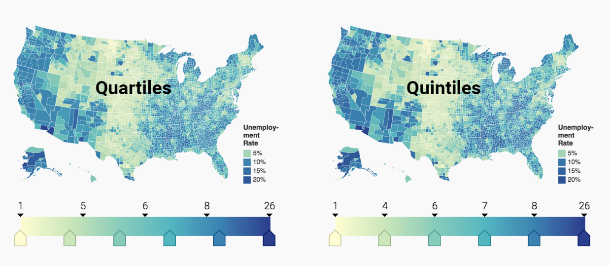
How to choose a color palette for choropleth maps
The colors we choose have a massive impact on our map: How it is perceived, how well our statement is communicated and how honest we present the data.
October 2017
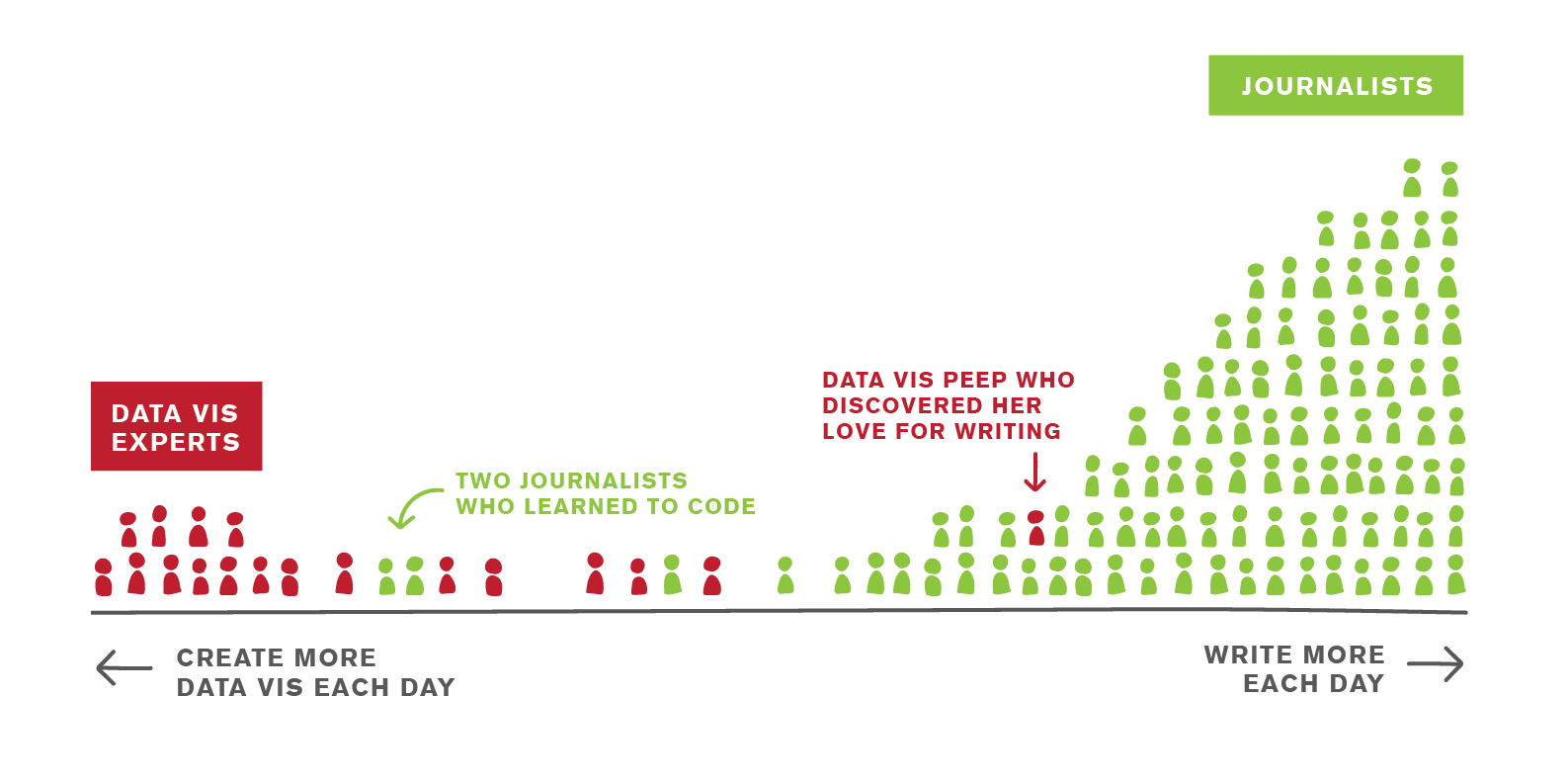
That Frustrating Thing About Creating Data Vis in Newsrooms
Why I decided to start working at Datawrapper
September 2017
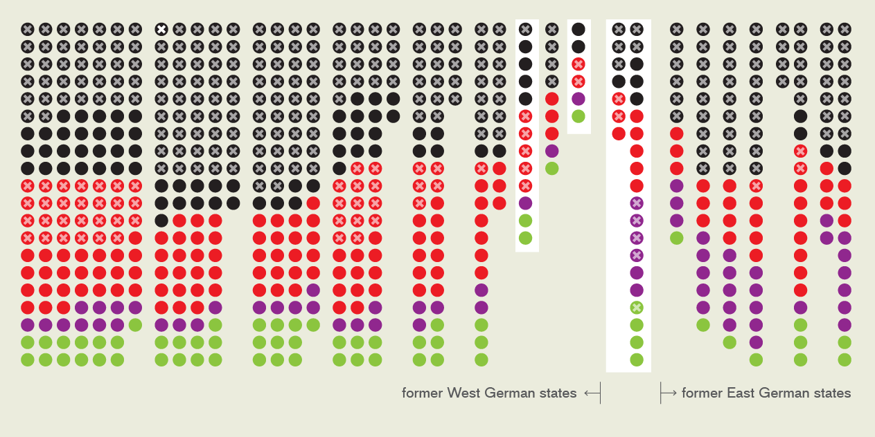
German Elections – The Data Vis Explanation
I was curious what we're actually voting for in Germany. So I wrote an explainer.
September 2017
on Google Sheets ↗
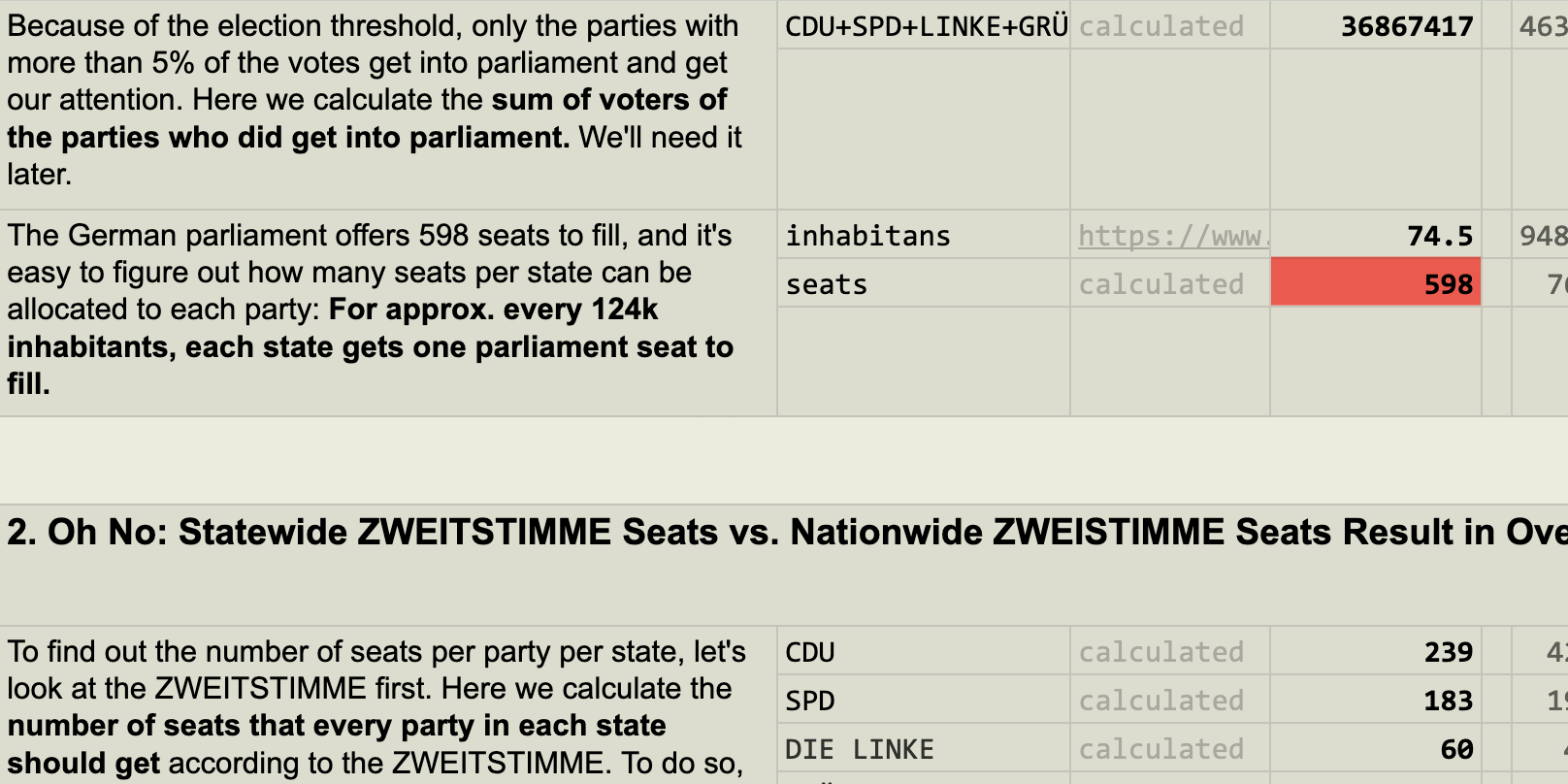
German Elections – A spreadsheet essay
How does Germany calculate parliament seats from absolute votes? In a quest to understand overhang mandates, I created an essay on Google Sheets.

August 2017
My Why and How of Blogging
An Q&A about my blog – why I blog, how I blog, and how I stay motivated.
✦
May 2017
at Republica
Why We Don't Believe In Facts, And How To Fix That
It's not about truth vs lie, it's about them vs us. Plus some data vis that made me think.
April 2017
Embracing Curiosity
Finding the sweet spot between discovery and explanation.
✦
March 2017
at INCH
Why do we visualize data?
Categorising the different reasons for visualizing data, and looking at examples & different industries on the way.

February 2017
Data Vis in Times of Trump
As a reaction to Trump, lots of us felt like we need to DO something. SOMETHING. This post tries to give structure to the desperation.

✦
December 2016
at CCC & OpenVisConf
A Data Point Walks Into a Bar
"If I look at the mass I will never act. If I look at the one, I will." A look at data (vis) vs anecdotes.
December 2016
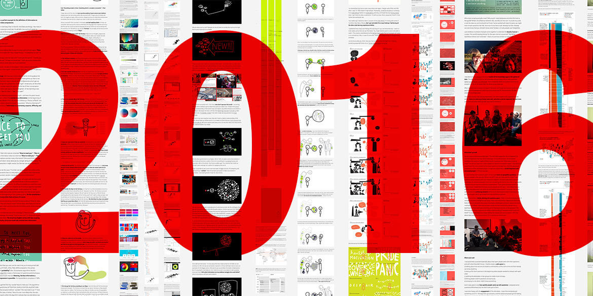
What I Wrote About In 2016
The questions I pondered in 2016, and my blog posts that resulted out of this pondering.
December 2016
for Source
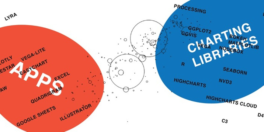
What I Learned Recreating One Chart Using 24 Tools
There are no perfect tools, just good tools for people with certain goals and backgrounds.
December 2016
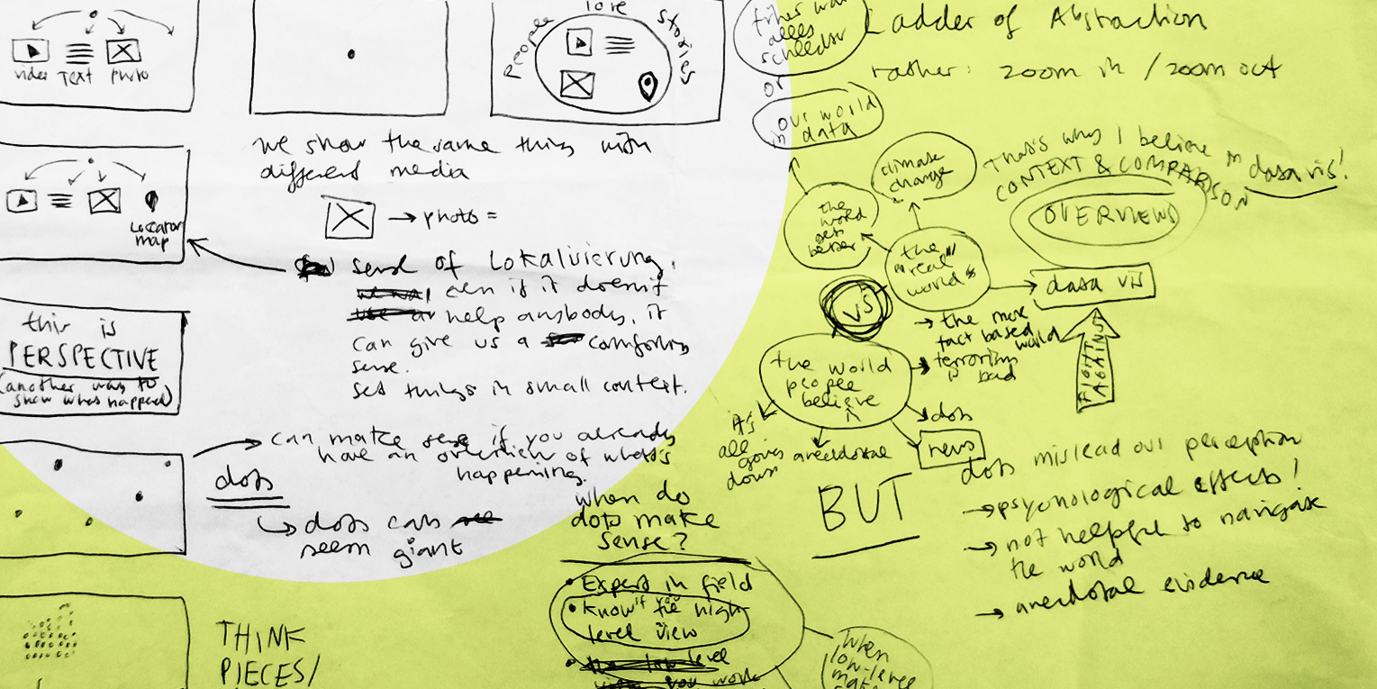
Drawing Thoughts – A Love Letter
Why pen & paper is favorite thinking (and data vis!) tool.
November 2016
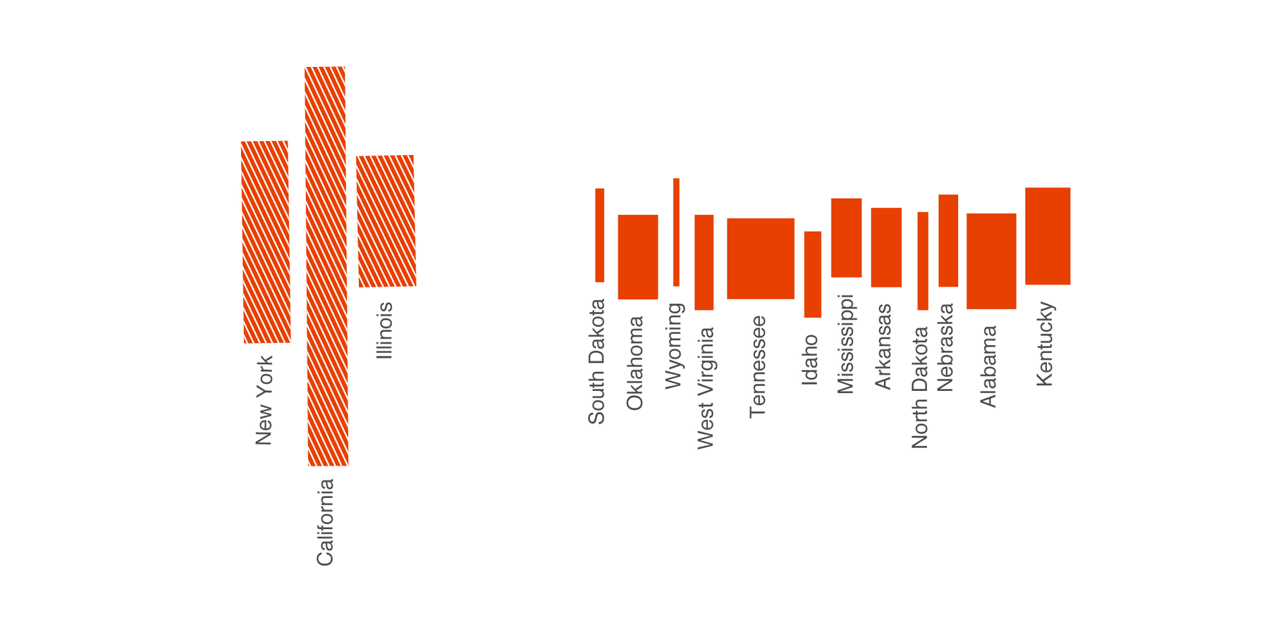
The US Election 2016 in Popular Votes
The US election results 2016 in popular votes. Featuring my favorite chart type, the Marimekko chart.
November 2016
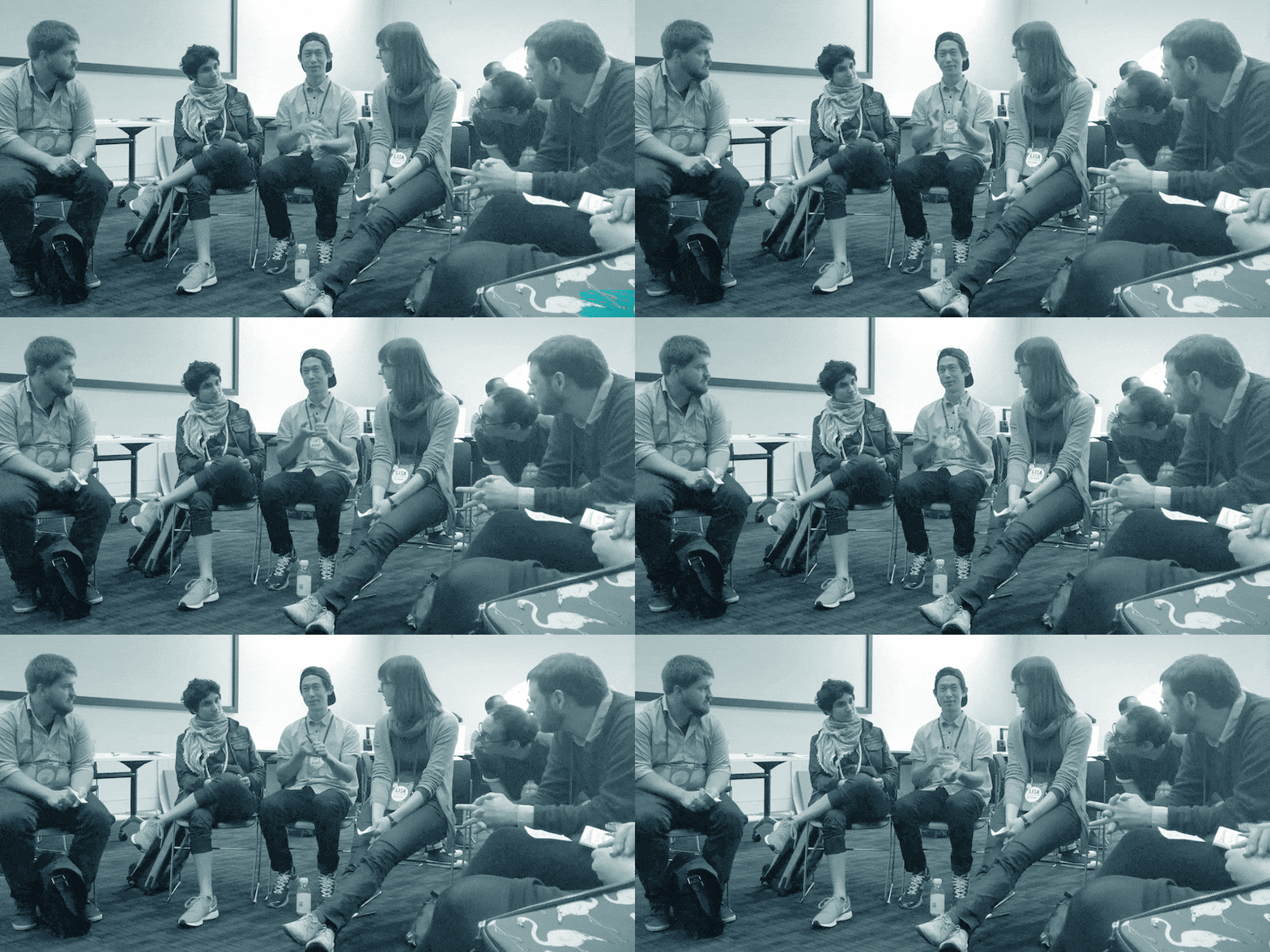
Let's Ask All Our Embarrassing Data Questions/Review
Self-taught as many of us are, we have gaps in our knowledge and skills that other people can fill.
✦
October 2016
at NACIS
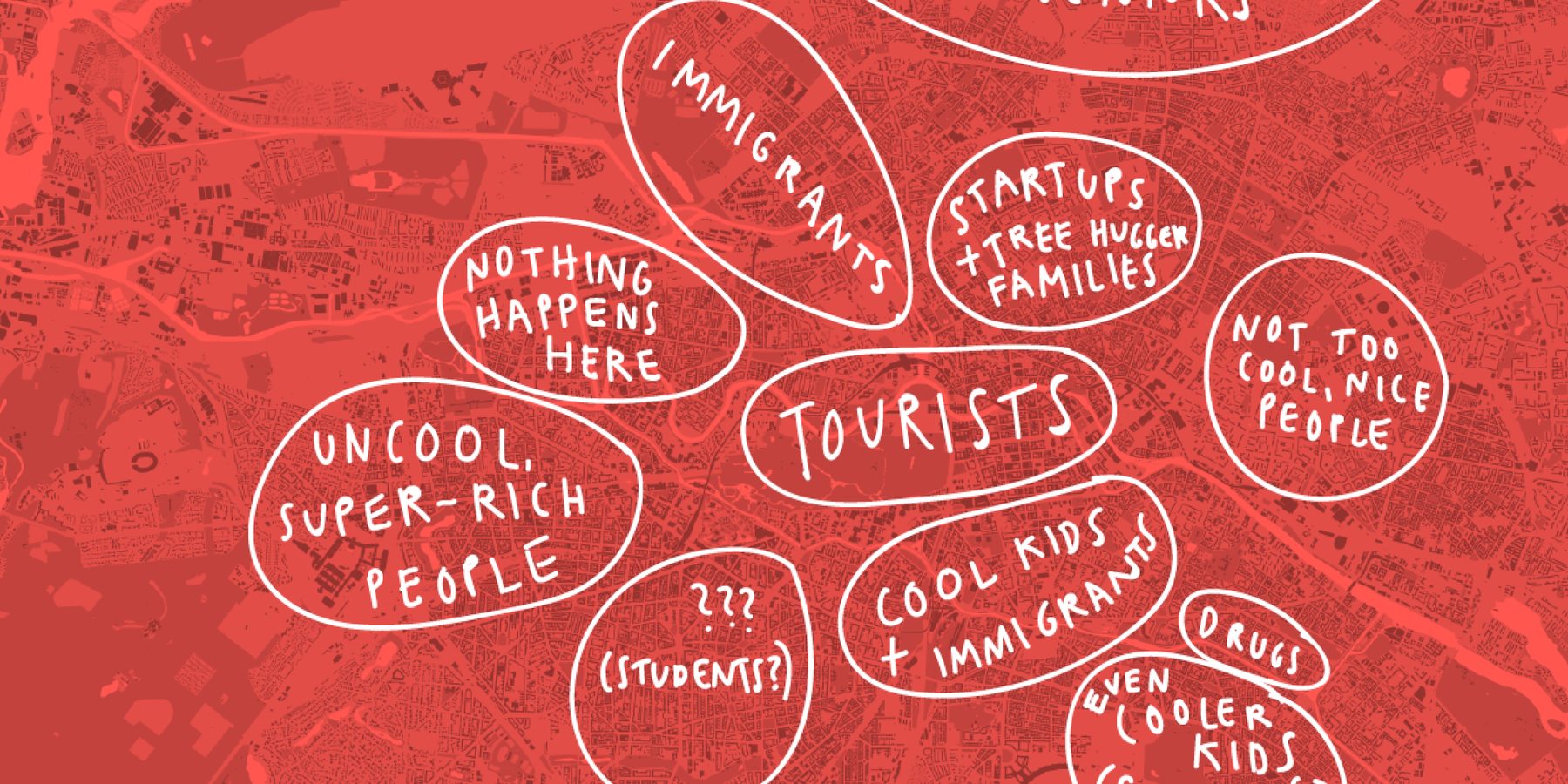
Map Poetry
Drawing our internal maps lets us explore how we and others see the world.
✦
October 2016
at the GeoNYC Meetup
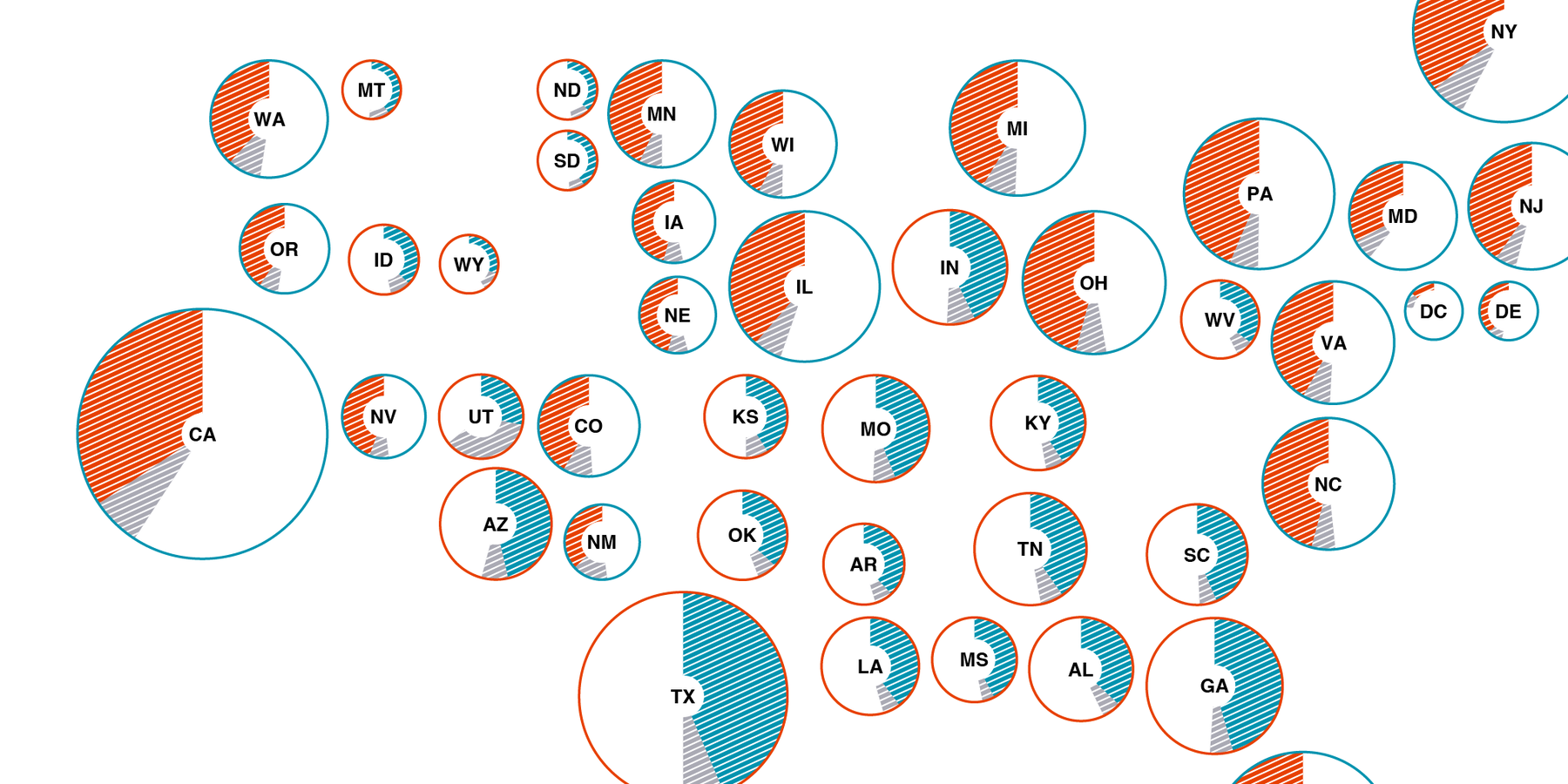
Making Election Maps Popular Again
Why we should map the popular votes, even in US elections.
✦
September 2016
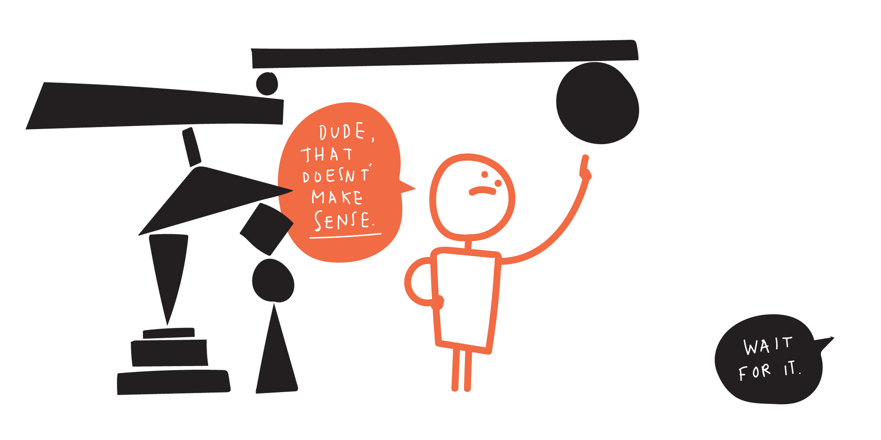
How I Feel When I Learn To Code
Aaaall the feels: Pride, Panic, Despair, Overwhelm, Annoyance.
August 2016
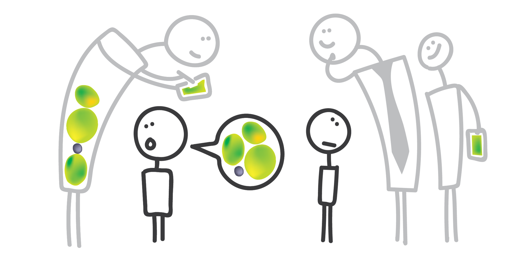
How I Feel When I Have A Conversation
We should all be privacy nerds. But it still isn't as convenient as just being slightly scared.
✦
June 2016
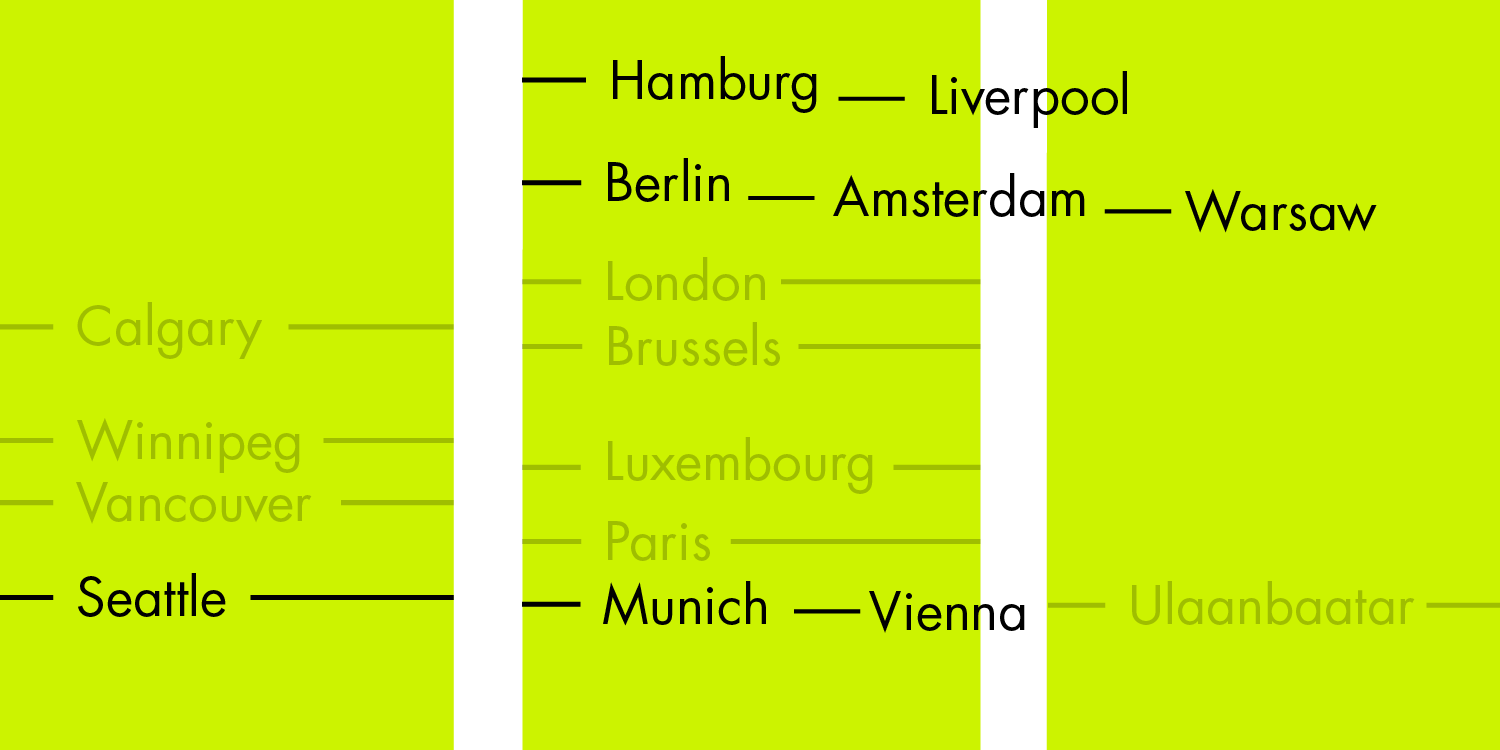
Which Cities Are On Similar Latitudes?
A simple visualization that removes data to let us see more.

✦
June 2016
at Information+
Less News, More Context
"With which information can my audience navigate this world better?" Looking at goals of journalism, and how data vis fits in.
May 2016
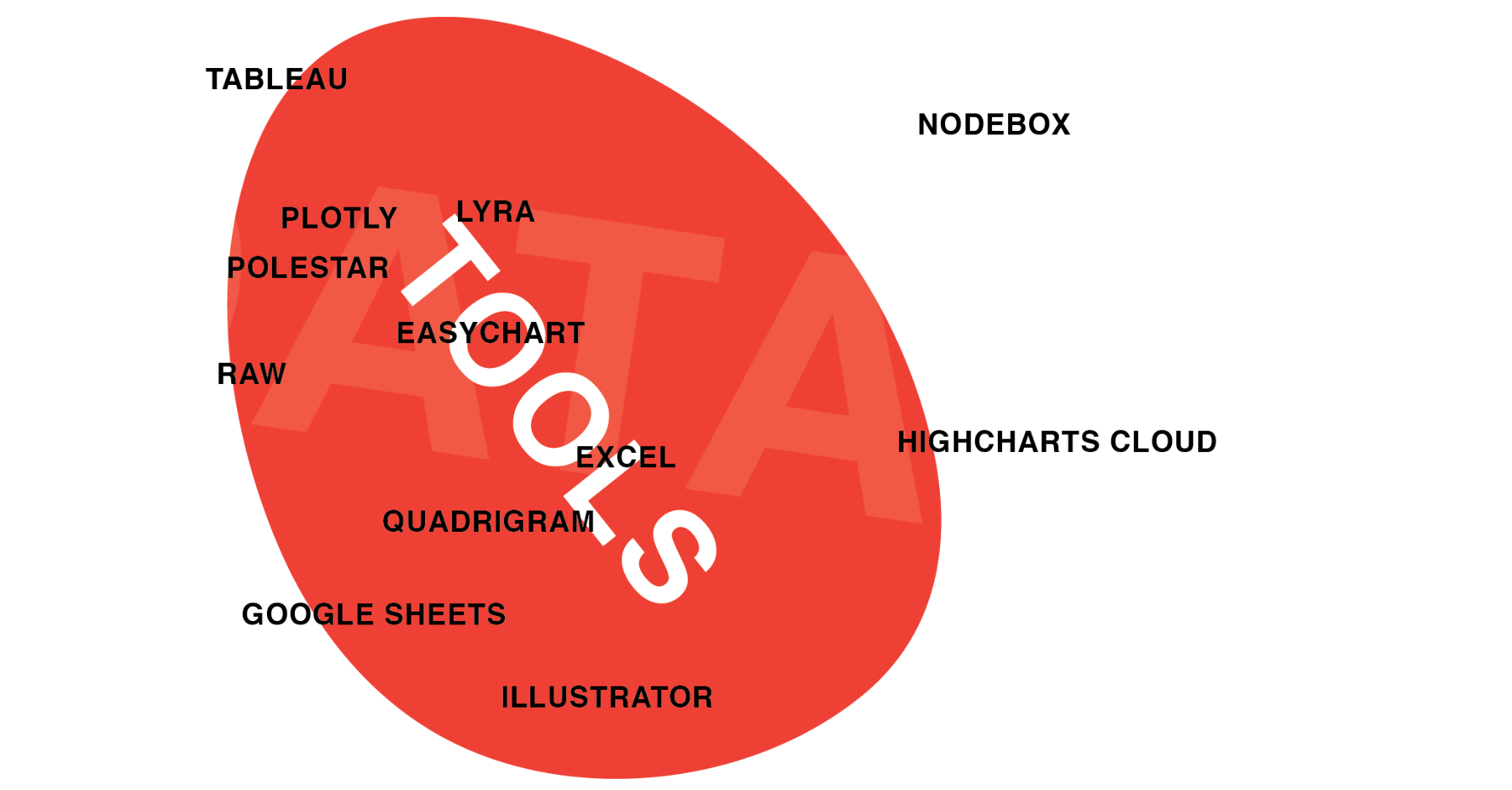
One Chart, Twelve Tools
I recreated the same chart with twelve drag&drop charting apps, like Excel, Tableau, Plotly, RAW and Adobe Illustrator.
May 2016
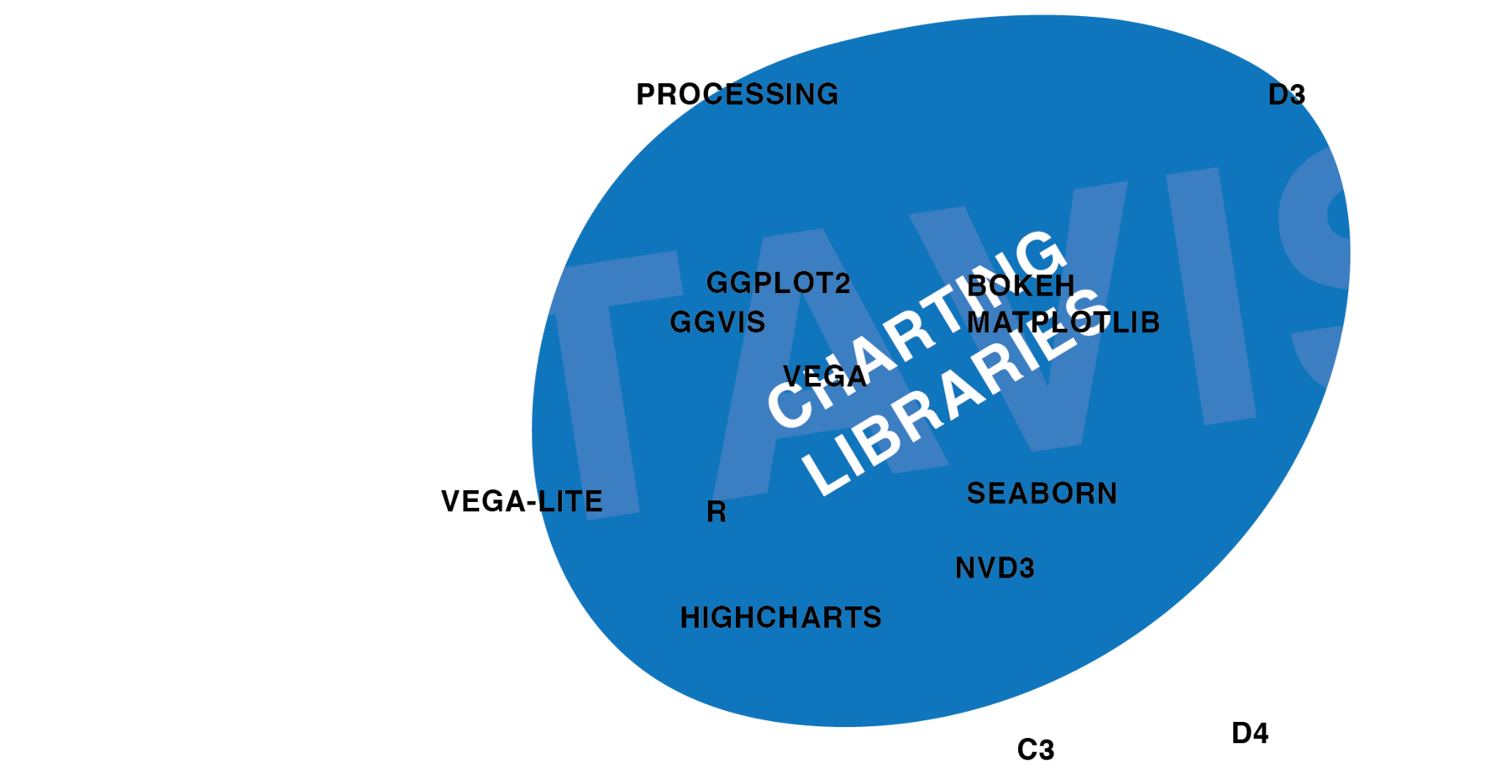
One Chart, Twelve Charting Libraries
I recreated the same chart with twelve frameworks & libraries, like d3.js, Vega, ggplot 2, matplotlip and Processing.
April 2016
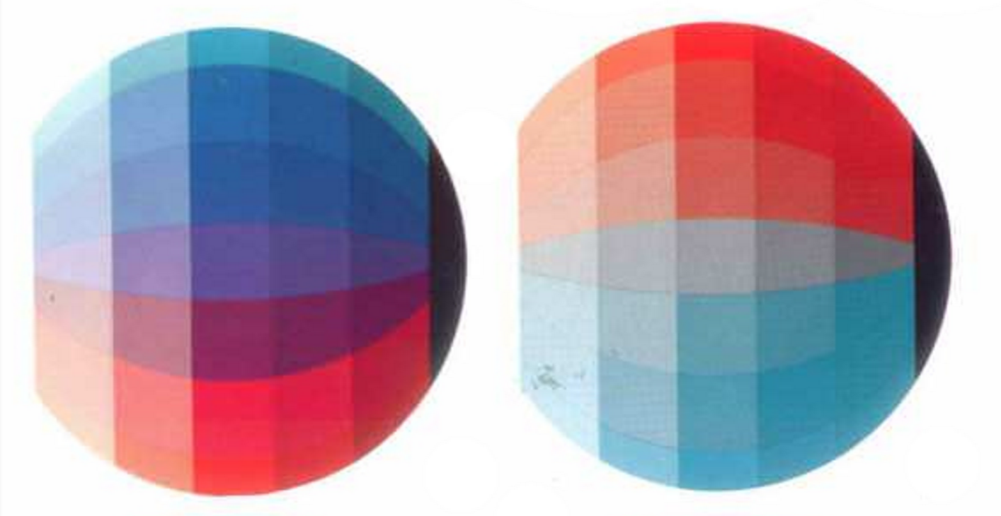
Your Friendly Guide to Colors in Data visualization
The original version of my guide to color tools. I published an updated version in 2019.
✦
April 2016
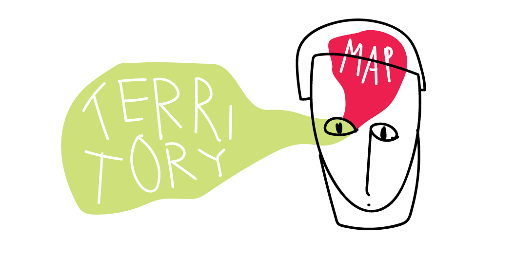
Map vs. Territory
"Everything simple is false. Everything which is complex is unusable." – Paul Valéry
March 2016
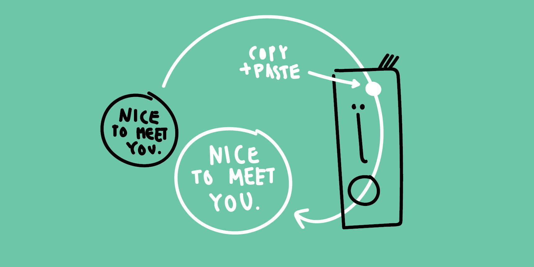
Nice to Meet You, Information Theory
American small talk is a perfect example for the definition of Information in Information Theory & for data compression.

March 2016
How I Organize my Files
"In the beginning, there was organisation. Then, files flooded in."
✦
December 2015
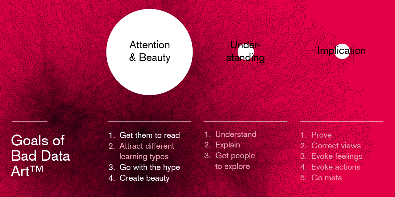
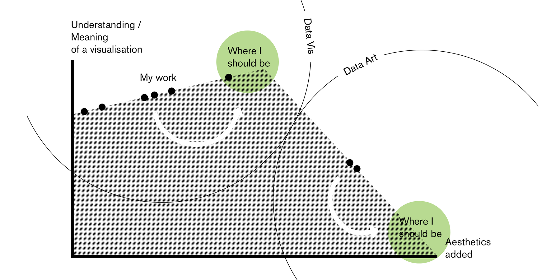
Meaning + Beauty in Data Vis and Data Art
In Data Vis, we should see aesthetics as a tool to increase understanding. In Data Art, we can see aesthetics as the purpose.
December 2015
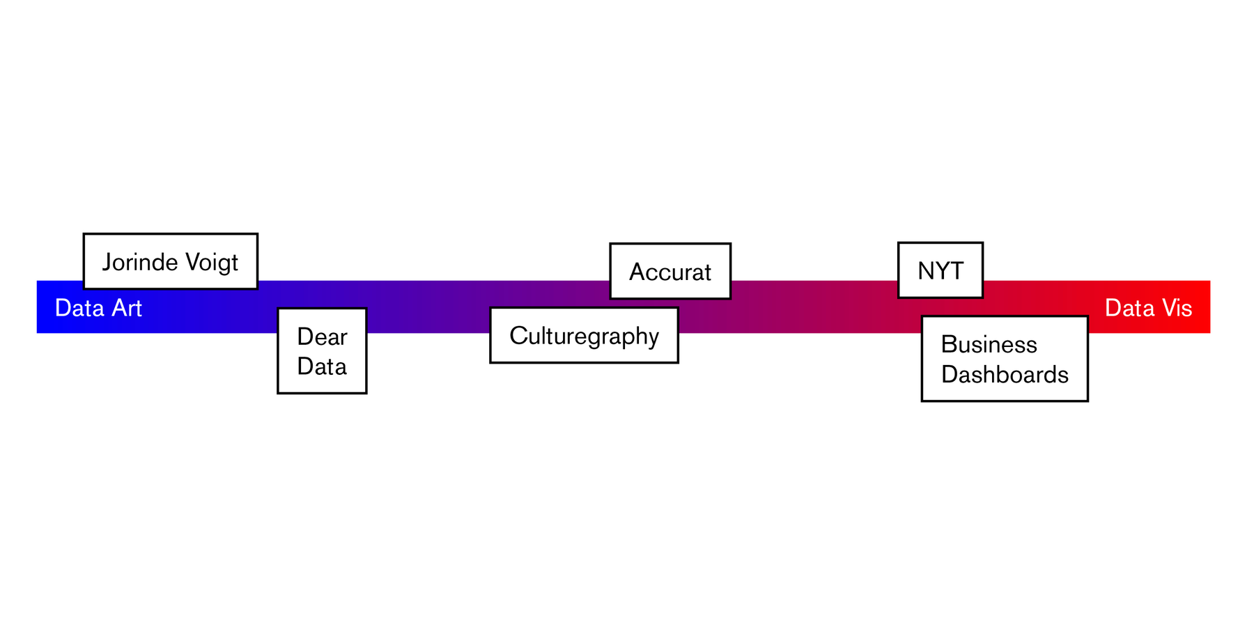
The Line between Data Vis and Data Art
"I believe that the field of data vis would benefit from a clear line between art and design." Maybe my most discussed opinion piece.
December 2015
Tracking Yourself for Insights
"Self-tracking these days often results in irrelevant visualizations which give a fake comfort of meaning, but don’t help neither the tracked person nor the viewer."
November 2015
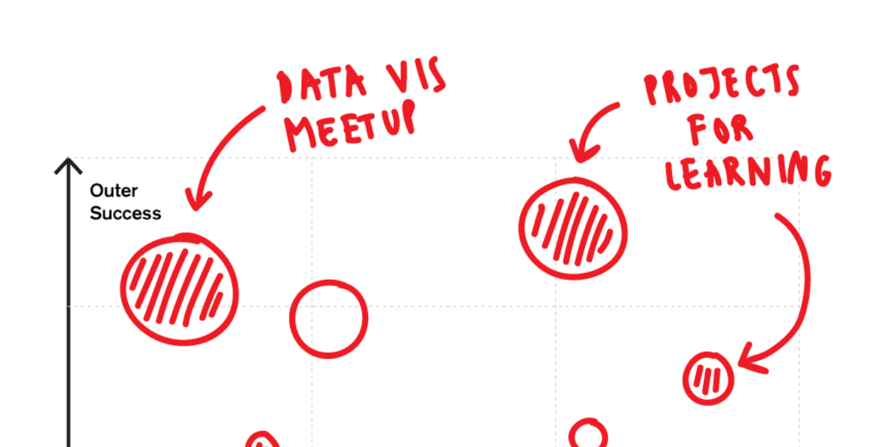
How to decide what to work on?
'I find work extremely exhausting when I'm not enthusiastic about it. So I appreciate the opposite even more.'
September 2015
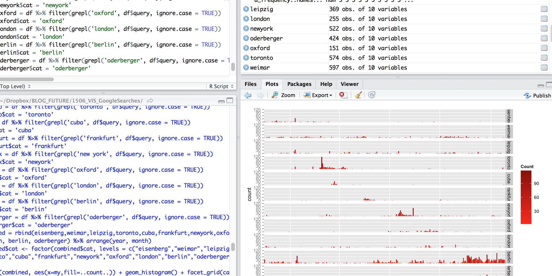
My Google Search History – Histograms in R
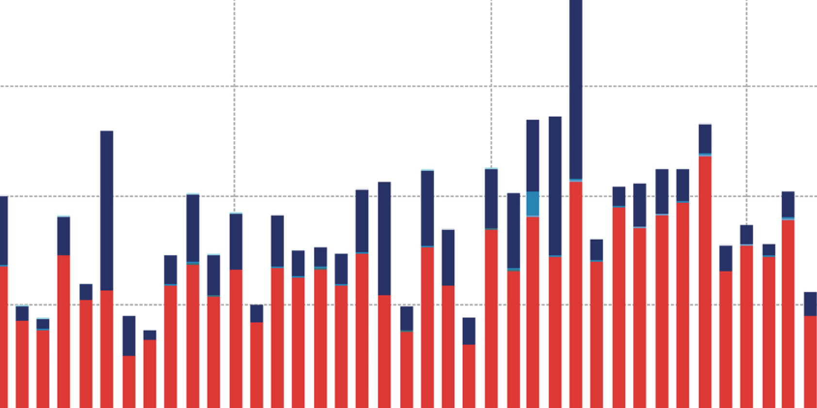
How to create histograms in R and in ggplot2 with facet_grid
September 2015
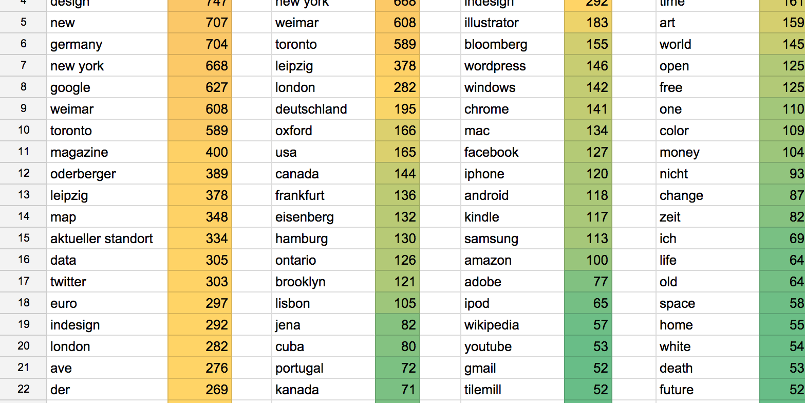
My Google Search History – Text Analysis in R
June 2015
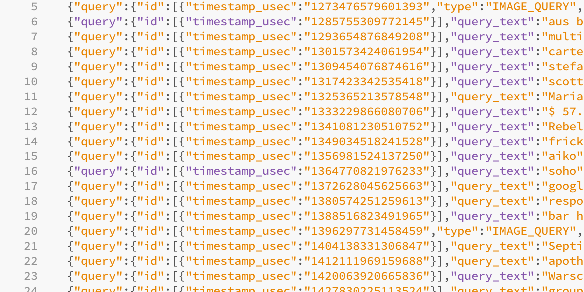
My Google Search History – Tutorial
An (sadly outdated) tutorial how to download, analyse & visualize your Google Search history.
✦
June 2015
My Google Search History – visualized
I visualized the 40,000 search queries I asked Google between June 2010 and April 2015.
June 2015
at State of the Map US
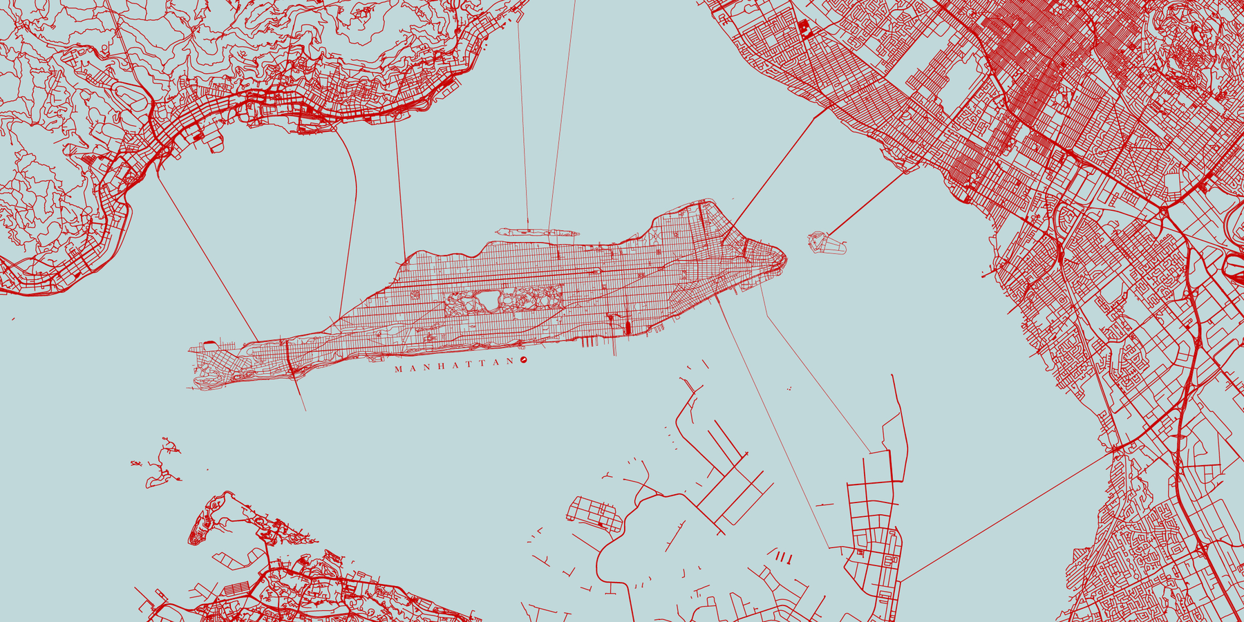
New York in Fiction, New York for Real
If we change our maps, we change how we think about the world.
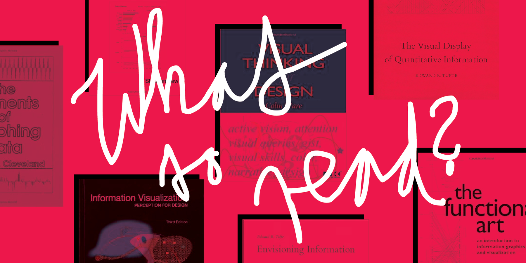
March 2015
What to read next?
"I guess every person in the data vis field thinks about that from time to time: 'I need to understand better what data vis is all about.'"
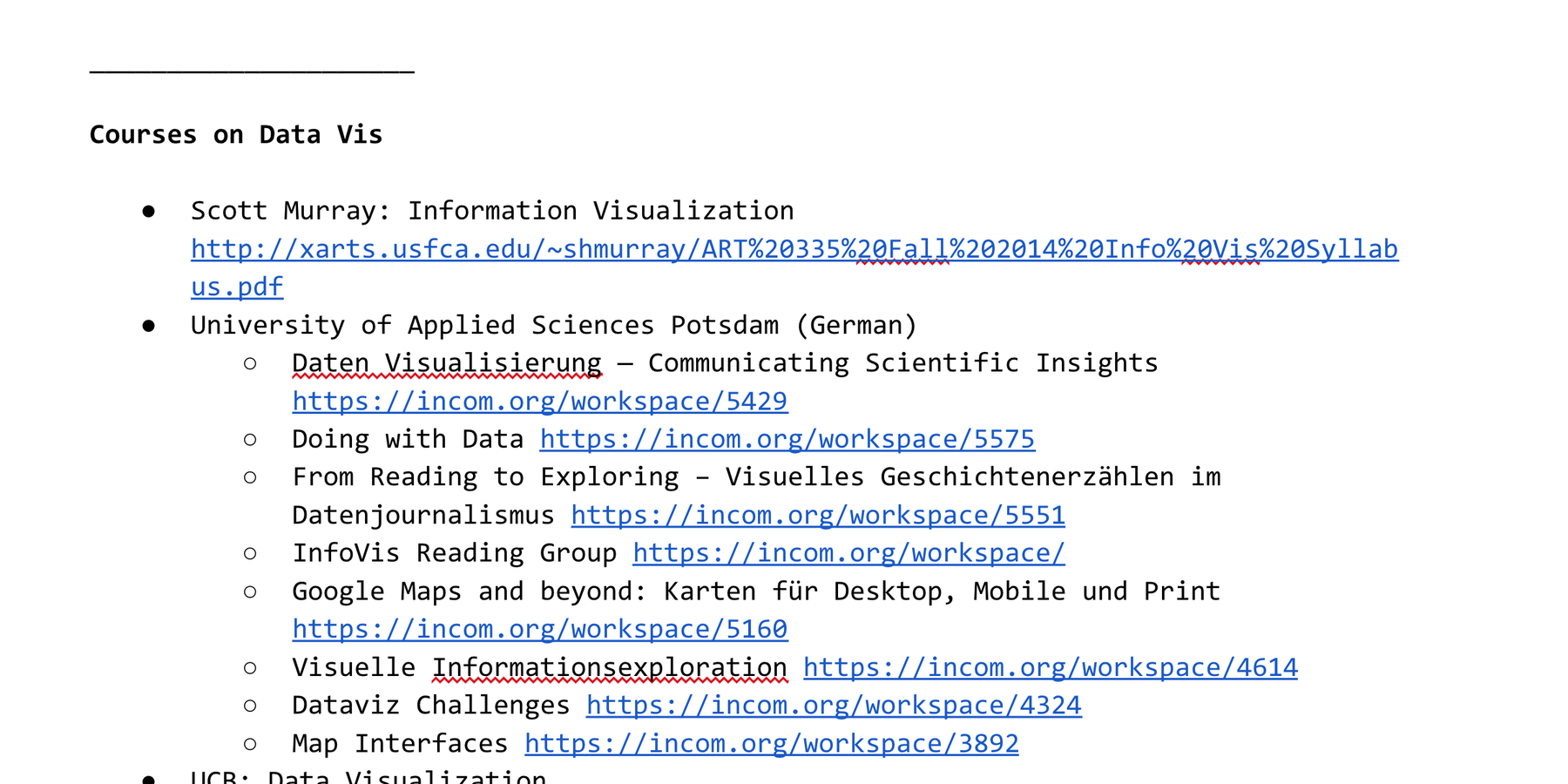
March 2015
Collecting Teaching Ideas
"Lately I have been wandering around the parts of the data vis field that yields brave men and women who dare to teach."

February 2015
Teaching Lessons Learned (about Data Vis)
"I am happy to announce that I will give my first data vis talk ever (well, you have to start somewhere)."
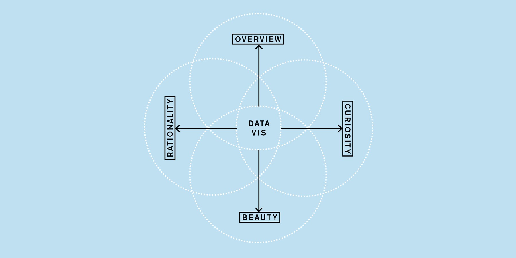
January 2015
Personality Traits for a Data Vis Career
How values like curiosity and a need for overview motivate us to go to meetups to create data vis.
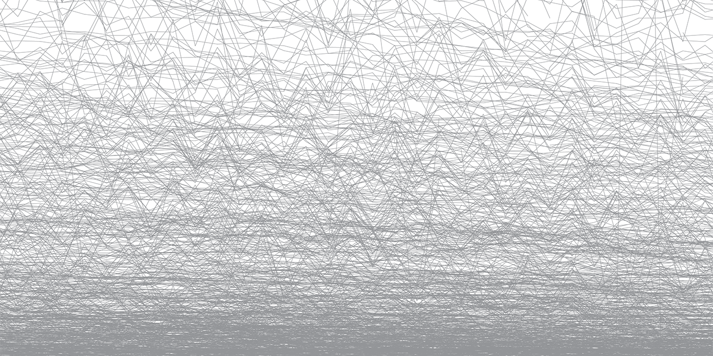
January 2015
Plotting Dying Newspapers and Magazines
"The chart has almost the same immediate power of a statement like the other two graphs, but offers more possibilities to explore."
December 2014
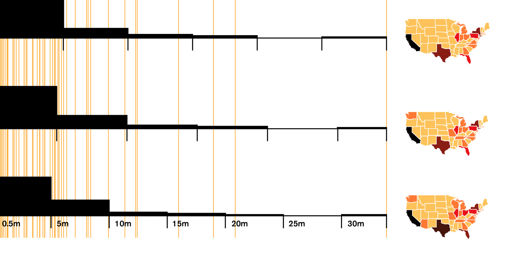
Styling Choropleth Maps
"The big challenge is to put our population numbers in the color intervals that make the most sense."
November 2014
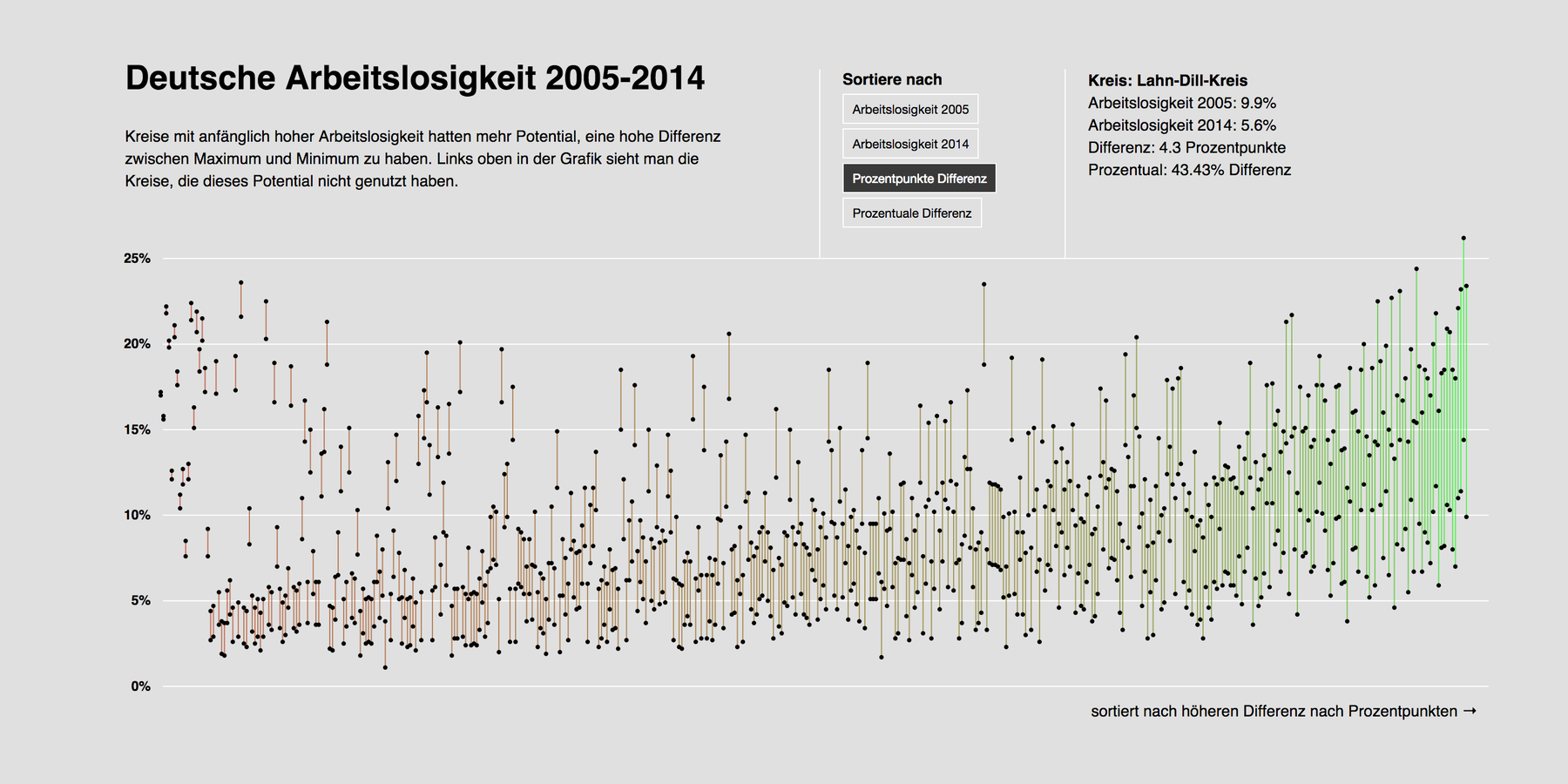
Unemployment Rates in Germany – The d3 Version
"That was the most complex coding experience I have ever had where I still understood what I am doing."

November 2014
From Tumblr to Jekyll & GitHub
"I like the simplicity. I like that I have the overview over what I can change (including the simple CSS)."
November 2014
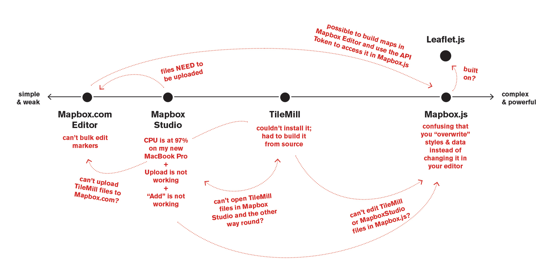
Trying to make sense of the Mapbox ecosystem
"Mapbox and I seem to have a typical love-hate-relationship."
October 2014
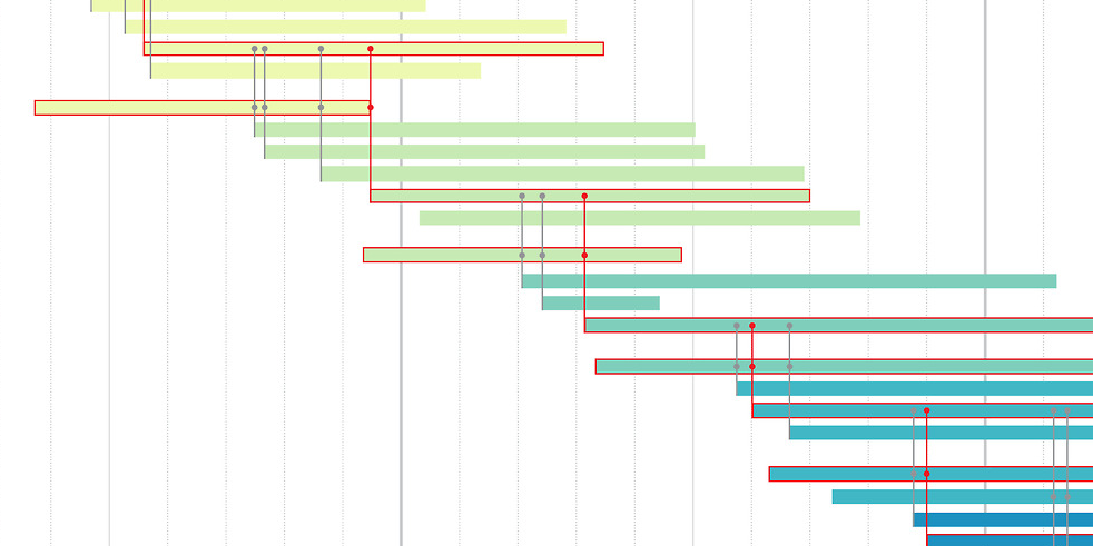
A new visualization for family trees
"In my family tree, the birth year is a certain point at at timeline."
October 2014
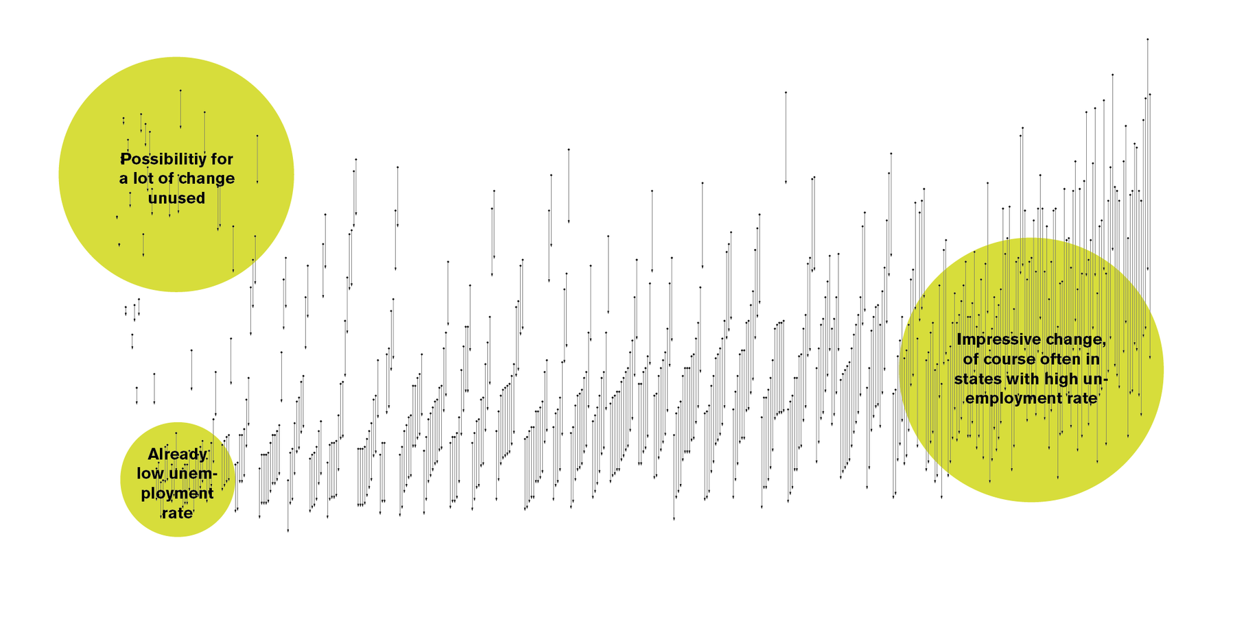
Unemployment Timelines in Germany
My first (and last) d3.js project, showing how the unemployment rate in all German counties between 2006 and 2014.
September 2014
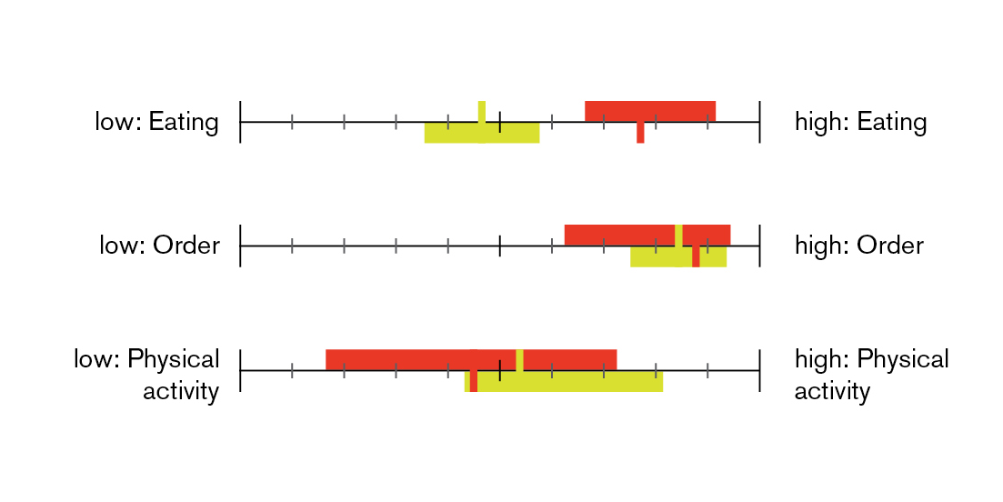
Mapping individual values
"Everybody values different desires high and low. But what you should want, is to find people who value similar things than you."
September 2014
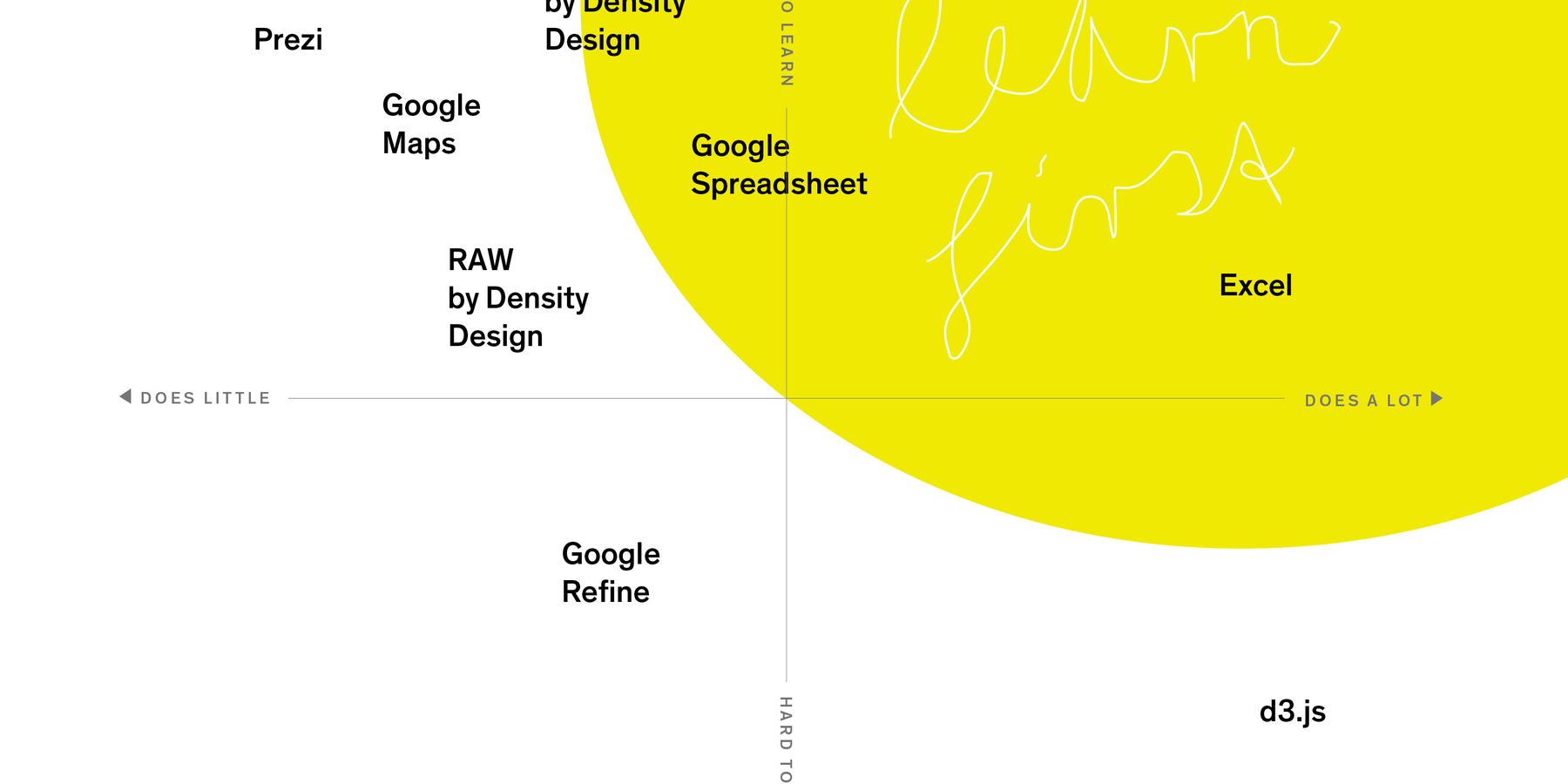
What to learn first when entering Data Vis
"The idea is simple: Some software is hard to learn, some is easy to learn."
September 2014
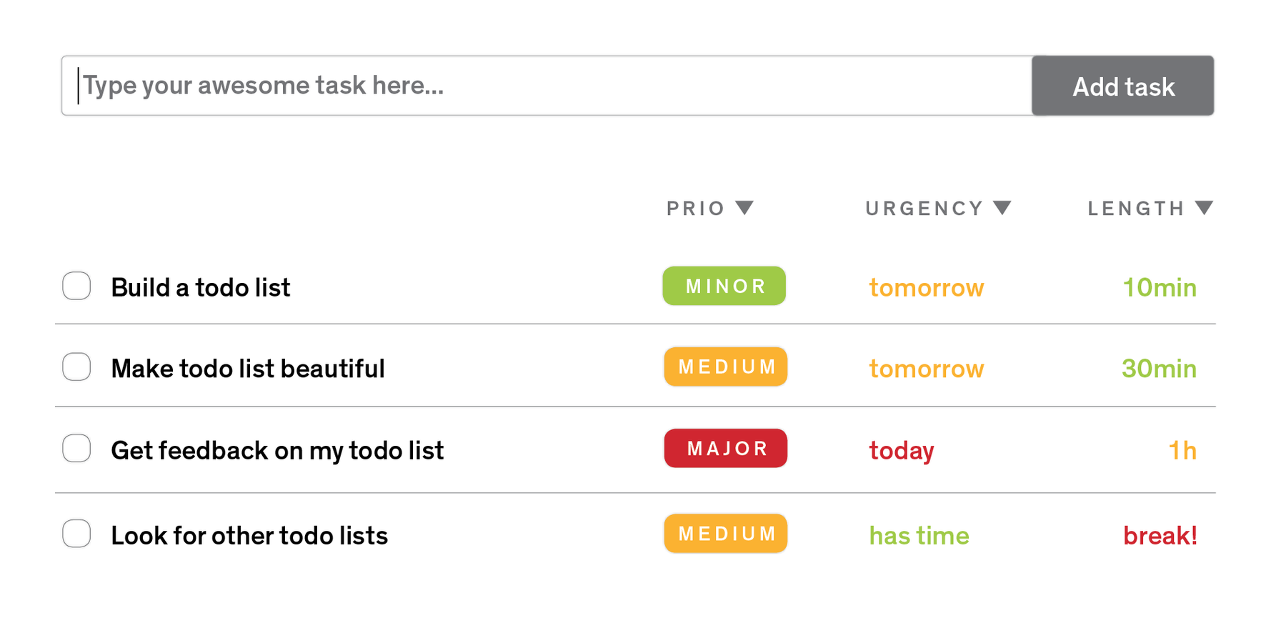
Thoughts about the perfect todo list
"There are two things I appreciate in life (ok, there are more, but these two are big ones): lists and tables."
July 2014
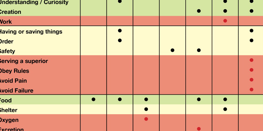
Values and Needs in Comparison
"In the last few days I found some joy reading papers about decision theory and motivational theory; about choices, needs and desires."
June 2014
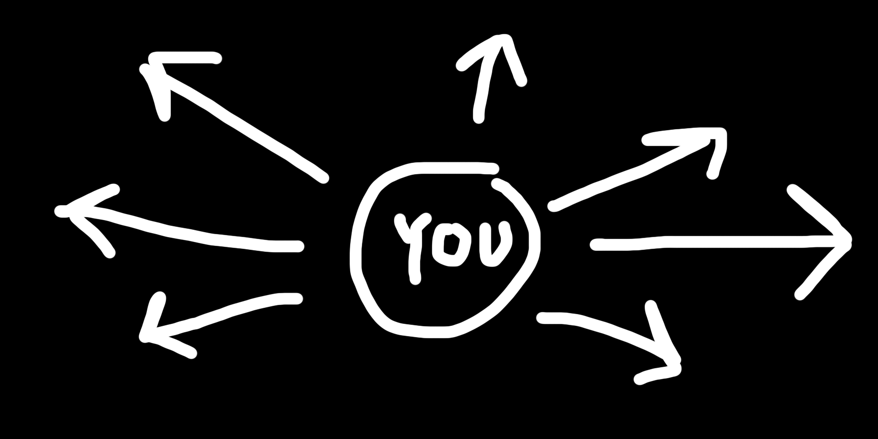
How to bring your work out there
"There is a »taste niche« for everything and everybody."
June 2014
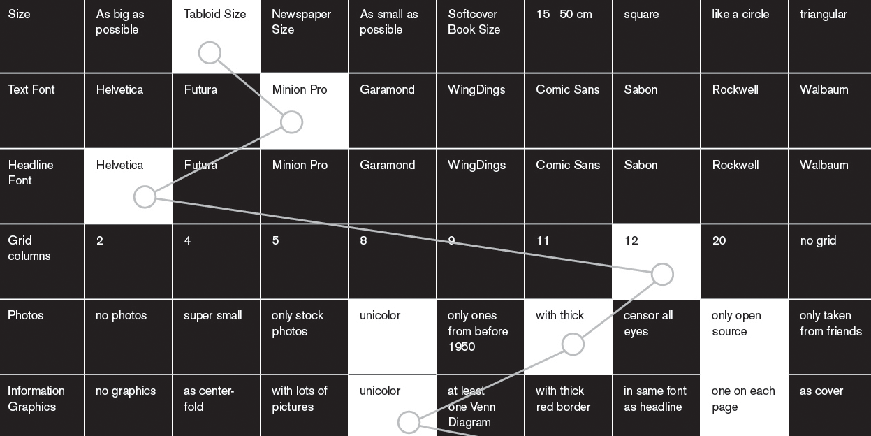
How to Copy and Paste professionally
"Here’s where I have to tell a little secret: I copy; shamelessly."
June 2014
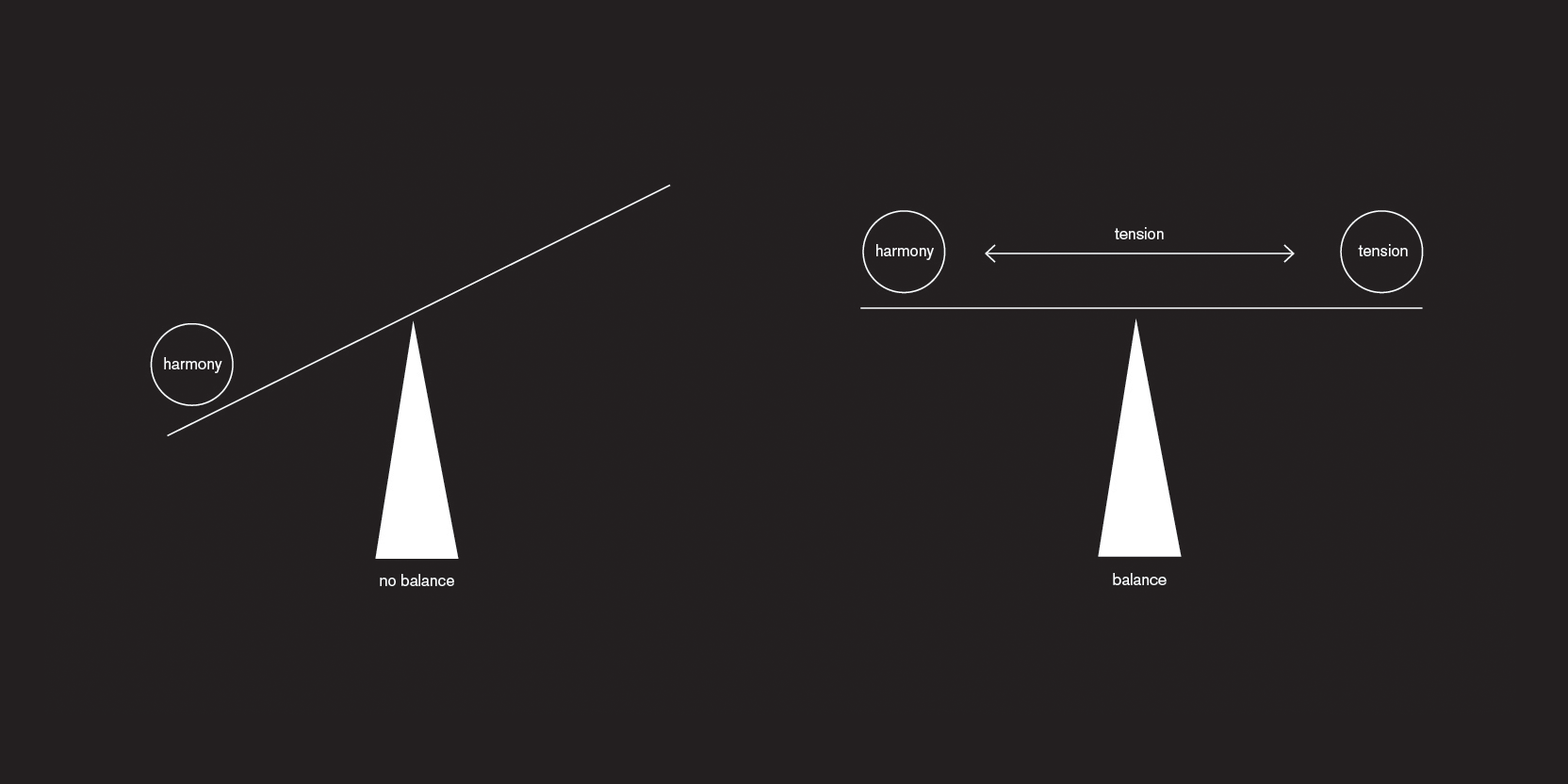
The Difference between Harmony and Balance
"Harmony means exactly that everybody is on the same page, not the opposite."

June 2014
Tension and Balance in Graphic Design
"With time, only harmony gets dull and boring. The human species needs variety and diversion."
June 2014
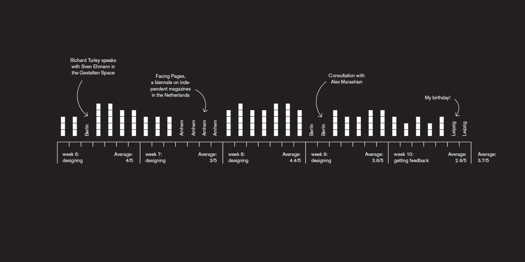
Get better, faster
"Have I even lost time while being away from the computer for 24 hours?"

June 2014
Design is subjective
"There can be a whole world to discover if you go to another »circle of taste« than the one you are used to."
June 2014
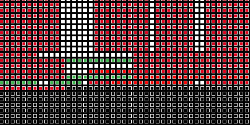
Your life in weeks
"My life so far will be very different from my life seen in total..."