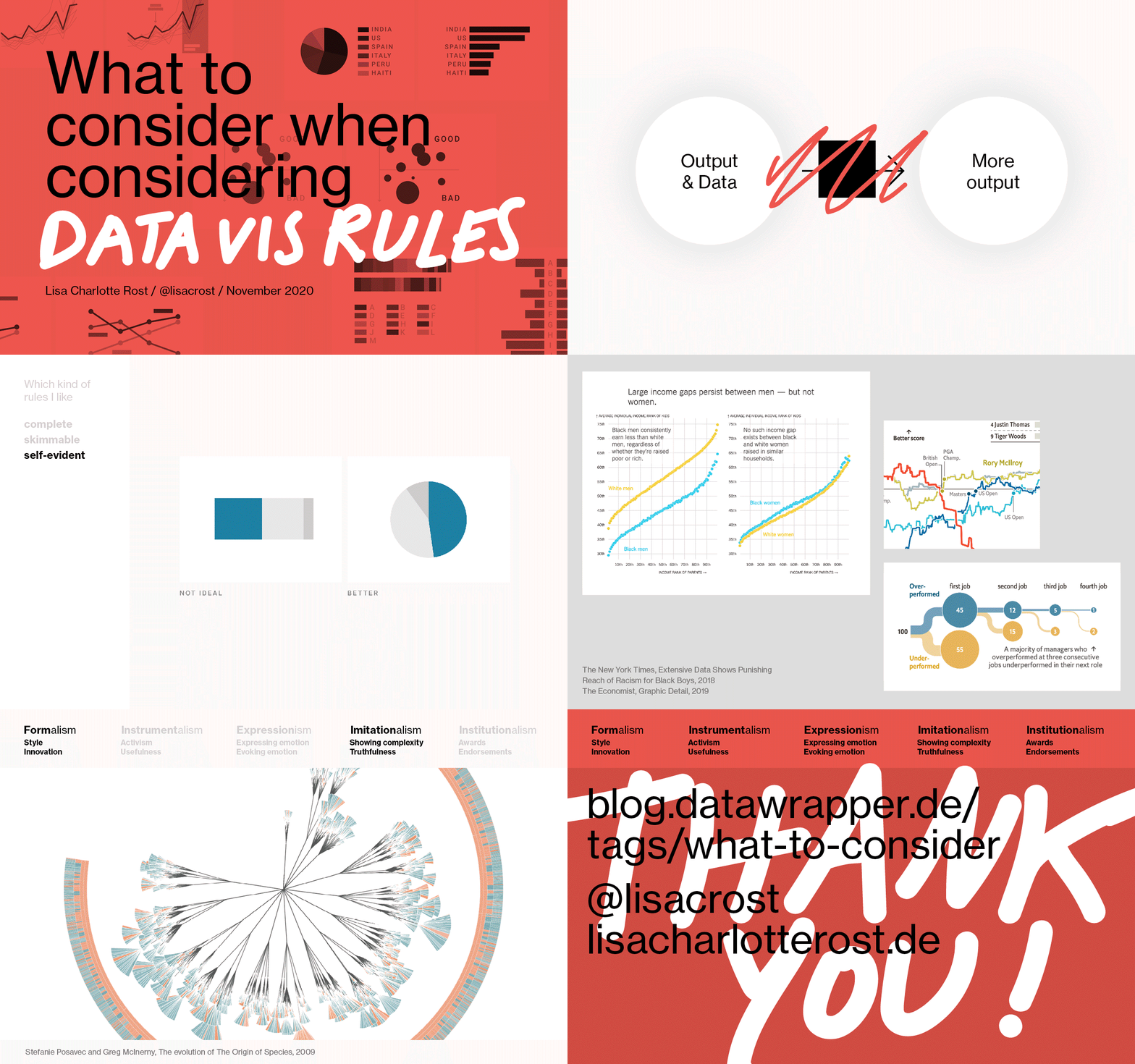
This is the transcript of a 40min-talk I gave at SHOW on the 28th of November 2020. You can find all the slides in that insanely fast GIF up here, or as PDFs on Github. There is also a recording of the talk, which the SHOW organizers will release in a few days or weeks or months.
This talk has three parts.
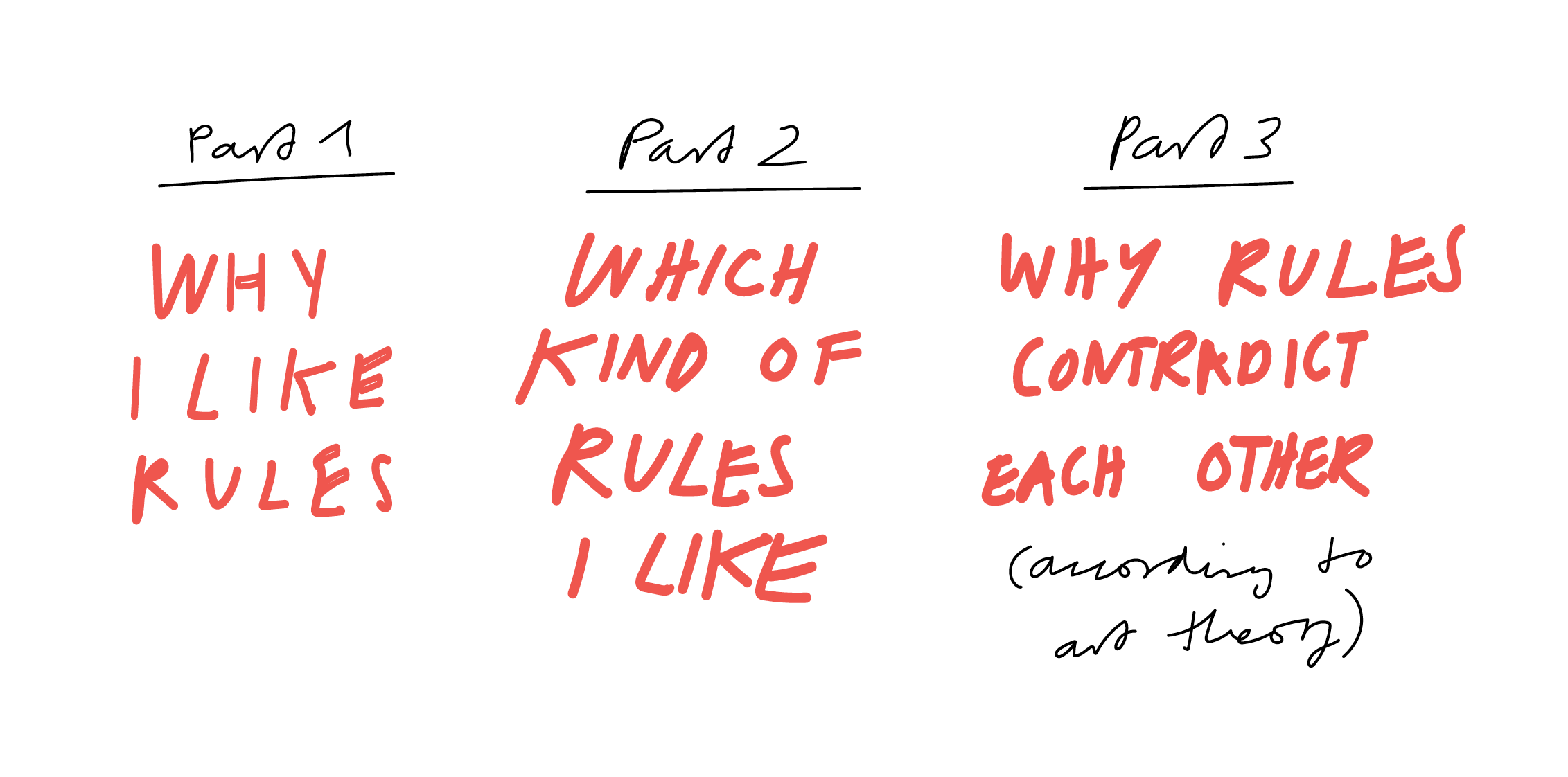
- If you’re interested in why I like rules, read the first part.
- If you’re interested in how I think that rules should look like, read part 2.
- The most interesting part for many turned out to be part 3, to which you can jump here. In it, I attempt to apply theories of art to data visualization, to explain how different goals can make rules contradict each other.
- You can also read a few reactions from the SHOW audience at the end of this transcript.
Part 1: Why I like rules
I like rules. And I think a lot about them. And for me, thinking about rules means thinking about one question: How? How do you, or I, or we all, get from where we are right now to design better-looking data visualizations? Or better-looking things in general?
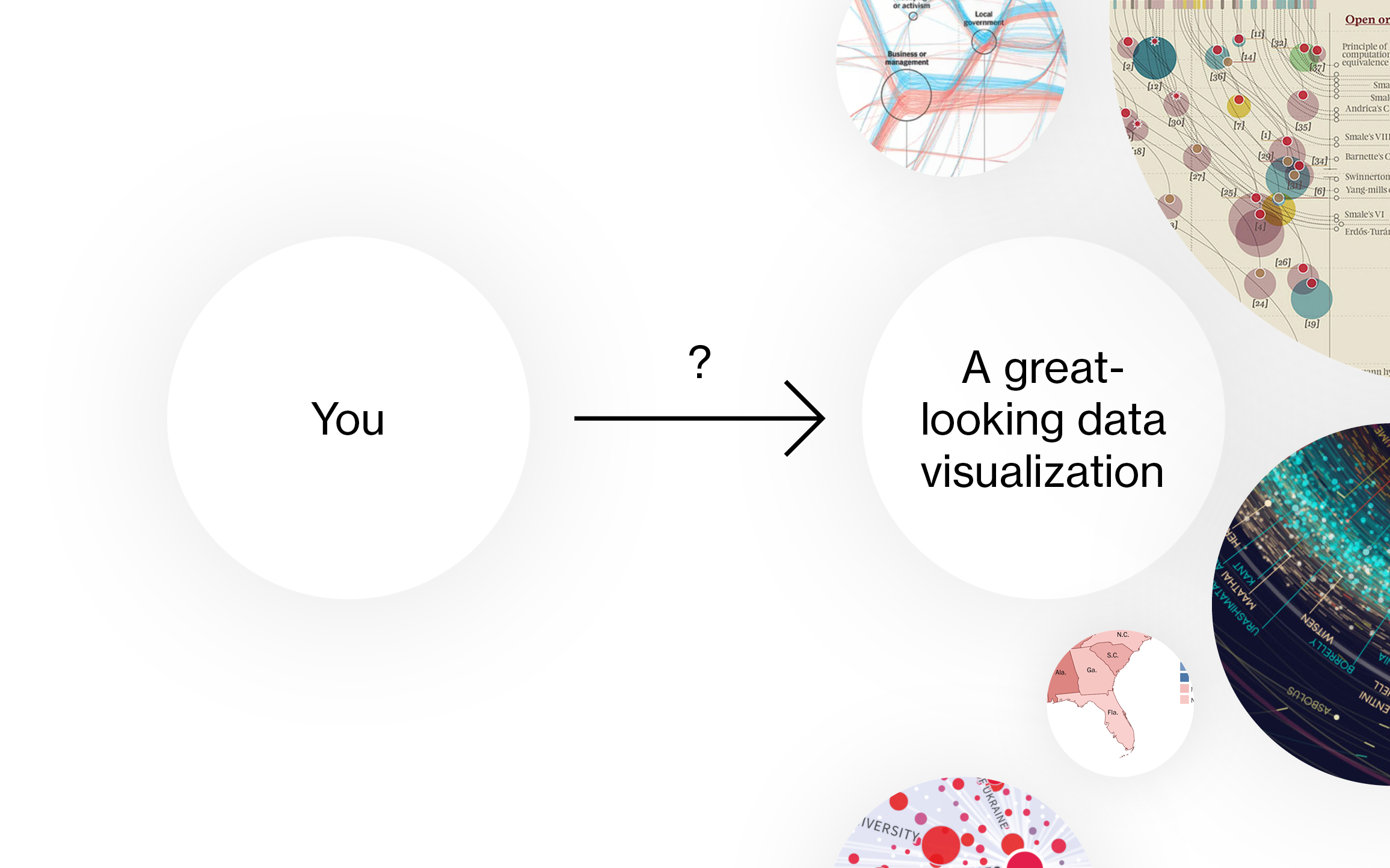
That’s a black box for most good designers. Like everyone, they start as bad designers. Then they study, or experiment in side projects, or have luck and get a great internship, or they meet great designers who are able to teach well, or they read inspiring books and do tutorials, or they do a mix of everything…
…and it just takes a really, really long time:

I’ve been through this process.
That’s me with 18:
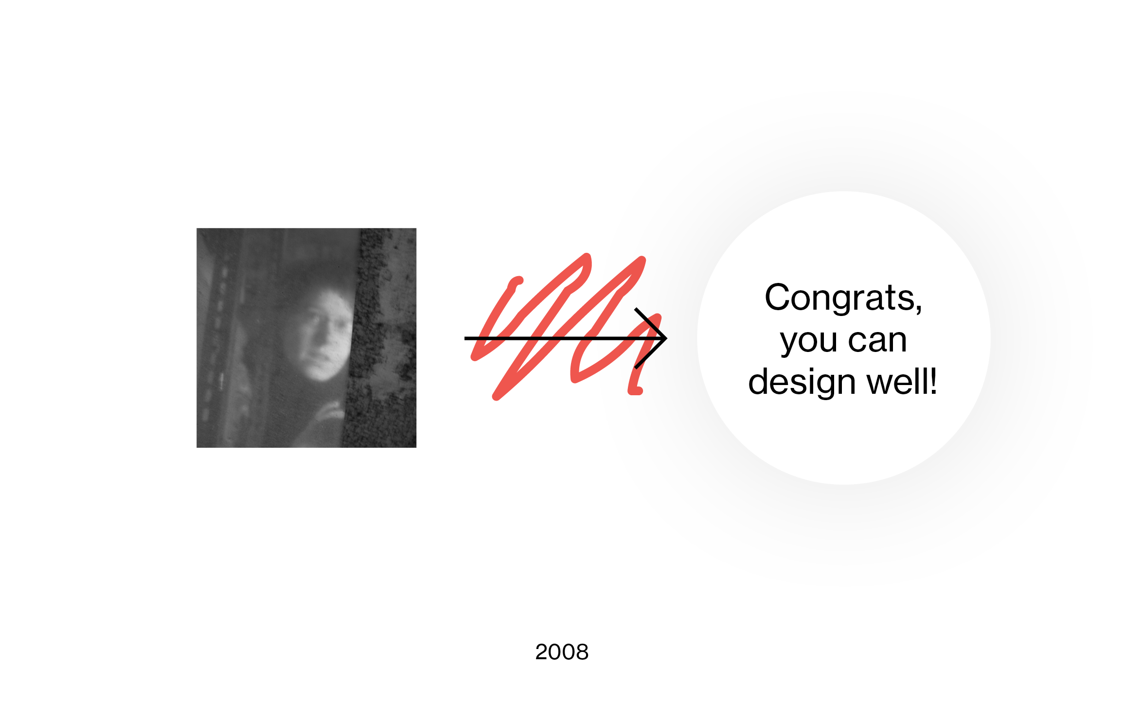
Yes, I was a shy teenager. And I could not design well. But I wanted to learn it – so I applied for a graphic design school.
Four years later, I left with a Bachelor of Fine Arts in my pocket…and I could still not design well.

Now, I’m grateful for lots of essential things I learned when I was a student. And my design skills had definitely improved. But they improved in a black-box kind of way. When I think back now of this time, I get reminded of how machine learning works (or at least of how I think it works): You give a computer some data and feed it with how you want that data to look like at the end. For example, you tell the computer, “Here are 100 Van Gogh paintings, make this one image (our data) look like a Van Gogh paintings”.
And then the computer does that, and you have no idea how exactly that happened.
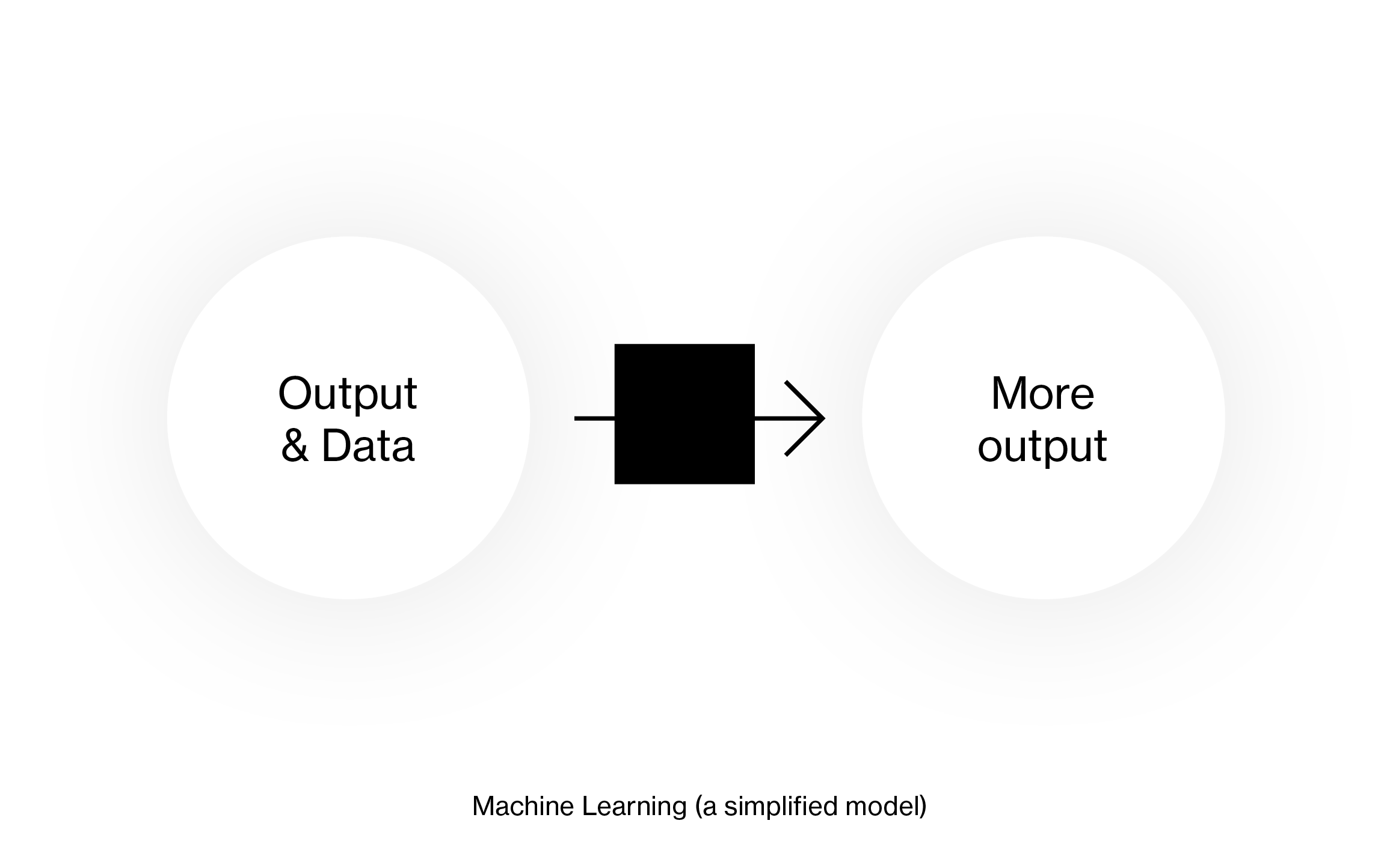
I didn’t look at 100 Van Gogh paintings, but I got lots of design inspiration from the library and the web and did other black-boxy stuff. And I started to design better, intuitively. And I can’t tell you how exactly I got there.
The worst part was that I didn’t know how I could improve my design skills even further.
But I knew that I wanted to – so I decided to study for two more years. Lucky for me, I stumbled upon Edward Tufte’s “The Visual Display of Quantitative Information” in my first semester.
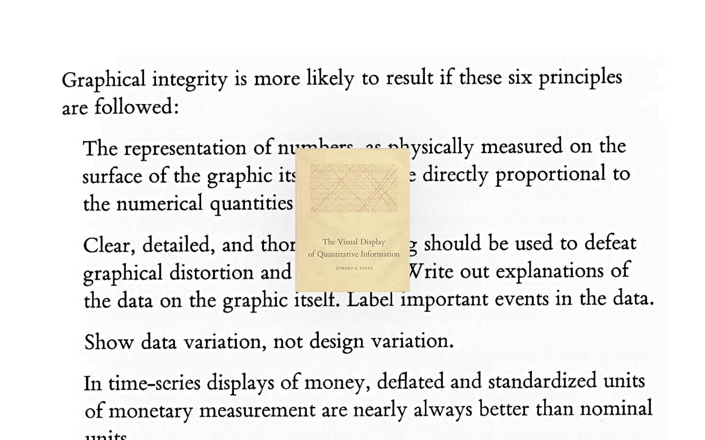
It was like an epiphany. Of course, the book and the examples in it are beautiful. But I also was fascinated – at least in hindsight – that there were so many rules about data visualization. So many principles! For me, that opened up a new way to become a better designer. Rules like the one by Tufte and many others helped me understand that and how I can improve.
This felt far less like black boxes and machine learning. It felt more like the traditional way of programming, where you give a computer data and clear instructions on what you want the computer to do with that data:
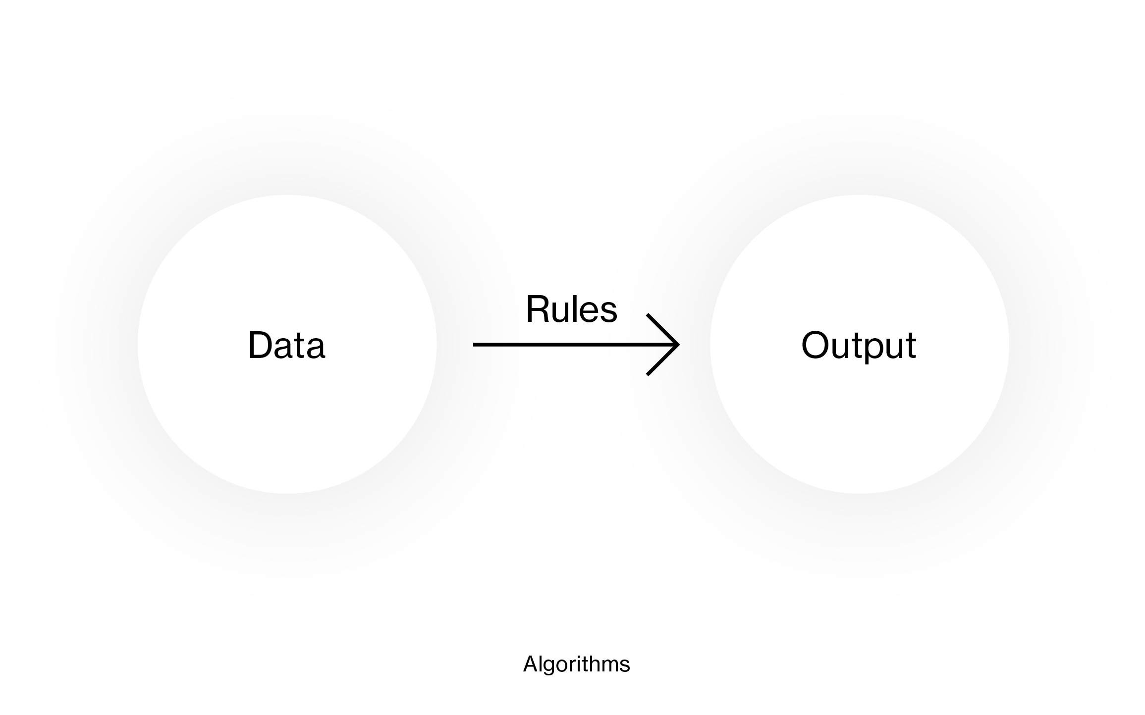
The black box is gone. Instructions – rules – have this big advantage: They’re not magic anymore. They’re visible. We can discuss them, and we can eliminate bias out of them, and we can debug them.
Yes, rules are limited. When following the rules, you can’t come up with a creative, innovative solution. You won’t be able to design the next Mona Lisa of data visualization with rules. You won’t come up with something like this great solar system visualization by Eleanor Lutz:
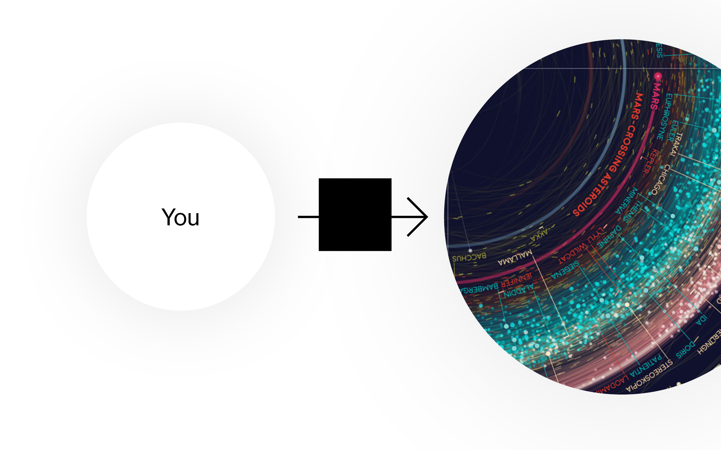
But rules can be a short cut for lots of people when creating simple charts:
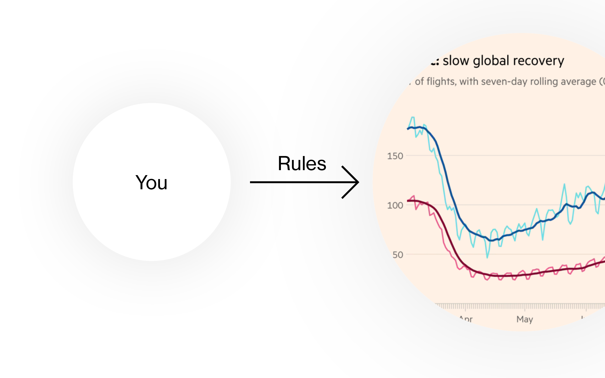
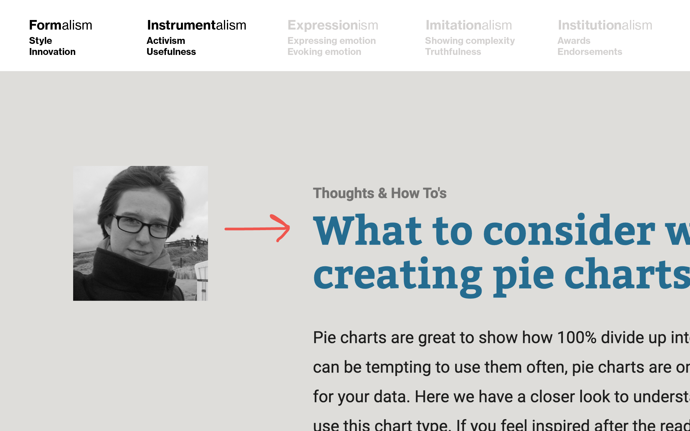
Three years ago, in November 2017, I started working for the data visualization tool Datawrapper. Since then, I made it part of my job to write down data vis rules. I call these blog posts “What to consider…” – like “What to consider when creating choropleth maps”, “What to consider when creating pie charts”, or “What to consider when choosing colors for data visualization”.
While doing so, my goal is to eliminate that black box. My goal is to empower people to create beautiful charts without studying design for six years. And my goal is to increase the general quality of data visualizations out there.
In the next part, I’ll talk about how I try to do all this:
Part 2: Which kind of rules I like
In my opinion, the best data vis rules are complete, skimmable, self-evident, explained, optional, and conditional.
First, complete.
Complete rules
Here’s an example from a “What to consider” blog post about stacked column charts. “Stacked column charts are great to show the parts of multiple totals,” I wrote. “If you only want to show parts of one total, consider a bar chart instead.”
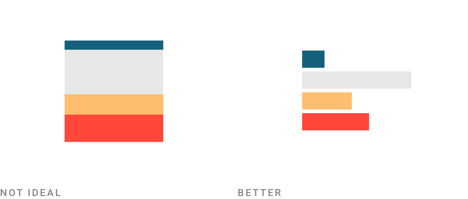
“Well, of course,” you might say. But if you haven’t created a data visualization yet, that might not be obvious to you. I like to write down even the most common-sensey rules – because we all come from different backgrounds, and there’s always a person who hasn’t thought about stacked bar charts this way.
At least, there’s one person. When researching which principles exist, e.g., stacked bar charts, I like to look at good data visualizations and understand what they got right. But I get the most inspiration from looking at not-so-good data visualizations, and what they got wrong. That “don’t create stacked bar charts with just one bar” principle exists because somebody did exactly that.
And while we’re talking about common sense principles – let’s talk about breaking rules.
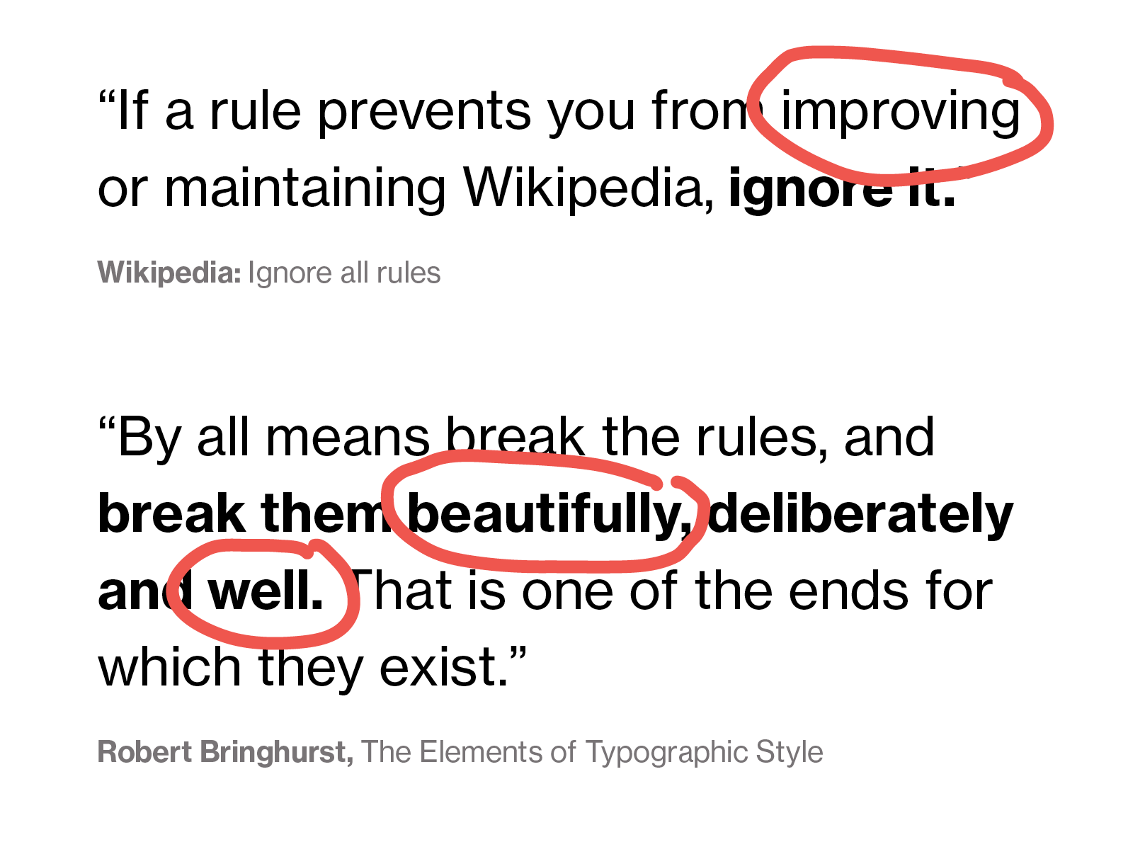
There are beautiful quotes out there explaining why and when to break rules: “If a rule prevents you from improving or maintaining Wikipedia, ignore it,” Wikipedia writes. I’m glad this rule exists – and I’d say the same is true for data visualization: “If a rule prevents you from improving your data visualization, ignore it.”
Robert Bringhurst adds in his popular The Elements of Typographic Style: “By all means break the rules, and break them beautifully, deliberately and well.”
Yes! Agreed.
But this concept of “breaking the rules” is only helpful if you already know what you’re doing. If you’re just starting out with data visualization or design in general (or with writing for Wikipedia), you don’t know yet what “improvement” means, or how to create something “beautiful and well”. These are the people I write for.
Skimmable rules
Because different principles might be helpful for different people, I believe that text and images work well for rule collections (instead of talks or videos). This way, you can skim the rules that are obvious to you. Having a clear structure (text - image - text - image) or headlines makes it easy for readers to know when a rule ends and the next one begins.
Self-evident rules
I don’t just want to tell readers what the rules are; I want them to understand it for themselves. That’s why I illustrate every rule. I don’t want them to think, “Ok, I believe you.” I want them to think: “I can see it for myself”.
I want them to see for themselves that a column chart is a better choice than a pie chart to show which value is the highest…
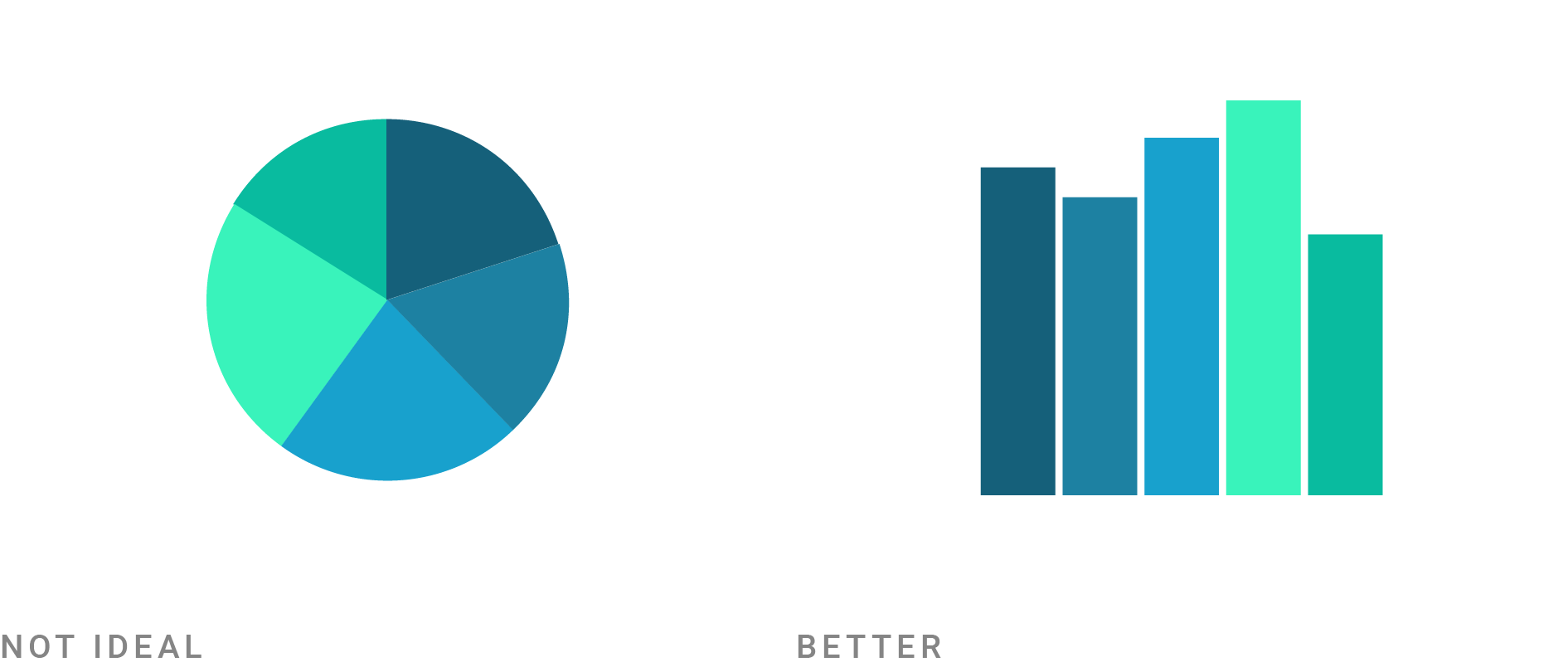
…but that a pie chart is a valid choice when the focus is on a value that’s close to or exactly 25%, 50%, or 50%:
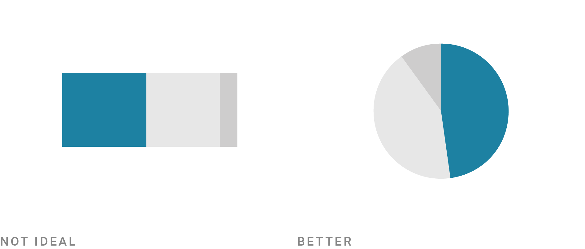
In my illustrations, I try to find the simplest and at the same time most realistic illustration for each rule. “Simple” means that only very few things change between the “Not ideal” and “Better” image. “Realistic” means that I always show some kind of (abstract) data visualization instead of just showing the design principle abstractly.
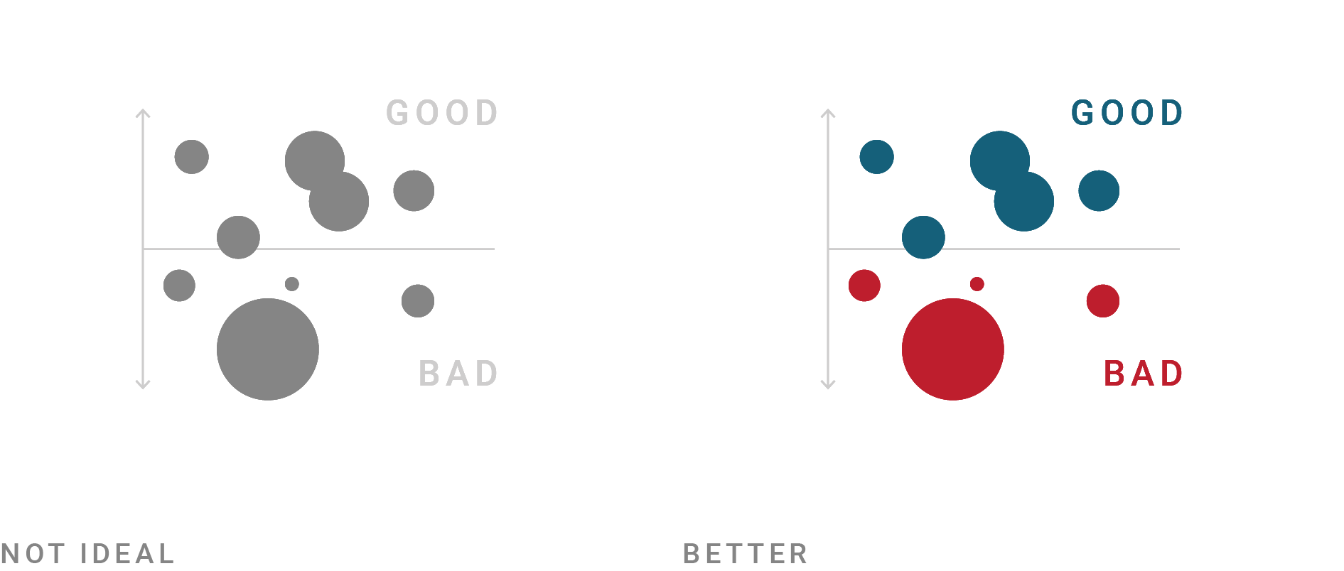
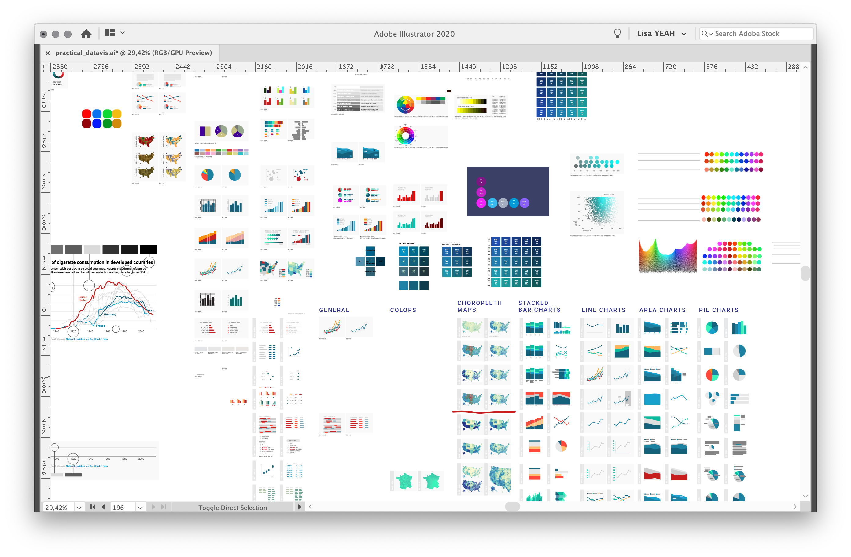
And yes, it’s lots of fun to come up with these little illustrations:
Explained rules
I think it’s fair to explain to readers why a rule works. If I explain that underlying premise, in the best case, people can transfer that knowledge to other situations (when visualizing data).
Here’s an example: “Your readers can compare values easier with each other if they have the same baseline” is not just valid for area charts.

Even if you didn’t read the article about stacked bar charts, you might remember that principle the next time you design a stacked bar chart.
Optional rules
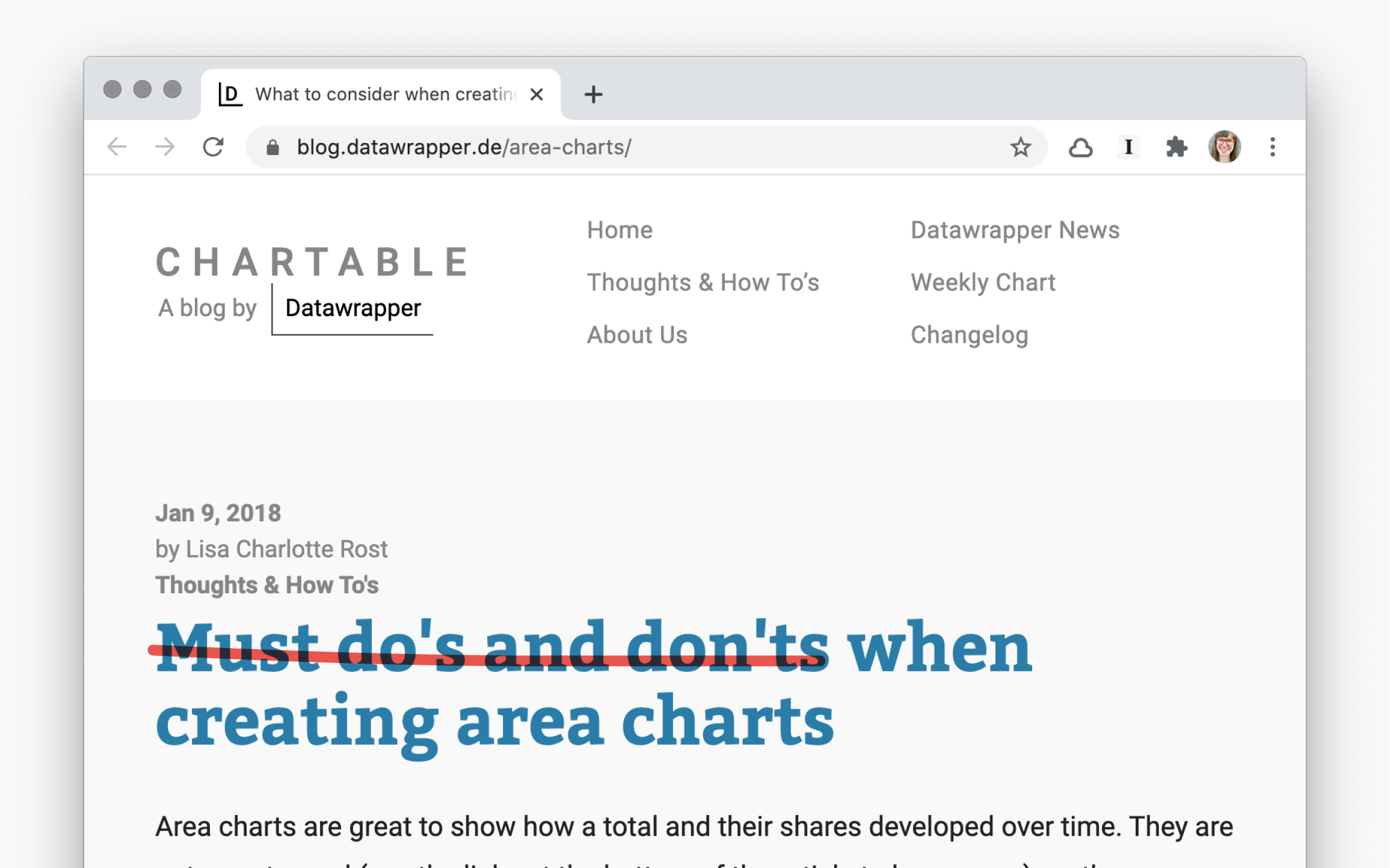
The English word rule comes from the Latin word rego: I rule, govern. That’s not quite the impression I want to leave with my “What to consider” blog posts. I see data vis rules more as in the German phrase in der Regel. Regel means rule, but In der Regel can be translated as usually, normally:
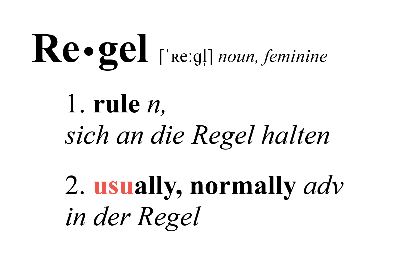
Now, the word usus come far closer to how I like to describe data vis rules: They’re usually useful, and we usually use them because of that. Rules are not top-down but optional. Feel free to ignore them. Take them as “food for thought”.
That’s why I call my articles “What to consider” and not “Must do’s and don’ts”:
Conditional rules
Rules are human-made. They’re not facts.
In 1739, the Scottish philosopher David Hume published “A Treatise of Human Nature”. In part 3 of this treatise, he wrote a short paragraph explaining that you can’t conclude what ought to be from what is. Philosophers call this the “is-ought” problem. Apparently, it’s been one of the most important questions in ethics since then.
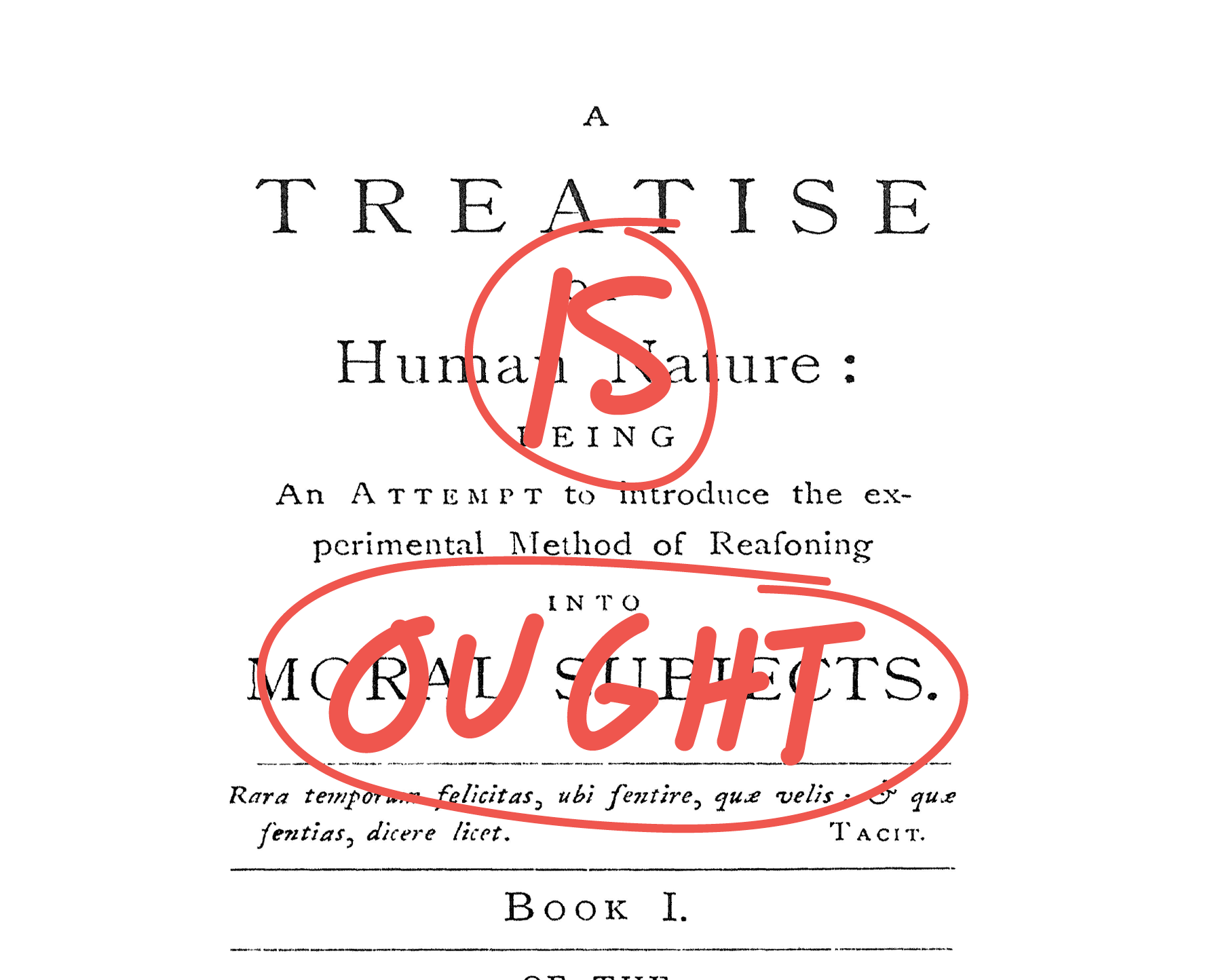
What does this mean for data visualization? It means that the fact “Humans have a hard time reading low-contrast text” doesn’t imply that your text should be high-contrast. It also means that “when bar charts don’t start at zero, people will be confused” doesn’t imply that your bar charts should start from zero.
But if you want your readers to read text or if you want them not to be confused, it would be weird not to follow these rules.
So we need to talk about goals.
“Nothing is good or bad, but thinking makes it so,” Shakespeare let Hamlet say more than a hundred years before David Hume wrote his treatise. It’s pretty stoic. And you can translate it to data visualization: “Your data visualization is neither good nor bad, but your own declared goals make them so”.
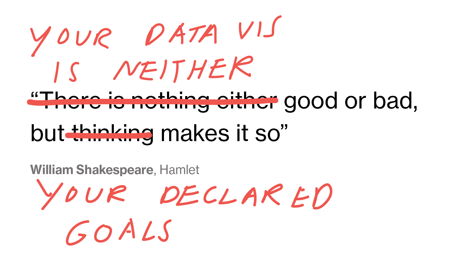
So we can only judge a visualization if the creator lets us know the goal they had. Most often, the goals are written within an organization. If you work for a news organization, then creating data art of the election results might miss its goal for the main election dashboard.
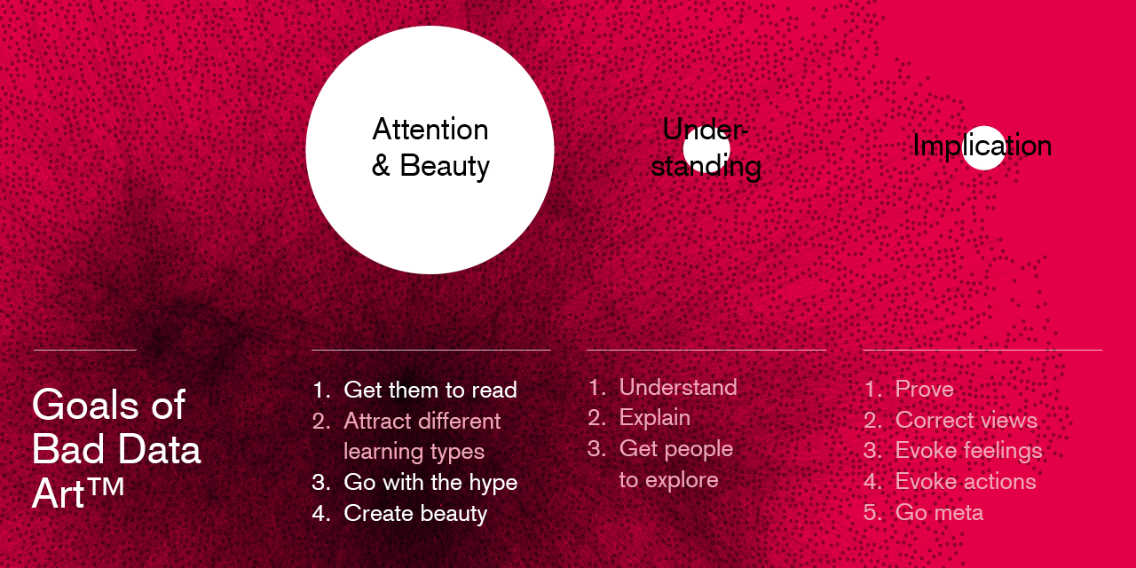
For the rest of this talk, I’ll talk about these goals we might have for our data visualizations, how they explain which rules we might follow and which ones we don’t, and how theories of art can help us to make sense out of all of this.
Part 3: Why rules contradict each other
Each data visualization principle exists in co-dependence from others. If I follow the rule to obey Web Content Accessibility Guidelines for color contrast for text elements, I might not be able to choose the (in my opinion) most beautiful colors.
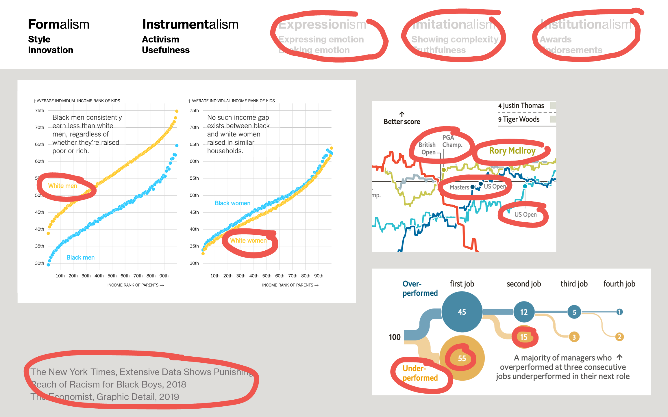
It’s easy to find lots of professionally created data visualization that don’t meet these accessibility guidelines for lots of these texts (everyone circled here):
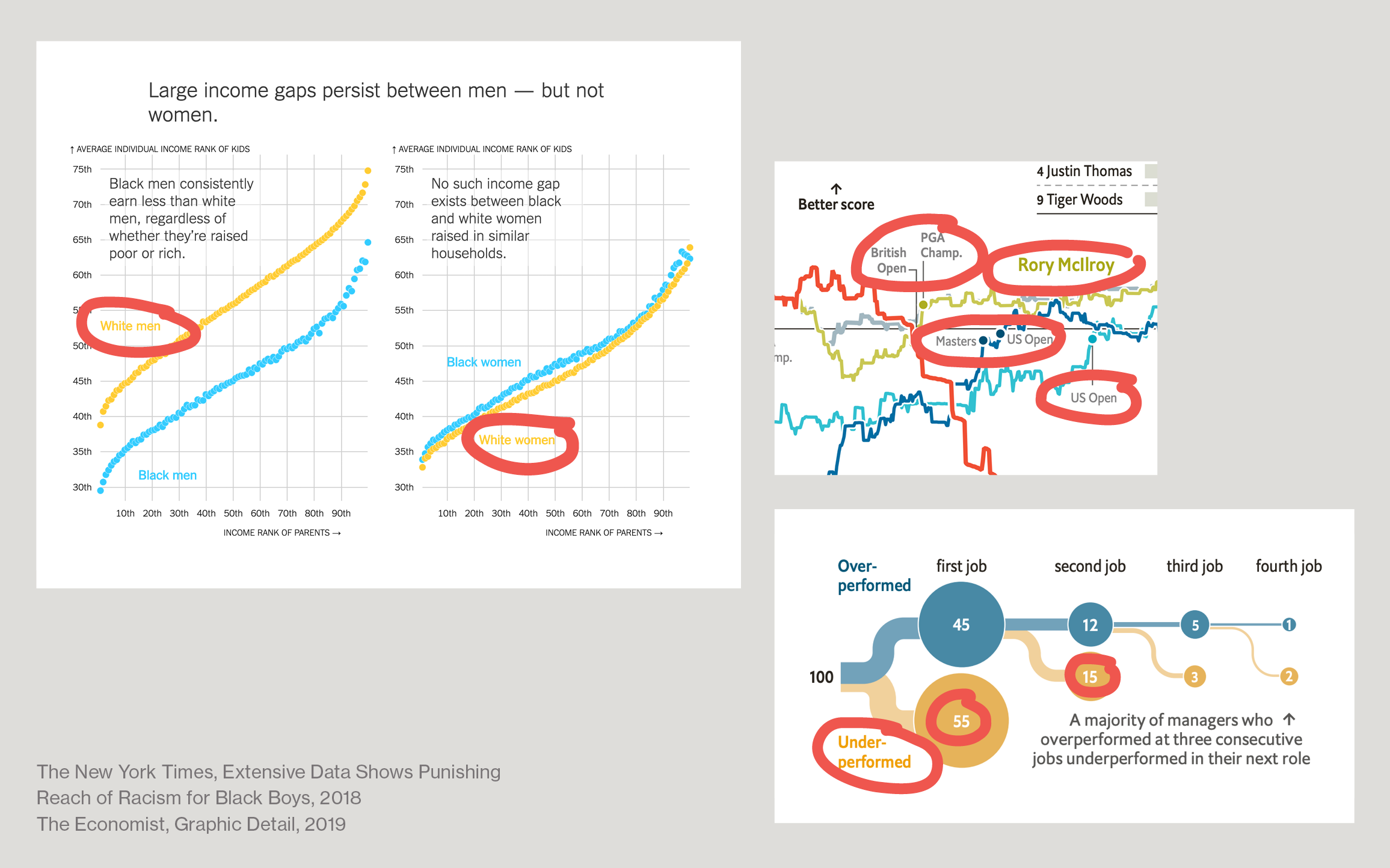
Why is that? And is this still a good data visualization if it doesn’t follow the rules?
I found one possible answer for that in art theory. Art is very, very diverse. This Rembrandt painting and this Paul Klee print both count as great art:
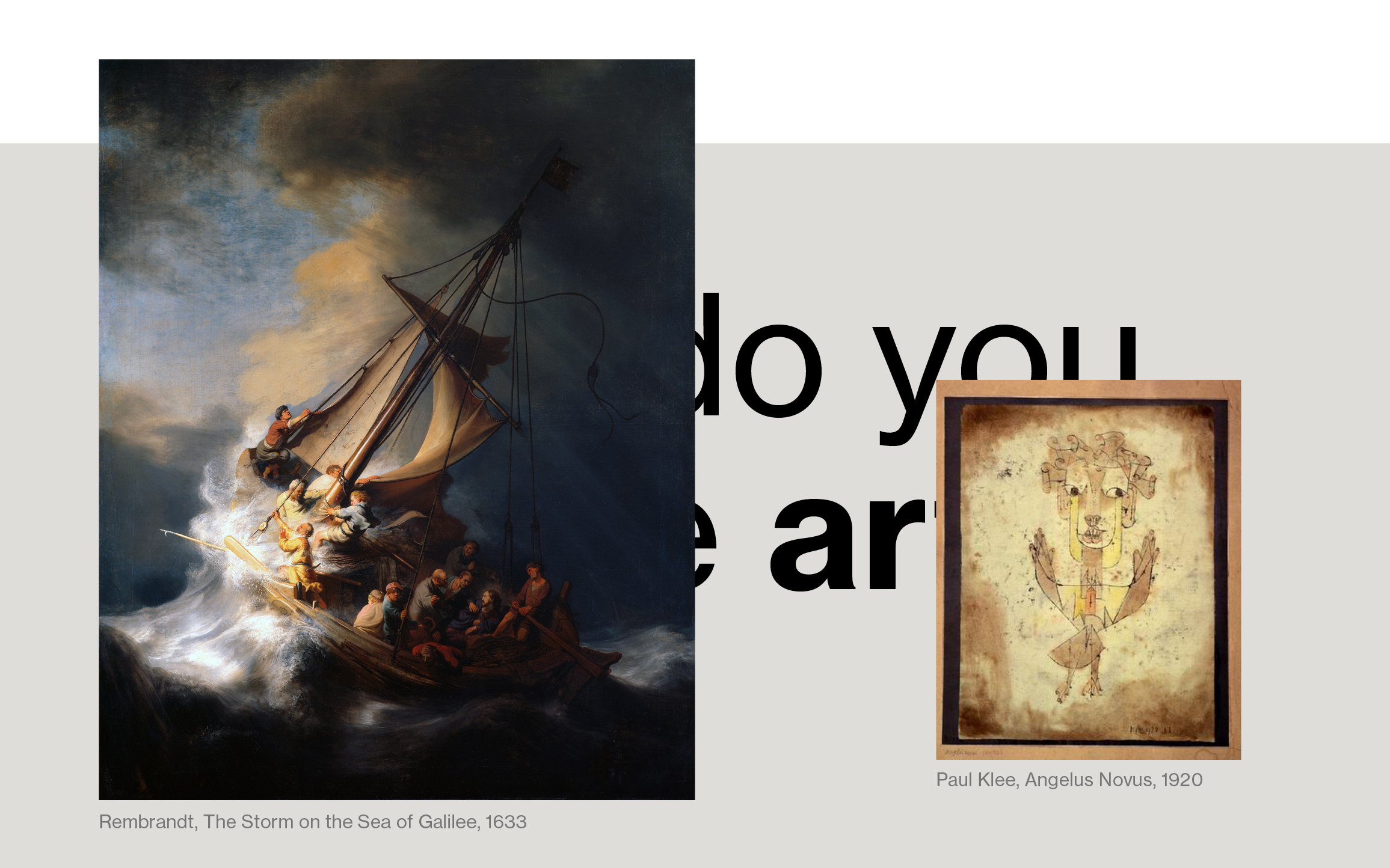
But how can you compare them? They’re so different. How can you judge them?
The trick that different people came up with is to judge them by different goals: For example, by their form, or by how much they achieve something. There are five traditional European-American theories I want to explain today: Formalism, Instrumentalism, Expressionism, Imitationalism, and Institutionalism.
Applying this model to the data visualization world could be useful in helping us think about rules and goals.
So let’s start:
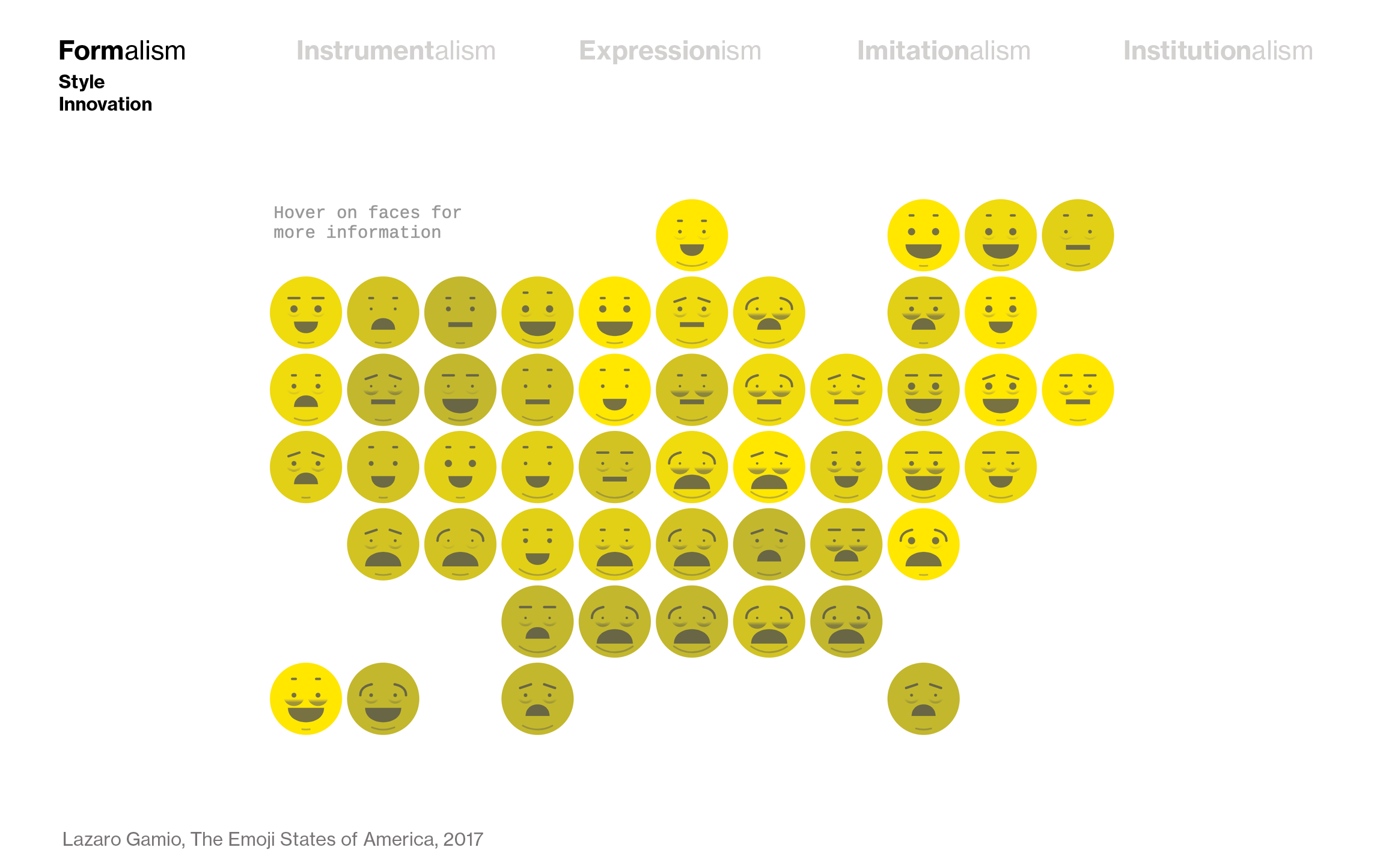
Formalism
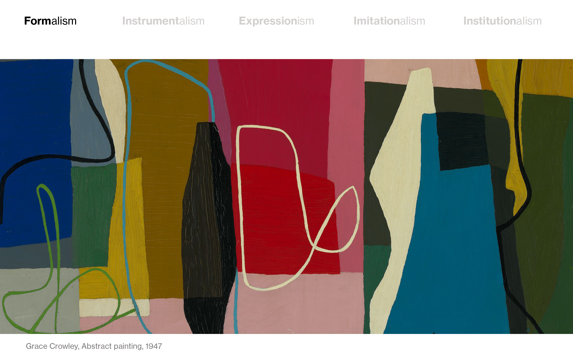
“Formalism” judges art by how interesting it is to look at, how well it is composed, how well colors are used, and shapes. Abstract art often wants to be judged by Formalism, like this painting by the Australian painter Grace Crowley:
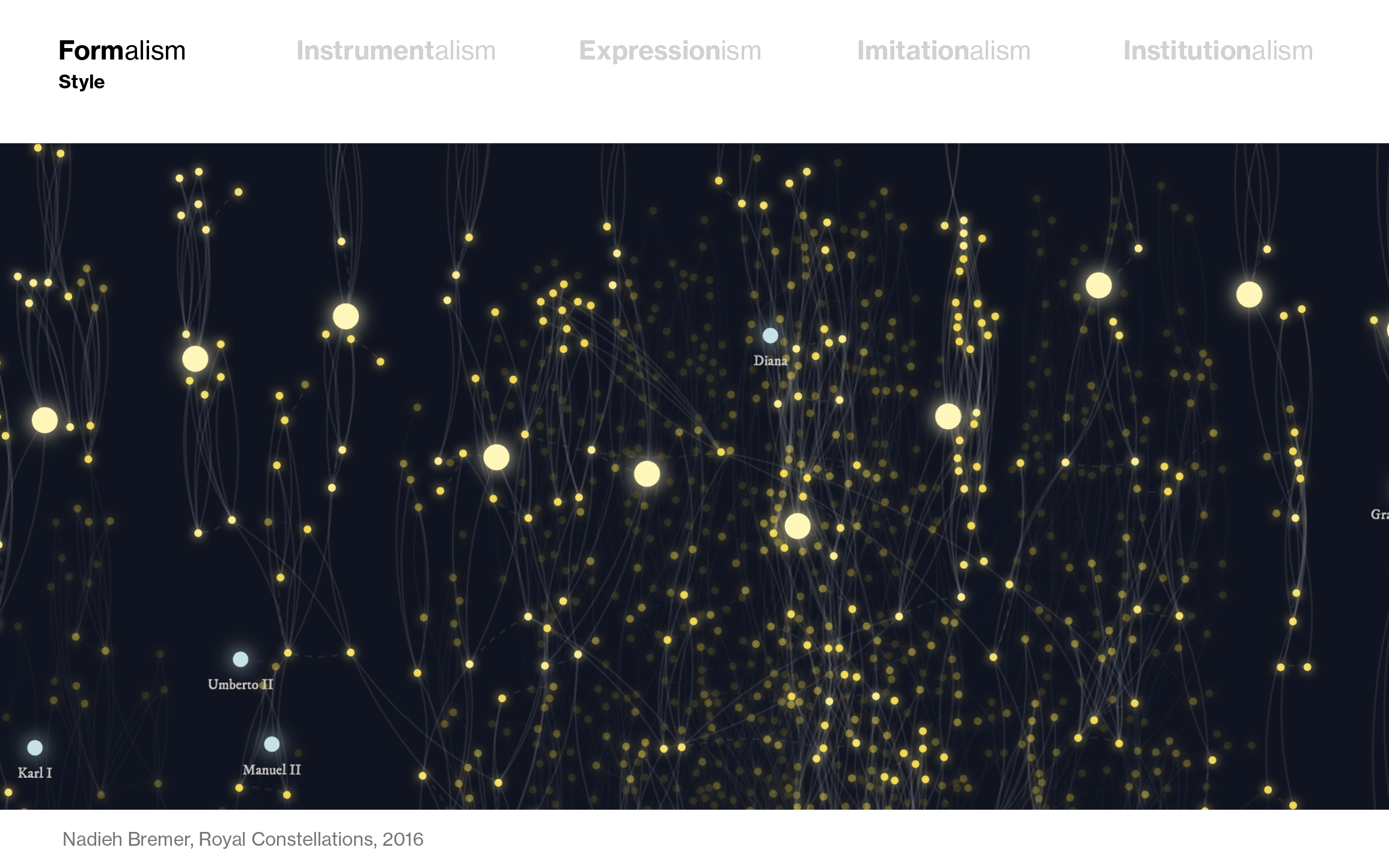
In the data visualization scene, too, there’s a big focus on aesthetics. Designers like Nadieh Bremer get praised for her beautiful visualizations, like this one called Royal Constellations:
But I’d say that every visualization that’s trying something new for the sake of trying something new falls in this category, too. Most often, such an innovative chart might not be the most readable – but it’s definitely interesting to look at:
Instrumentalism
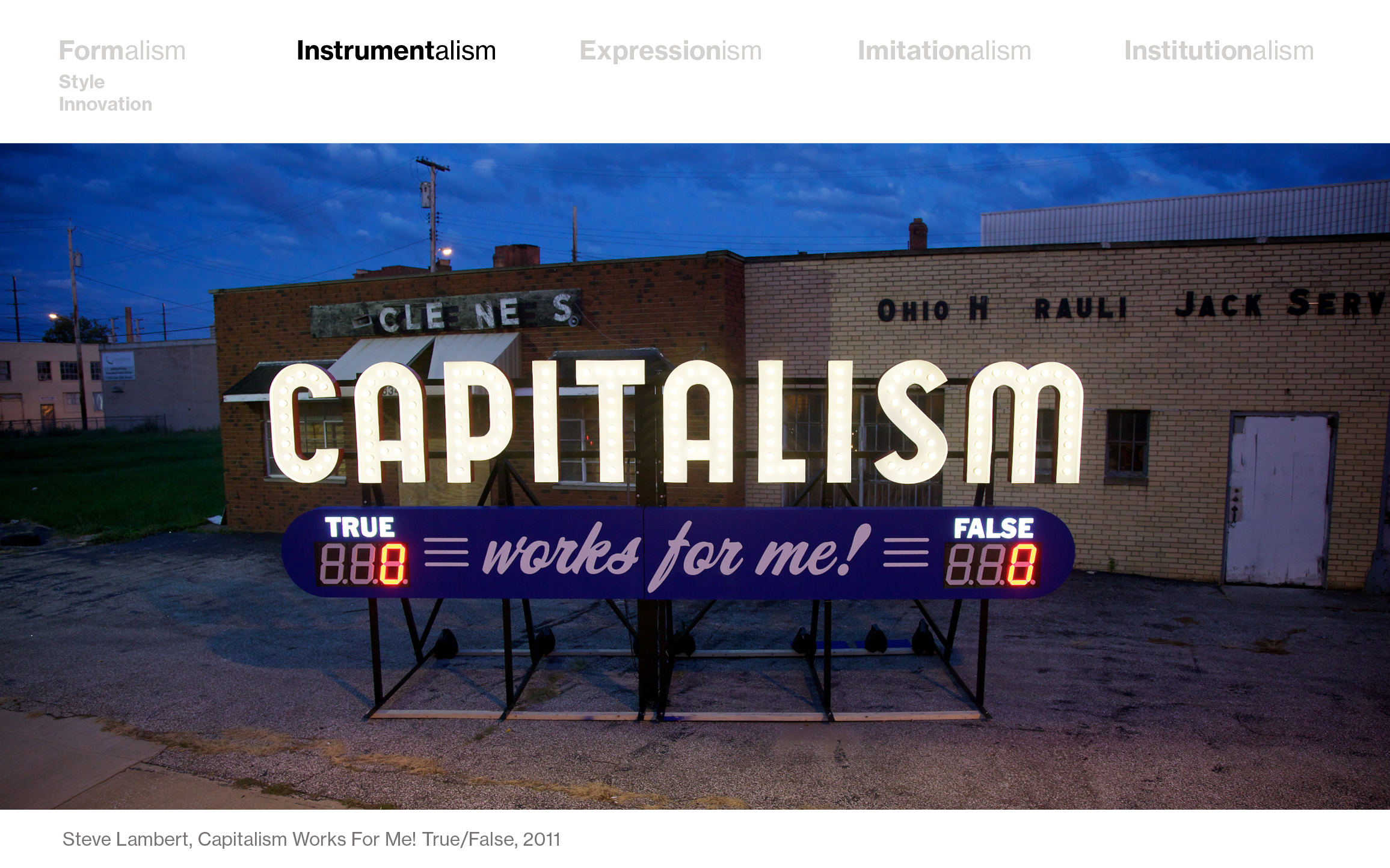
Advocates of “Instrumentalism” argue that art should serve a purpose. Art should influence society and lead to some social good. An example is Steve Lambert’s “Capitalism works for me! True/False” that makes people reflect on their opinion of capitalism. Lambert says that his work is supposed to make us think about the agency we have about the economic system we live in.
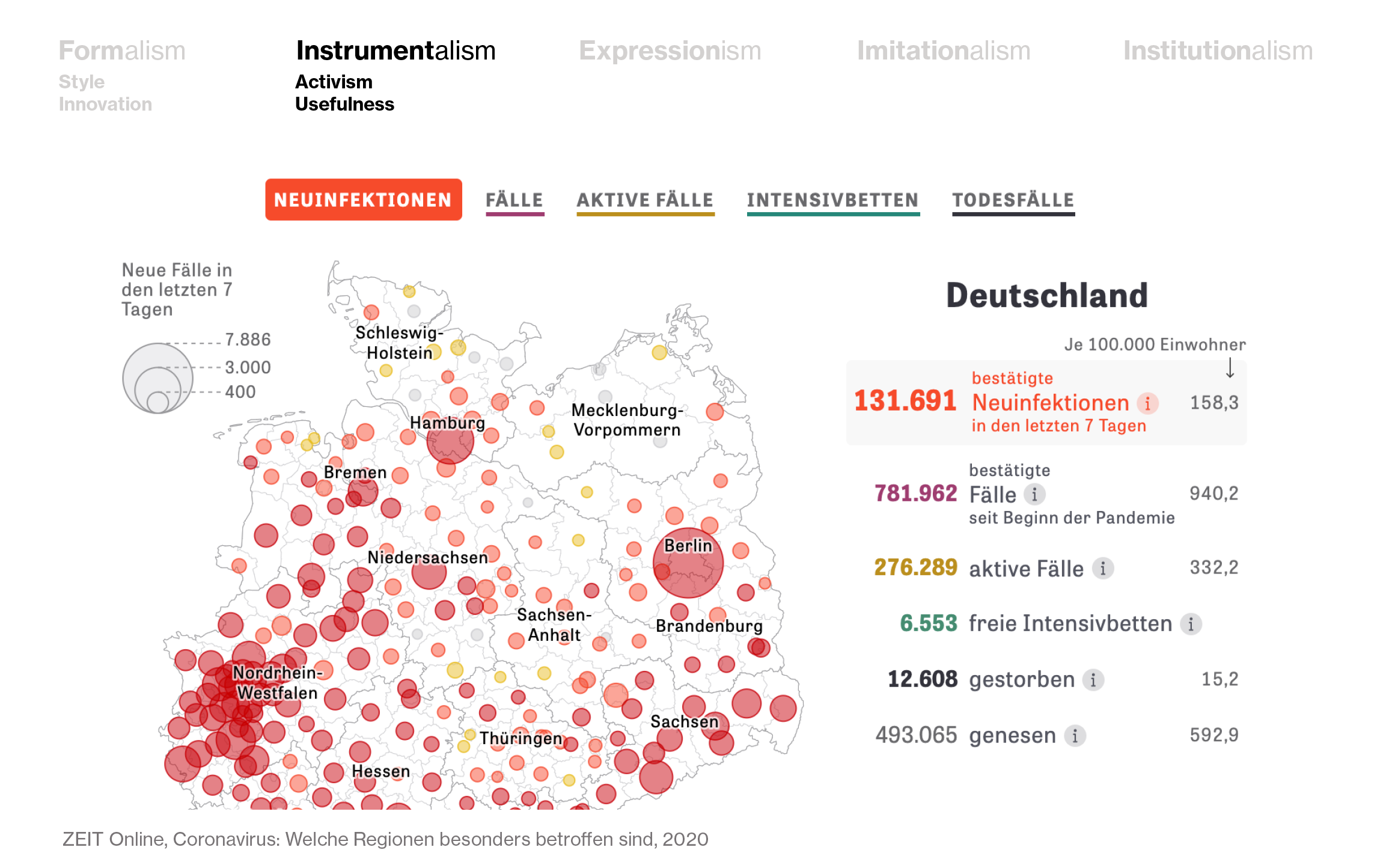
Data visualization, too, can be created by activists who want to have a clear impact:

But even a simple dashboard that simply has “informing” as its biggest goal, or a chart that’s focused on making a clear statement for the biggest number of readers possible, are “instruments” in data visualization. Like this Coronavirus dashboard by German news site ZEIT Online that I’ve been checking every morning for a few weeks now:
Expressionism
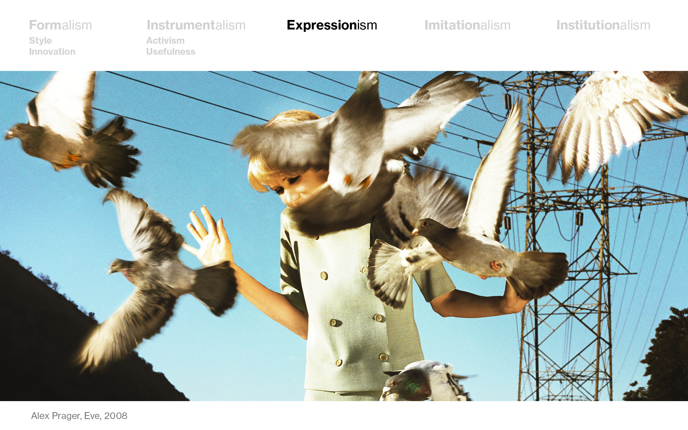
For some artists (and their critics), art is all about expressing emotion. In lots of video art, this is the case, or in this cinematic photography by Alex Prager:
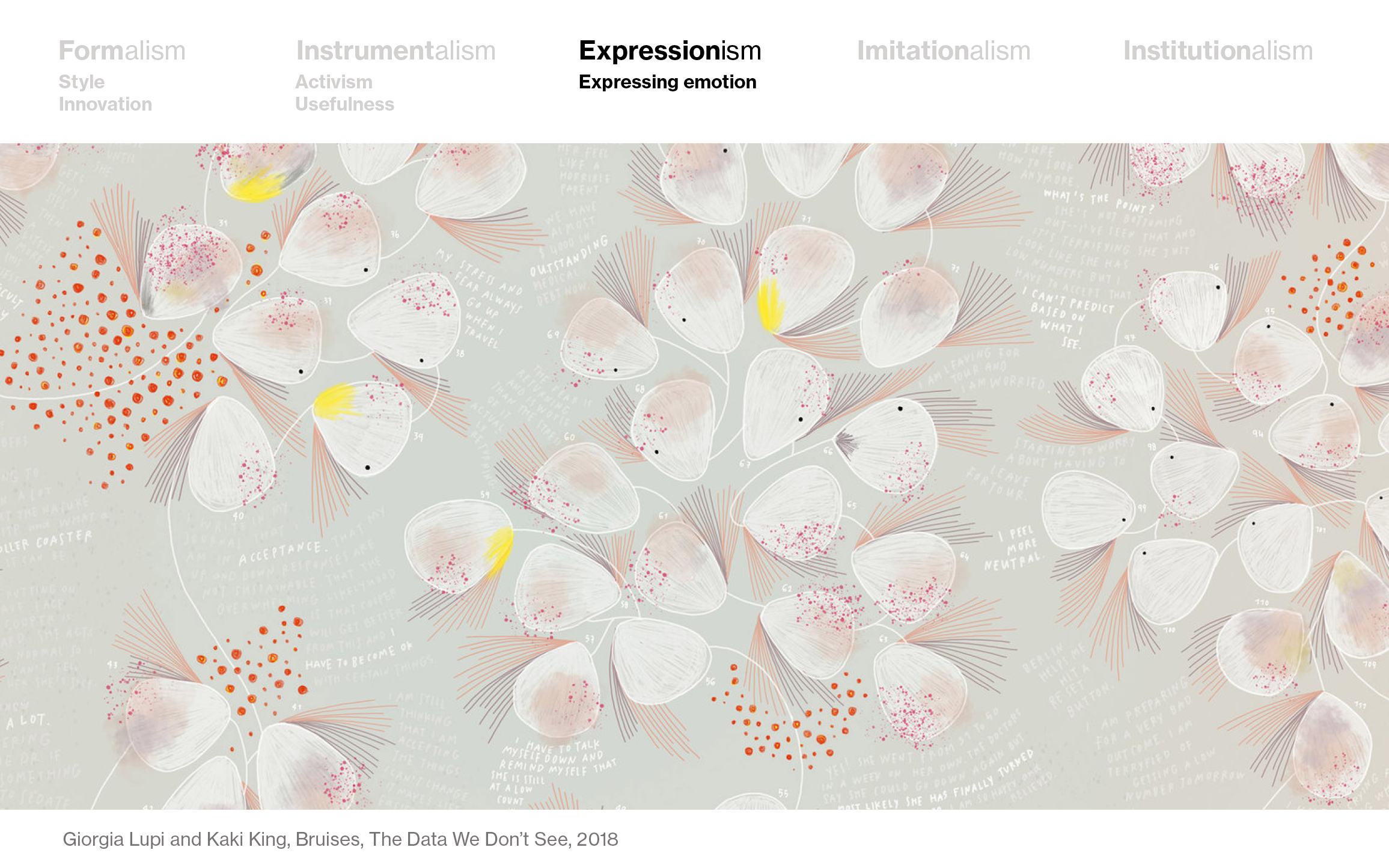
In the data vis scene, there are quite some people creating beautiful, subjective, expressive visualizations with data. On the forefront of that is certainly Giorgia Lupi. Here’s her 2018 piece “Bruises”:
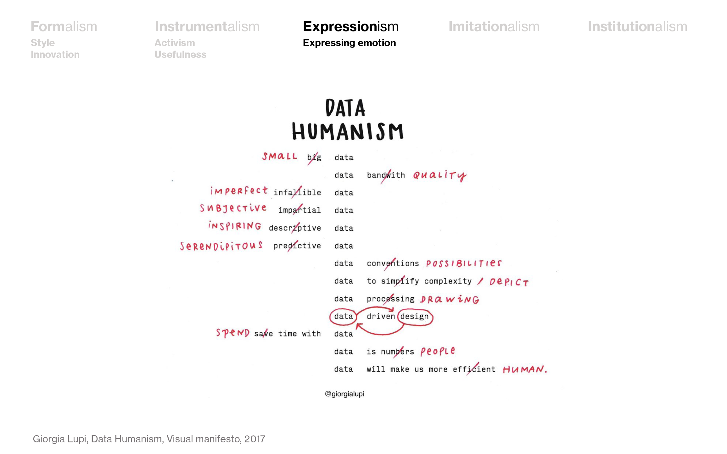
In 2017, Giorgia wrote a Data Humanism manifesto, declaring exactly that: That data visualization should be subjective, not impartial, and that data is people, not numbers:
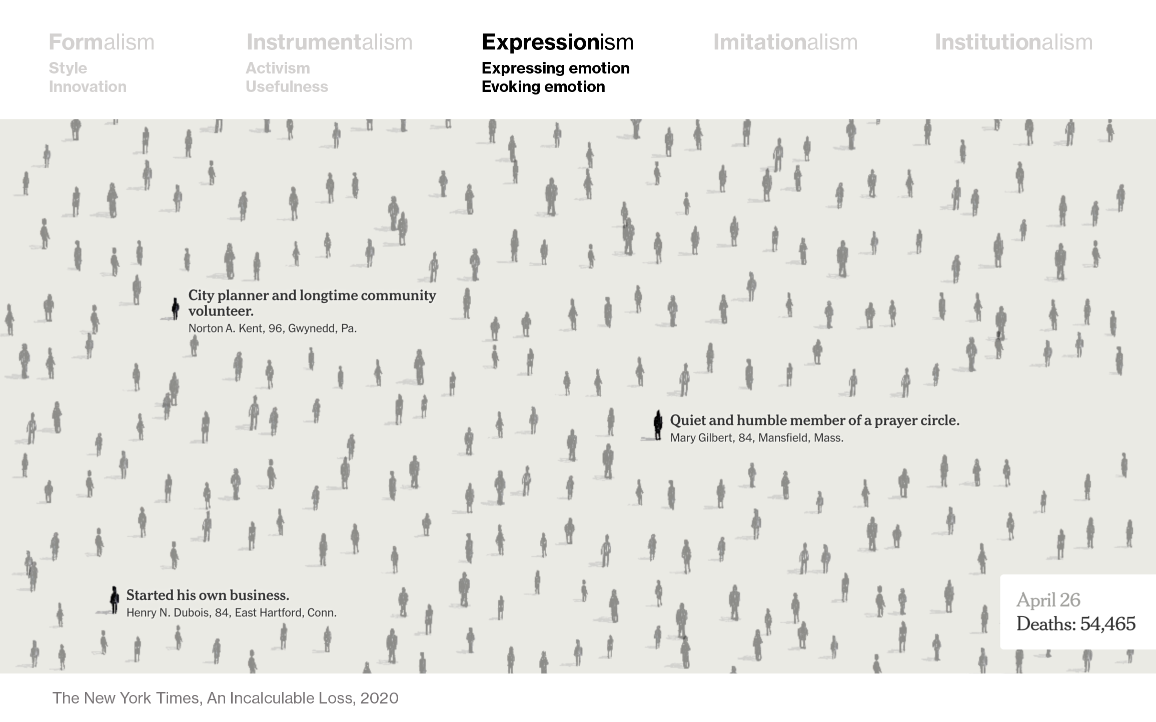
The data is certainly people in this visualization by The New York Times that shows all known people who died with COVID-19. But opposed to the piece by Giorgia Lupi, we know only very little about the feelings of the creator of this visualization. The main purpose is to evoke emotions, not to express them:
Imitationalism
If you believe that art should be realistic, then you judge art with “Imitationalism” in mind – and you’ll like art by e.g. Ron Mueck:

Translating that idea of “as realistic as possible” to data visualization is an interesting thought experiment. I think that showing the data in its hole and showing the complexity of the topic (even if that makes it unreadable) is pretty “imitationalist”. I get reminded of these “maps of the web” that lots of people created ten years ago or so, or this map of Reddit comments by Mark Allan Thorton from 2014:
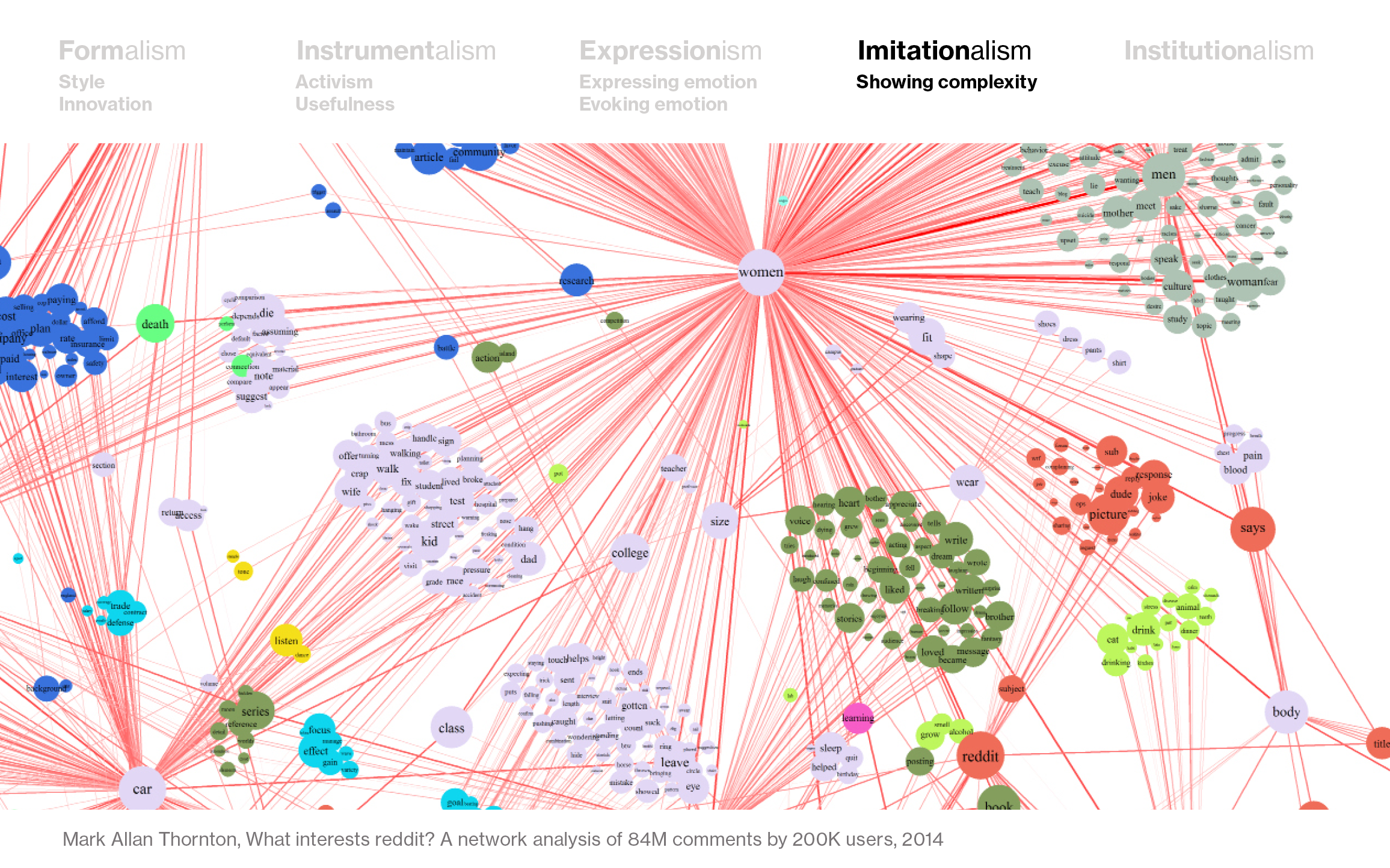
There’s very little subjective about this visualization – it just tries to shows the data closely and objectively, without making its own statements.
In this way, this raincloud plot by Micah Allan is also an imitationalist attempt. It tries to show all the nuances of this data while making mathematically correct aggregations:
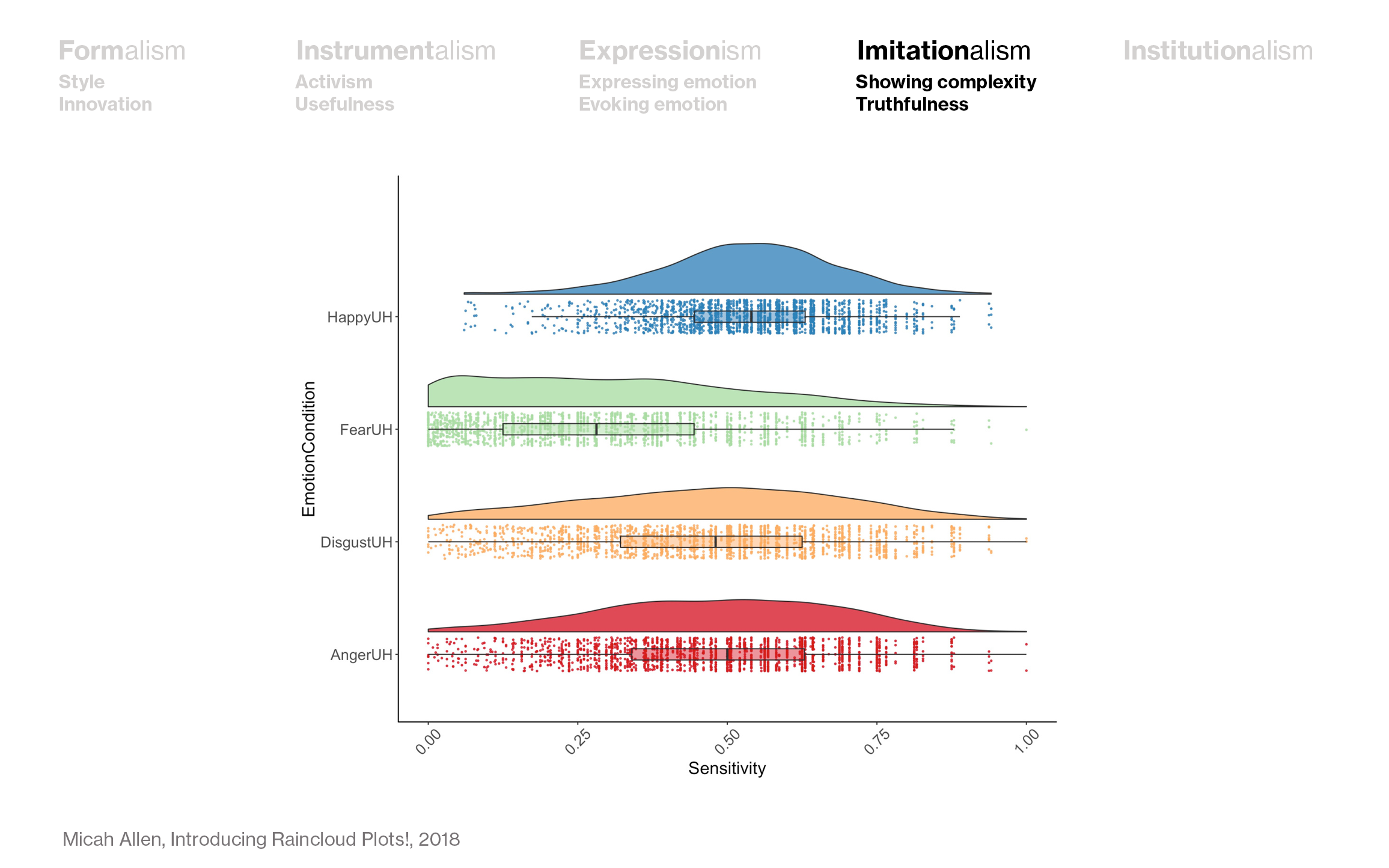
When thinking about imitationalist data visualization, it’s important to think about the difference between analysis and communication. A raincloud plot in the analysis phase of a data visualization project is an instrumental choice: You’re trying to find something out, and maybe this raincloud plot will help you. But communicating your data like this, I’d say, comes with an imitationalist motivation: You’re trying to be as truthful to the data as possible, even if that means that it becomes unreadable for some.
Institutionalism
The last theory of art I want to talk about is “Institutionalism”. This is a banana:
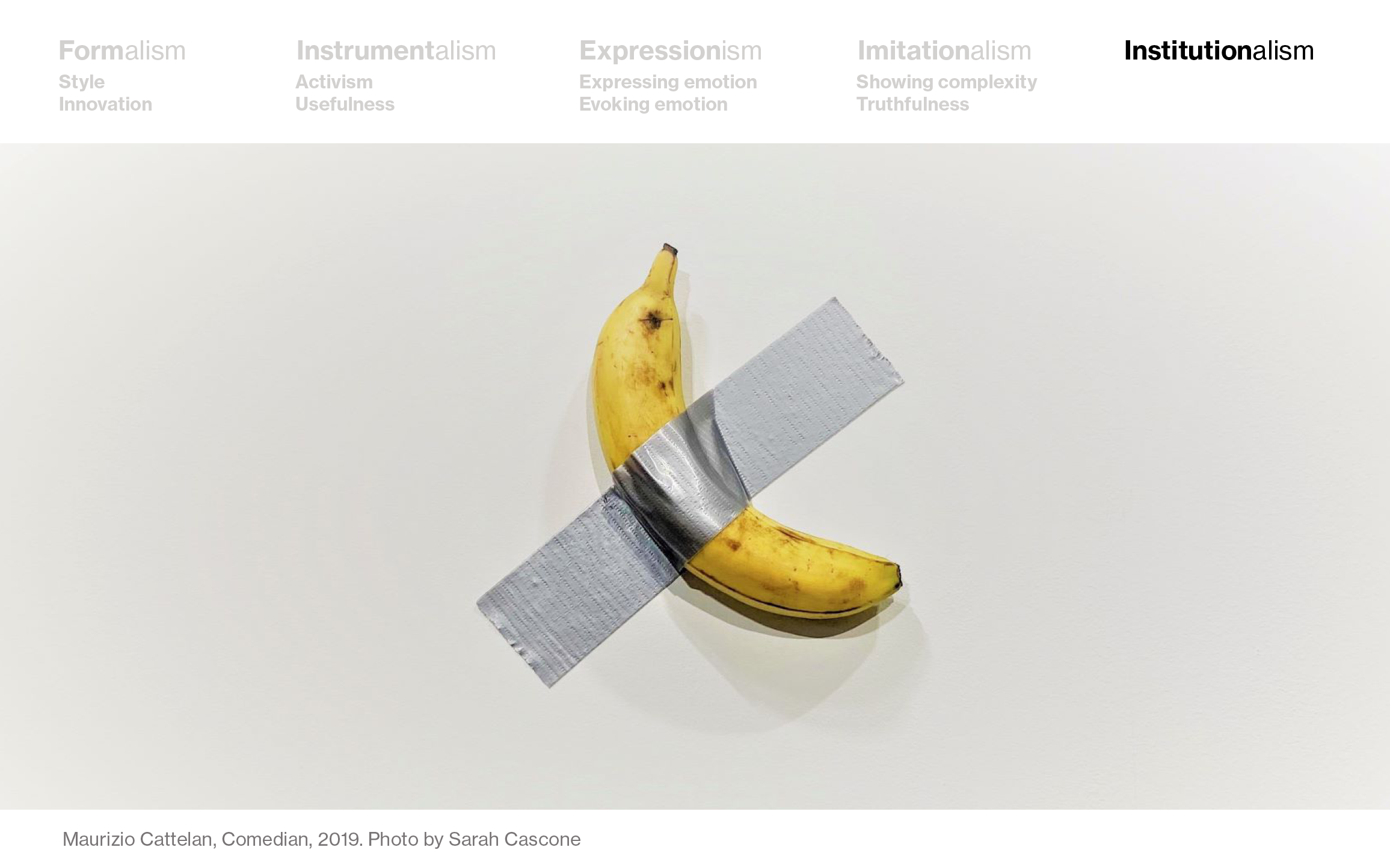
Two of these bananas sold for 120,000 USD ar the Art Basel in Miami Beach last year. But this is good art – because others say that this is good art. Institutionalism means that people with authority define what is good art and what is bad art.
In data visualization, we do have this too to a less extreme extend. We have awards like the Kantar Information is Beautiful Award, Malofiej and Iron Viz. We also have people with lots of followers on Twitter who function as curators and have opinions about if a data visualization is good or bad.
But we also listen to ourselves. I bet that if people see a data visualization on the Subreddit Data is beautiful and it gets a lot of upvotes, they’re inclined to try something similar the next time they’re visualizing data. And if a tweet that shows a project gets lots of likes, it’s hard to think: “This is not a good visualization.”
And in our organizations, we get confronted with “Institutionalism” in a literal sense: The company we work for or our coworkers defines what’s good or bad data vis: Good data vis is what your team says it is.
The lines are blurry
Like every model, this one falls apart if you look close enough. Of course, every data visualization has a form, has a function, or shows the data more or less truthful. Often, you can’t even say what’s the focus of a data visualization. Here are two examples:
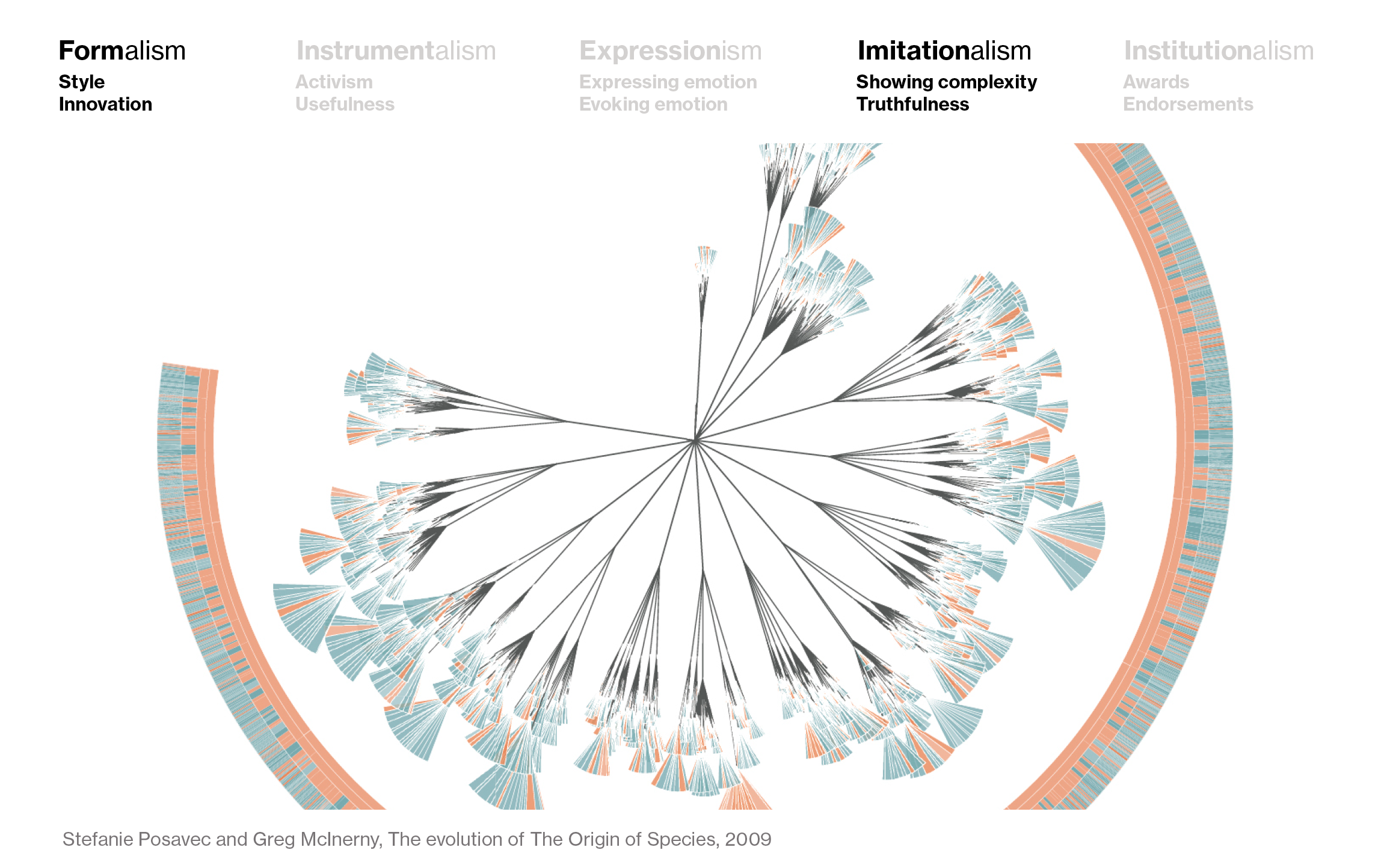
Stefanie Posavec’s visualization of Darwin’s “The origin of species”, for example, is as much concerned with its form as it is to show the full data, making it a child of both Formalism and Imitationalism:
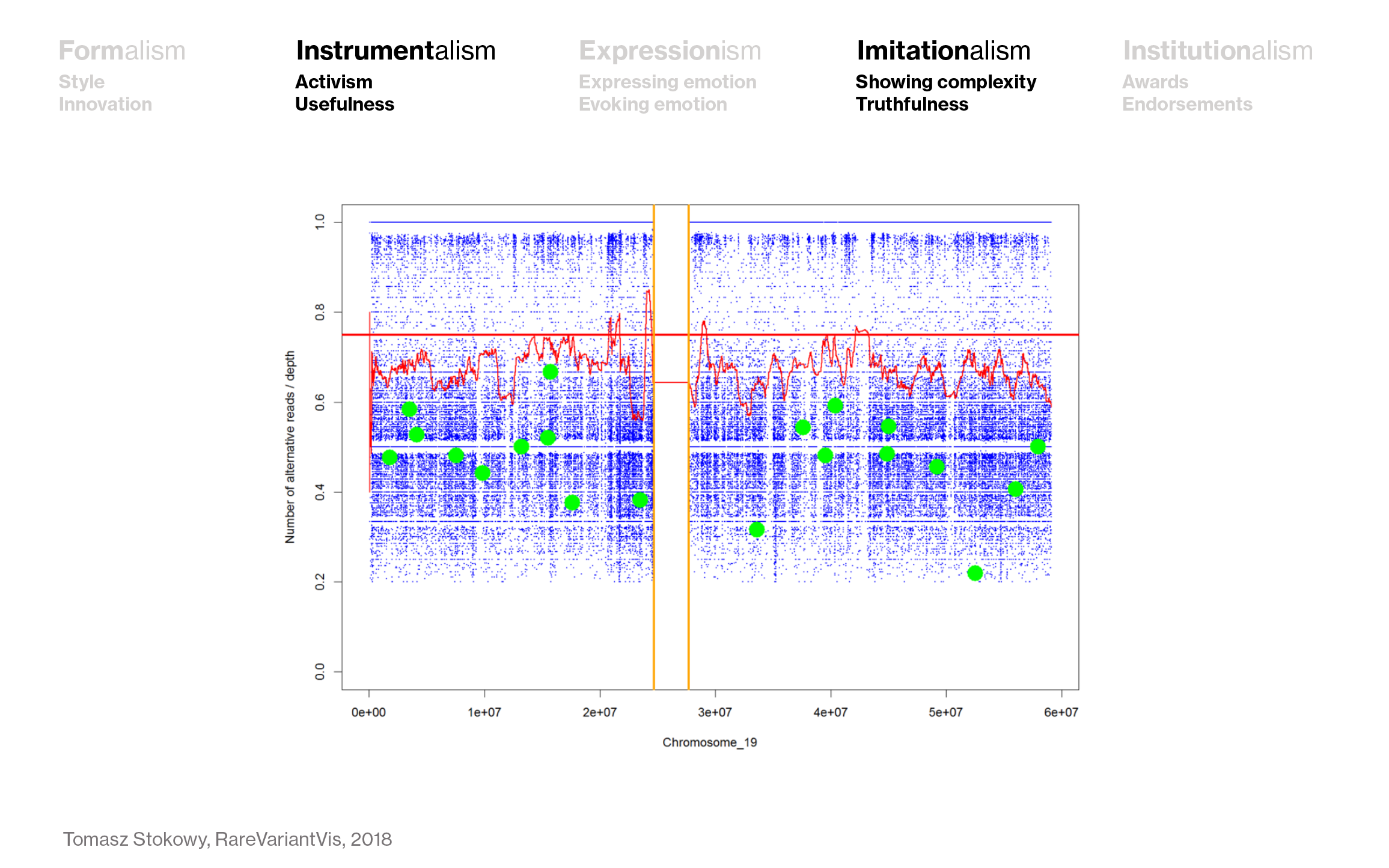
And lots of scientific visualizations are concerned with showing the complexity of the data (Imitationalism) – but not for the sake of doing so, but for the sake of being useful (Instrumentalism):
Still, I found this “theory of art” model helpful in figuring out why rules contradict each other: Because they come from different “theories of data visualization.” Here are three examples:
Example 1: Accessibility vs. nice colors
First, let’s come back to our Web Accessibility vs. beautiful colors example from the beginning. You’ll follow the rule “Act on the Web Accessibility guidelines” if you judge your work by Instrumentalism: You want to reach as many people as possible. And you follow the rule “Use beautiful colors” if you’re…well, if you’re a designer and you want to use yellow in a data visualization because you haven’t done so and you like how it looks like. That’s Formalism.
(By the way, I am torn between instrumentalism and Formalism in my work, too. Parts of this very presentation are unreadable to people with impaired vision – which is something I’m willing to accept.)
Example 2: Ease of understanding vs. mathematically correctness
The second example of clashing rules is “Make a clear statement with your data that’s easy to grasp” vs. “Do justice to the complexity of the data”. It’s almost impossible to do both consequentially. You have to bring sacrifices.
A few weeks ago, Financial Times journalist John Burn-Murdoch gave a keynote at VIS2020, talking about his learnings from visualizing COVID-19 numbers, and about that dilemma. He said:
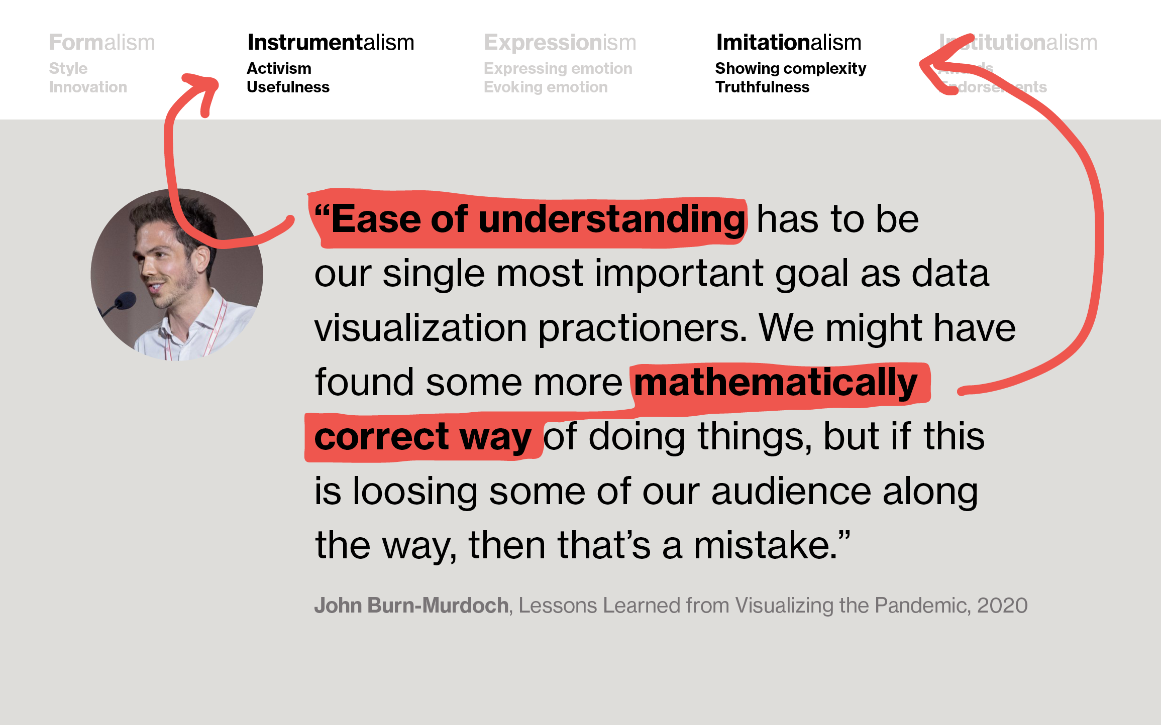
“Ease of understanding” is a clear Instrumentalist rule, while “mathematically correct” is rather Imitationalist. As a data journalist, it might be his “single most important goal” to make it easy for his (mainstream) audience to understand the numbers. But for other data vis practitioners, that readability might be less important than doing justice to the data or being mathematically correct.
As we can appreciate realistic paintings without thinking, “That’s not useful’,” we should do the same with data visualizations that are “just” beautiful or “just” a sophisticated portray of the data.
Example 3: Attract attention vs. bar chart races
Two more rules that don’t go together well are “Attract and hold the attention of your readers with your data visualization” and “Don’t do bar chart races.”
To remind you, bar chart races are these bar charts that show development over time with animation, where the bars resort by rank.
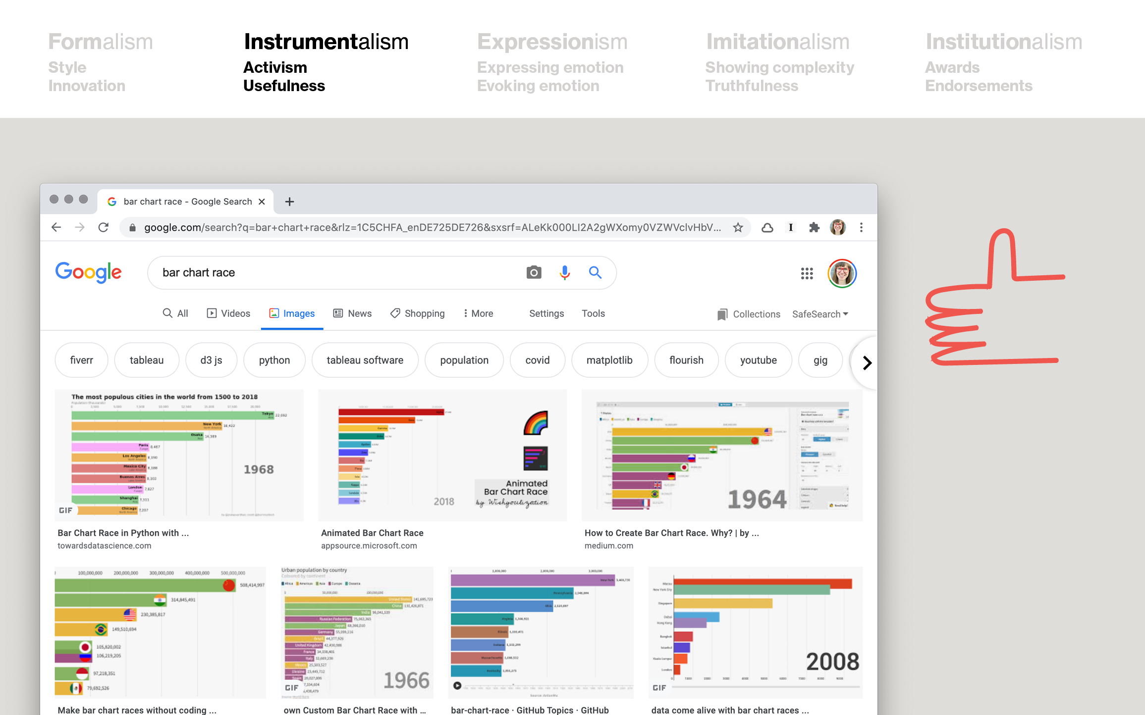
They’re really, really engaging. They’re great at holding attention. They’re not even manipulating or anything. They just work. I’d say they’re a good example of instrumentalism.
But some experts really didn’t (or still don’t) like them, and told everyone so:
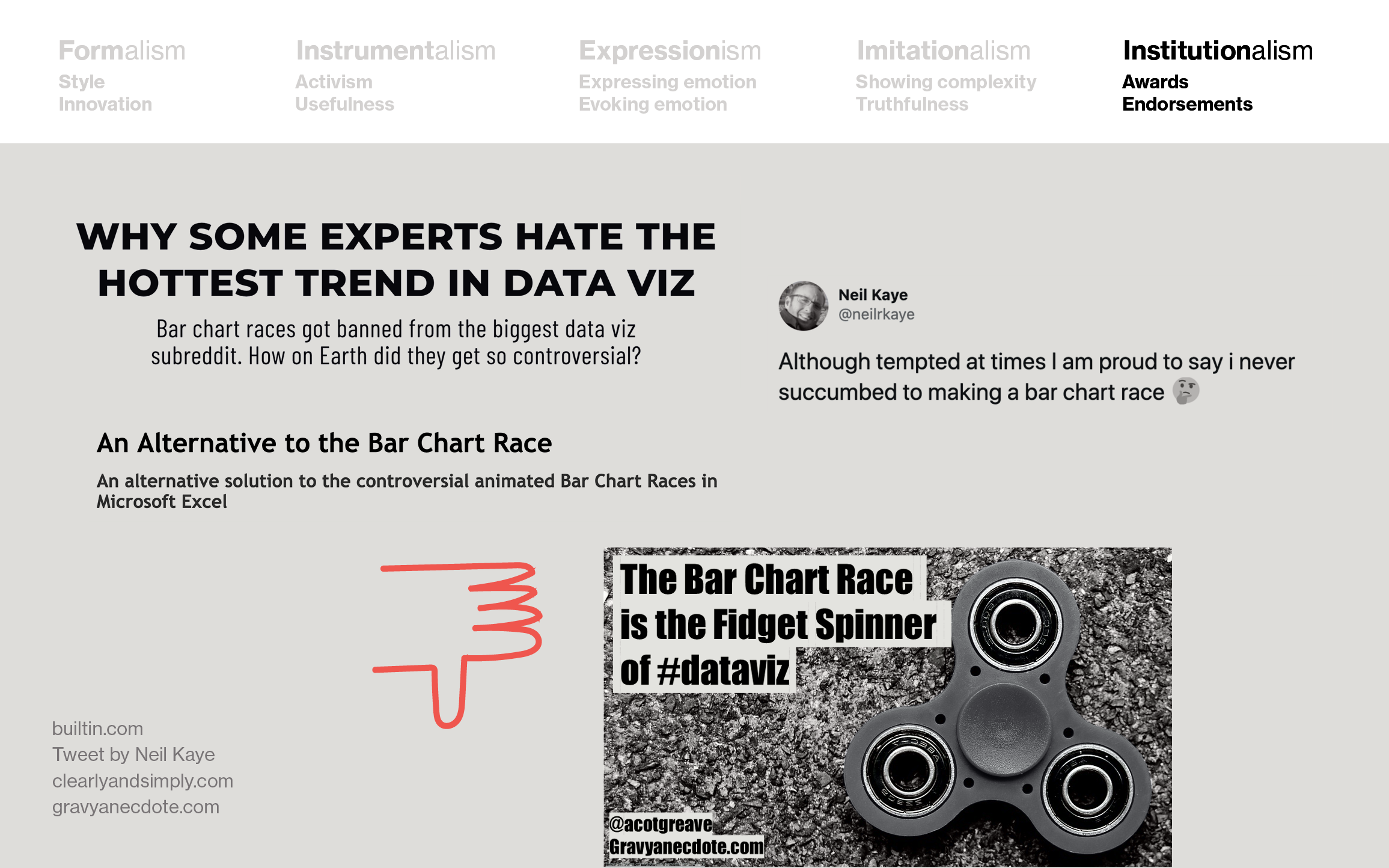
This conflict between “hey, but they’re engaging” and “we don’t like them” was a conflict between Instrumentalism (or Formalism, as one could argue) and Institutionalism.
Models like these help me figure out why certain conflicts or dilemmas exist, and how to think about them – and I hope they can help you, too. In the end, like so often, it truly is about your goals and priorities. To find out what they are, try asking: “What do you want your data visualizations to be judged for?”
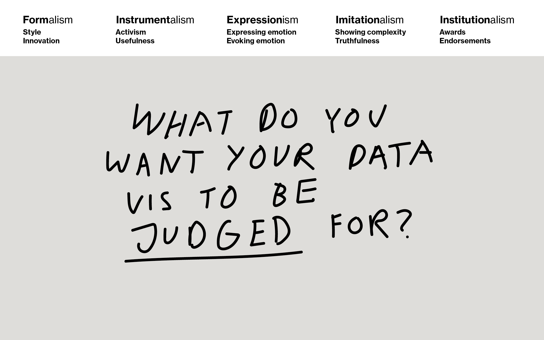
Should your data visualization be judged by how it looks like? Or for what they achieve? Or for how much they evoke emotions? Or if they are a truthful portrayal of the world? Or if experts love them?
If you know your goals, you can ignore rules – or whole rule collections. If you’re trying to evoke emotions, for example, there’s no point in reading my “What to consider” blog post.
Personally, I want my data visualizations to be judged by how beautiful they are, but especially how much they inform or change minds. Data vis principles helped me to design better data visualizations that do exactly that.
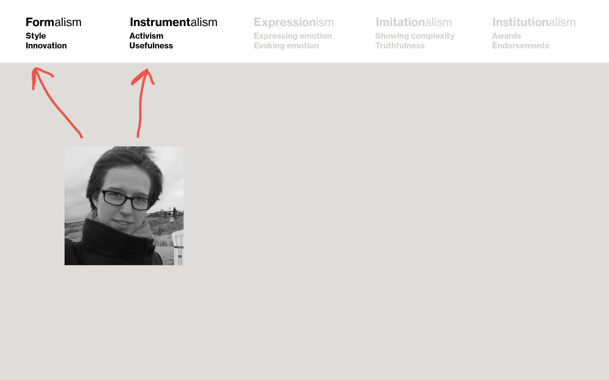
Now I enjoy communicating these principles – in the hope that others who are just starting to learn beautiful, mind-changing, informing data visualizations find them helpful, too.
Thank you for reading through this talk! If you have thoughts, new categorizations, and critique, please email me: (lisacharlotterost@gmail.com) or look me up me on Twitter (@lisacrost).
Reactions from the SHOW audience
Some people found the idea of the “-isms” interesting, and had comments.
Steve Haroz pointed out:
Maybe it’s worth thinking about different goals, not in terms of “choosing one”, but in terms of prioritizing and balancing them. Sometimes understandability is the priority and the aesthetics just need to be not gross. Other times, you’re prioritizing engagement and aesthetics, and you just want a little bit of basic info to be conveyed.
He continued:
One way I think about balancing goals is:
– For some aims, you may get some compliments if you do well at accomplishing them
– For other aims, not accomplishing them sufficiently is a failure.
– It’s not exactly a pleasant thought process, but the goals that result in failure of the project if not achieved are your priority. The rest are a bonus.
It’s an interesting question. I’d love to hear a whole talk about how to think about balancing goals.
Jonas Oesch tried to map this model on another one:
Mapping your categories to what I traditionally thought of as the different goals of visualization, your talk shows that there might be gaps:
Imitationalism → Explorative visualization
Instrumentalism → Explanative visualization
Formalism → Artistic visualization
Expressionism → ?
Institutionalism → ?
Do you think this mapping is valid? And do you have the impression that we have been blind to the goals of expressionism and Institutionalism in the vis community?
I replied that these models might not be comparable but valid (meaning, useful!) in their own regard.
There was also a great question in the Q&A section of the Zoom call, which I forgot about it…I guess we need to wait until the video recording of the talk comes out.
I also want to point out that this ism-idea is not an idea that I thoroughly thought out. I just started thinking about it a few weeks ago. See if it’s useful to you, what parts work for you, which ones don’t, and develop it further.
