Last Sunday, I published a data vis crossword puzzle. If you still want to try to solve it, don’t continue reading! Head over to this blog post and give it a go. It’s fun! (At least that’s what I hope.)
The winner
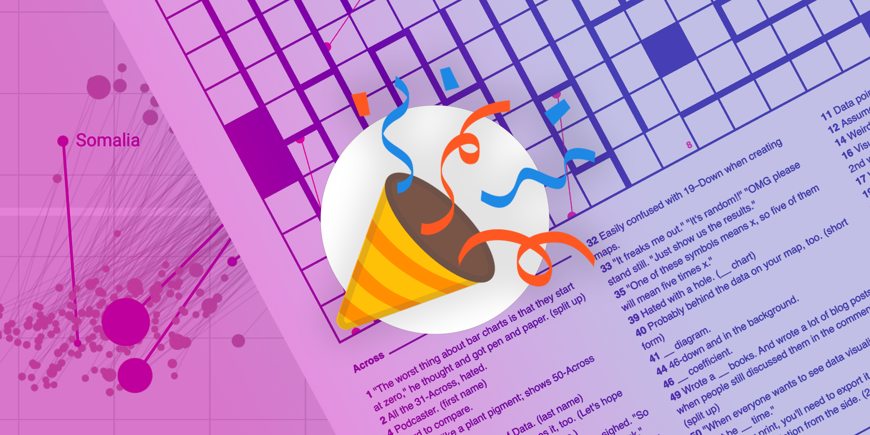
And the winner of this crossword puzzle is…
🥁🥁🥁
…Duncan Geere! The information designer solved the puzzle within 23 MINUTES (!) after me posting it. His price – a data vis book of his choice – is already on its way to his home town Gothenburg. Duncan called it “possibly the nerdiest triumph of my life”.
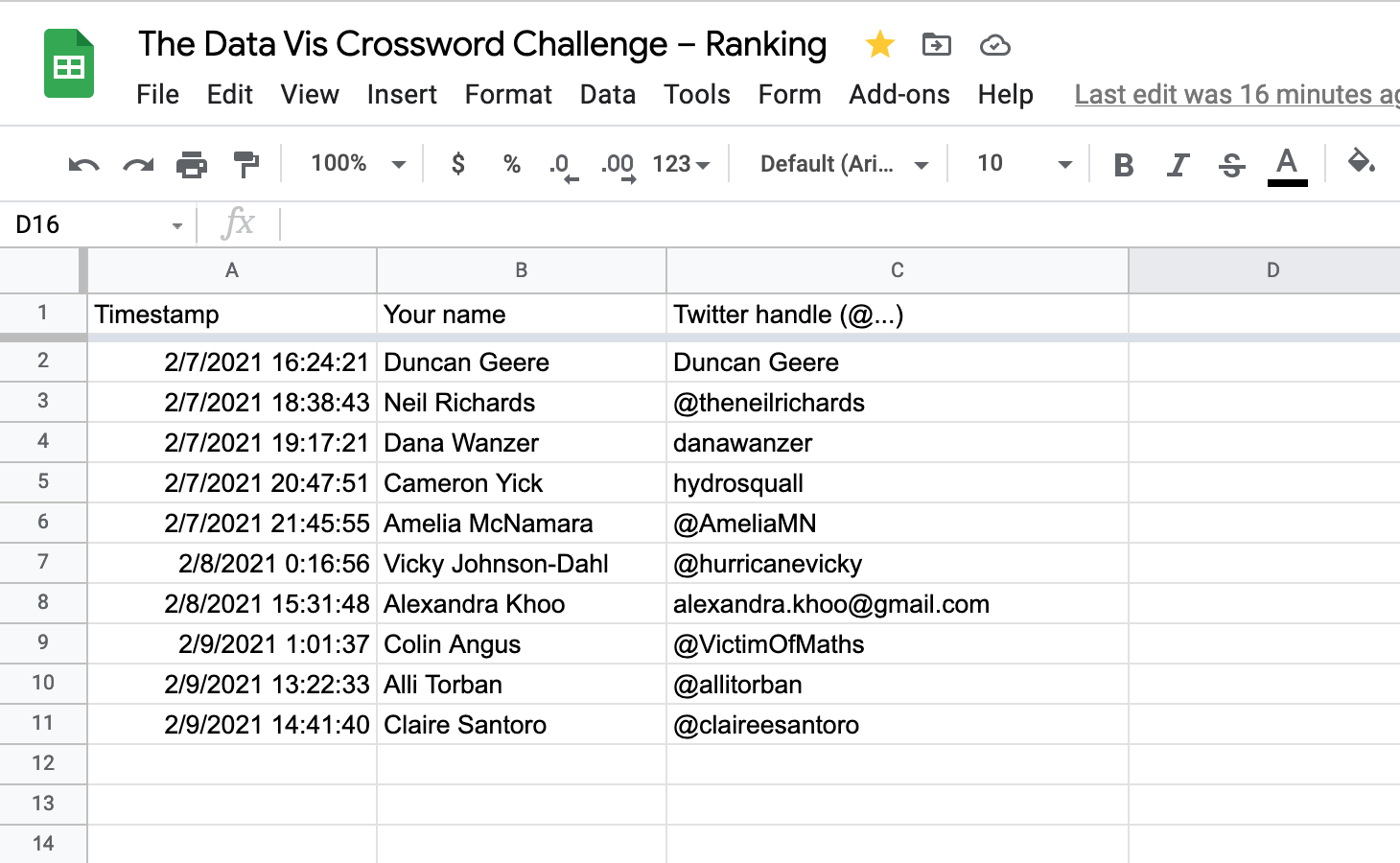
A big, big kudos also to Neil Richards, Dana Wanzer, Cameron Yick, Amelia McNamara, Vicky Johnson-Dahl, Alexandra Khoo, Colin Angus, Alli Torban, and Claire Santoro for scoring 2nd to 10th place.
The solution
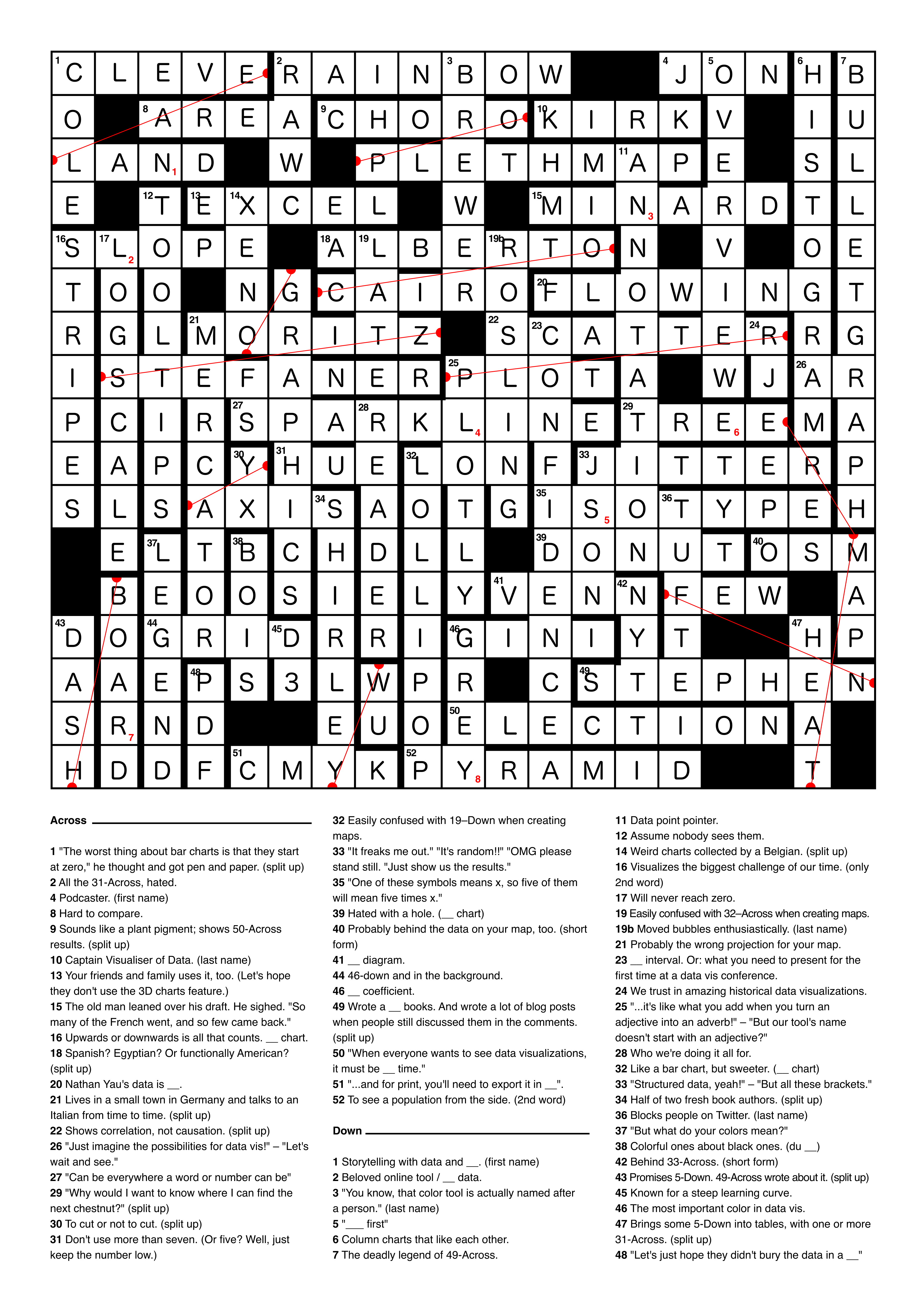
You can also download the solution here as a PDF.
“But what does the clue x have to do with the correct word y?” I got you. Here are all the explantions for every single word:
The solution, in detail – Across
1 – “The worst thing about bar charts is that they start at zero,” he thought and got pen and paper. → CLEVELAND → William S. Cleveland is one of the inventors of the dot plot. It’s an alternative to the bar chart, except it doesn’t need to start at zero.
2 – All the 31-Across, hated. → RAINBOW → The clue is “All the hue(s), hated”. The rainbow color scale has many hues, and many data vis practitioners and cartographers dislike them precisely because of that. Here’s an explanation by Robert Kosara.
4 – Podcaster. (first name) → JON → Jon Schwabish is the host of the PolicyViz podcast, one of the essential podcasts in the data vis scene.
8 – Hard to compare. → AREA → Uh, a tricky one. Area is a visual variable that’s hard to compare. For example, it’s hard to compare the size of one rectangle with another one – harder than to compare two simple bars (which are encoded by length).
9 – Sounds like a plant pigment; shows 50-Across results. → CHOROPLETH MAP → “Choropleth” sounds like “Chlorophyll”. Chloropleth maps often show election results.
10 – Captain Visualiser of Data. (last name) → KIRK → Andy Kirk is behind visualisingdata.com – and shares the last name with Captain Kirk from Star Trek.
13 – Your friends and family use it, too. (Let’s hope they don’t use the 3D charts feature.) → EXCEL → Excel is so widely used that it’s maybe the only software with extensive data vis features that your friends and family will know. Sadly, you can also create 3D charts with it.
15 – The old man leaned over his draft. He sighed. “So many of the French went, and so few came back.” → MINARD → When Charles Joseph Minard was already 88 years old – one year before his death – he designed his famous map of Napoleon’s Russian campaign. It shows that the size of Napoleon’s army decreased in size drastically, mostly because of the harsh temperatures in Russia.
16 – Upwards or downwards is all that counts. __ chart. → SLOPE → Slope charts just show a general trend: Does the value go up? Or down?
18 – Spanish? Egyptian? Or functionally American? → ALBERTO CAIRO → Alberto Cairo is from Spain and lives in the U.S. Cairo is the capital of Egypt. He wrote the book “The Functional Art”.
20 – Nathan Yau’s data is __. → FLOWING → Nathan Yau is behind the website flowingdata.com.
21 – Lives in a small town in Germany and talks to an Italian from time to time. → MORITZ STEFANER → Moritz Stefaner lives in the town of Lilienthal in the north of Germany. Together with the Italian professor Enrico Bertini, he’s also the host of the Data Stories podcast.
22 – Shows correlation, not causation. → SCATTERPLOT → Scatterplots are great to show the correlation between two variables. They don’t show if one of the variables is the cause for the behavior of the other variable, though.
26 – “Just imagine the possibilities for data vis!” – ”Let’s wait and see.” → AR → AR is a technology that might be useful for data visualization but is only at the beginning of being explored for it.
27 – “Can be everywhere a word or number can be” → SPARKLINE → That one could be googled well! Tufte (see 36-Down) coined the term “sparkline”, which is a tiny line chart mid-sentence or e.g. in a tooltip and simply shows a trend.
29 – “Why would I want to know where I can find the next chestnut?” → TREEMAP → That’s just a joke – a treemap neither looks like a tree nor like a map. But an actual tree map could show you where the next chestnut tree is!
30 – To cut or not to cut. → Y AXIS → There was (still is?) this big discussion about if you should cut y-axes or not. Here’s a great article about it.
31 – Don’t use more than seven. (Or five? Well, just keep the number low.) → HUE → “Don’t use too many colors/hues because it looks confusing and like confetti and it becomes harder and harder to distinguish between them” is a commonly mentioned data vis principle.
32 – Easily confused with 19–Down when creating maps. → LON → Lots of people – especially data visualiser who are not studied cartographers – keep confusing latitude (lat) and longitude (lon). 19-Down is lat, so this one is lon.
33 – “It freaks me out.” “It’s random!!” “OMG please stand still. “Just show us the results.” → JITTER → When the New York Times showed a live gauge with a jittering needle to show the US election results 2016, Twitter freaked out. The good outcome for Trump didn’t help.
35 – “One of these symbols means x, so five of them will mean five times x.” → ISOTYPE → Isotype is a picture language developed in the 1920s by Otto Neurath and Gerd Arntz. According to Wikipedia, “it consists of a set of standardized and abstracted pictorial symbols to represent social-scientific data with specific guidelines on how to combine the identical figures using serial repetition”.
39 – Hated with a hole. (__ chart) → DONUT → The pie chart is traditionally disliked (which I don’t agree with). The donut chart is very similar to the pie chart but has a hole.
40 – Probably behind the data on your map, too. (short form) → OSM → OpenStreetMap.org (OSM for short) is a map that’s created (for free) by people on the internet and is used by mapping tools like Mapbox, Mapnik or Datawrapper.
41 – __ diagram. → VENN → Basically two overlapping circles! Here’s the Wikipedia page.
44 – 46-down and in the background. → GRID → 46-down is “Grey” – and the data visualization grid (e.g. of a line chart or scatterplot) is grey and behind the data points.
46 – __ coefficient. → GINI → The Gini coefficient measures income/wealth inequality. (Wikipedia)
49 – Wrote a __ books. And wrote a lot of blog posts when people still discussed them in the comments. → STEPHEN FEW → Stephen Few wrote a few (four at least) books. There were many great discussions happening in the comments to his blog posts between all the big names in the field, back when Twitter wasn’t a thing.
50 – “When everyone wants to see data visualizations, it must be __ time.” → ELECTION → Elections are some of the few very big news events that are also very data-driven. It’s a busy time for graphics team at newspapers.
51 *– “…and for print, you’ll need to export your it in __”. * → CMYK → CMYK is a color model. If you want to print something, it will be printed with Cyan, Magenta, Yellow, and Black (K), so it makes sense to export it in this color model.
52 – To see a population from the side. (2nd word) → PYRAMID → Population pyramids show the age structure of populations.
The solution, in detail – Down
1 – Storytelling with data and __. (first name) → COLE → Cole Nussbaumer Knaflic is famous for her books & workshops about “Storytelling with Data”.
2 – Beloved online tool / __ data. → RAW → RAWGraphs is a online tool for visualizing data. “Raw data” is data that’s not cleaned up yet.
3 – “You know, that color tool is actually named after a person.” (last name) → BREWER → Cynthia Brewer is a professor for cartography and behind the popular color tool colorbrewer2.org.
5 – “___ first” → OVERVIEW → “Overview first, zoom and filter, then details-on-demand” is a “data vis mantra” by Ben Shneiderman.
6 – Column charts that like each other. → HISTOGRAM → Histograms look a bit like column charts without gaps between the columns. They basically moved closer together. That’s what you do when you like each other!
7 – The deadly legend of 49-Across. → BULLETGRAPH → 49-Across is Stephen Few, who designed the bullet graph (and bullets can be fairly deadly).
11 – Data point pointer. → ANNOTATION → Annotations help, among others, to point the reader to certain data points.
12 – Assume nobody sees them. → TOOLTIPS → A slide quote from Archie Tse, editor at the New York Times, who said in a talk: “If you make a tooltip or rollover, assume no one will ever see it.”.
14 – Weird charts collected by a Belgian. → XENOGRAPHICS → Xeno.graphics is a website by the Belgian Maarten Lambrechts on which he collects “weird but (sometimes) useful charts”.
16 – Visualizes the biggest challenge of our time. (only 2nd word) → STRIPES → Warming or climate stripes are a visualization by Ed Hawkins showing global warming with colors.
17 – Will never reach zero. → LOGSCALE → Logscales can’t reach or include zero, as I explained in detail over here.
19 – Easily confused with 32–Across when creating maps. → LAT → Lots of people – especially data visualiser who are not studied cartographers – keep confusing latitude (lat) and longitude (lon). 32-Across is lon, so this one is lat.
19b – Moved bubbles enthusiastically. (last name) → ROSLING → Hans Rosling was famous for his TED talks, in which he used animated bubble charts to enthusiastically talk about global developments.
21 – Probably the wrong projection for your map. → MERCATOR → The Mercator projection is probably the most famous map projection and useful e.g. for inner-city navigation – but should not be used for maps that show multiple countries (and are close to the poles).
23 – __ interval. Or: what you need to present for the first time at a data vis conference. → CONFIDENCE → Confidence! That’s what you need at any conference. A confidence interval is the range in which (often, but not always) 95% of the estimated data points will fall.
24 – We trust in amazing historical data visualizations. → RJ → RJ Andrews is @infowetrust on Twitter, wrote a book called “Info We Trust” and is known for unpacking and showing beautiful historical data visualizations.
25 – “…it’s like what you add when you turn an adjective into an adverb!” – “But our tool’s name doesn’t start with an adjective?” → PLOTLY → Plotly is a data vis tool founded in 2012, back when a lot of startups ended with -ly.
28 – Who we’re doing it all for. → READER → No explanation needed – we want readers to read, enjoy and learn through our data visualizations.
32 – Like a bar chart, but sweeter. (__ chart) → LOLLIPOP → Lollipops are sweet. Lollipop charts are like bar charts, but with a line and a circle at its end instead.
33 – “Structured data, yeah!” – “But all these brackets.” → JSON → JSON is structured data – but especially if you’re just starting out with data vis, or work with tools that don’t let you use them as data sources (like Datawrapper), you get frustrated by it and all its brackets.
34 – Half of two fresh book authors. → SHIRLEY WU → Shirley Wu and Nadieh Bremer wrote the just published book “Data Sketches”.
36 – Blocks people on Twitter. (last name) → TUFTE → Edward Tufte is known for blocking people on Twitter.
37 – “But what do your colors mean?” → LEGEND → Color keys or legends show your readers what your colors represent in your visualization.
38 – Colorful ones about black ones. (du __) → BOIS → W. E. B. Du Bois and his team created beautiful, colorful data visualizations about institutionalized racism.
42 – Behind 33-Across. (short form) → NYT → 33-Across is the jittering needle, and the New York Times (short: NYT) created that one.
43 – Promises 5-Down. 49-Across wrote about it. → DASHBOARD → 5-Down is “overview”. A dashboard promises to give an overview (where you then filter on demand). 49-Across is Stephen Few, who wrote the book “Information Dashboard Design”.
45 – Known for a steep learning curve. → D3 → D3.js is a Javascript library that is the gold standard for coding data visualizations. It comes with some tricky concepts one needs to understand first.
46 – The most important color in data vis. → GREY → Not sure actually who said that first, but it’s true. Andy Kirk talks about the importance of grey here.
47 – Brings some 5-Down into tables, with one or more 31-Across. → HEAT MAP → 5-Down is “overview”, and 31-Across are “hue”s. Rows and columns full of numbers can be hard to parse until you represent them with colors in a heat map.
48 – “Let’s just hope they didn’t bury the data in a __“ → PDF → Sometimes, your most important data is not in a neat machine-readable CSV or JSON, but in a PDF. There are tools helping you to get it out of there; it’s still a pain.
How to get to the ranking list
The little red numbers in the crossword lead you to this URL:
bit.ly/NLNLSERY
This link leads to a Google Form:
After entering your name and hitting Submit, you get a link to the Google Sheets ranking list:
How it went
It went well! I think it made people happy, and that was my goal. Hopefully, it gave them a nicely spent half an hour or so.
It was not easy to solve, as people kept telling me on Twitter (“So much awesomeness. As soon as I read 21-across I heard his laugh in my head :). Definitely not easy to finish the whole thing though!” – Justin)…but ten people made it to the ranking list, and that’s even more than I thought, to be honest.
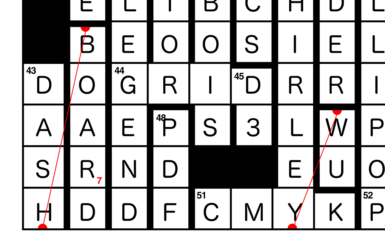
But I underestimated how many wrong answers fit in that puzzle a bit too well. For example, the solution to 43-Down was “dashboard”. But if you didn’t know the answer and just guessed that the last word would be “chart”, the letter no. 7 that you needed to get the right URL still would have been “R”:
I guess that’s something to consider for future crosswords (you know, in a year or two or ten).
Where to find more data vis crosswords
You should make one! If you had fun solving that data vis puzzle, you might be great at actually creating one.
Alexandra Khoo, who came in 7th, created her own crossword as a reaction to the data vis crossword. You can find it in this Google Sheets. “It’s themed in line with Valentine’s Day with bits of dataviz inspiration thrown in,” she explains in the Data Vis Society Slack.
And Cédric Scherer pointed me towards the R-themed crosswords by Georgios Karamanis.
As always, find me on Twitter or via email: lisacharlotterost@gmail.com.