tl;dr:I believe that the field of data vis would benefit from a clear line between art and design. I believe that we need that boundary to judge both forms according to different criteria and therefore more fairly.
Data art, data vis. Who decides what is which? Some data vis projects feel like a third category to me: To artistic to be considered by design questions. But too designed to be considered art and judged as art (for example data journalism). They want to be everything at once. And indeed, data art and data vis are currently mixed together: in books, in conferences, in client mindsets, in creative approaches.
Why is that a problem? There is good and bad design, and since I studied art for one semester in Oxford, I believe there is good and bad art. But data vis that is considered good art can be considered bad design. And data vis that is considered bad art can be excellently designed. Art and design should be judged by different criteria.
What are these criteria art and design are judged by? Opinions about that differ, and I’m curious to hear your one. This is mine: Design needs to be functional. I studied and taught visual communication, and I tried to make my students ask constantly: “What does it communicate me?” In data vis, that question needs to be answered. The clearer, the better. Data art, on the other hand, doesn’t need to be functional. If a student would ask me for feedback for her data art project, I would judge strength of idea / concept or strength of aesthetics, but not readability. I want a piece of art to stimulate emotions or thoughts in me; I want a piece of data vis to explain me the world. I want Data art, like lots of other art, to raise questions. I want Data Vis to answer them.
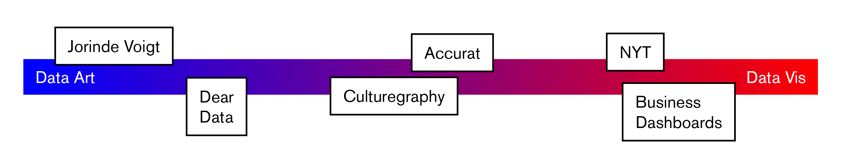
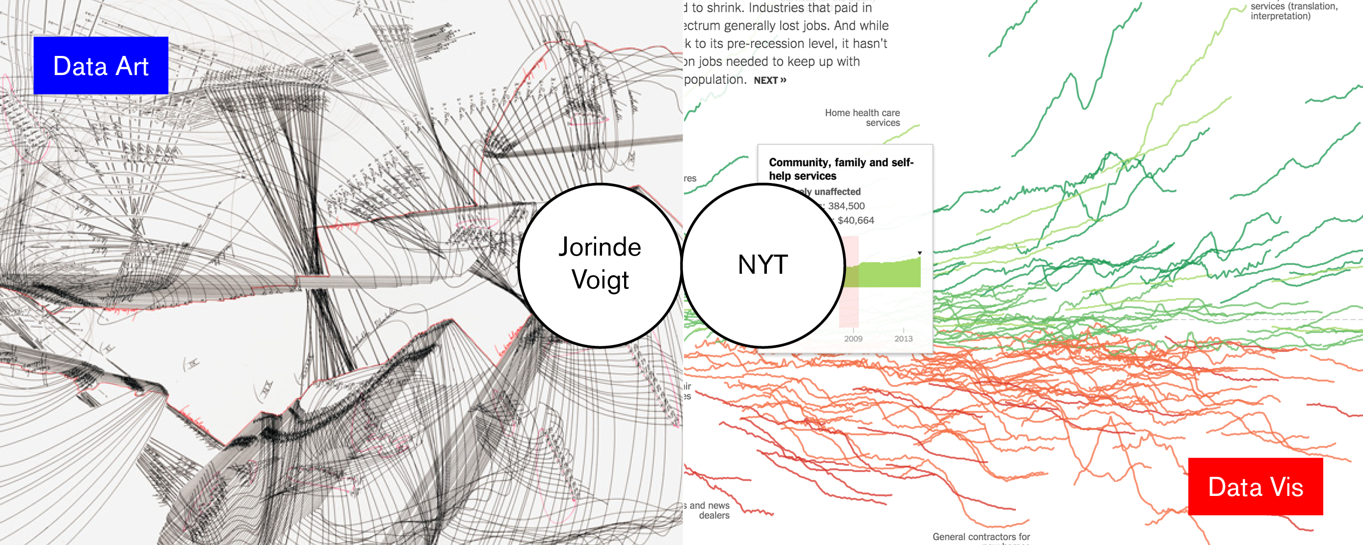
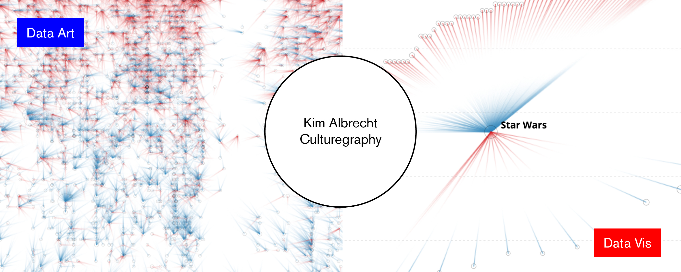
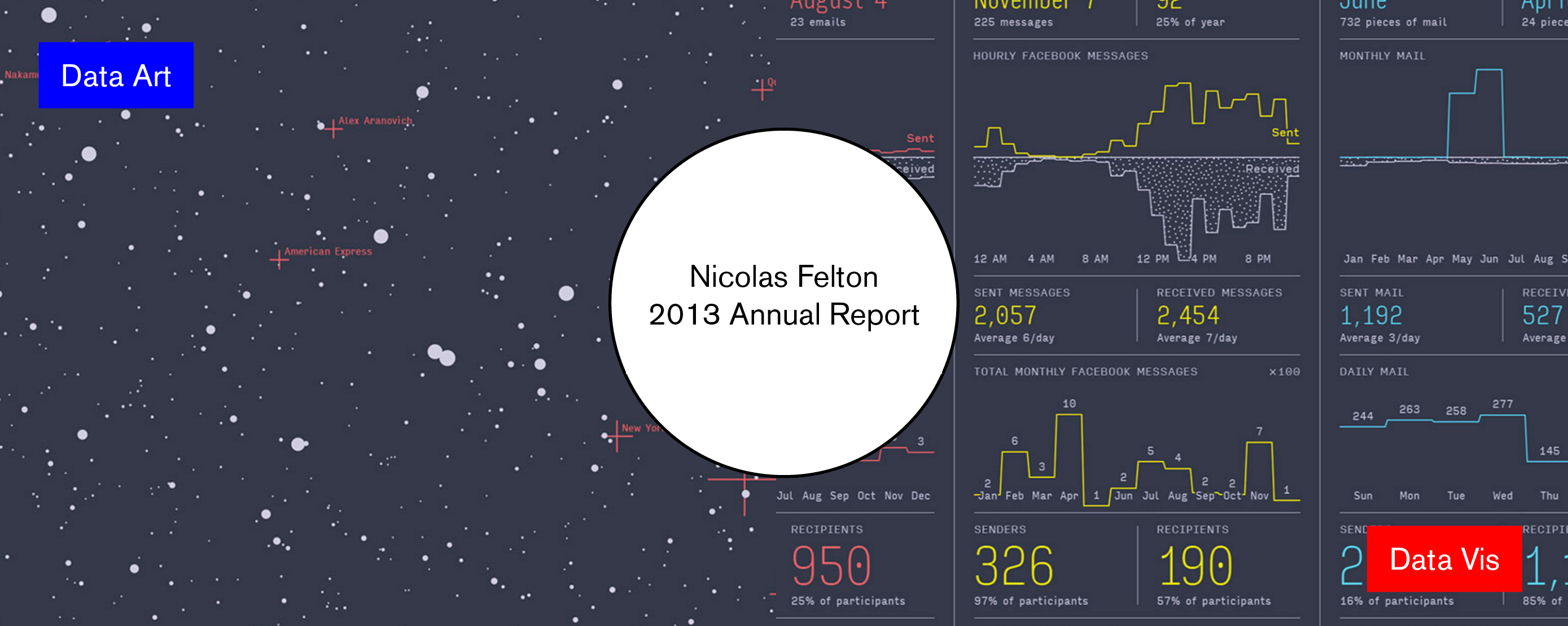
Of course, design is a “functional art”, as Alberto Cairo describes it famously. Every data vis piece needs to have parts of “art” in them and the other way round. (The best projects might be the ones combining data art and data vis, as the examples by Nicholas Felton and Kim Albrecht show.) It’s not binary – it’s a scale. So the borders are not that discrete. But even talking about priorities helps. “Never sacrifice readability for aesthetics” is a guideline designers should have - and artists shouldn’t be bothered with.
So what is the consequence of unclear borders between Data Vis and Data Art? I can see two big ones: A) I think, creators of both kinds are not as consistent as they could be. Artists feel bad if they don’t label their axis, because Tufte told them to do so. And data designers try to be as innovative and artistic in their designs as artists, for the sake of readability and functionality. Projects of both data artists and data designers can become better if they stand to who they are. B) The feedback on their work does neither benefit artists nor designers. I can’t judge Nicholas Felton’s work as good or bad, because I don’t know if he intended to make art or design with his self tracking project. But I really hope that Giorgia Lupi and Stefanie Posavec wanted to make an artistic experiment: In my eyes, their work is not well designed. But it’s really good art and I’m glad it exists.
The only benefit (I can see) that a blurry border between art and design might have: a constant inspiration between the two fields. Design can benefit a lot from the questions raised and the aesthetics used in data art. And art can get inspiration from the content that gets designed. But when I look at the rest of the graphic design and art scene, I need to notice that the inspiration transfer works extremely well, without having them so mixed up.
Just in case that wasn’t clear: I love data vis and I love data art. Both are very important in my life. But no, it doesn’t help to compare apples with oranges.