In the past few weeks I wasn't working so much on results, but more on a way to make results better in the future: I got my teeth into d3.js. I learned the basic concepts and wrote them down in a GitBook, to be sure that I totally understood them. All the things I learned I tried on a project that is rather personal; it is data that I collected with my friends and that I won't be able to show here without getting in trouble with them.
But today I was working on a evening/night project that I will show here. Two weeks ago I discovered the work of Paul Blickle and liked especially the very complex work about unemployment rates he created with the Datajournalism team at ZEIT Online.
They did a great job in showing the unemployment rates for all districts in Germany, for each month from 2006 to 2014. Because of the colours used you can easily detect the seasonal unemployment (in the winter, unemployment is usually higher), and the user gets a lot of helpful sort functions. Nice.
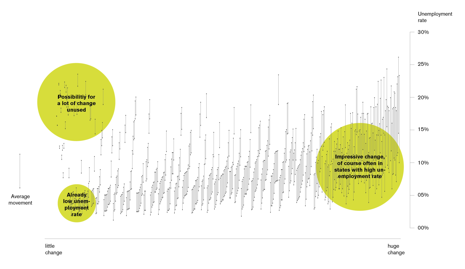
One thing, however, was lacking for me in this great info graphic. When I was skimming the coloured bars, it seemed like the unemployment in some districts changed massively, but was still worse than in other districts, in which it didn't change so much (because the unemployment was low from the very beginning). And I wanted to have this phenomena shown as a graphic: How big are the changes of the unemployment rates for all the districts; how much "travelled" the rate?
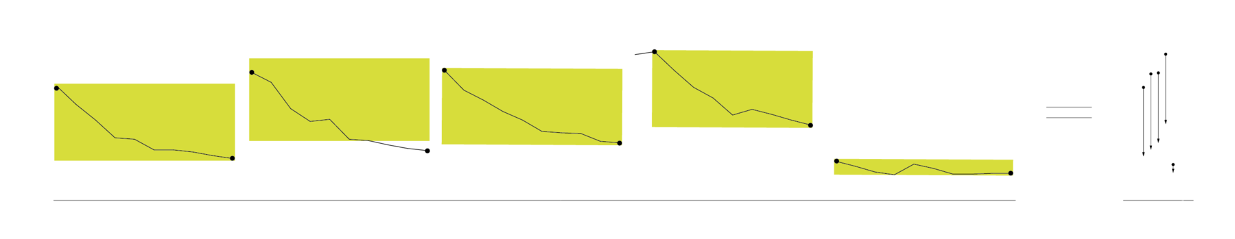
To show that in the graphic above, I used the Google Spreadsheet they provided. First, I got rid of all months except September, to avoid the seasonal changes. Then I found the MAX and MIN value in each row, got the difference of the two values (the change) and sorted by this distance. The result is a graph that shows the highest and lowest unemployment rate of all the districts as points instead of in a graph as we are used to:
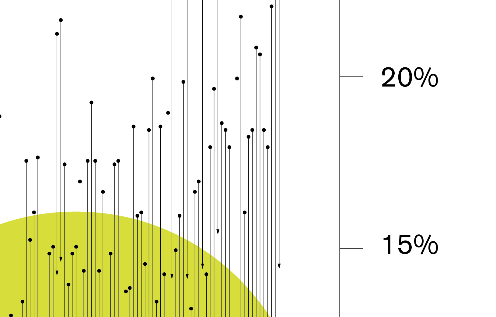
What can we see? We see that a lot of districts with a high unemployment rate did a quite good job in getting it down – that's a the right-hand side of the graphic. The biggest change has seen the district "Kyffhäuserkreis", which had unemployment rate of 23% in 2006 and brought it down to 10% in 2013.

We can also see that some districts which had also high unemployment rates and therefore a high possibility to change, didn't perform so well: They stay at the top left corner of the graphic.
But of course, it is somehow unfair to measure the change; especially for the districts with an already very low unemployment rate. They are at the bottom-left corner.
Now, hover effects and sorting possibilities would be nice. Sigh. Well, I'm getting there.