The composition of everything two-dimensional like illustrations, photographies and magazine spreads has been a skill I wanted to groove for at least the past eight years. It is still one of my biggest interests in visual communications.
What is the challenge? Well, if you have an axis with the two poles »tension« and »harmony«, you want your composition right in the middle (if you paint, maybe a little bit more to »tension«, in magazine design maybe a little bit more to »harmony«.) To achieve this, I personally use some principles from which I will list a collection here:
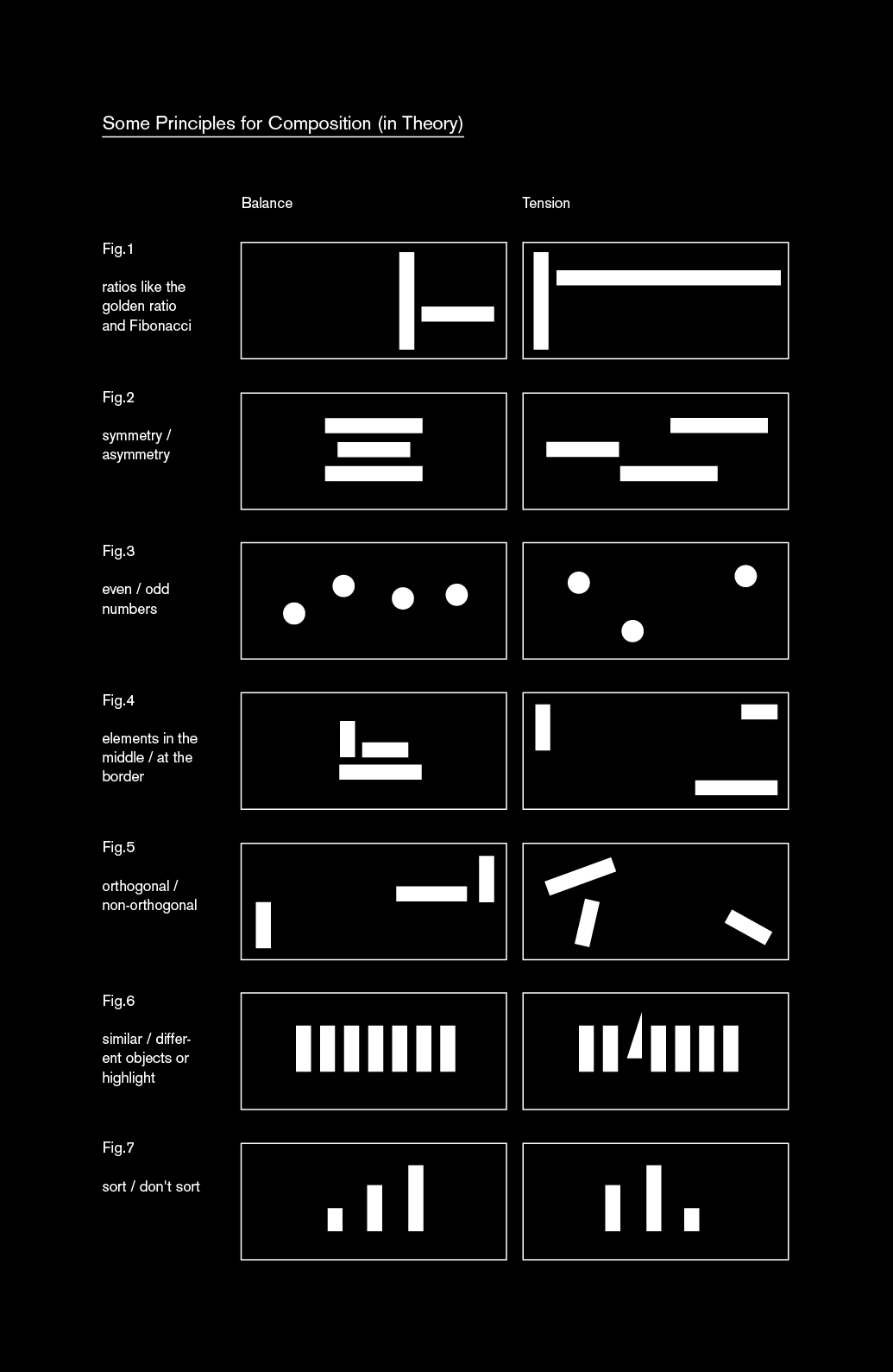
Principles for Composition
- Fig 1: Use ratios like the golden ratio and the Fibonacci numbers to create harmony; ignore them to create tension.
- Fig 2: Use symmetry to create harmony (»Symmetrie ist die Ästhetik des kleinen Mannes«, as my father used to quote); use asymmetry to create tension.
- Fig 3: Use even numbers to create harmony; use odd numbers for elements to create tension – especially if you can count them with a glimpse (everything below 7).
- Fig 4: Bring elements in the middle of your page to create harmony; bring elements at the border of your page to create tension.
- Fig 5: Arrange elements orthogonal to the border of your page to create harmony; arrange elements non-orthogonal to create tension.
- Fig 6: Use similar objects to create harmony; use different objects and/or a highlight to create tension.
- Fig 7: Sort objects to create harmony, don’t sort them to create tension.
As one can see, I especially often use a triangular composition – it’s one of the easiest forms of arranging something so that it looks well composed. »The Sistine Madonna« by Raffaello Sanzio da Urbino is based on the same principle; back then (1513) surely to remind of the holy trinity (like many other art works around this time):
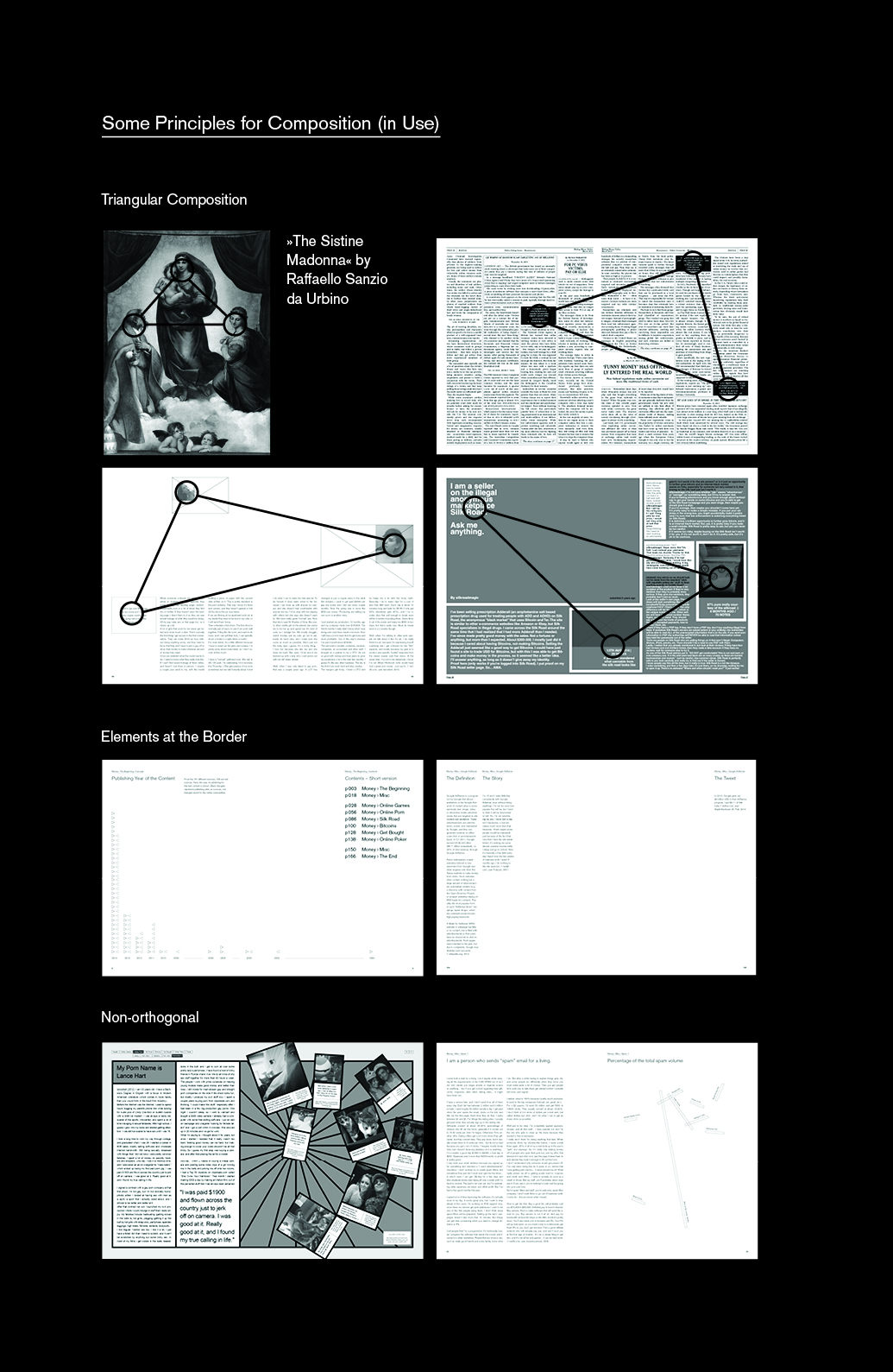
Nowadays one can bring more tension in the own work with making the sides of the triangles as different as possible. One long side and two short (imaginative) sides of a triangle are considered more interesting than a equilateral triangle like the one from Raffaello.
Balance & Harmony
Basically, what creates tension and what one can see in almost all the principles, is contrast. A long time I thought harmony and balance are the same – but balance is tension, so at the same time balance is the balance between harmony and tension. With time, only harmony gets dull and boring. The human species needs variety and diversion, and so needs the magazine. This has always been one of the greatest struggles in visual communication for me: To find the point on an axis between these both extremes that’s perfect for the reading experience is tricky. You want the reader to understand the design language in the magazine – so you’ll need one. But you also want to surprise the reader and get bold on this or that page, so you need to break out of your magazine language. I guess the best magazine is the one where you get surprised while flicking through it, but in which you clearly see the difference to the ads in the mag. In the end, you need a compromise between tension and harmony, between quiet and loud, between your system (grid) and breaking out, between new and traditional – and between emotion (communication) and ratio (information), as Francesco Franchi points out in his book »Designing News«: »The journalist and designer must move within a spectrum that includes raw information at one end and communication at the other, staying somewhere in the middle. Consciously choosing this position ensures that they do not fall into the trap of either supplying a plethora of facts and figures or, at the opposite end of the spectrum, editorializing by guiding readers’ opinion and employing an aesthetic that is an end in itself.«
Read more about that topic in my mini blog post »The Difference between Harmony and Balance«