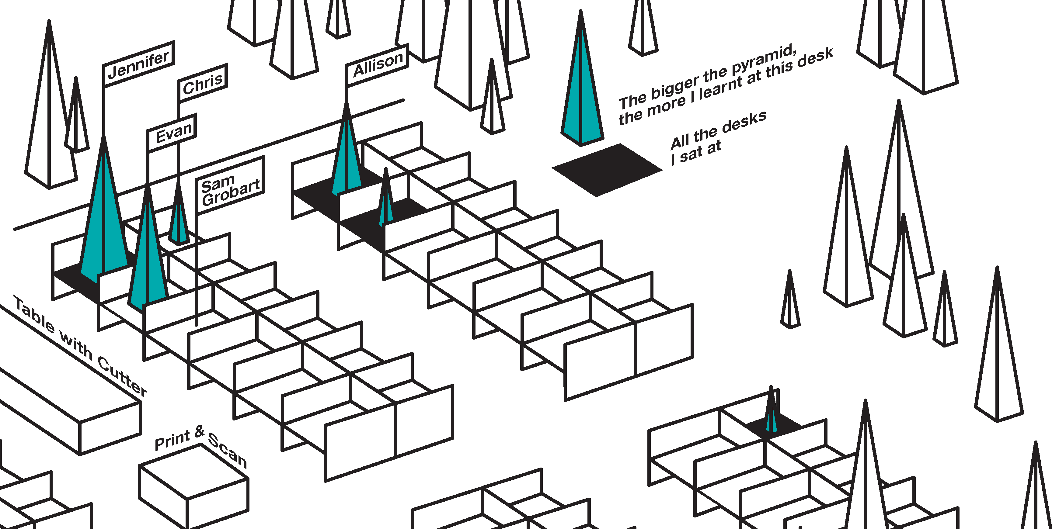
"To understand something, write about it," they say. I'm curious. So I started writing: first on my personal blog, mostly about data vis when I got into the field around 2014. There was so much to learn! Since November 2017, I get paid by Datawrapper to do just that: Figuring things out, and taking you all on a tour with me:
Hi! My name is Lisa  .
.
I write, create, talk & host events about data vis, currently for Datawrapper in Berlin.
Here's what I've worked on.
May 31, 2026
| "Botanischer Volkspark Pankow Blankenfelde. A park that’s nicely rel..."
| "Botanischer Volkspark Pankow Blankenfelde. A park that’s nicely rel..."
May 29, 2026
"Today I went shopping close to Hackescher Markt, which, despite not..."
"Today I went shopping close to Hackescher Markt, which, despite not..."
May 20, 2026
| "My first (short, German) talk in years (!) is happening tomorrow at..."
| "My first (short, German) talk in years (!) is happening tomorrow at..."
Selected projects
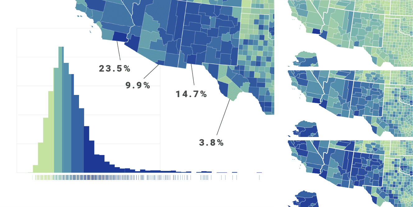
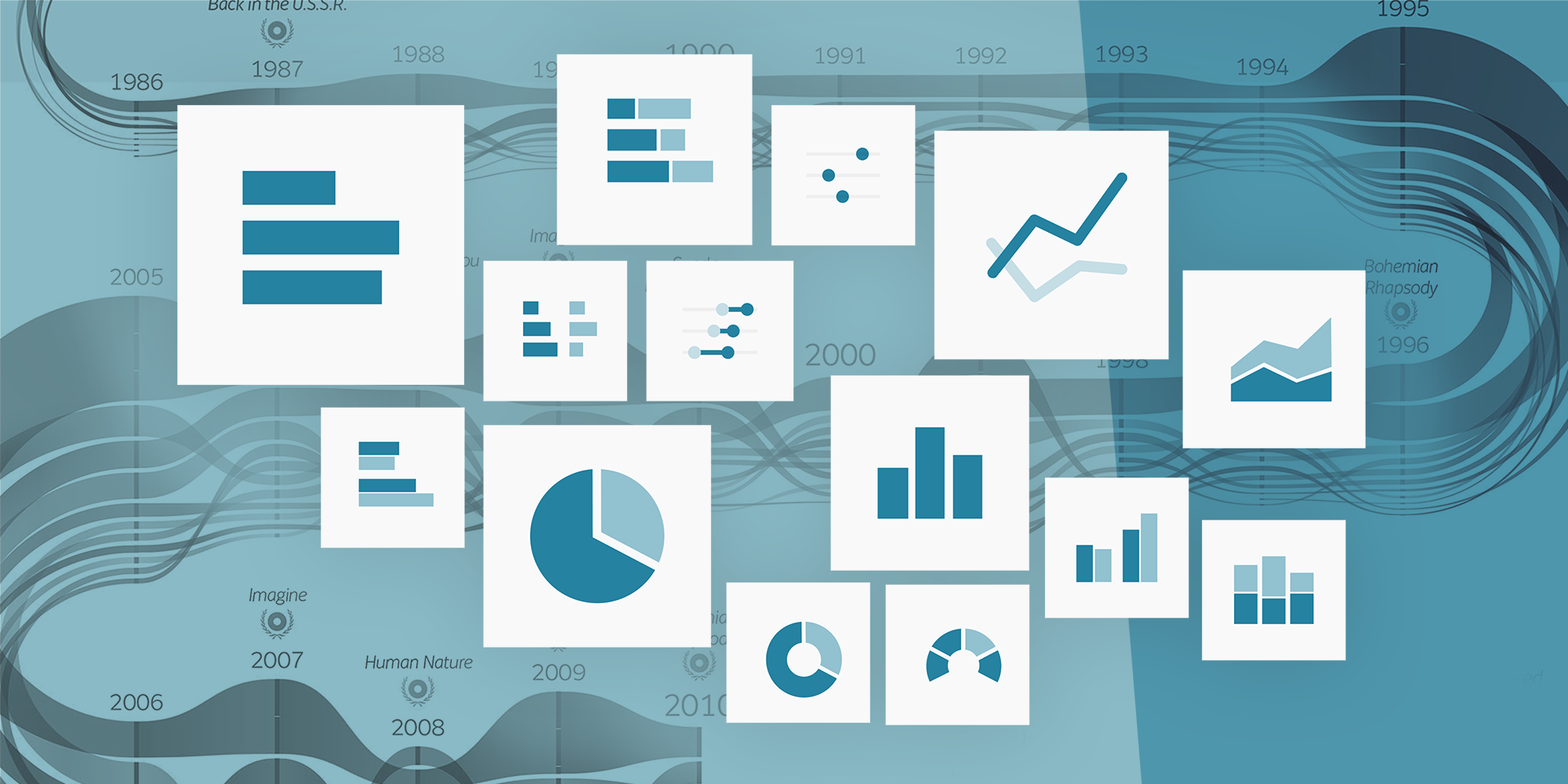
Before delving into data vis, I studied print design for six years. Here you can find some of these older works, but also data visualizations I've created for newsrooms, in my free time, and, most recently, for the Datawrapper blog:
Organized events
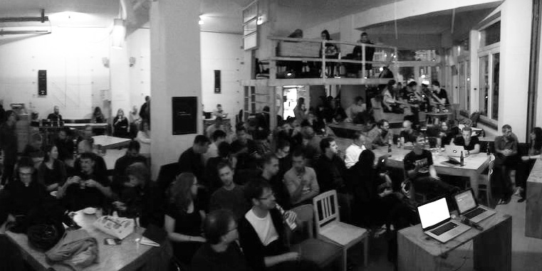
I started going to conferences and meetups about data visualization as soon as I had the epiphany that "Whoa, this is a real field, and people actually do this for a living!" At some point, I wanted to bring data vis enthusiasts together myself – to meet them, but to also give back to a community that had given me so much. So far, I've organized three things:
Selected talks
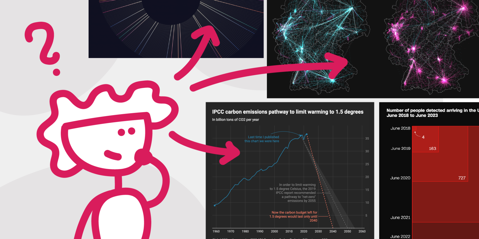
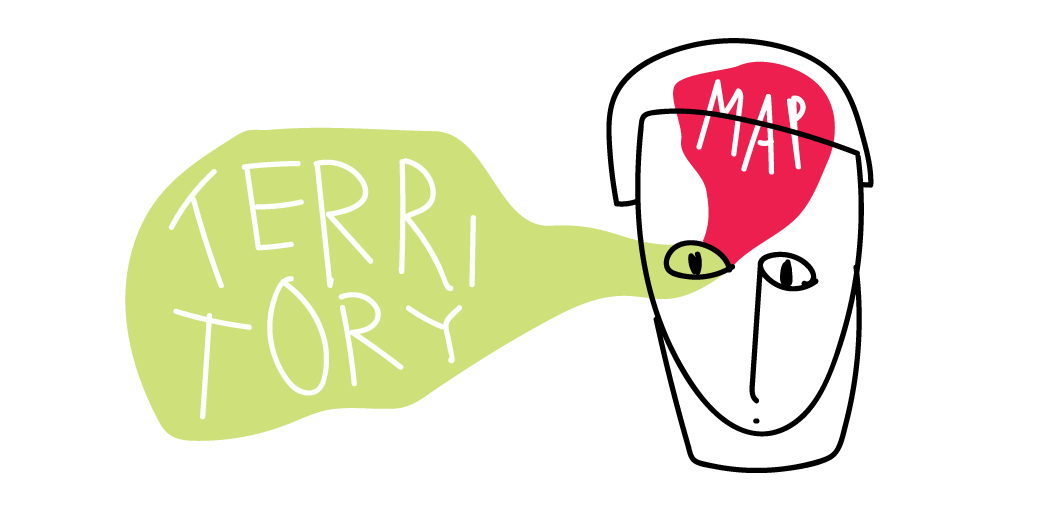
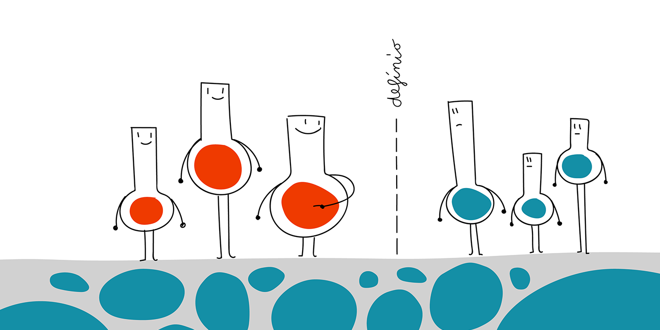
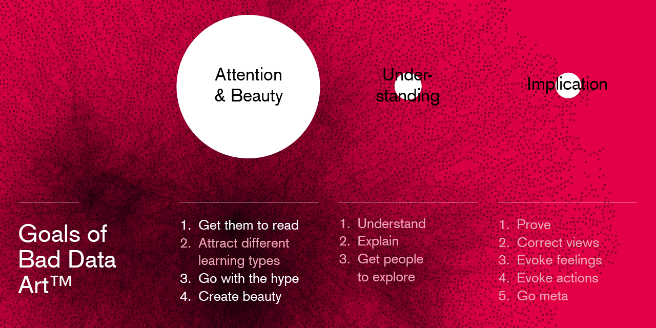
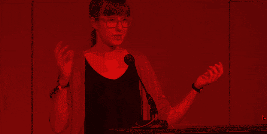
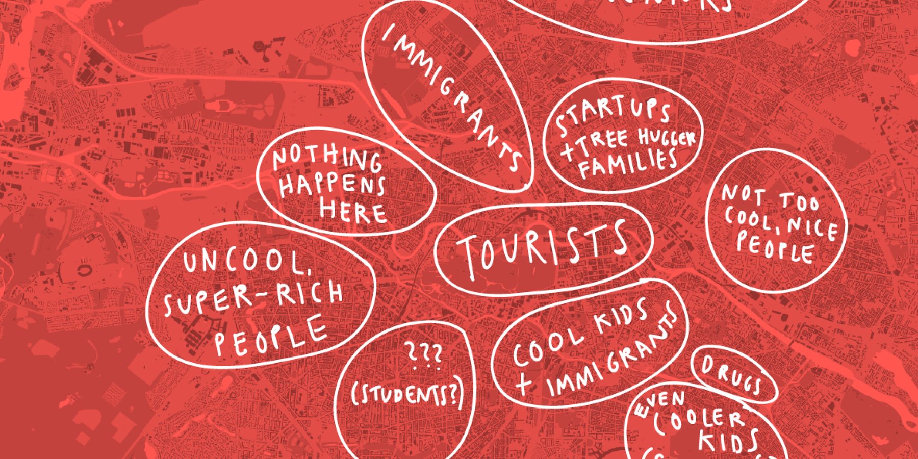
Talks let me combine images (slides) and text (my speech) in a more tension-building, direct way than blog posts. I taught data vis at different universites and have given general data vis workshops over the years – but here you can find the talks I used as an excuse to research a completely new question:

About me
Lisa Charlotte Muth is a Berlin-based writer for the data visualization tool Datawrapper. Before that, she studied graphic design for six years and created data visualizations for newsrooms like Tagesspiegel, Bloomberg, SPIEGEL, ZEIT Online, and NPR as an OpenNews Fellow. She co-hosted the Berlin Data Vis meetup, started the global, digital Data Vis Book Club, writes a handbook, and tries to live a good life.