Talks let me combine images (slides) and text (my speech) in a more tension-building, direct way than blog posts. I've given some general data vis workshops and talks, but here I show the talks I used as an excuse to research a completely new question:
Talks
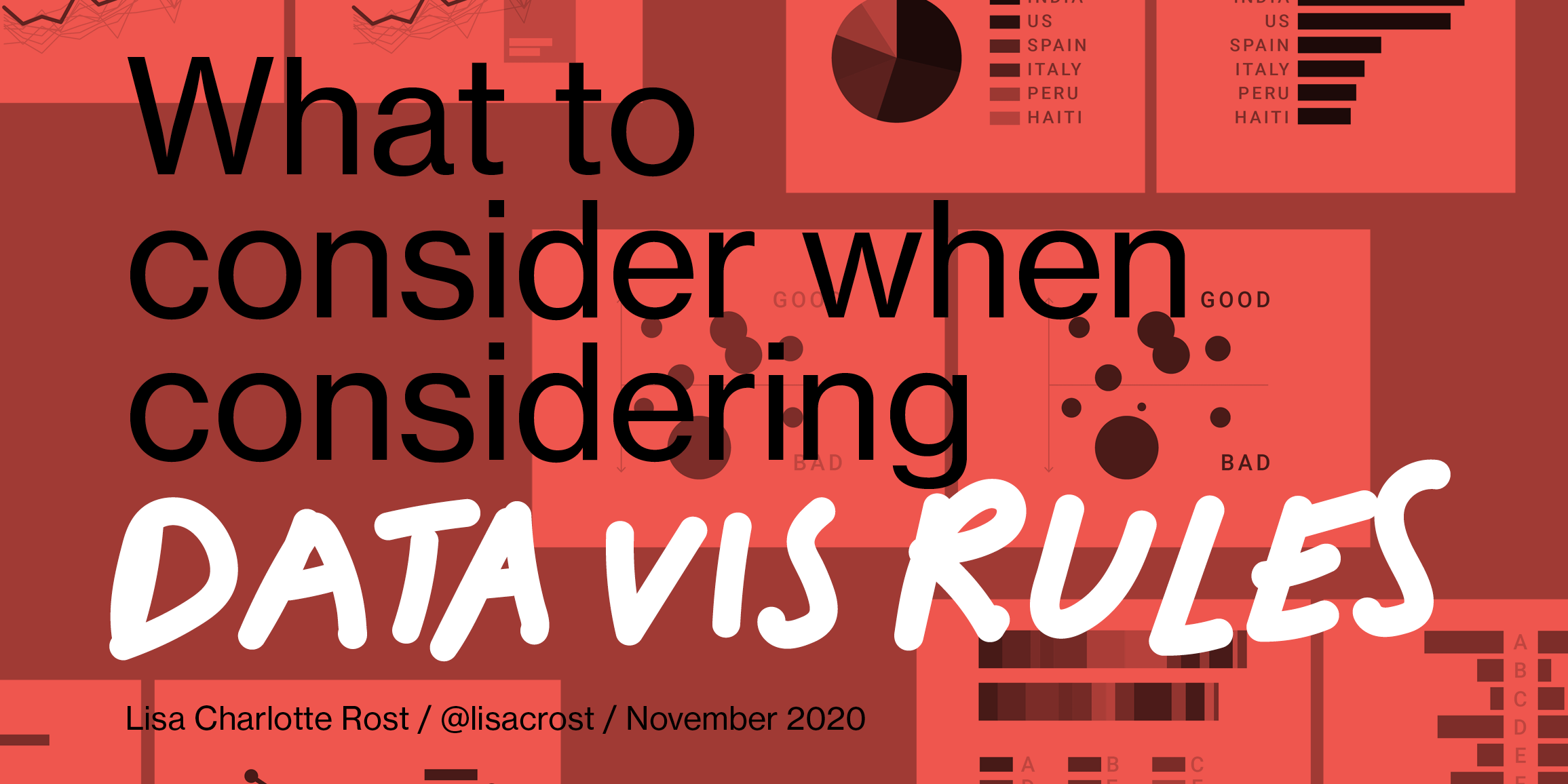
November 2020
at SHOW
What to consider when considering data vis rules
Which kind of data vis rules I like, and how the theory of art can explain why rules contradict each other.
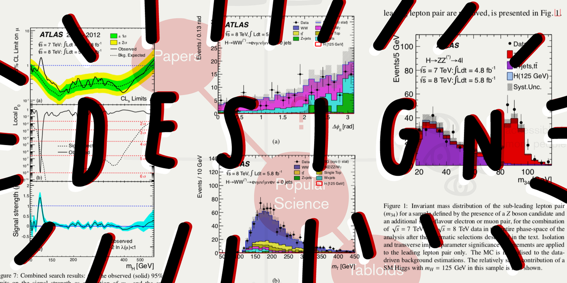
February 2019
at the United Nations
Complexity for the experts, simplicity for everyone else?
Understanding what role design can play to increase the audience when communicating scientific ideas.
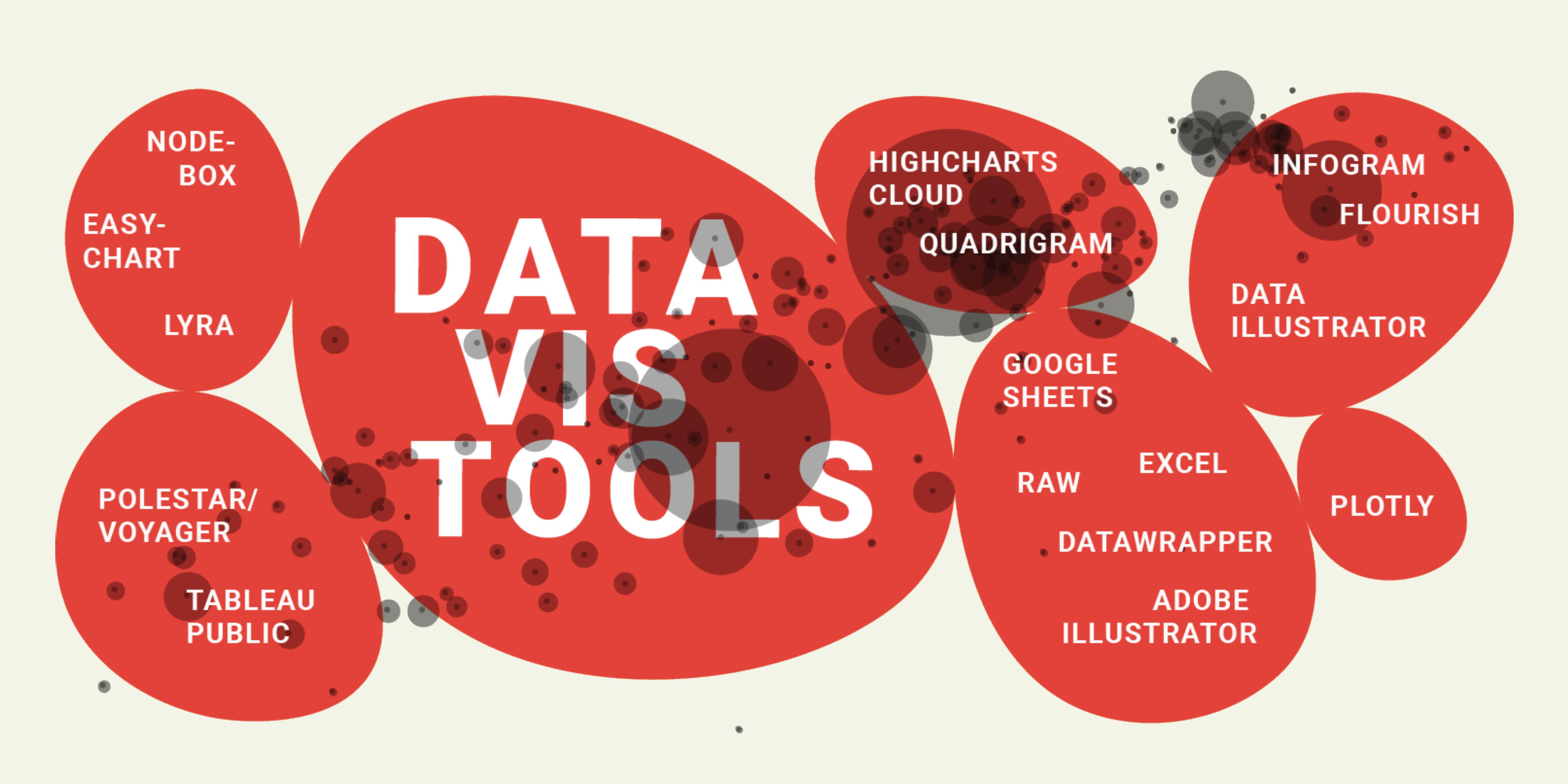
October 2018
at IEEE VIS
Data Vis Tools, Revisited
2.5 years I wrote down my thoughts about the data vis tool landscape. It's time to revisit these lessons.
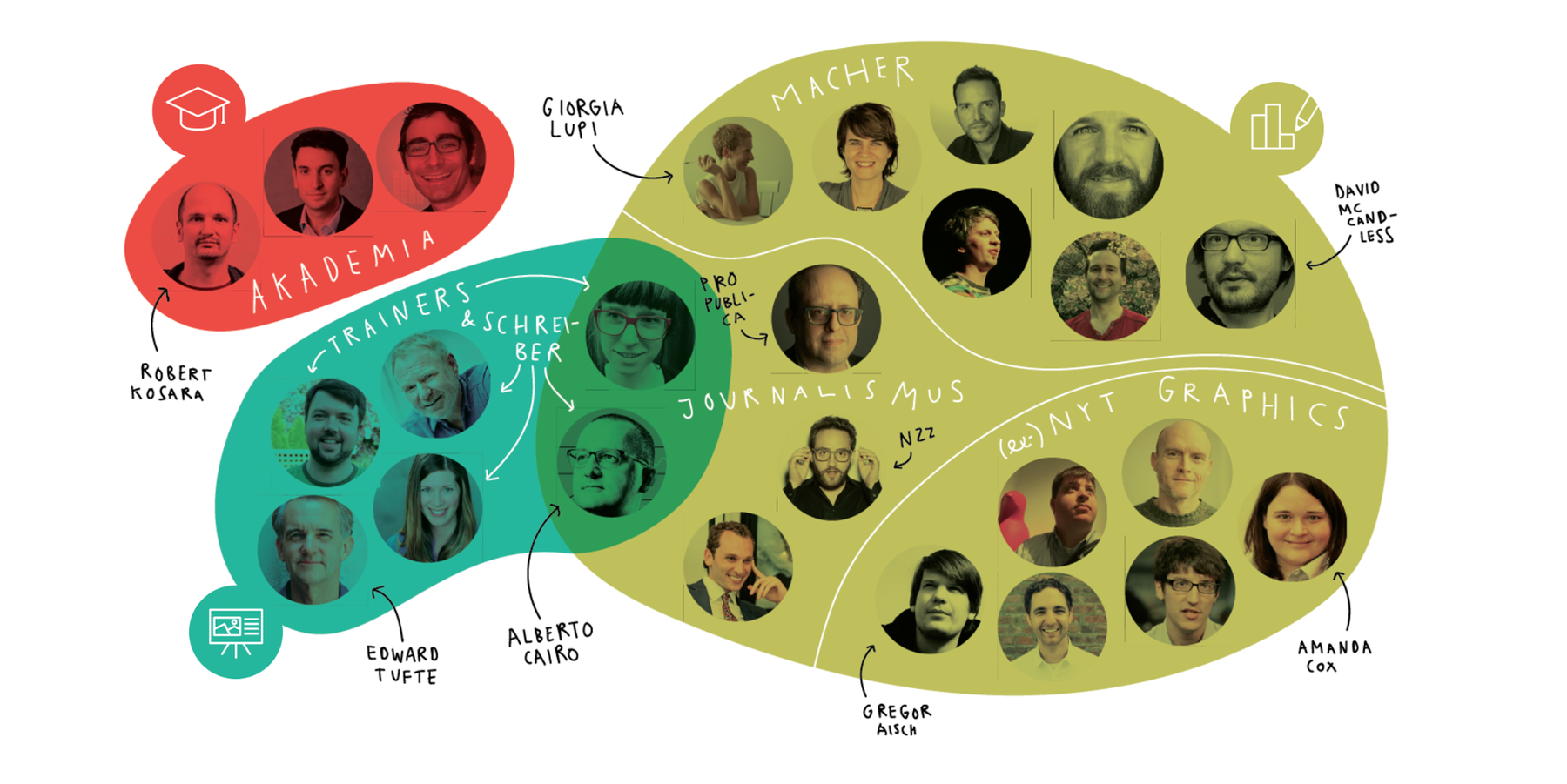
June 2018
at Netzwerk Recherche
Die spannendsten Kontroversen rund um Daten-Grafiken in den News
Talk in German about controversies in the data vis scene in the past few years.
✦
May 2017
at Republica
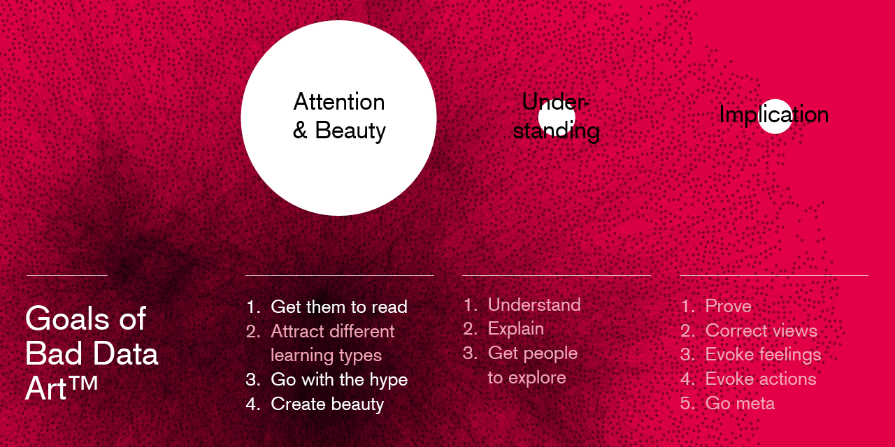
Why We Don't Believe In Facts, And How To Fix That
It's not about truth vs lie, it's about them vs us. Plus some data vis that made me think.
✦
March 2017
at INCH
Why do we visualize data?
Categorising the different reasons for visualizing data, and looking at examples & different industries on the way.
✦
December 2016
at CCC & OpenVisConf
A Data Point Walks Into a Bar
"If I look at the mass I will never act. If I look at the one, I will." A look at data (vis) vs anecdotes.
✦
October 2016
at NACIS
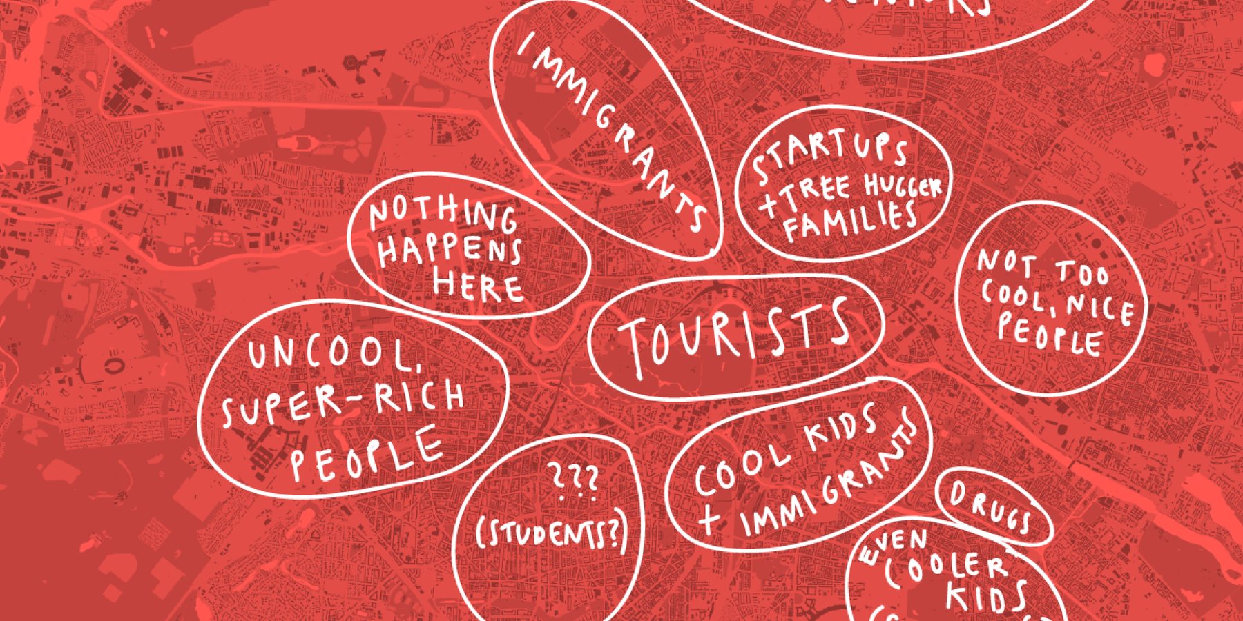
Map Poetry
Drawing our internal maps lets us explore how we and others see the world.
✦
October 2016
at the GeoNYC Meetup
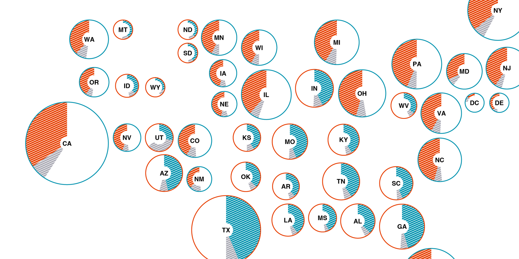
Making Election Maps Popular Again
Why we should map the popular votes, even in US elections.
September 2016
at the Hacks/Hackers Media Party Buenos Aires
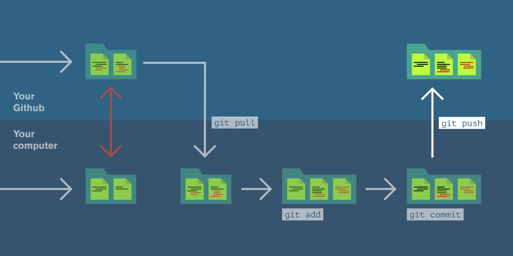
Github Tutorial
Small Github Tutorial that explains basic principles like forking and branching in a visual way.

✦
June 2016
at Information+
Less News, More Context
"With which information can my audience navigate this world better?" Looking at goals of journalism, and how data vis fits in.
October 2015
for the other Knight-Mozilla OpenNews Fellows 2016
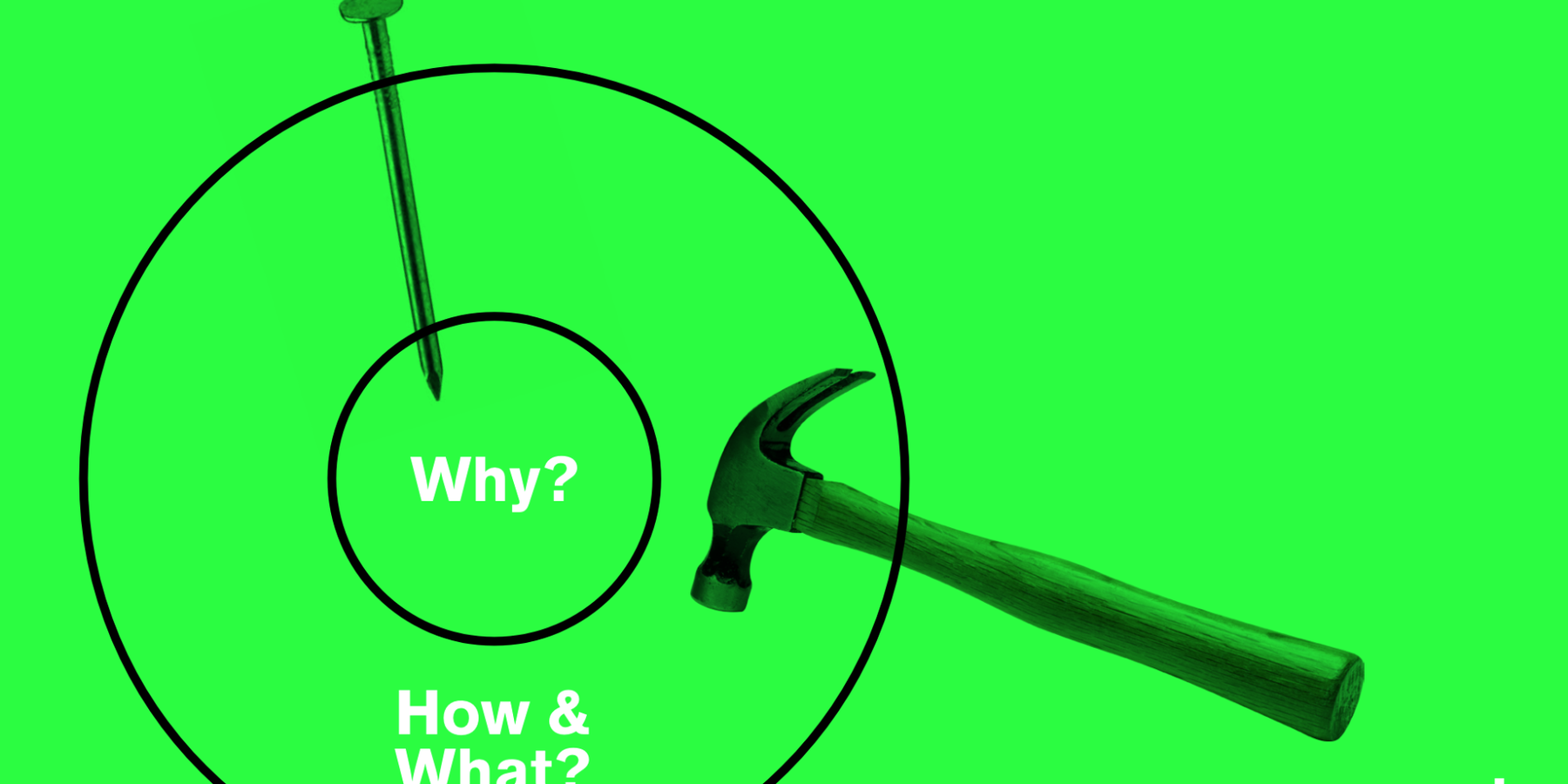
Why What How
Explaining the “Golden Circle” by Simon Sinek and how it relates to data vis.
June 2015
at State of the Map US
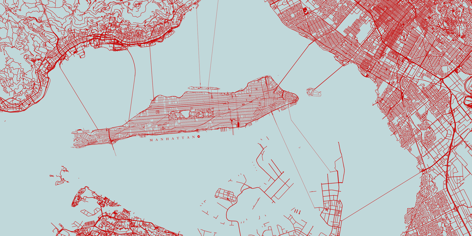
New York in Fiction, New York for Real
If we change our maps, we change how we think about the world.
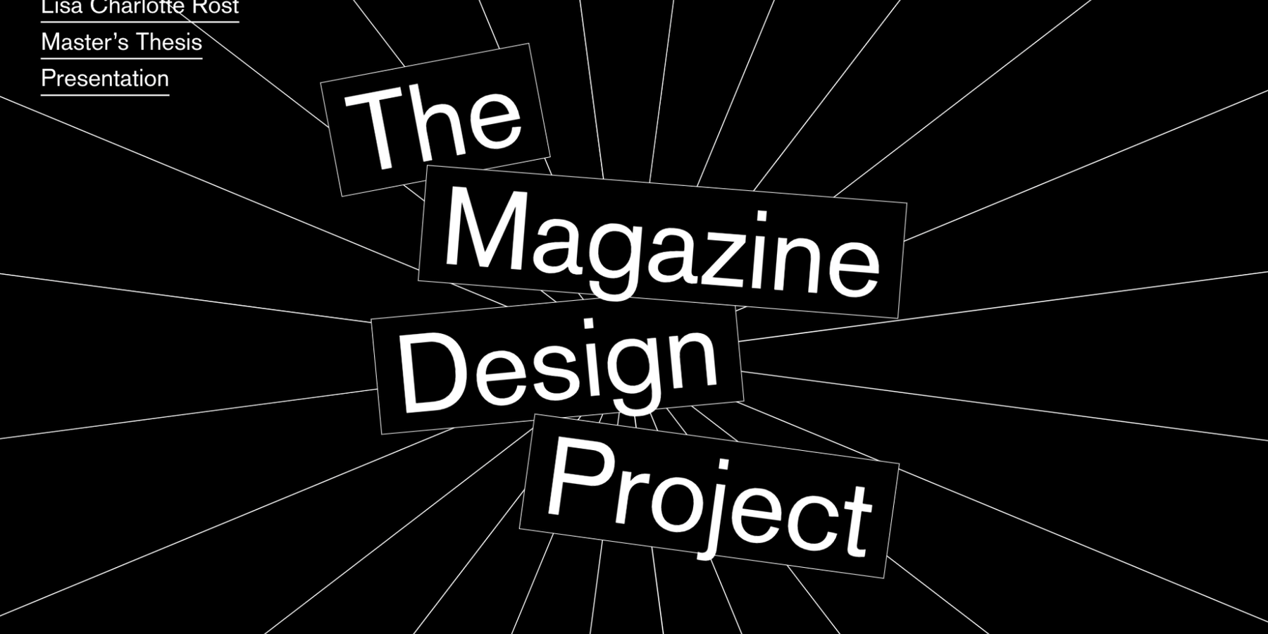
August 2014
for my Master's Thesis
The Magazine Design Project
Maybe my best-designed slides to date. Answers the question if one can improve graphic design through feedback.
Recordings
If you'd like to watch me talk, you can choose between recordings from CCC 2016, Republica 2017, OpenVisConf 2017 (all in English) and Netzwerk Recherche 2018 (in German).
Nice things others have said about my talks