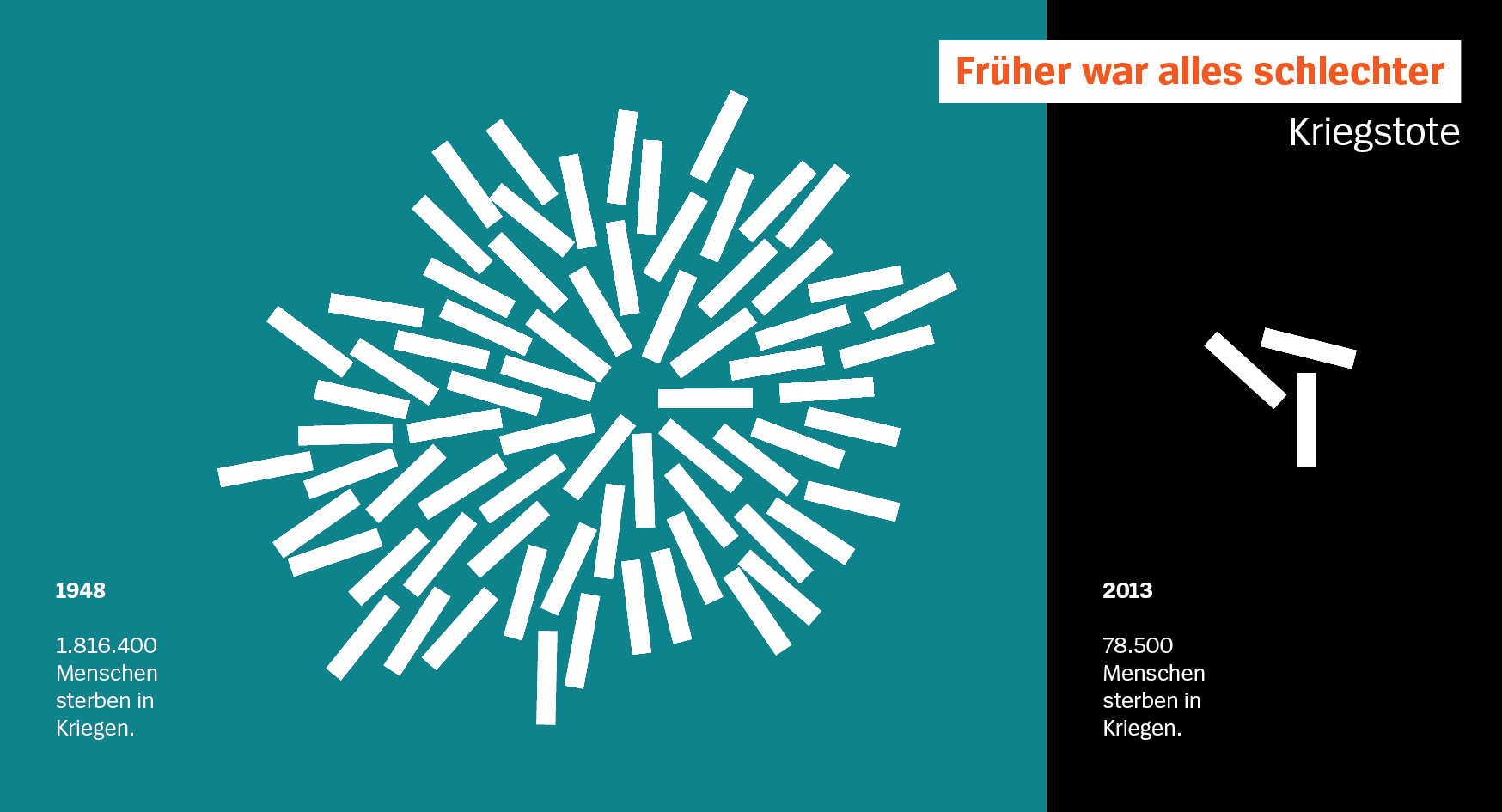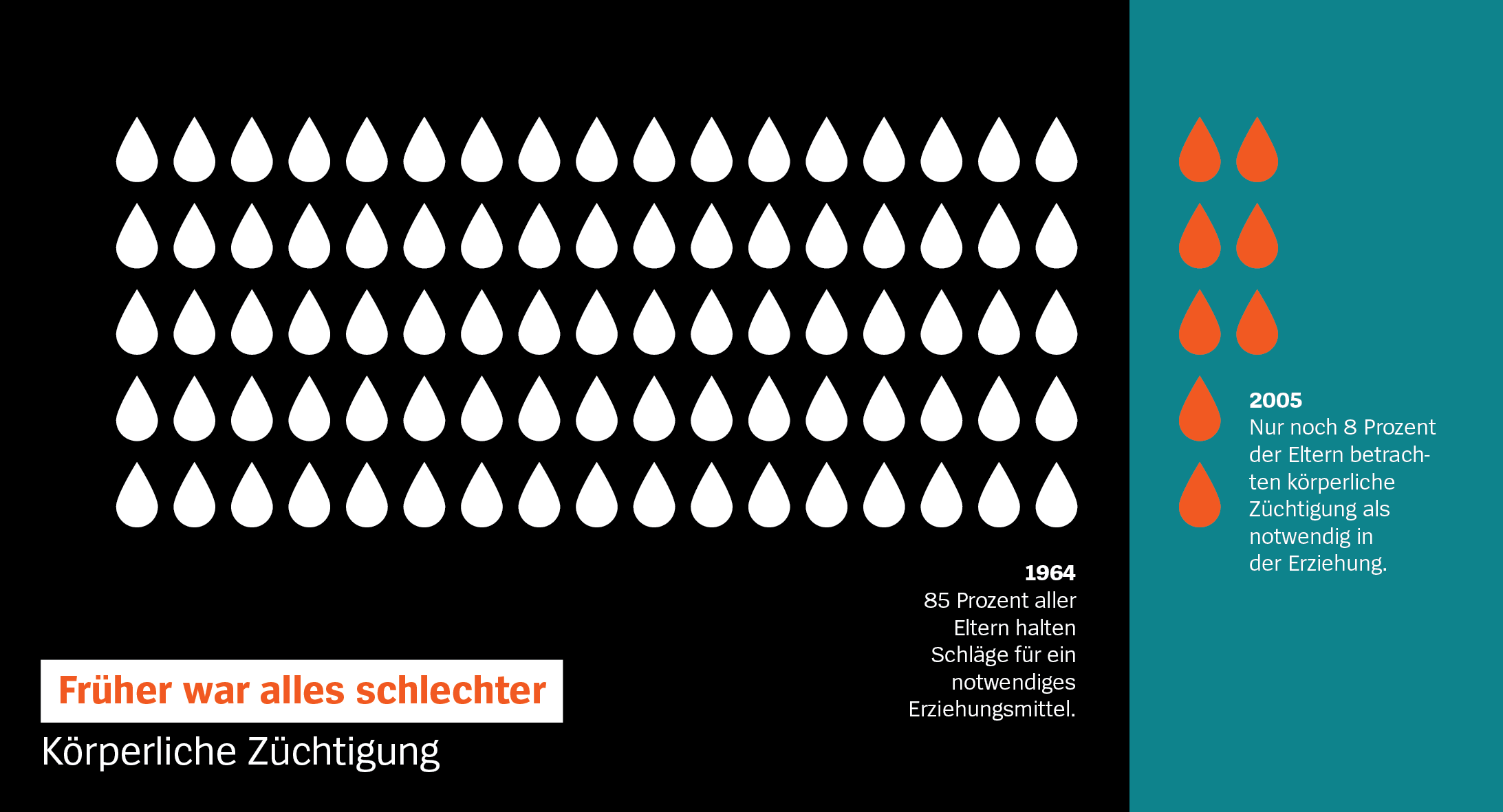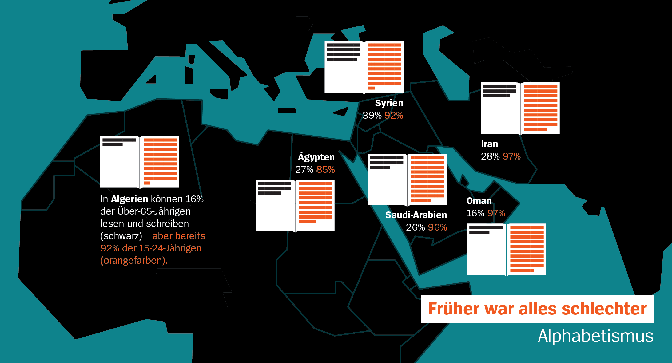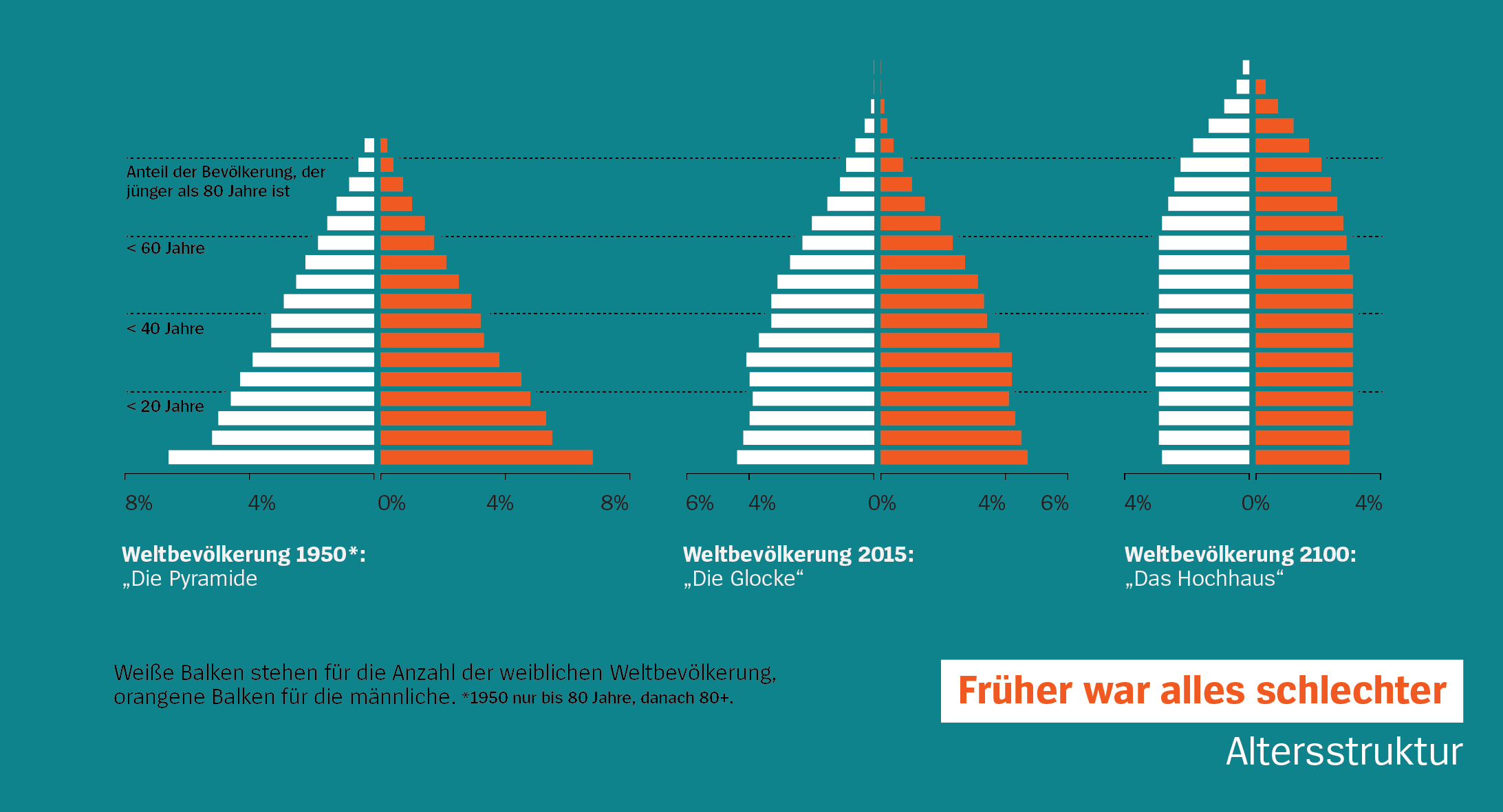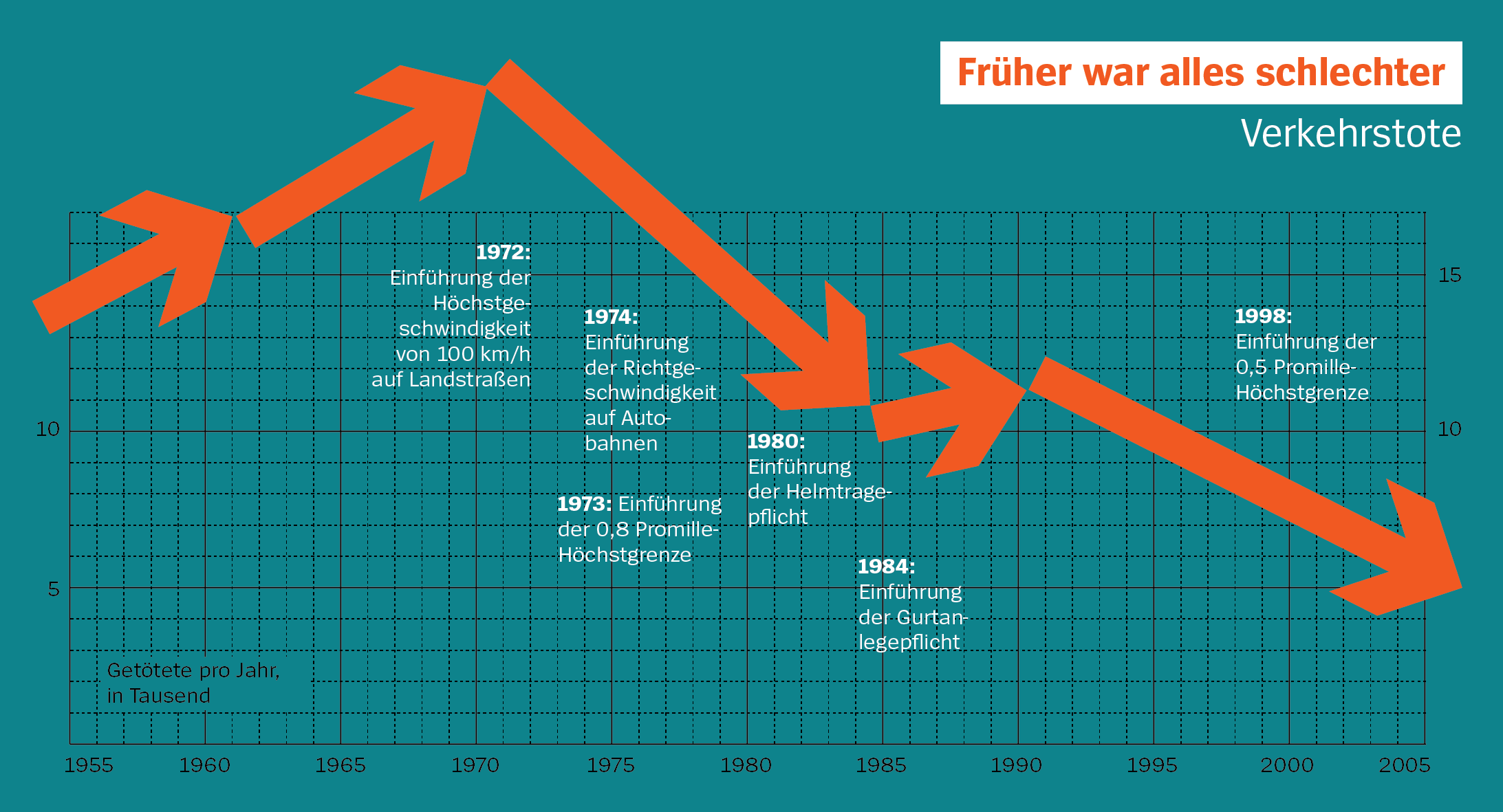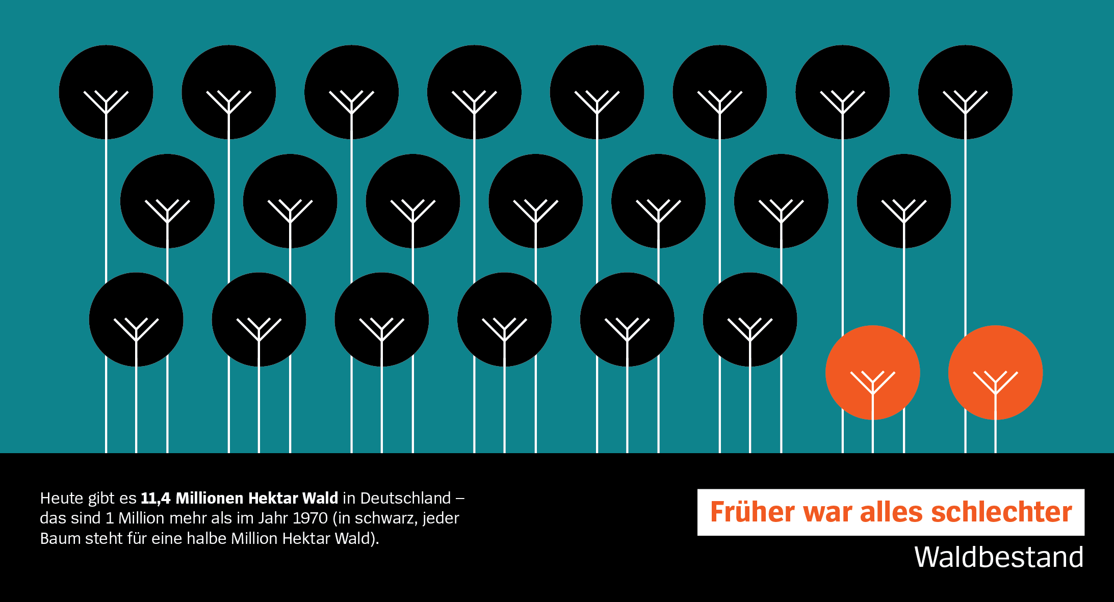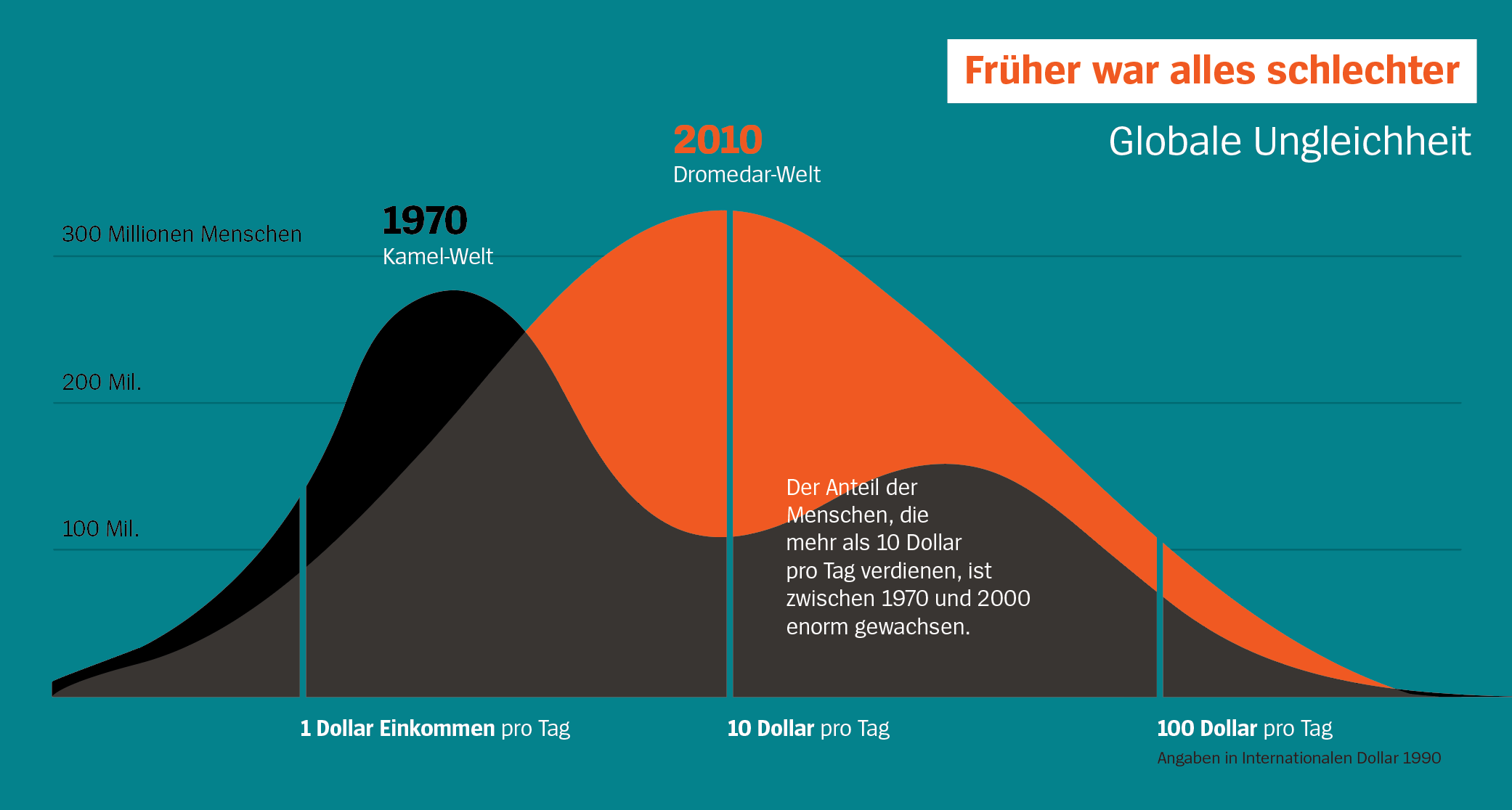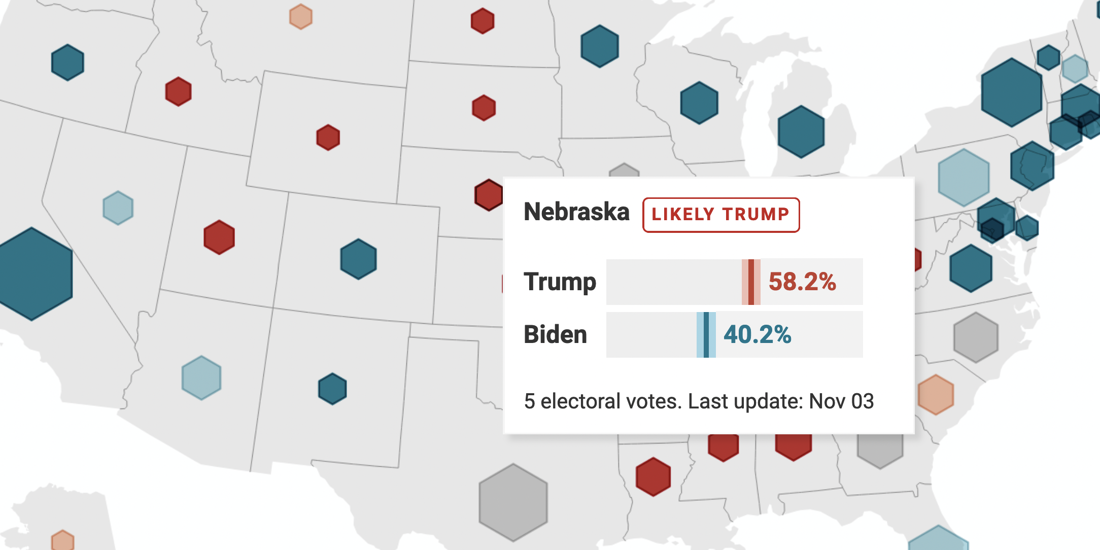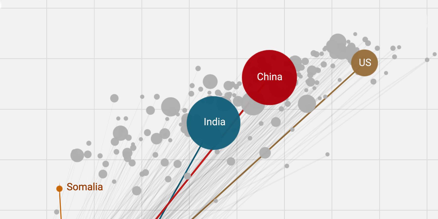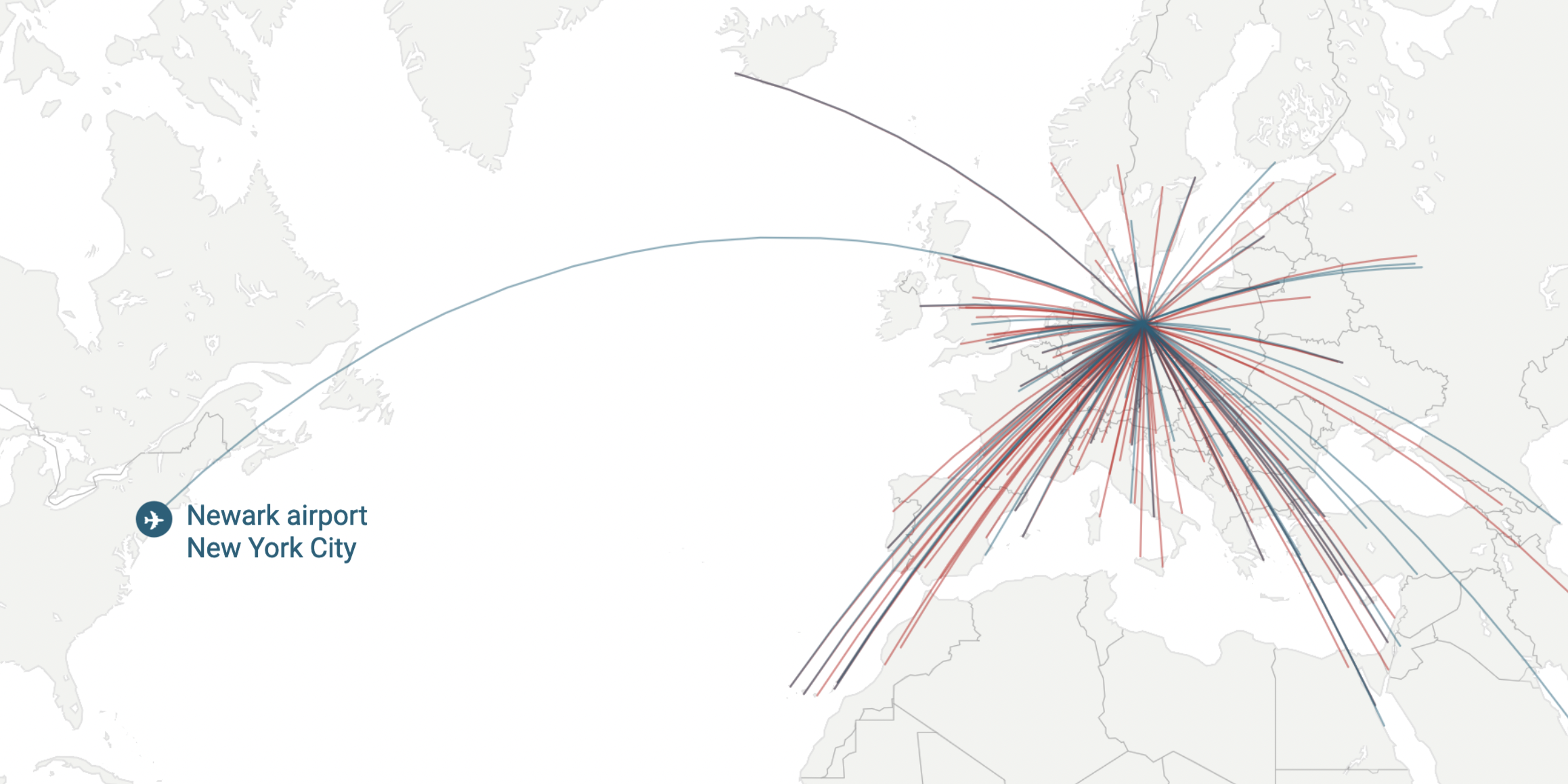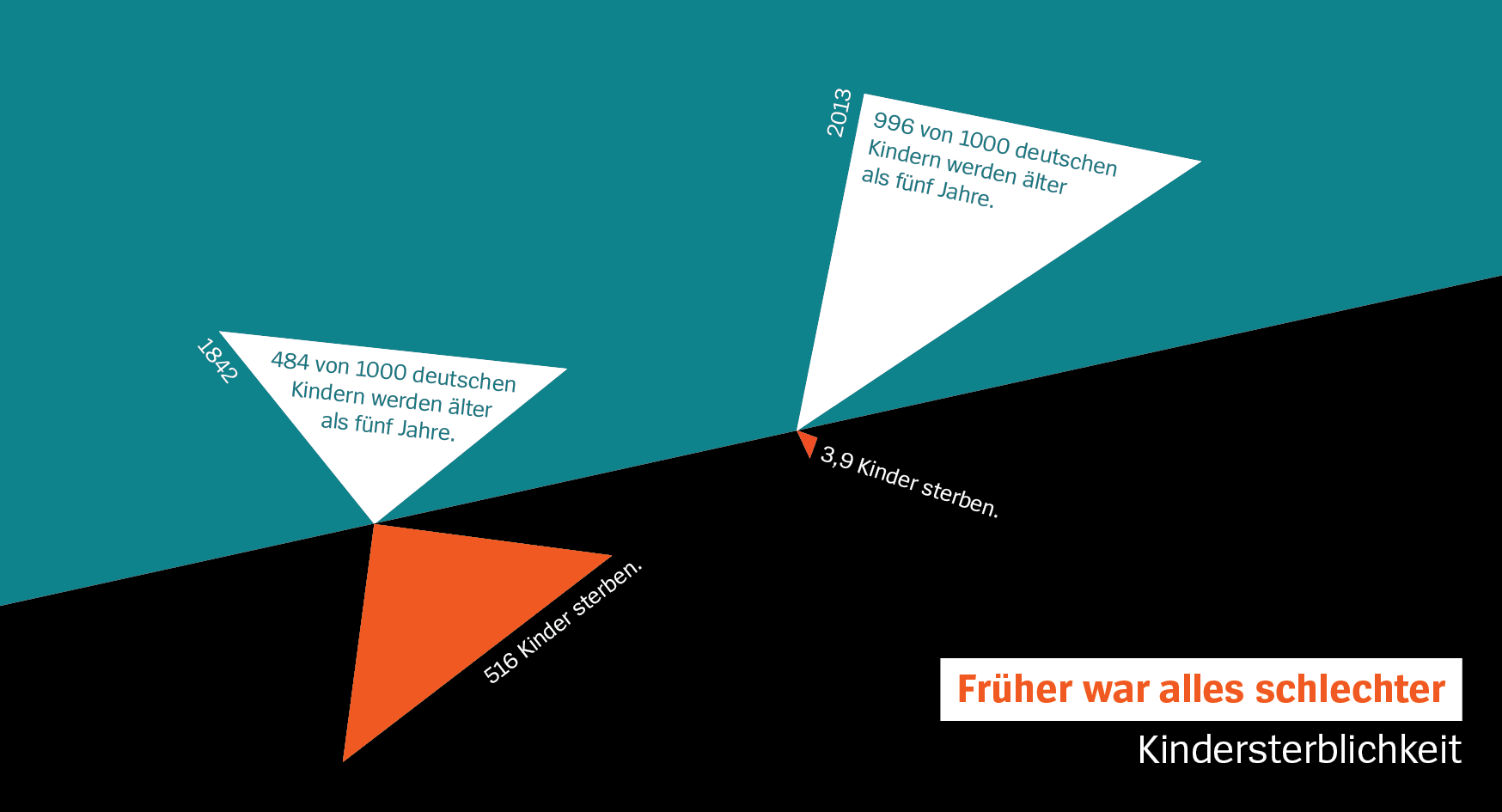
In 2015, the German magazine DER SPIEGEL asked me to create the visuals for a weekly data column by editor Guido Mingels. The topic: showing that lots of global indicators like child mortality, traffic accidents, literacy or wealth distribution improved over the last decades and centuries. The name: “Früher war alles schlechter” (= “back then, everything was worse”).
The issue was close to my heart, so I got started. I quickly decided on the minimalist color palette and the overall look.
I also created the visuals for the first few months of the column in close collaboration with the editor. When I started the OpenNews fellowship in 2016, I ended my work for this column – a hard decision. The internal infographics team of DER SPIEGEL took over.
The column is still running in the printed magazine, still with the same color palette. In 2017, a selection appeared as a book. Here I show some graphics I created for the column:
