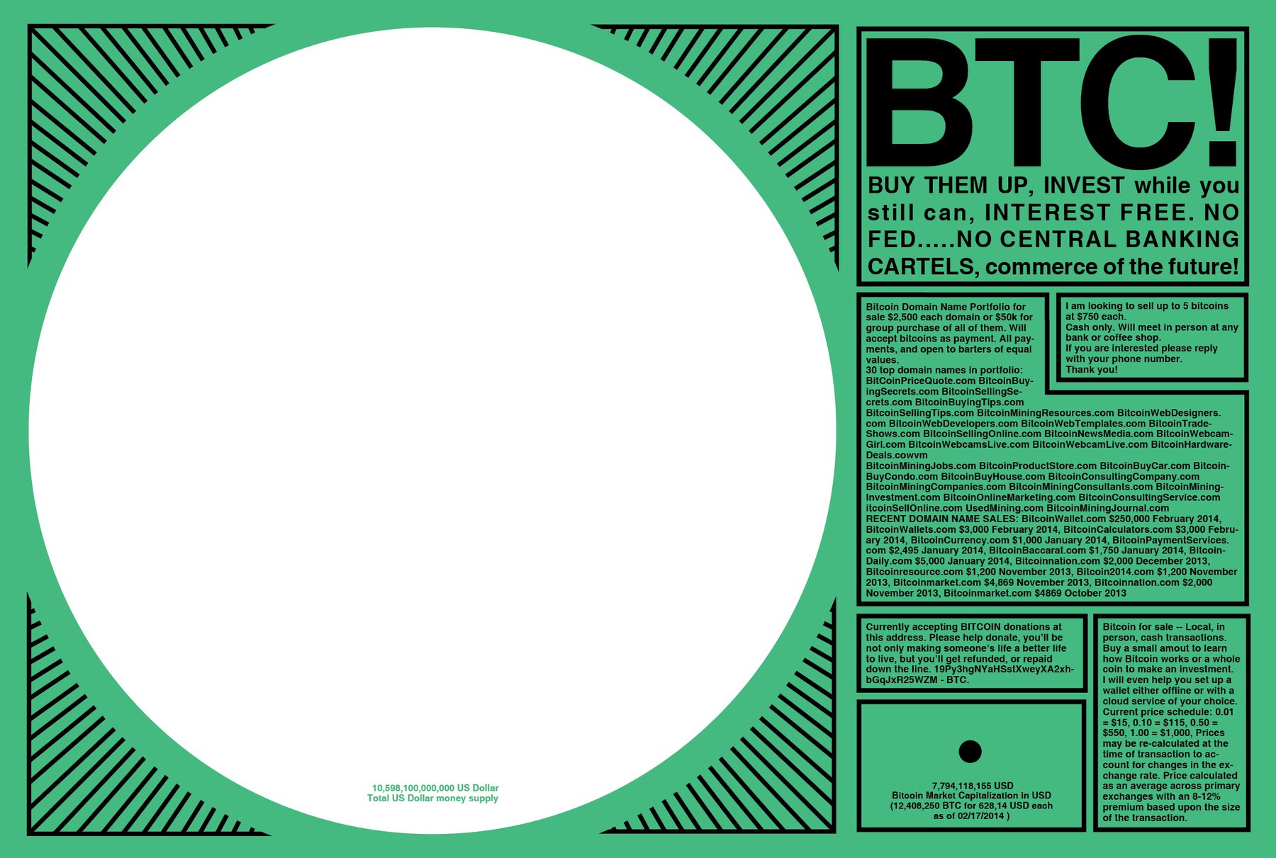
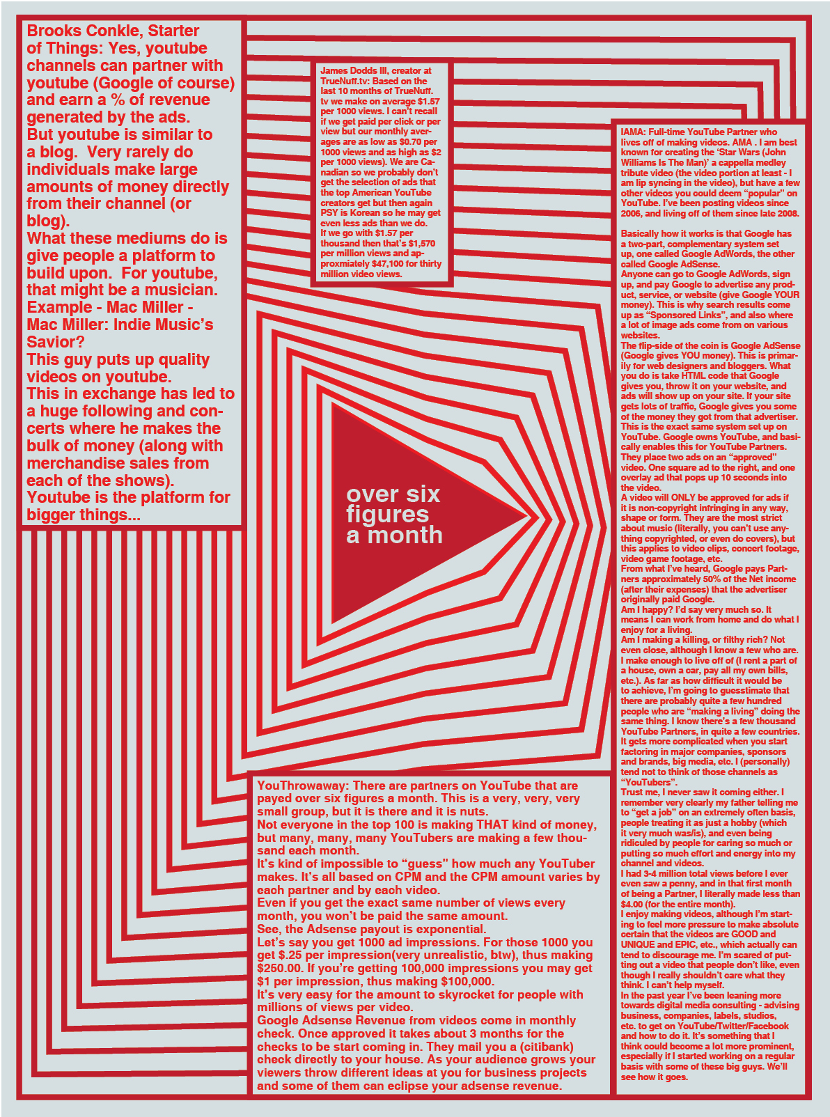
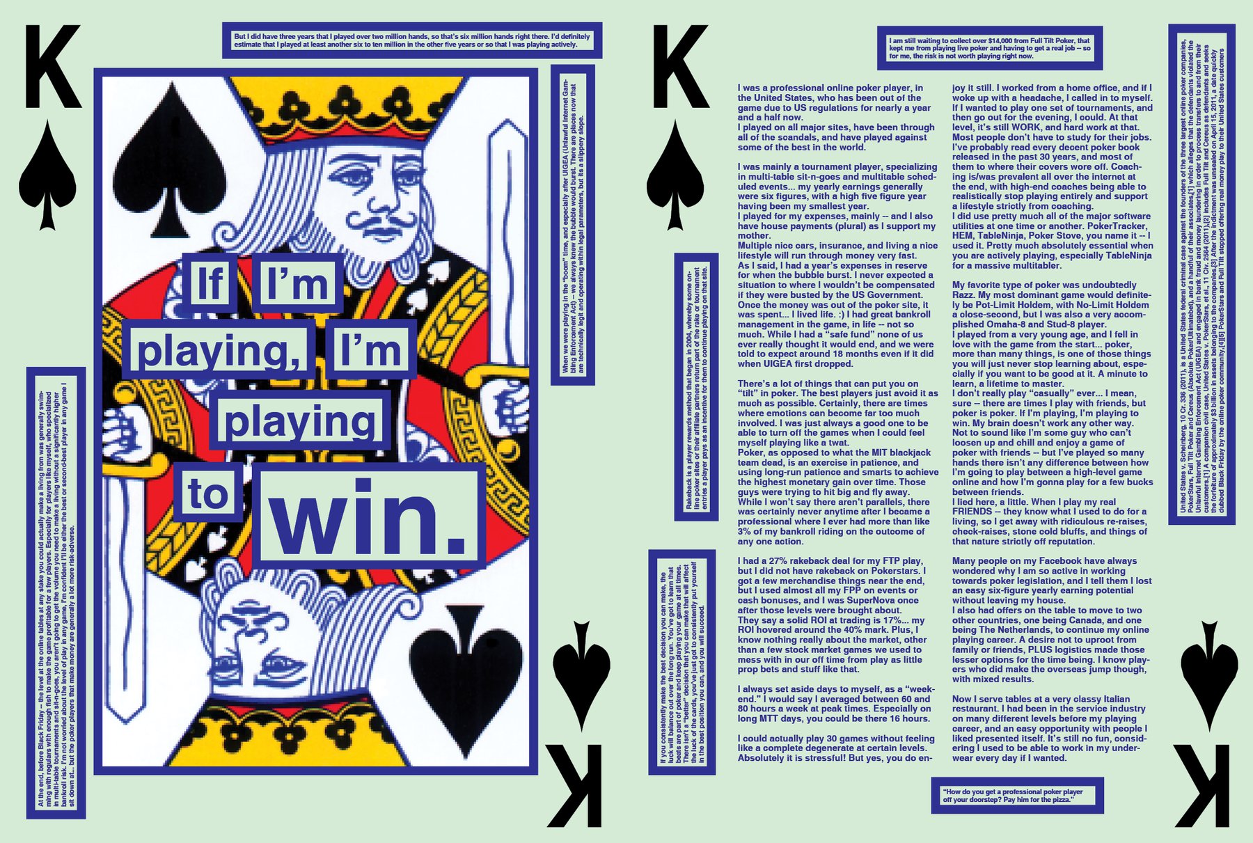
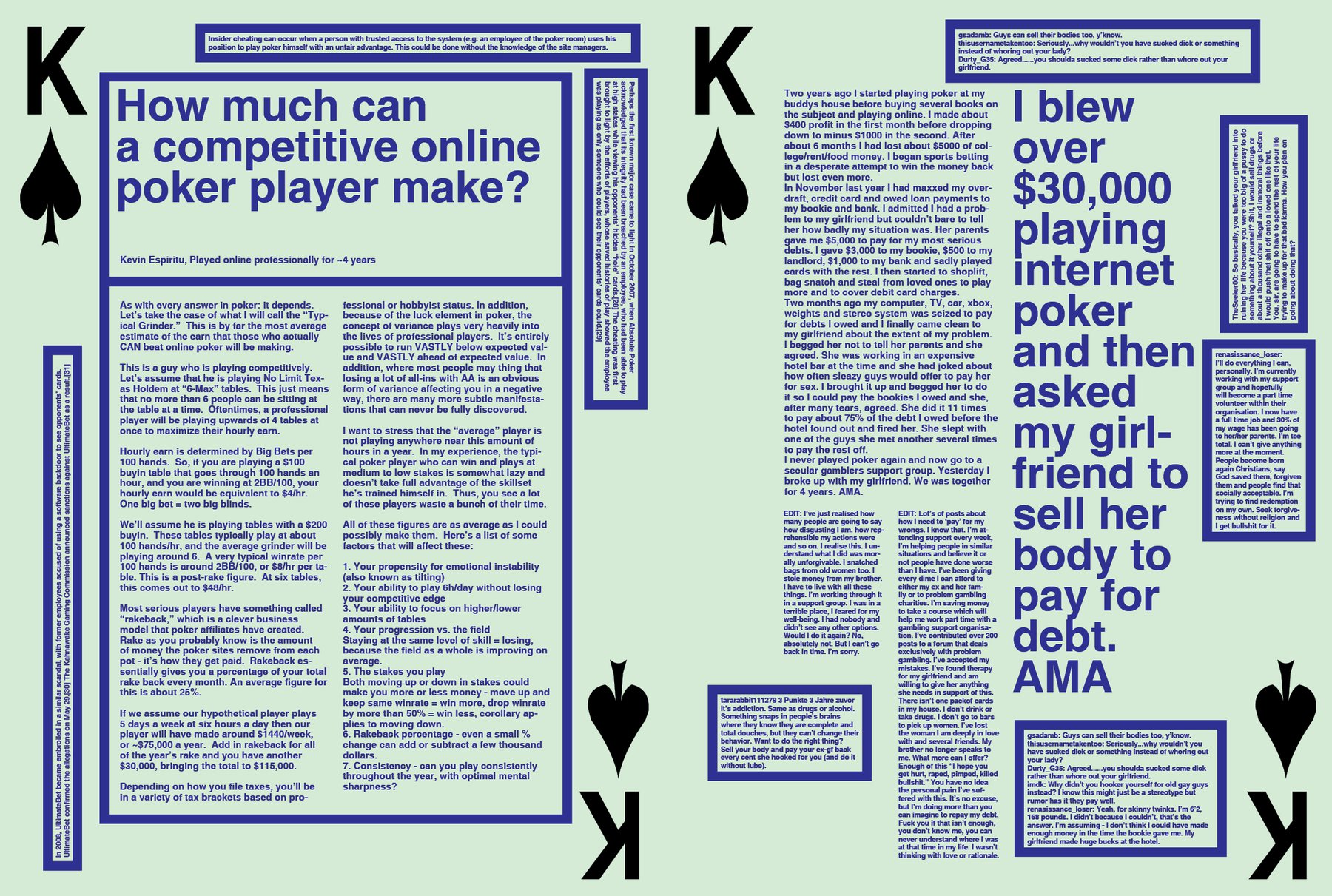
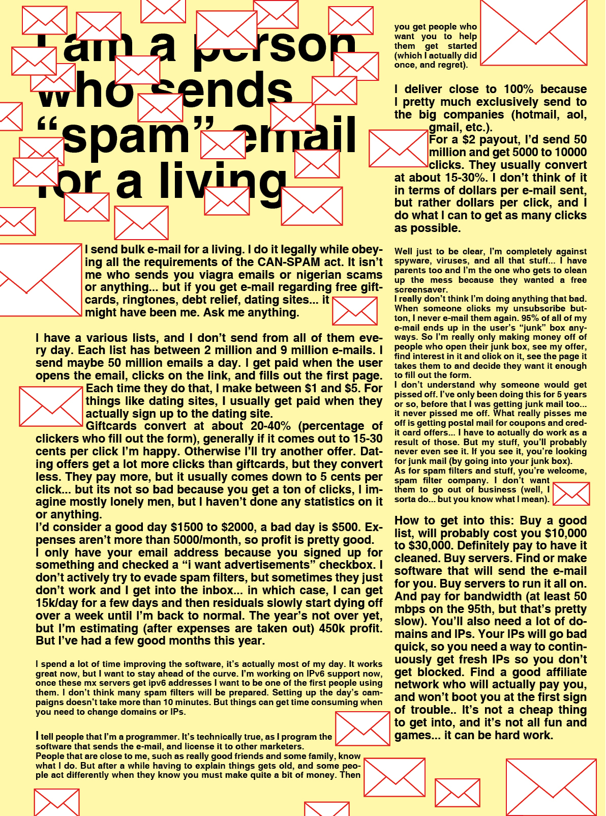
It’s three days since my last post here - and there is more than one spread that happened in this time. I finalised the Bitcoin opener (and think that it’s the best spread I’ve done so far in this project), started with the Spam and YouTube story and yesterday quickly put together the Online Poker story. The YouTube story took some time - I recorded it (and will upload it here), but I was super clueless at the beginning how I want to handle this and it’s not the best page ever designed.
I also got a very hard feedback (about how I’m doing not readable stuff) from a friend that really got me thinking. I know that probably nobody ever will read this magazine - but that’s how it works with most design (student) projects. I don’t have a problem with it. I try to find super interesting stories for my magazine, but I’m not an editor and never will be - I don’t know which stories are the best. Her feedback - and of course she’s right - is that I still should design with the purpose to bring people to read this magazine. I think, currently I design a very attention-driven magazine. Every page looks different; it’s a magazine full with posters. Personally I would flip though the magazine with huge interest because of the design, although I’m not sure if I would read it. And I think that’s ok for this kind of project. My goal is not to design three perfect magazines, but to experiment with and exaggerate different styles. I truly want to enjoy the last semester of my student life and the possibility of experimentation and freedom that comes with it. So the feedback of this particular friend helped me to understand my aims better - but it didn’t change my designs.
In the last three days, I also changed the design of the front pages a lot. Remember when I said that I don’t know it people understand the newspaper reference if it doesn’t look like a newspaper? Well, now it does. The contrast in complexity of the front and middle pages is gone; now the only difference is about color and font (and use of images). But it really looks like a newspaper, so that’s great.
I also started to think about the next magazine I’m going to design; you know, the one about love. There will be a LOT of whitespace in it. My main focus will be the images. I noticed that generating images is still troubling me - I though the whole day about images for my “Porn Business” story…this was not a successful day. My learning goal will be the organisation of articles in the magazines, so that’s perfect: The layout will be done quickly (max. one week) and I will think mostly about the structure and the images.