I was super productive today - even more than I thought I would. Or maybe the work that I had to do didn’t take as much time as I thought it would; I don’t know.
I did all the final work that has to be done when finalizing a magazine; some image edit work, a lot of typo detail work, adjusting borders etc. In addition I worked on the newspaper spreads and finalized them.
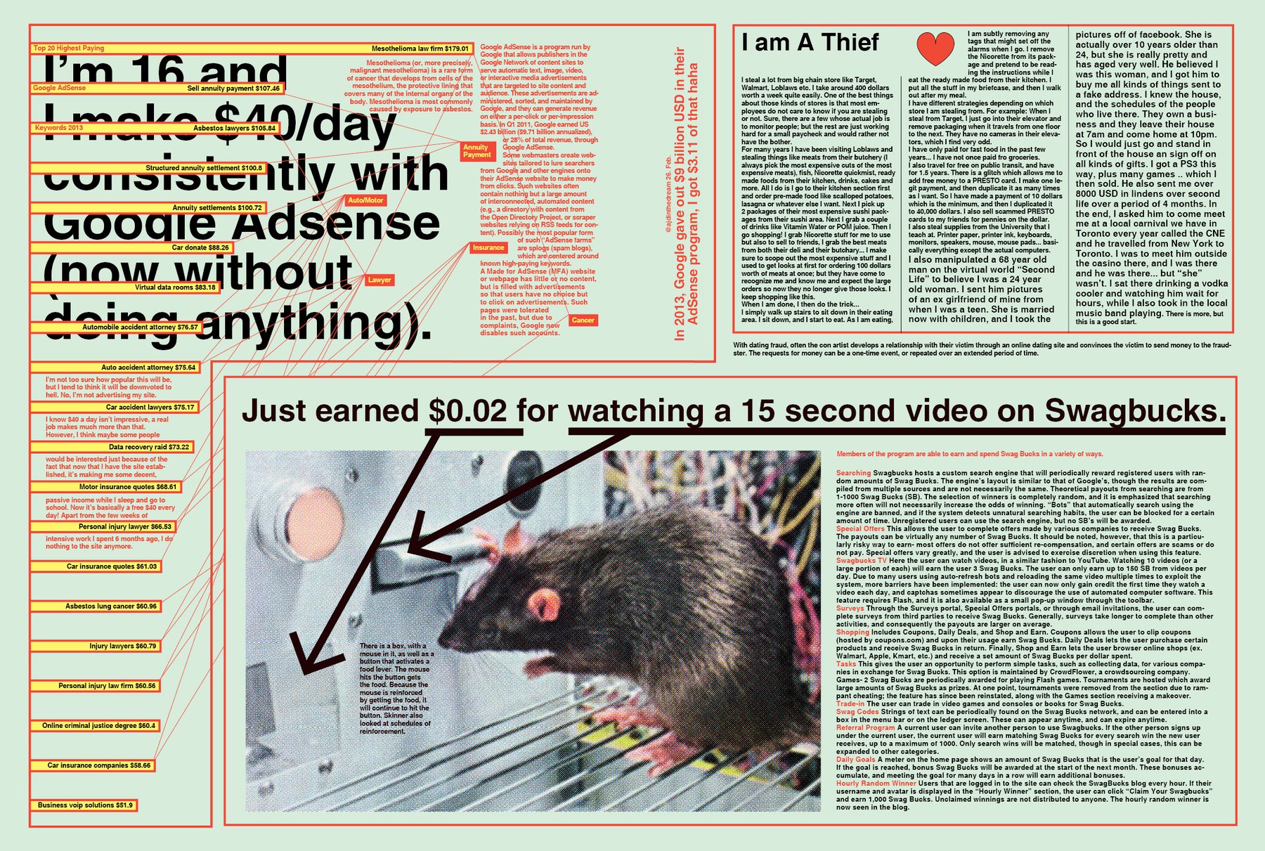
One big change that I made was deleting all colors except three - so now I have paper white, black and only the three colors light green, yellow and medium bright red in my magazine. I did the exact same move in my “Lessons Learned” internship documentation: When things get to busy and confusing, at least the colors can held everything together. Colors…it’s interesting. I learned that I don’t like them in masses. I think, deep inside me I’m still a very strict minimalist. I also noticed today that I don’t pay a lot of attention to them in general. When I’m designing, I only think in “bright enough so that text can stand on it and it’s readable” and “possible text color”; so I often choose black, white and red and hope that I still have time in the end to rethink the colors. But even while doing this I don’t use color palettes or internet tools (although they are a lot genius stuff out there). I use colors like I used to use fonts: Just trying, looking and retrying. So when I chose yellow, red and green, it’s not because it’s the perfect combination or because I don’t like blue (to the contrary, I actually can’t stand green), but because it…just happened. Maybe that’s enough? Or, just maybe, color choosing is a skill I really should strengthen.
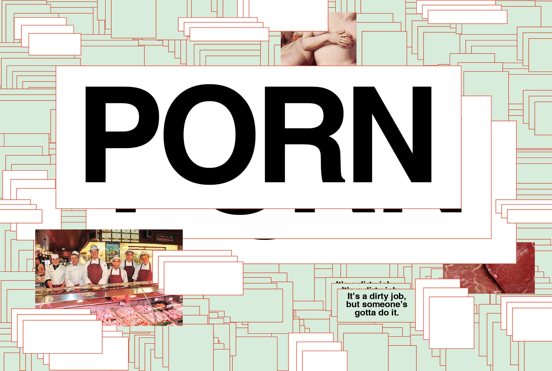
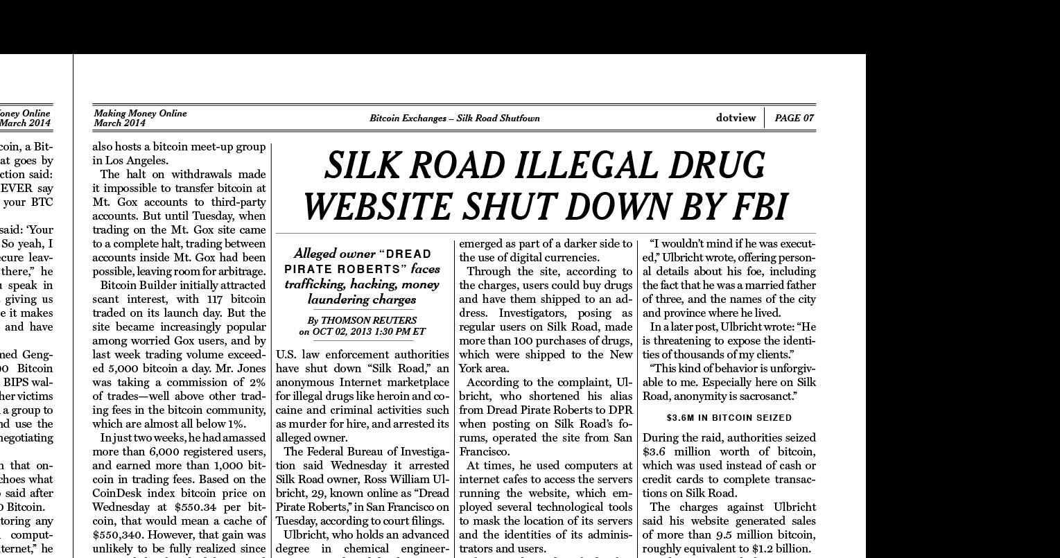
As one can see, I also changed the porn opener. I’ve never liked the one with the butcher, and today it occurred to me why: It would be the only big photo-realistic image in the magazine. My magazine is not a magazine full of great image ideas or great photography. I use a LOT of graphical elements on all the spreads, except on the one with the Million Dollar Homepage and on the one about ransomware - but on each of them are only a lot of screenshots pixels visible instead of elements from the real world. So the butcher doesn’t fit. And - I removed it. And kind of happy with the result. I also changed the Silkroad story style and the spread with the survey and thief story; it’s both a little bit minimalized now (and not as ugly as before).
The greatest win today was the cover (see last post). I wouldn’t have imagined that I can put together a cover like this in two hours with a lot of (self-made) stress in the back. Really nice.