Today the four weeks for designing the second magazine (out of three) officially started. I made one big decision that will make my life so much easier and my designs so much better (hopefully) in the next time: I will keep the same content as last time. I will keep it for both of the upcoming magazines. Why?
With so many good arguments, one could wonder why I even considered NOT keeping the same content. Well, initially I wanted to see the magazine as ongoing; as readable by real readers. But of course there are no real readers and in the end it’s all about the design - so, yeah, this approach is gone. The next magazine won’t be “dotview issue 4”, but “issue 3b”.
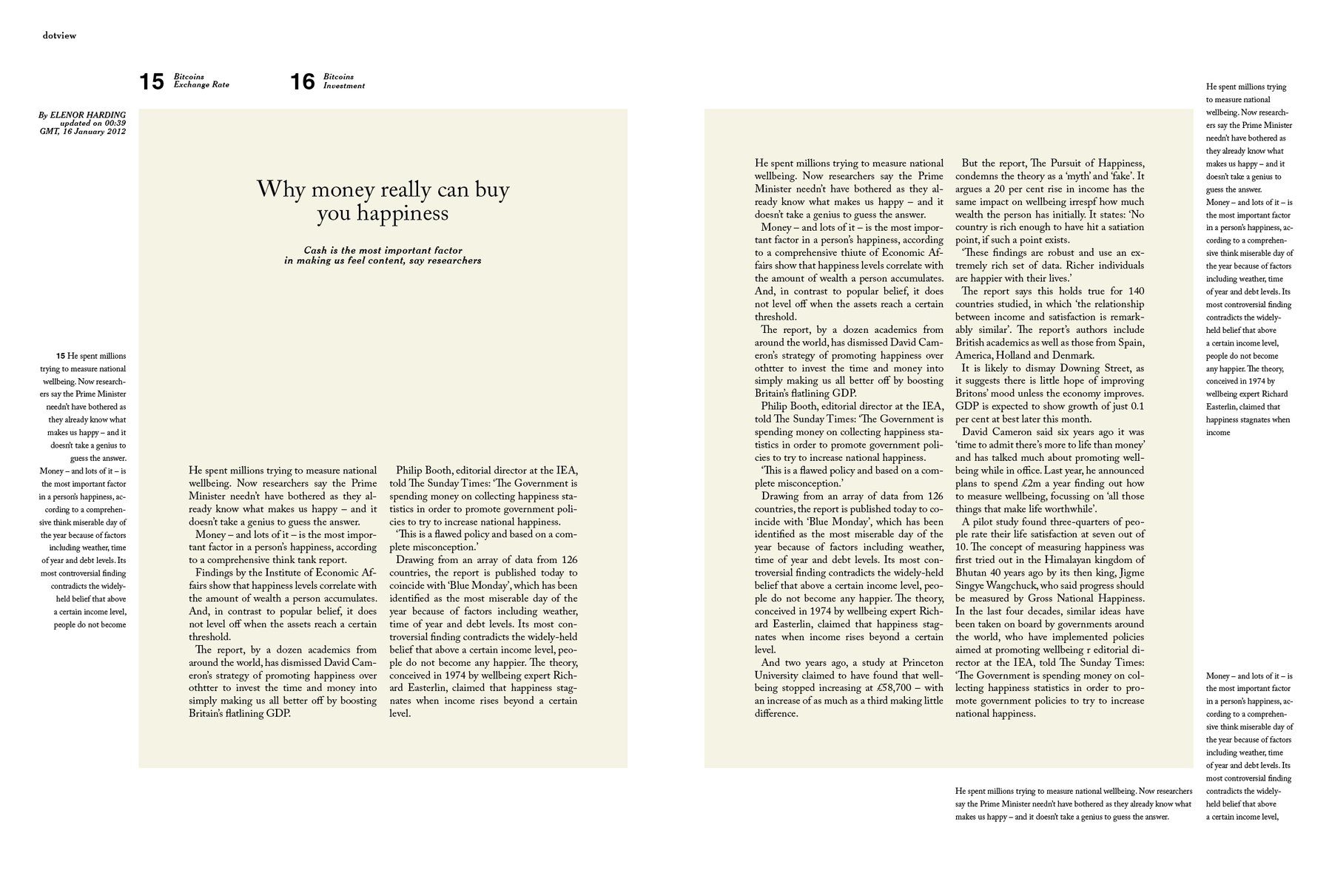
What one can see at the top are thoughts about the layout of this issue. The next magazine will be VERY minimalistic. I noticed: It’s easier to be minimalistic if you don’t have so much space to fill (a smaller magazine size, so to say). CEREAL has this, and this is the most reduced magazine I know (and, maybe, that’s possible). I want everything to be minimal: The font, the images, the layout.
And that’s NOT easy when you come from filling every inch of the page, as I did in the last magazine. One can see me struggling on the layouts I did in the last few hours. But I really like some of them! I like the “magazine in a magazine” idea, and the “color background for the content part” layout.