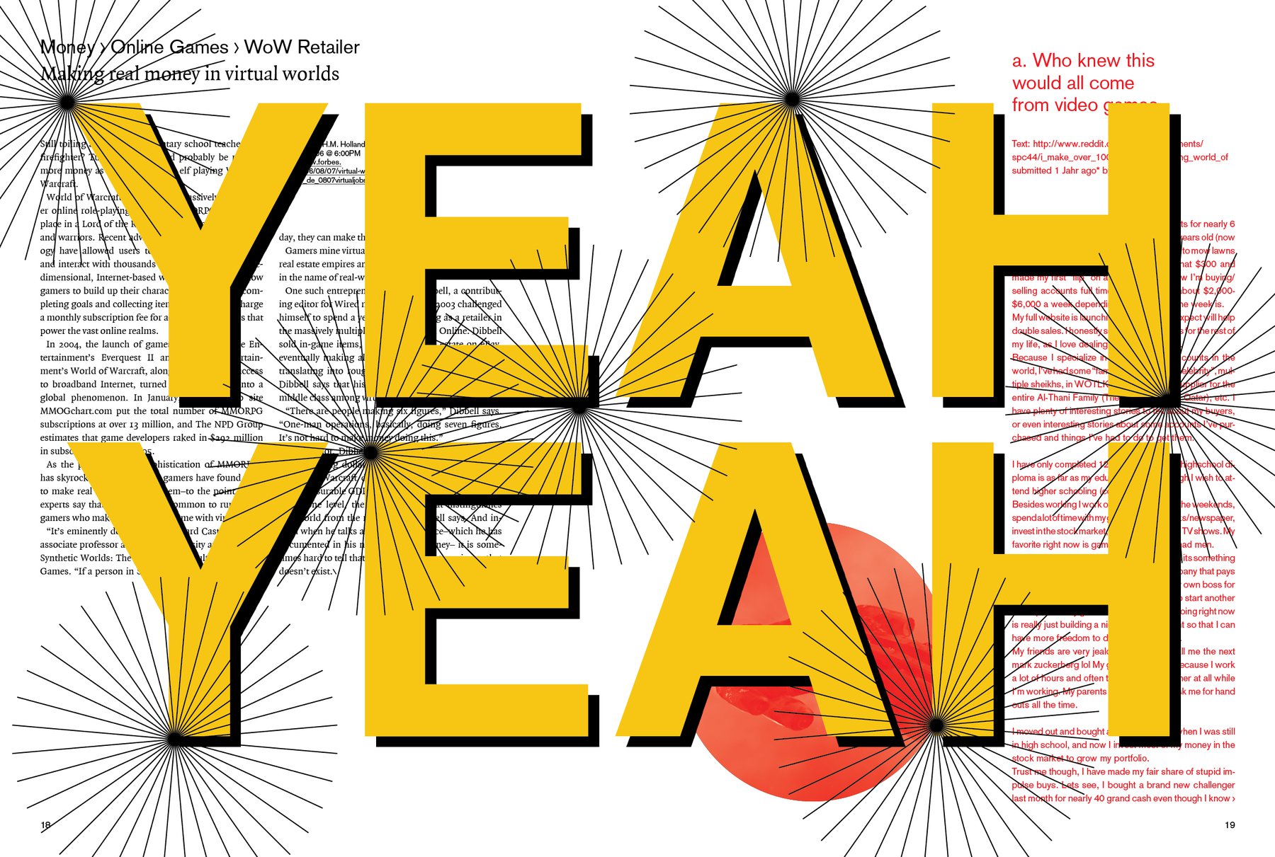
Yesterday I got a reeeeally good critique from my second supervisor for the Master’s project (A.). It’s actually working as I wanted it to be: I have one supervisor who doesn’t look at the content so much, but who’s really good in judging and helping with the design. And A. is perfect in asking the right questions about the content and if the elements on the page are making sense.
And if the reader understands everything. He basically reminded me that minimalism is nice, but must be in service for the content. For example, he pointed out that the headline of the articles catches the eye less then the breadcrumb navigation - but in the end, the headline will convince or not convince the reader to start reading this particular article. (And to give the reader an incentive to read is exactly what I want). So it makes more sense to emphasize the headline and not the navigation.
In addition, A. asked a lot of questions that made me aware that the magazine is still confusing in it’s content. That must change. I need to ask for each element on each page: It is clear why this element is there? Does it make sense? It is clear if and what this element belongs to? We remember: “Simplicity is about subtracting the obvious, and adding the meaningful.”
To sum it up: It was a pleasure and really helpful to have somebody looking on this magazine in an intelligent way.