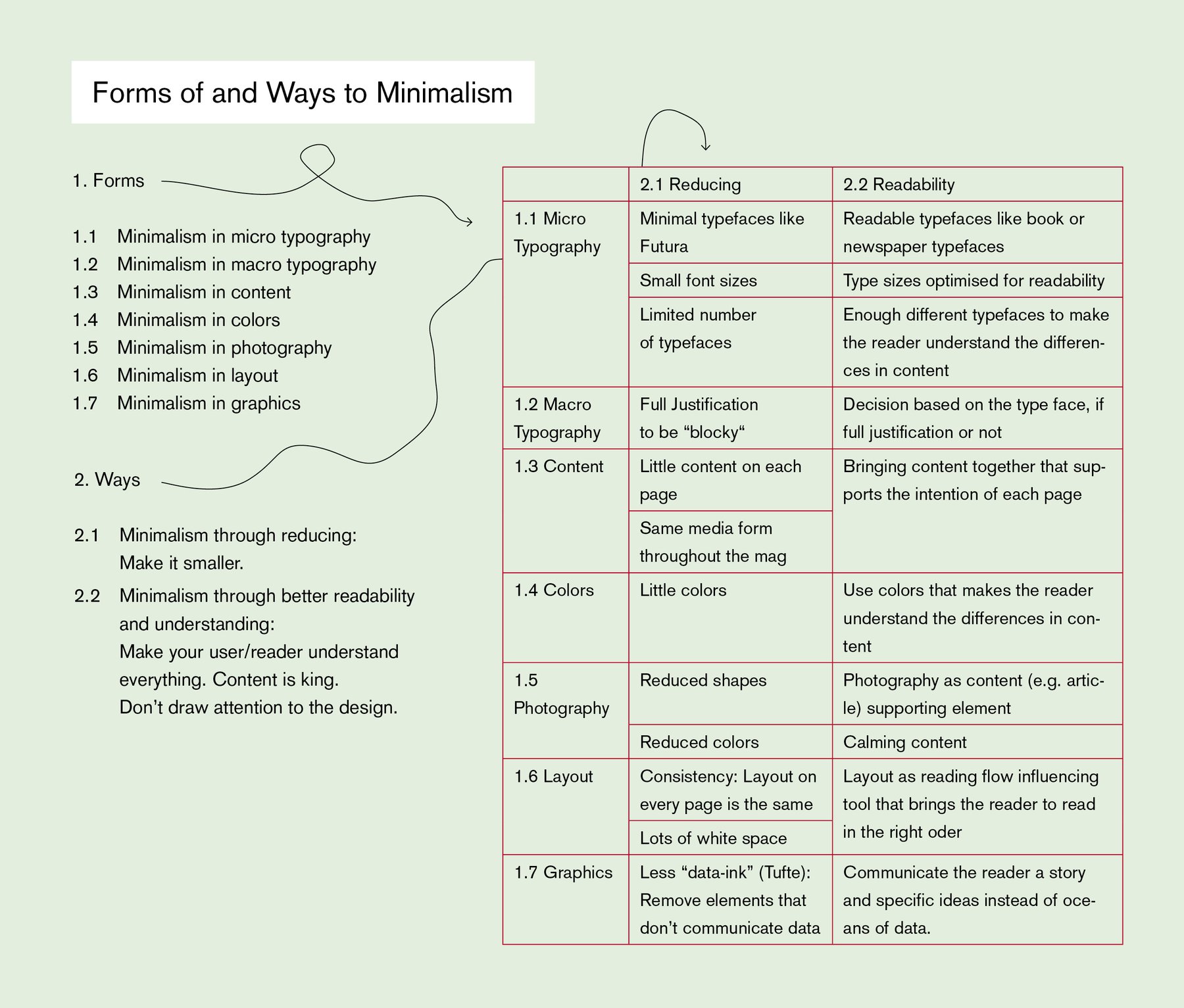
On Wednesday, we had our third - our fourth? - Arbeitsgruppe Abschlussklasse (Task Force Graduation Class) event, and I held a presentation on the different kinds of minimalism. Why? Because, when I explained people that I want to create a minimalistic magazine, everybody seemed to have a very specific picture of a minimalistic magazine in mind. Sure, lots of white space. But is this everything? What IS minimalism, regarding magazine design?
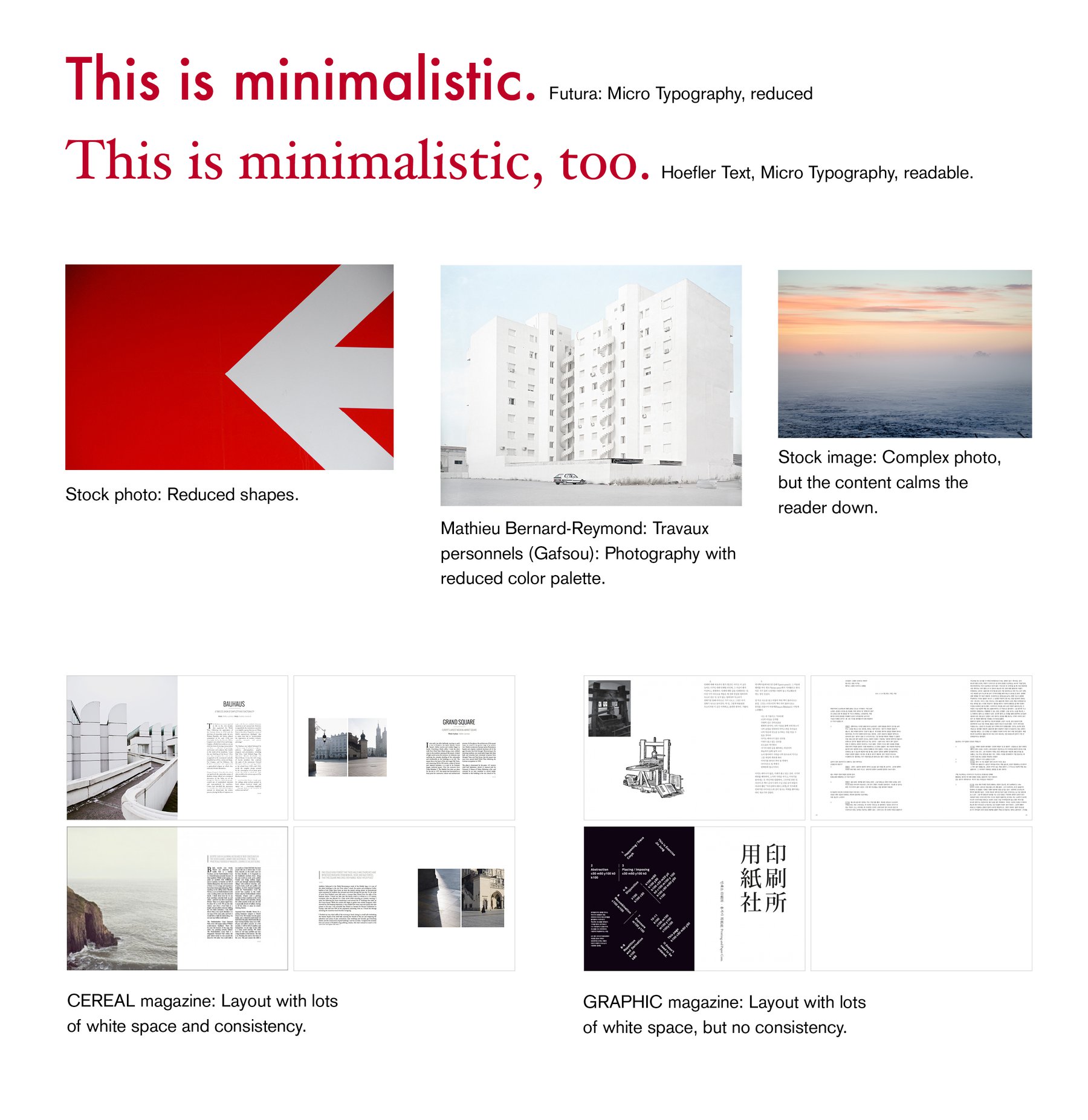
So I made this table with the forms of magazine design. As preparation for this served my last presentation about applying John Maedas “10 Laws of Simplicity” to magazine design. From him I got the concept of “reducing” and “understanding / readable designing” (in Maedas terms: “creating knowledge”) as ways to achieve simplicity; these are two laws out of the ten - and for magazine design these are probably the most interesting ones.
In general, applying theories from other (but close-by) disciplines on the own discipline is such a good idea! I can recommend it.
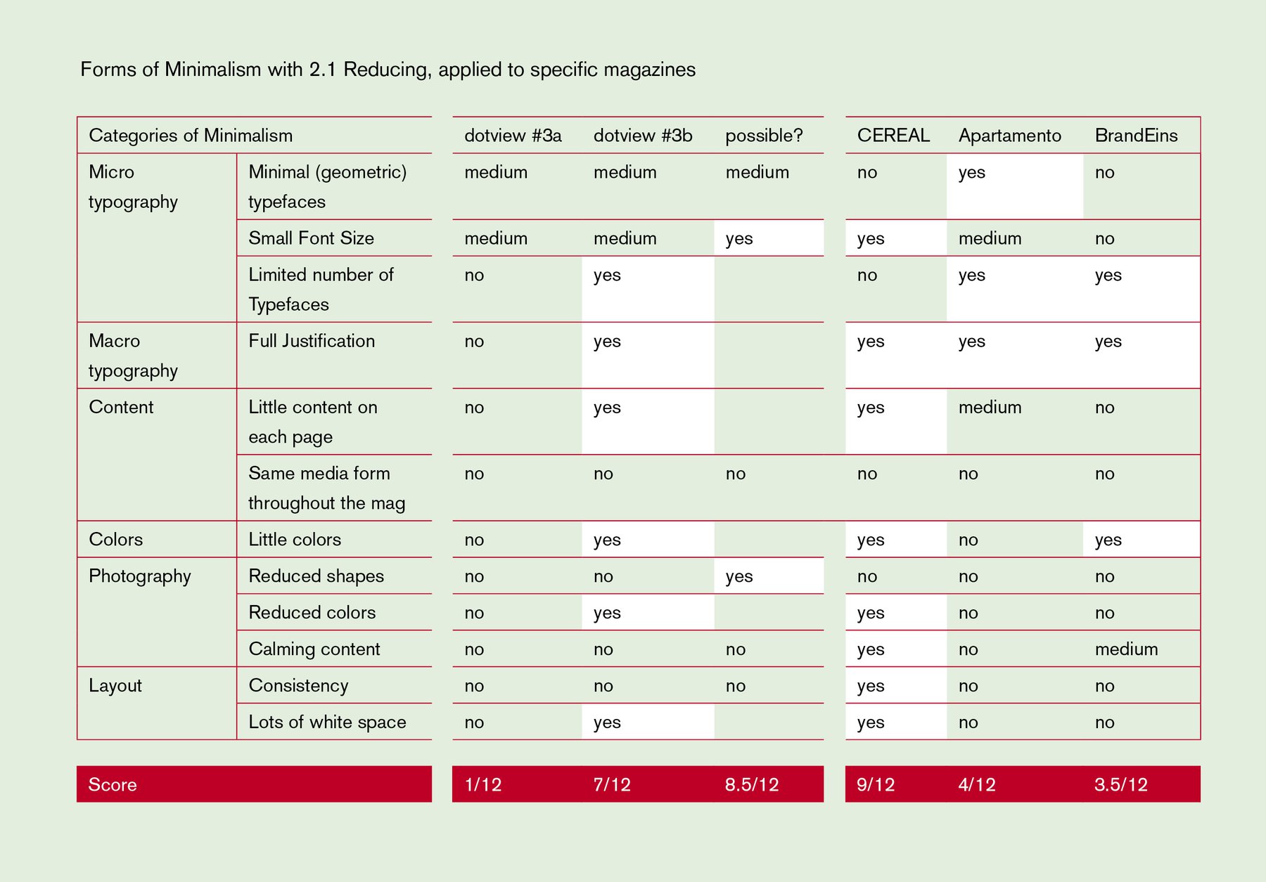
So what does this long thing at the top show? In the beginning, I introduce the forms of and ways to minimalism; then I show examples. Analyzing my own dotview magazines and three other magazines in terms of these forms happens in the last table. In the end, every magazine can get a “minimalism score”: How minimalistic it is. CEREAL is king with 9 out of 12 possible points. My second (minimalistic) issue of dotview is not so bad with 7 points - better of course then Apartamento and the BrandEins. The first magazine I designed as part of my Master’s Thesis, however, is not minimalistic at all: It only gets one point for the typefaces.