Man, I’m always coming back to using just one color. Well, now I’m using two: Internet-Link-IK-Blue for the text and other stuff, and one other color for each chapter (to separate them). (I’m not sure if I will keep this concept, I came up with this just today.)
As you can maybe see, I simplified the grid. Now it’s just one broad and one narrow column - but more fun will happen in this grid, I hope. I won’t use this broad-narrow-grid for every page - especially not for the shorter articles in the beginning and end, where I’m using three to four columns. But I guess it’s nice for the long articles in the middle.
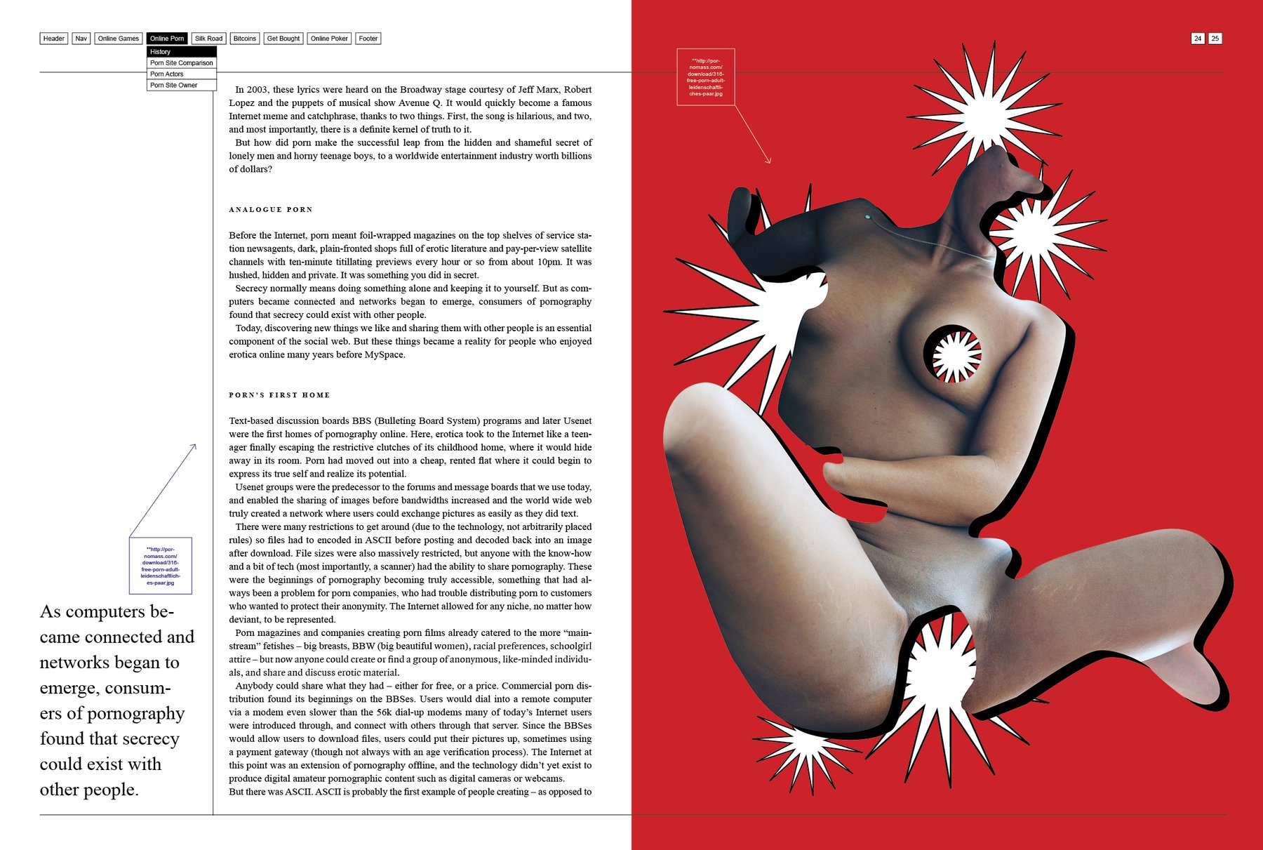
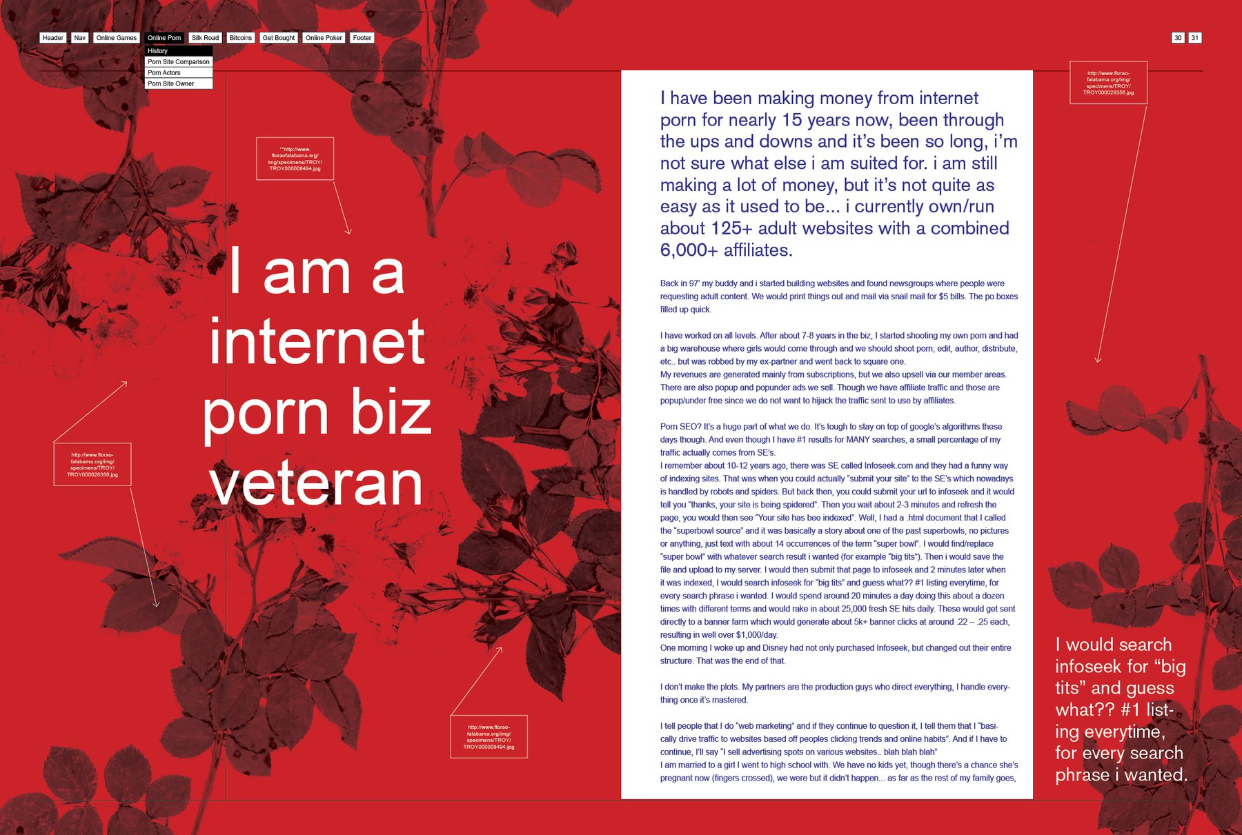
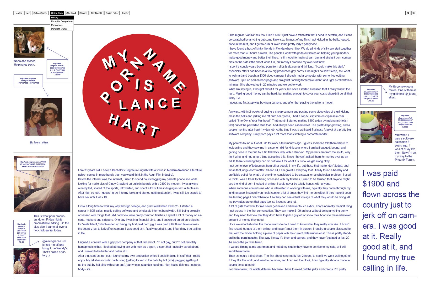
Ok, regarding the pages: I like the Porn History story at the top and the “My Porn name is…”story at the bottom - I’m not sure though about the multiplied flowers for the porn biz veteran story. I kind of like the contrast between the hard business and the beautiful flowers (and I LOVE red multiplied pictures), but…nah, I guess, a football manager with porn stars instead of football stars would be more appropriate. Something like this.
But, yeah, today was a good day and it seems like I’m almost done with the porn story. (Thank god, now you won’t have more porn pictures in your Tumblr stream. Well, at least not because of my blog.) I feel a little bit bad because I haven’t cared about the typefaces so far. I decided for Arial and Times New Roman (because Internet, you know). But I haven’t done test prints so far. Seems like I’m going to do this in the end.