

Im comparison with yesterday, today felt unproductive, too - with the difference that today, I actually WAS pretty lazy. After lunch (and thinking about harmony, see my last post), I went to the library to get inspired for the illustrations for my magazine. I went trough a lot of nice Gestalten books and found a lot of work that’s worth copying.
Afterwards I thought about balance and contrast again, and that I should have a clear difference between “boring pages” and “bold pages” in the magazine. I actually though about combining both on the same page (and I will, to a certain degree), but letting a minimalistic page following a complex and clustered one can have something very powerful in my eyes. As a consequence, I want to have articles with small type, black and white maybe, that can be designed all in the same way (minimalistic); and “feature” articles that I want to highlight with better illustrations, bigger type and colors.
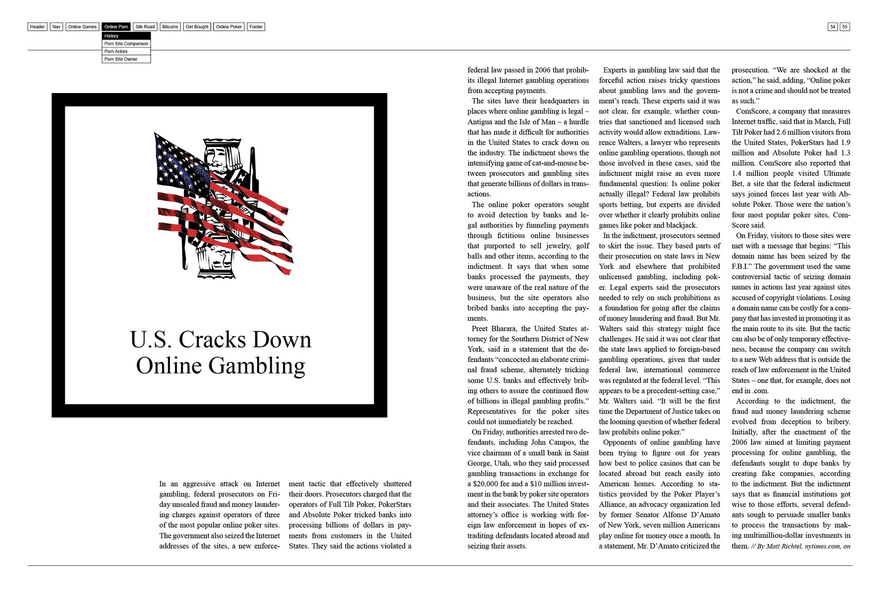
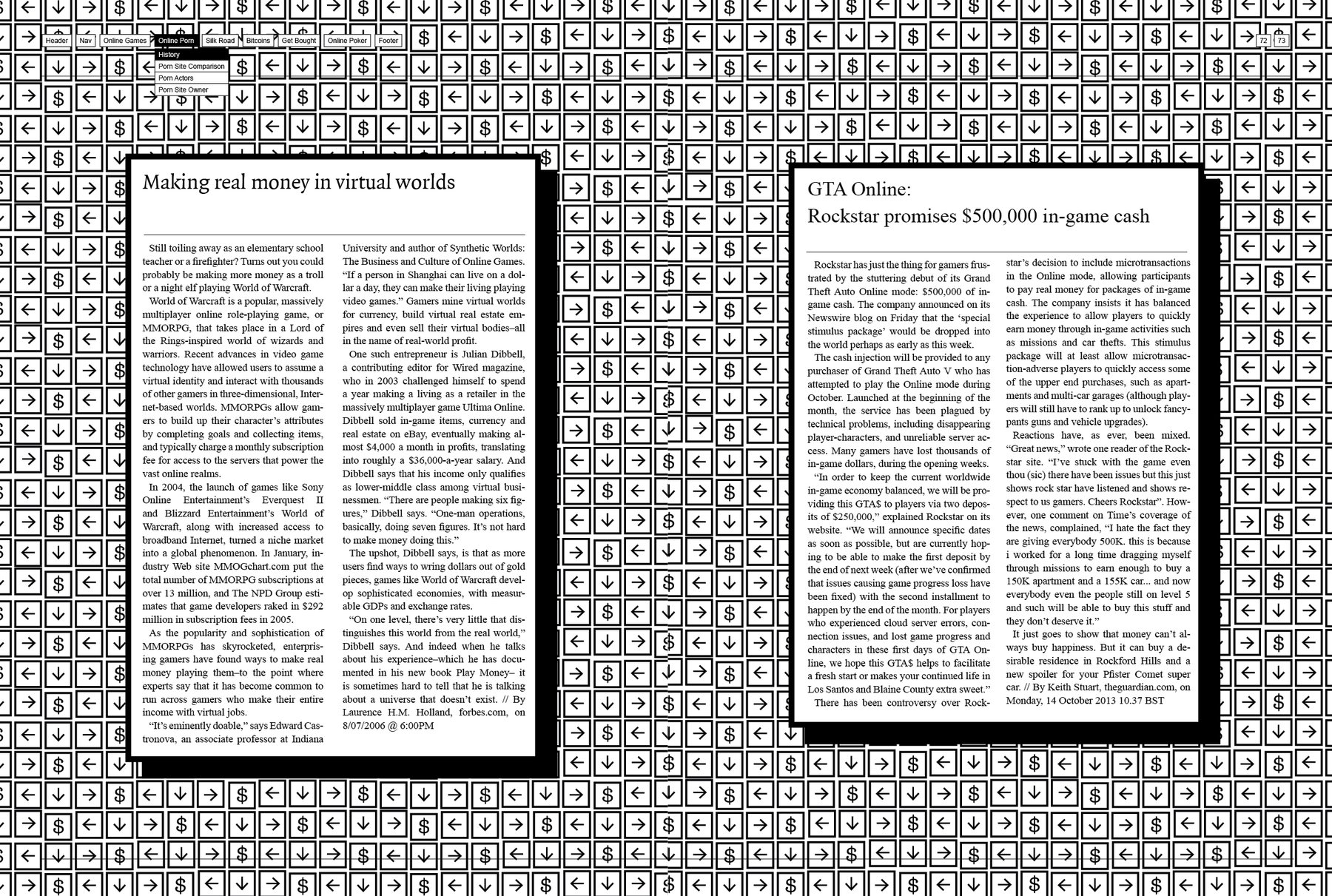
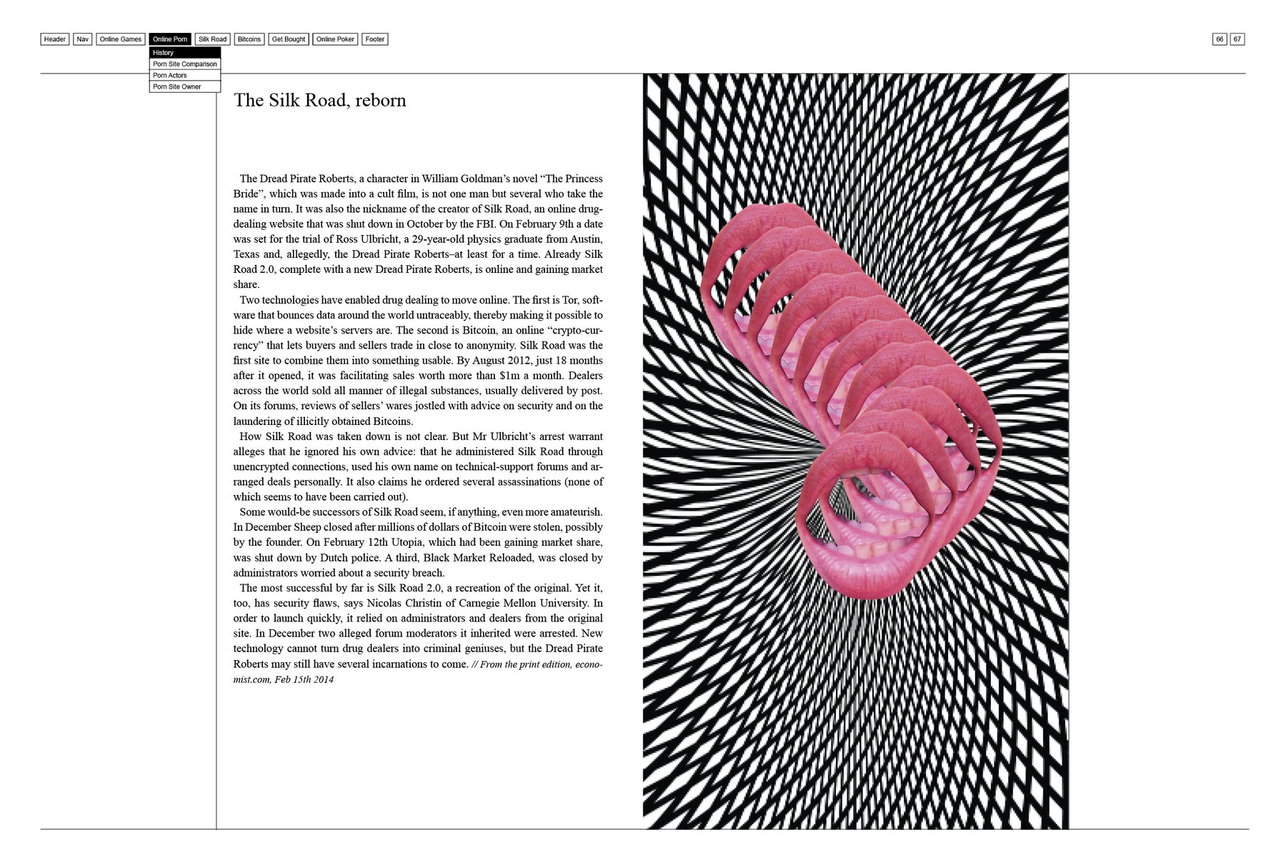
So the drafts on the top show my unsuccessful attempt to design these minimalistic pages. I want them to be look even more “the same”, even more “basic”, even more a contrast to the other pages. I have the problem, though, that I actually want them to be still rooted in their chapters; unmistakably. That was the idea behind the icon pattern in the background in the second draft. However, that’s not minimalistic. Hm.