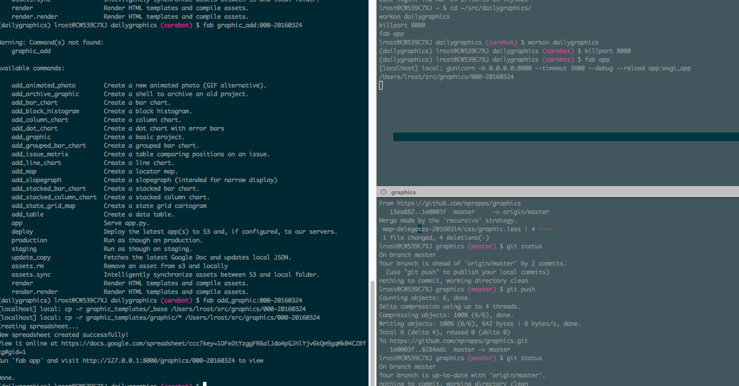
Youknowwhatthatisyouknowwhatthatisyouknowwhatthatis? That’s the graphics rig of the NPR Visuals Team. Today, Katie set the whole thing up with me, on my computer. And gave me a great introduction how to use it. I’m super excited to finally use it!
Before that, I was struggling with some data and how to represent it best. I don’t know if we just didn’t get to the best possible solution, or if we found the best possible solution and there was just not a better one possible. As Katie said: She thought there would be some Aha moment at some point when looking at one of the possible options, but there just wasn’t. After trying out scatterplots, a parallel coordinates chart, stacked bar charts etc, we decided to go with…a table. Kill your darlings etc. Still, I had fun making graphs and pushing data around.
Input? 5
Output? 3
Learnings?
If you don’t like something about somebody, consider that you’re not the only one. Then consider helping that person, instead of being upset about her/him.
git commit -a makes you skip adding the files, when they are already tracked.
The cities in which the most households with an income up to 15k USD pay more than half of this income for rent, are not the same cities in which the most households with an income between 15k and 75k pay more than half of their income for rent.
Spotify doesn’t have my favorite Radiohead album.
Questions?
Should I work on smaller graphics or one big research project which will take a long time? Should I work on smaller graphics first, then the big project? Or should I do it simultaneously?
How bad is the tap water in DC? While filling up my bottle with that liquid stuff at work today, a woman came and first said “that’s not made for drinking, you know that, right?”, and then almost begging me to not drink it so much. I’m a little bit confused. What do they serve you when you ask for tap water in restaurants here?