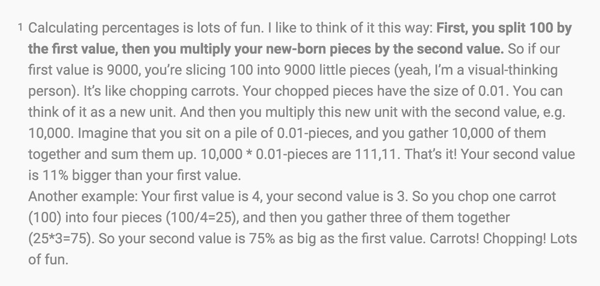
This week’s Weekly Chart features Tyler Vigen’s spurious correlations, an explanation how to make indexed charts, and – my favorite part – what’s going on in my mind every time I calculate percentages: blog.datawrapper.de/weeklychart-in…
Likes: 10 | Retweets: 3