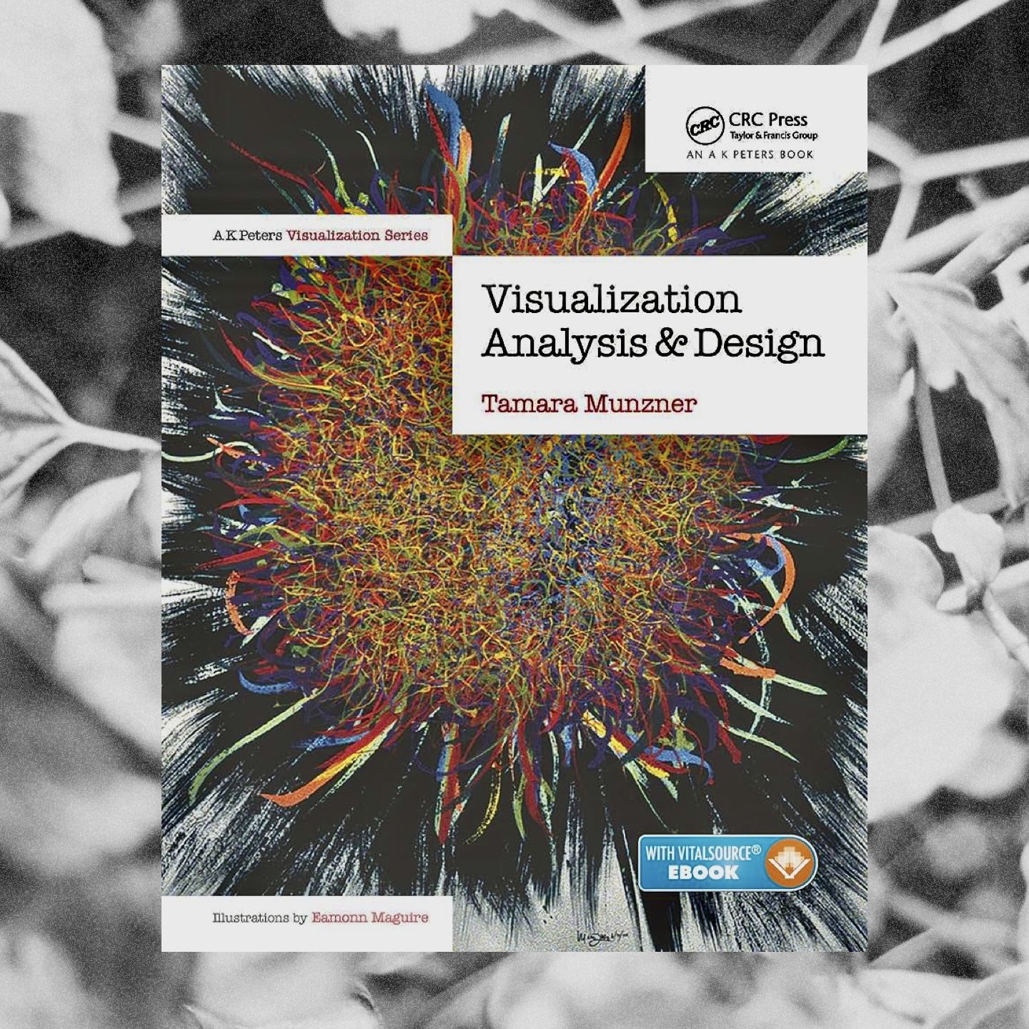
I liked it! It IS a textbook, I think I underestimated that. But that’s also what made it so helpful: This book structures the field and it challenges and names everything, and that makes the data vis field more understandable.
I was also surprised how much this book is focused on vis tools for exploration, instead of on data vis for presentation (something I normally spend a lot of time thinking about). Data vis in journalism is just an afterthought in her book. I didn’t mind that, though; it was interesting to get to know this perspective, especially because it was so new to me.
The idea of the four building blocks in chapter 4 is brilliant. I enjoyed the idea that they’re nested, and especially this: “The challenge of nesting is that choosing the wrong block at an upstream level inevitably cascades to all downstream levels.” (p68) I’ve had the feeling that this is the case, but I haven’t heard it so clearly communicated yet.
In this regard, I also enjoyed the concept of threats and validation at each of the four levels (p76). It’s so helpful to keep in mind that not every block can be designed perfectly after just enough analysis of the problem or enough user research. Instead, you first need to build something to test it.
In the second part of the book, less of the book applied to my work. Especially the few last chapters werde mostly about “how to navigate and keep an overview in huge datasets” – that’s something I’ve never thought about. But it’s a really interesting design challenge and I’m glad the book introduced me to it! It’s good to know that many smart people have thought about that problem. I’m sure I will encounter it at some point, and then I’ll know where to look.
I did have a little “mind blown” moment in chapter 8, on page 181. There Tamara writes: “The major design choices for choropleths are how to construct the colormap, and what region boundaries to use.” That made me excited to think about the major design choices for all chart types: If you design a line chart, for example; what are the design choices that will determine your chart (and its ability to reach its goal, e.g. to be readable) the most? For a line chart, that would maybe be the y axis range and definitely the x axis range. I’ve written articles about design guidelines for chart types before and I have not considered mentioning these big design decisions. Kind of want to go back and edit aaaall the blog posts.
In general, the few chapters that were important to my work resonated a lot with me. Chapter 10 was just genius; I think I’ve read that already in the past, but I feel like I need it again for a few more times to digest all these super valuable information in there.