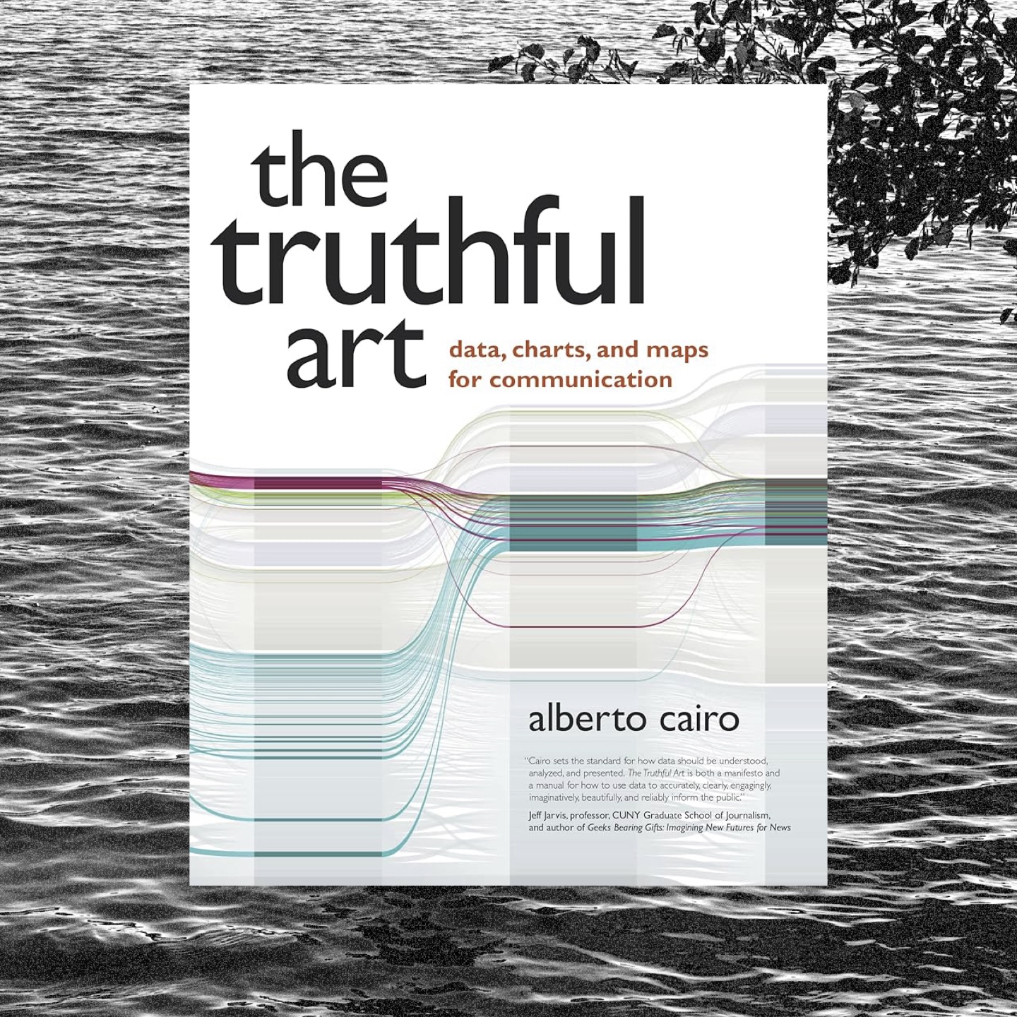
These days, Alberto Cairo is everywhere, and his books are, too. I was really curious to see what the hype is about (and I read his book “The Functional Art” and wanted to compare).
And, well: I really liked it. It was a fascinating read and I got a lot out of it – especially of the statistical part. It’s amazing how well-explained it is; Alberto obviously put a lot of consideration into how he explained such complicated concepts. I also thought that it was great that he didn’t sell the book as a stats book at all; he just casually slides in these lessons and mixes them up with lots of great visuals. Genius. I learned a lot about, well, how to explain stats.
My favorite paragrah:
“What if our purpose is to show readers both the big picture and the details? Then we’d need both the map and the chart on the same page or, if this were an interactive visualization, a menu that’s let people switch between them. Multiple graphic forms may enable multible tasks.”
It’s one of these ideas that I’ve heard often (The book “Storytelling with Data” by Cole Nussbaumer-Knaflic is almost entirely about that idea), but then you hear it phrased in a certain way and it really makes you think and you start to grasp it (or a part of it that you haven’t grasped before).
Would definitely recommend.