We published a new Data Vis Dispatch yesterday! It’s our weekly collection of the best of small and big #dataviz. Have a look: blog.datawrapper.de/data-vis-dispa…
Here are screenshots of the four visualization-heavy articles that impressed me the most this week:
Likes: 216 | Retweets: 41
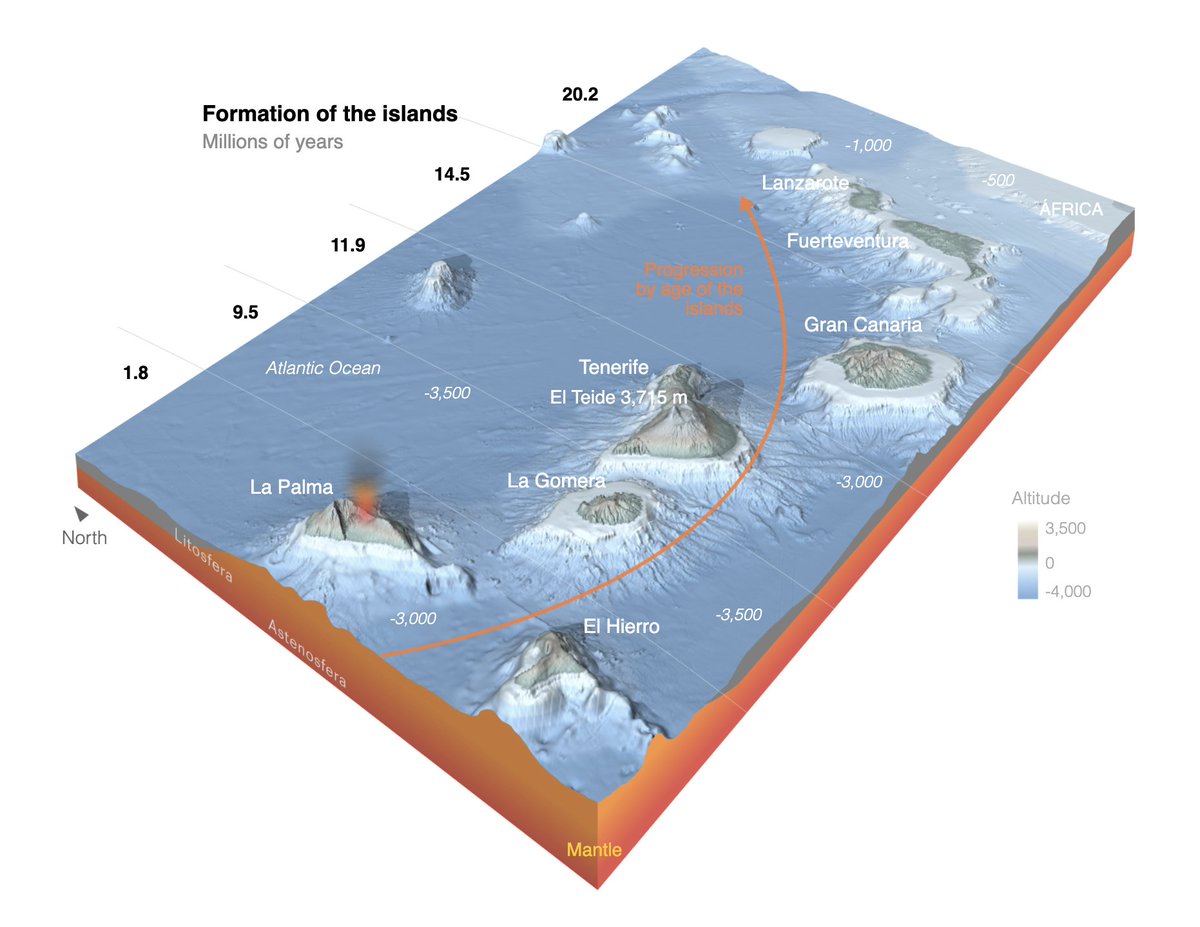
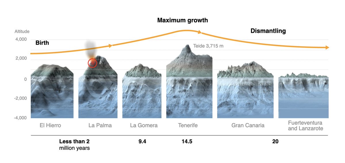
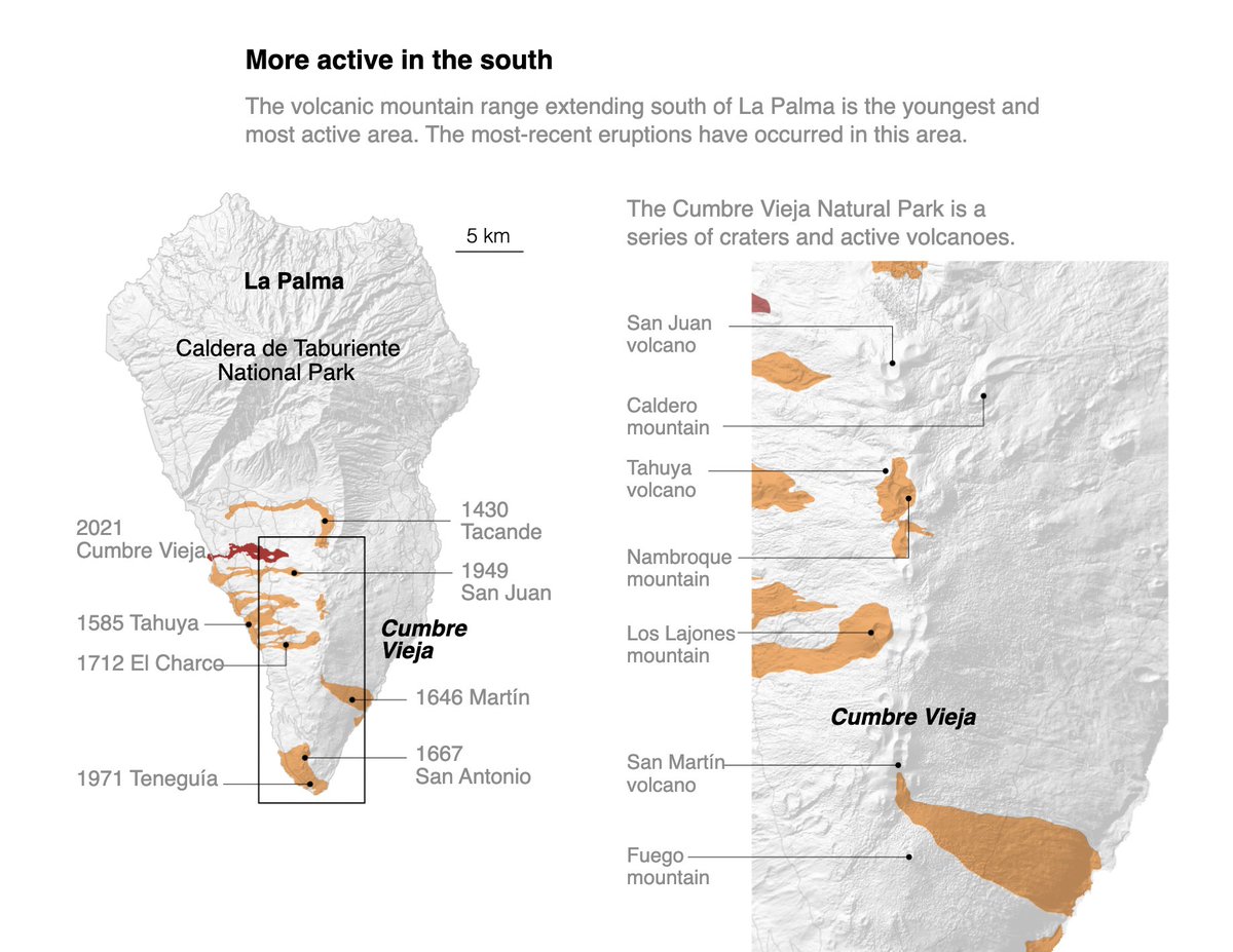
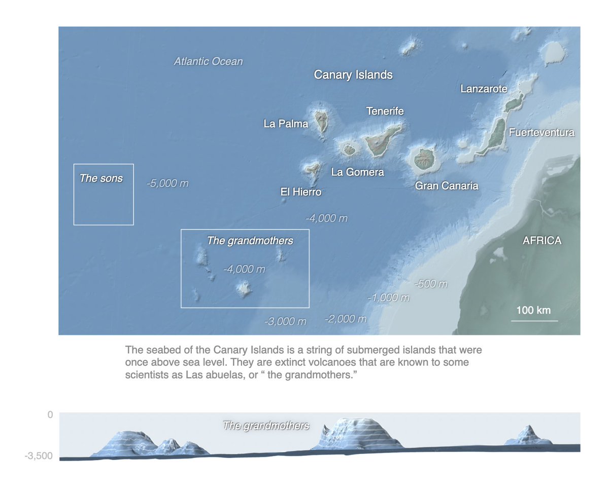
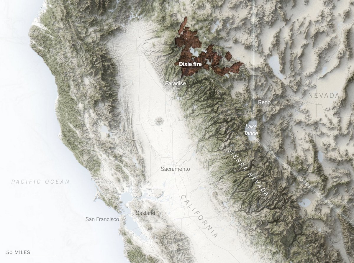
First, @elpaisinenglish’s excellent explanation of why the underwater ‘hotspot’ feeding La Palma’s volcano will create new islands, by Nuño Domínguez & Mariano Zafra: english.elpais.com/science-tech/2… It gives context to the volcano eruption with amazing, detailed (3D) maps.
Likes: 37 | Retweets: 8

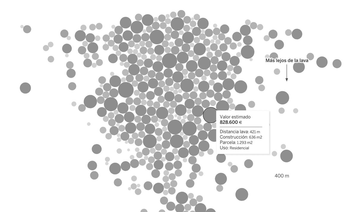
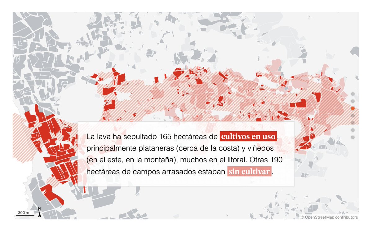
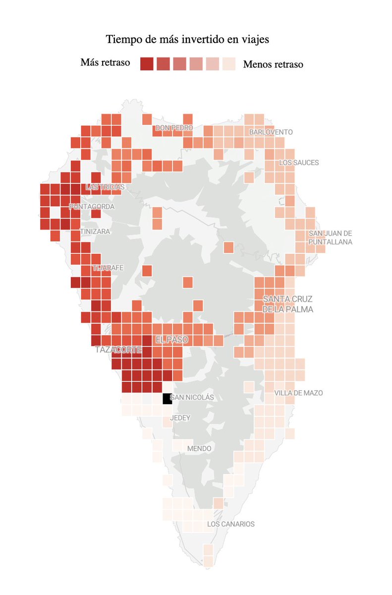
Another @elpais_espana article about the volcano, this time by Kiko Llaneras, Borja Andrino & Guishe Vega, asking: “¿Qué ha destruido el volcán de La Palma desde el día de su erupción?”: elpais.com/sociedad/2021-…
Impressive: All these charts & maps are made with @Datawrapper 🤯
Likes: 13 | Retweets: 2
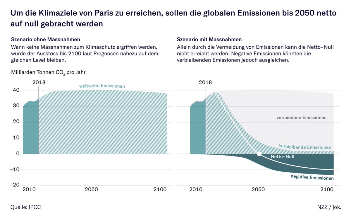
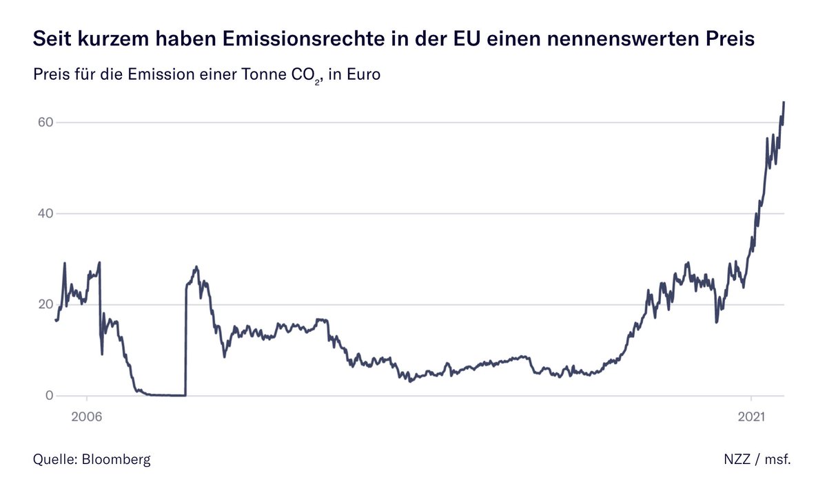
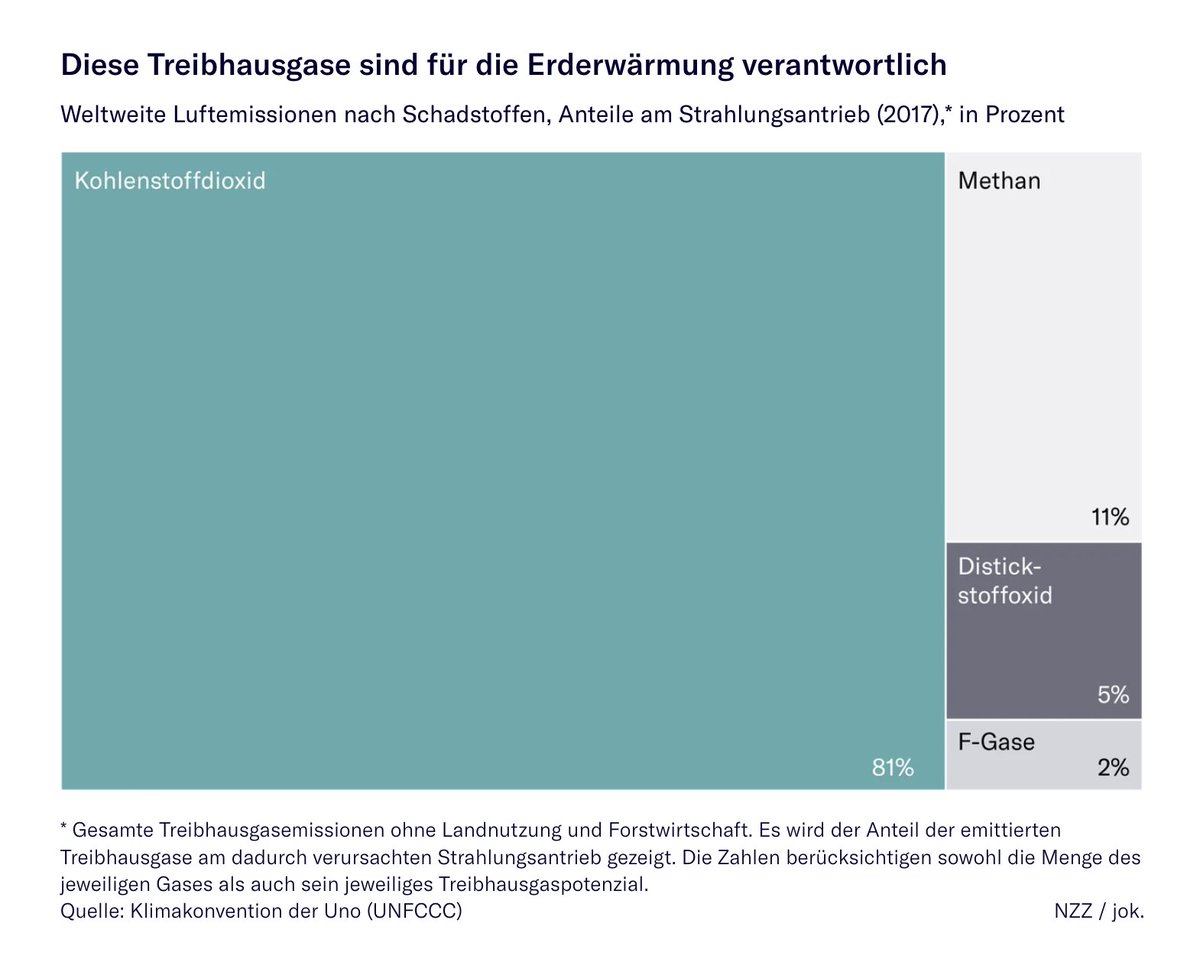
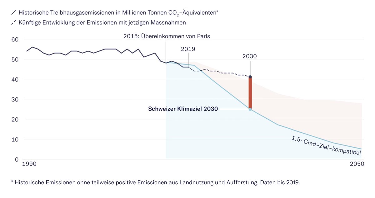
Third one: “Wo die Welt beim Klimaschutz steht” by Gerald Hosp with just so many great, simple charts by the @nzzvisuals team (Joana Kelén, Alexandra Kohler, and others). And when you least expect it, you get surprised by some scrollytelling: nzz.ch/international/…
Likes: 7 | Retweets: 3
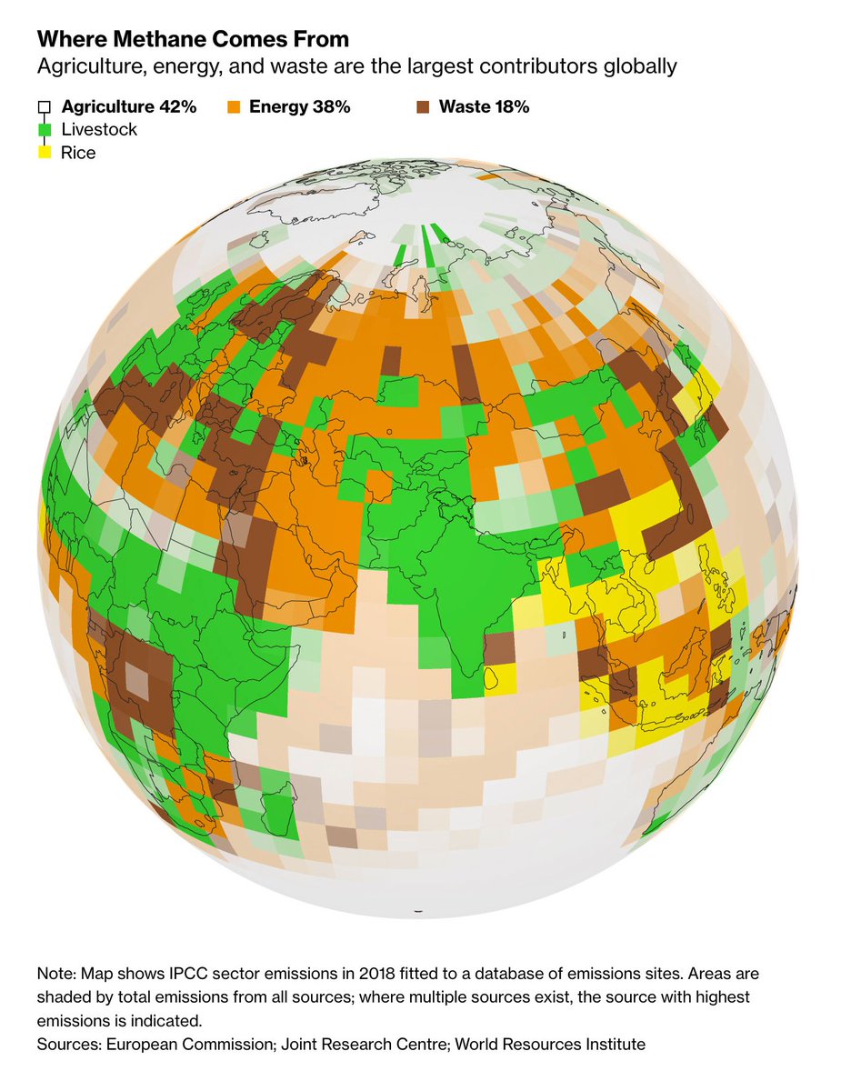
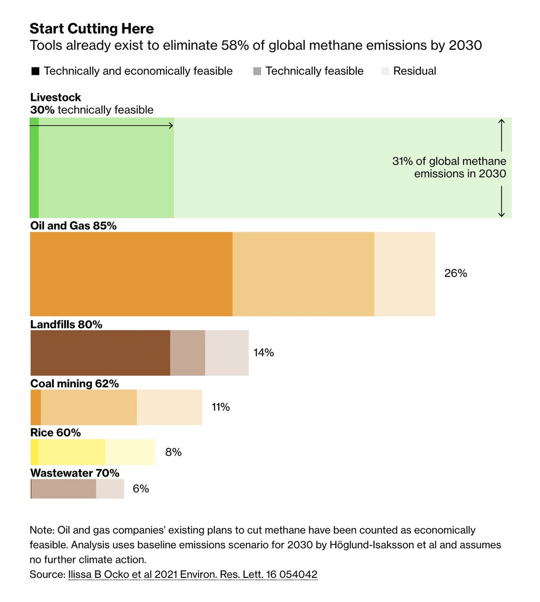
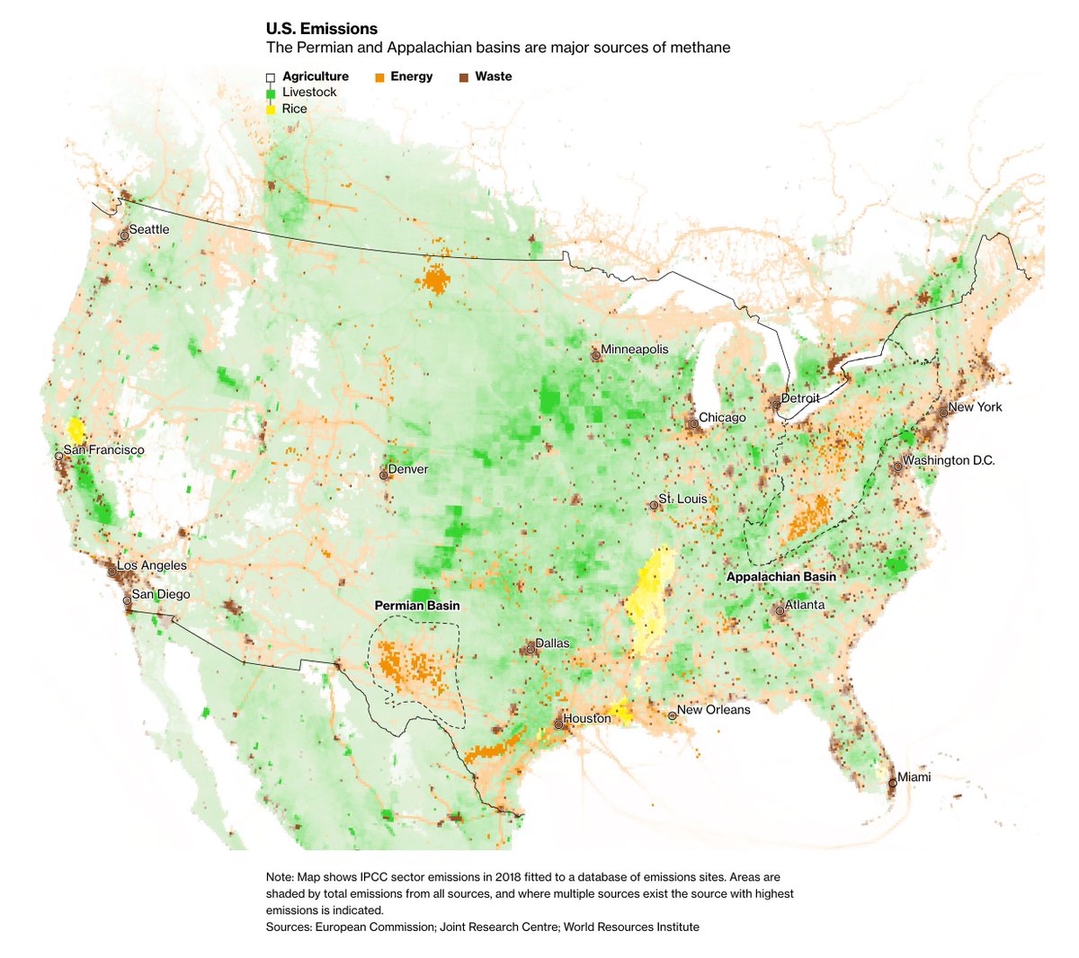
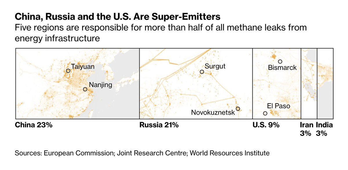
And last but definitely not least: “The Cheap and Easy Climate Fix That Can Cool the Planet Fast” by Hayley Warren and Akshat Rathi for @climate: bloomberg.com/graphics/2021-… These maps! This Marimekko chart! And look at this stacked bar chart filled with regions: Such a good idea.
Likes: 28 | Retweets: 4