Today I put together a survey, to ask people to help me with my book. I made good experiences with such surveys – but this one is a bit different. Like with every survey, I’m a bit worried that I won’t get any answers. But I’m also a bit worried to learn that the topics that some of my blog posts covered so far are considered not very helpful. Or that I could have been more helpful with other kinds of blog posts.
Basically, I tried to listen very much to beginners and their problems in the past years – every time I gave a workshop and people asked questions and I saw what people were struggling with, I was very grateful.
But I never asked people in structured way; like with a survey. And I never really sat down with them and told them: “Lead me through your thought process while you’re creating this chart.”
I hope to do this more, and this is the start. You can find the survey here: https://lisacmuth.typeform.com/to/B3NhU95f
I also went down a little rabbit hole. A few days ago I discovered Huetone, a color tool which kept being an open tab in my browser:
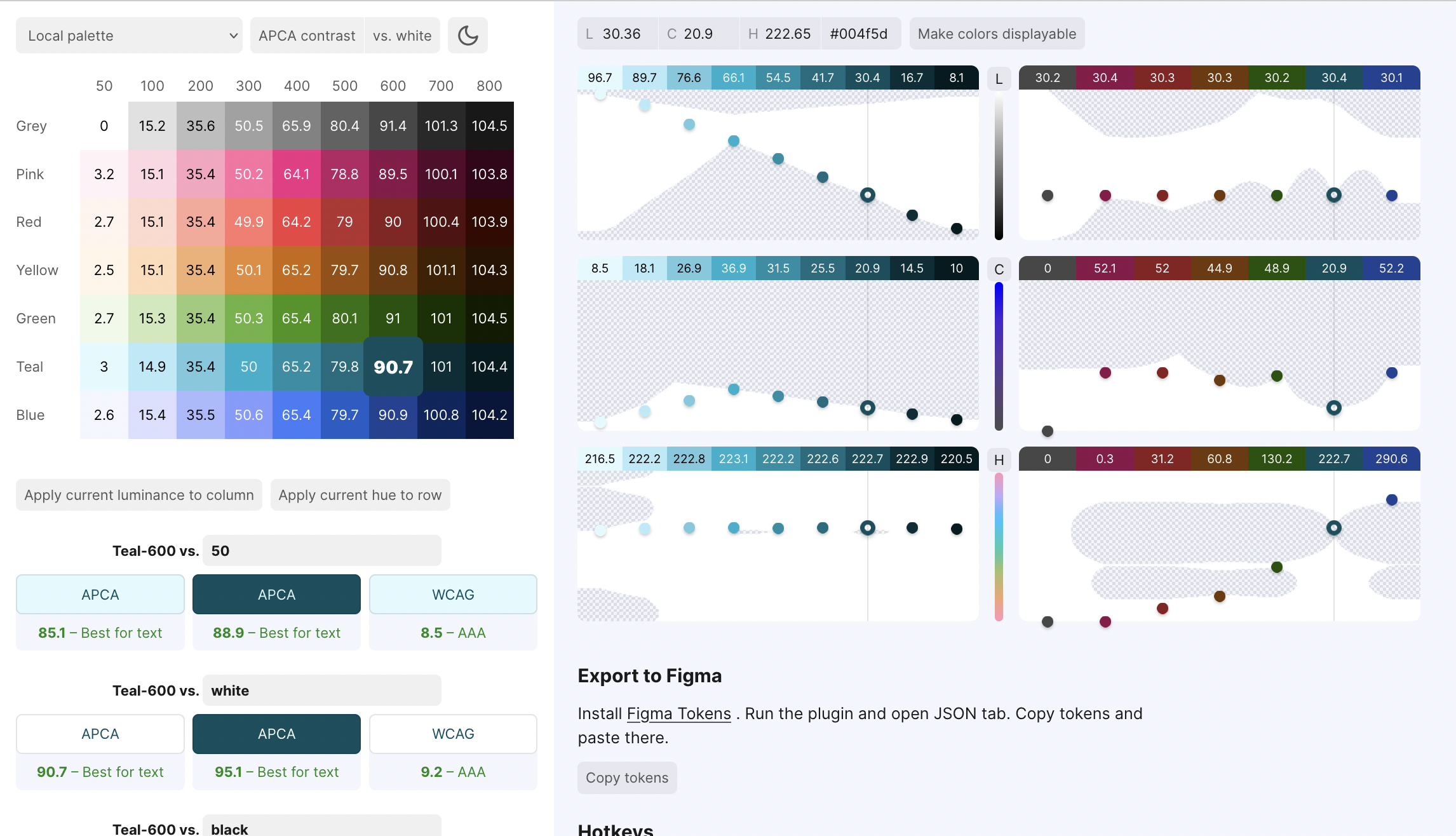
Today I finally checked it out a bit more and discovered that it was created by product designer Alexey Ardov. He has a great thread about the tool on his Twitter account, in which he mentions an article by Wildbit called “Accessible Palette: stop using HSL for color systems” (Wildbit – I didn’t know that – is a company that creates several products, among others Postmark, a software we use at Datawrapper, too.)
It’s a really good article by Eugene Fedorenko, lead designer of Wildbit and Figma enthusiast, about that CIELAB or LCh are better color models to create a color system for a style guide, because they take into account the perceived lightness of each color. Eugene built a color tool, too, called Accessible Palette:
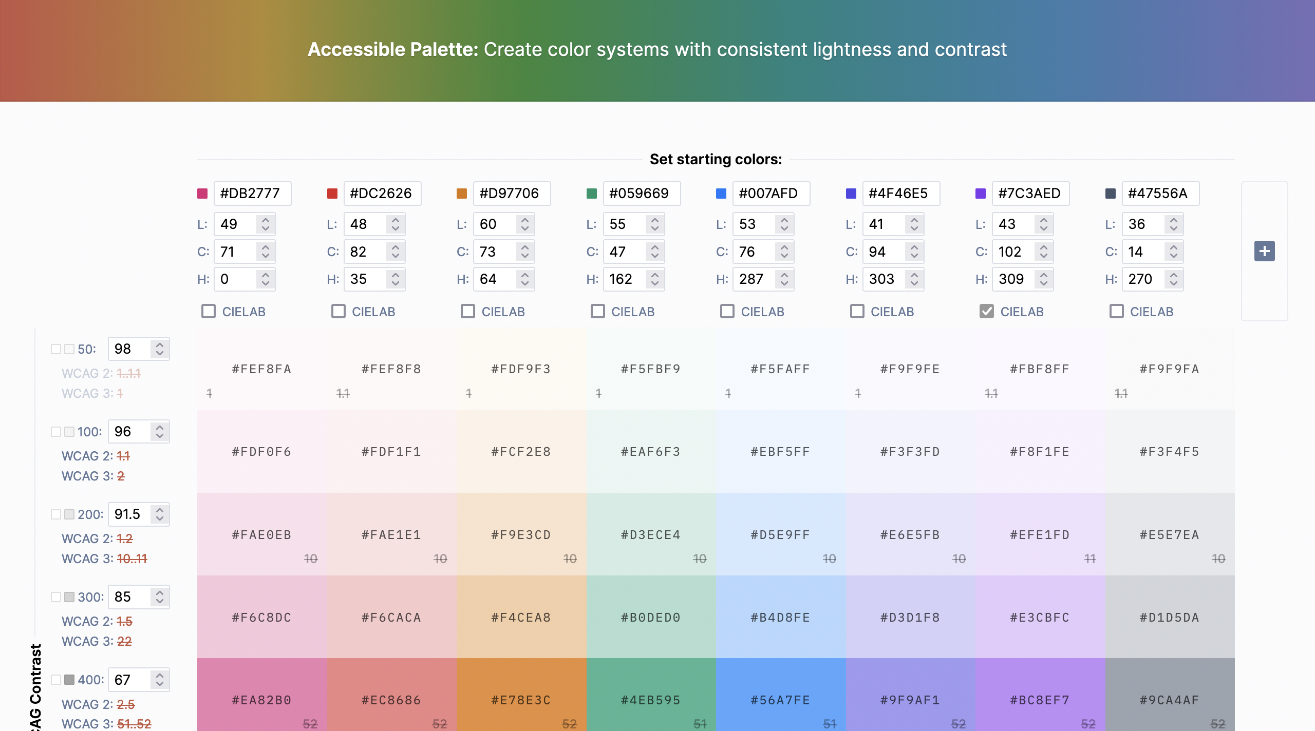
Fun fact: Both tools use chroma.js, a Javascript library our Datawrapper CTO Gregor wrote.
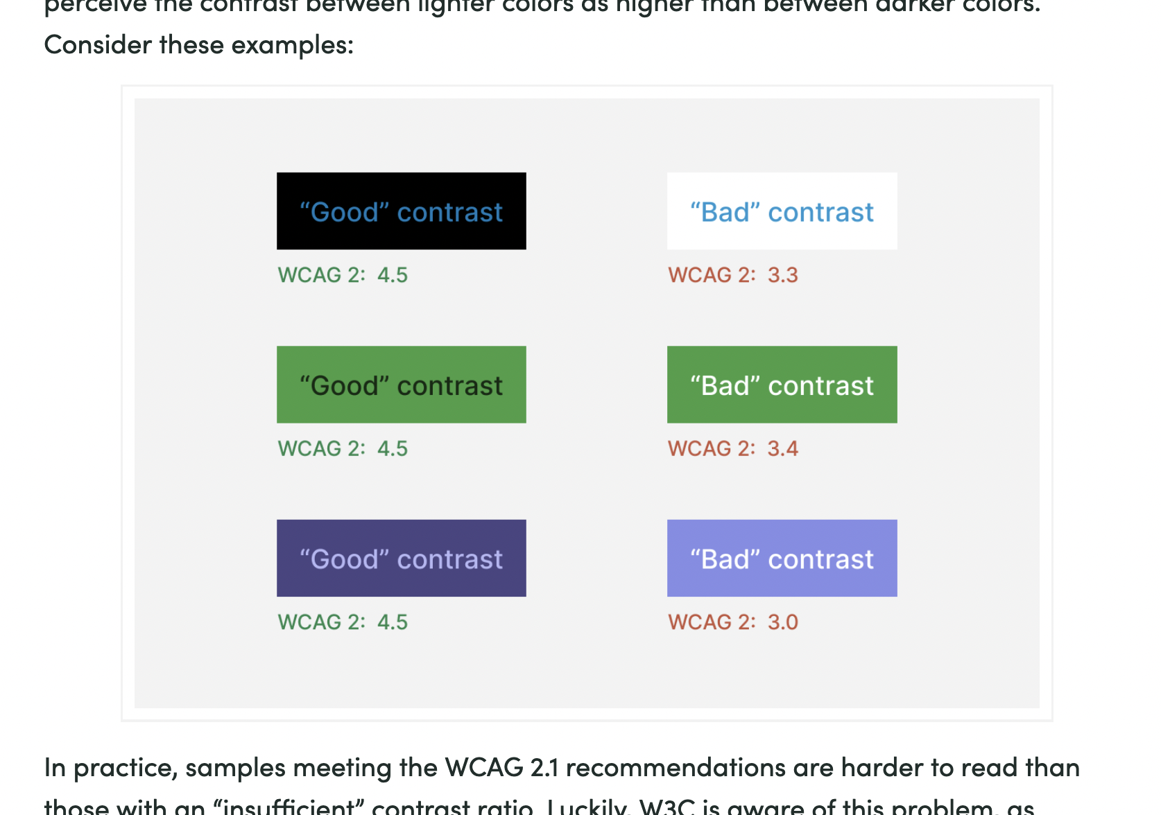
The most interesting new thing I learned today is that the Web Content Accessibility Guidelines (WCAG) 2.0, while commonly used to make statements about “is the contrast between text and background readable enough”, is not perfect. Here’s a screenshot from Eugen’s article:
The new accessibility check in town is called APCA and will be in the next version of the WCAG. This crazy website lets you check your colors with it:
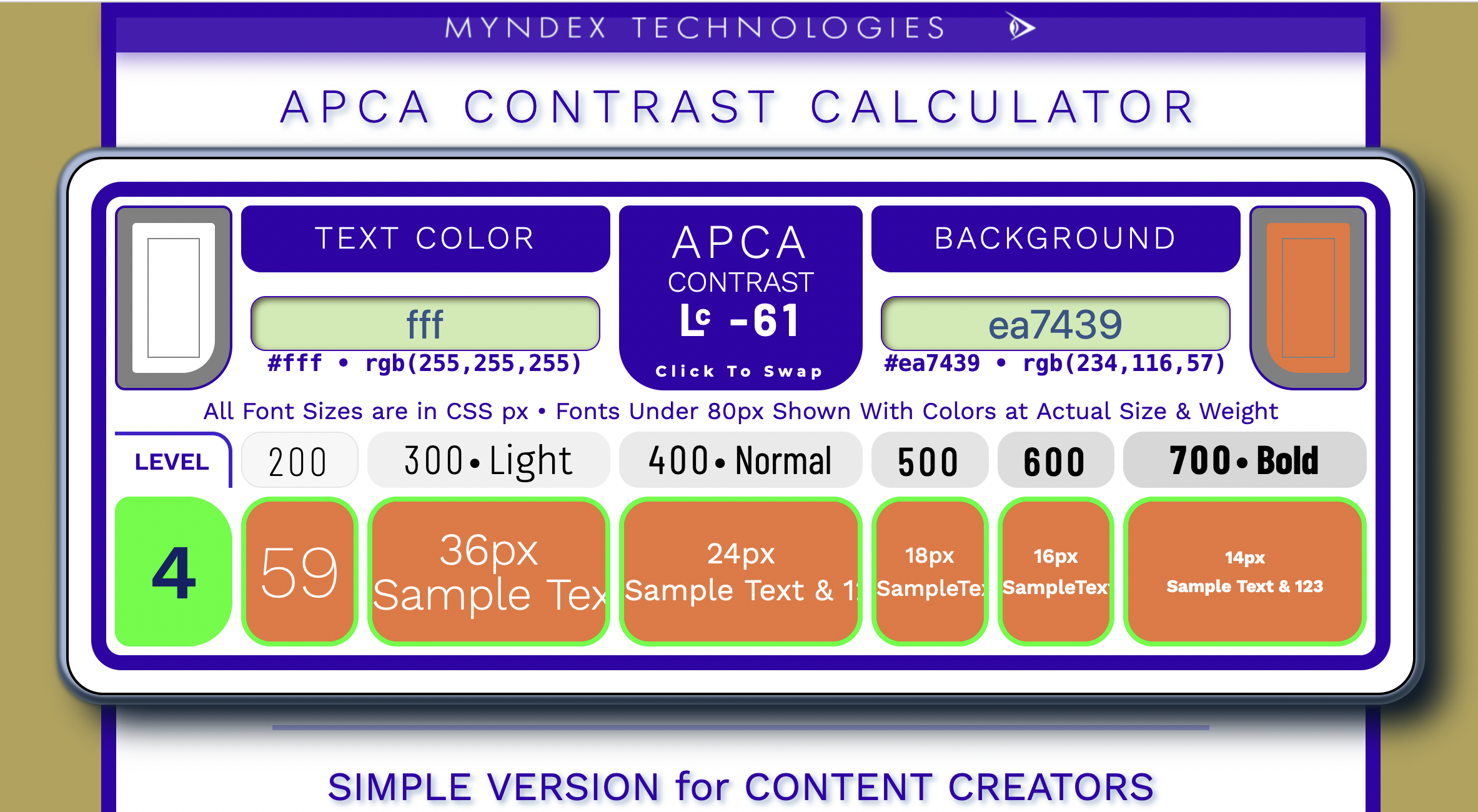
This is also resolves “the orange button problem”, as Andrew Somers (the creator of the crazy contrast checker up there) explains here.
Quote of the day: “Like color, contrast is also not real, it is a perception.” – Andrew Somers
Open questions: What does that all have to do with colors in data vis?