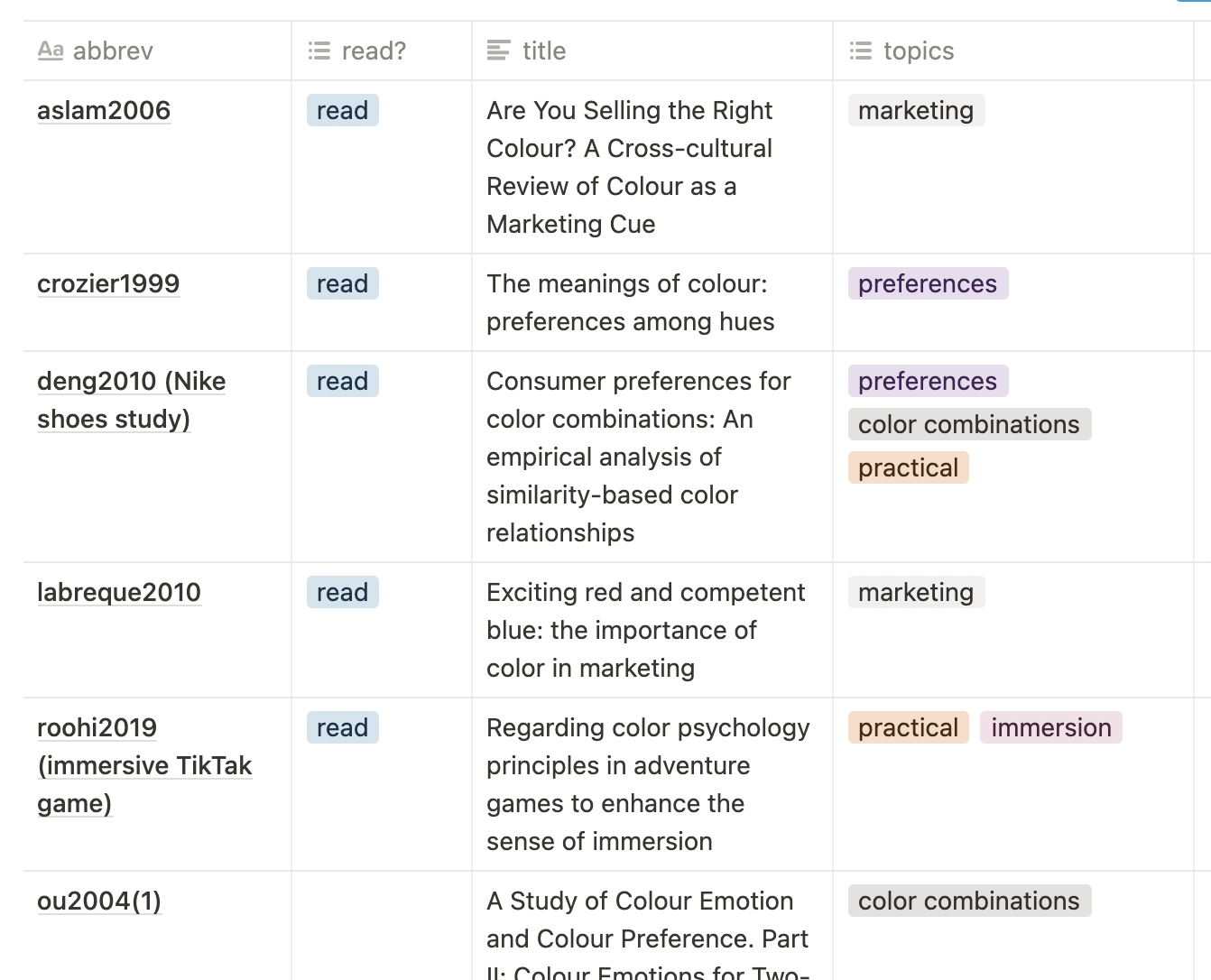
Nice day today! I read four papers, mostly about marketing aspects of colors. I’m pretty sure I can learn something from studies done with marketing in mind, because if you’re designing a logo or some packaging, you’re trying to go for colors (and shapes, and typo, and images) that
a) look good
b) communicate “hey I’m part of this industry”
b) attract the attention (maybe by being a bit different than the industry)
Sounds like something a lot of data visualizations want, too.
I also found more color tools. (Maybe I should add a “color tool of the day” category at the bottom of these updates, because I’m fairly sure I’d be able to find one for each day of the year…)
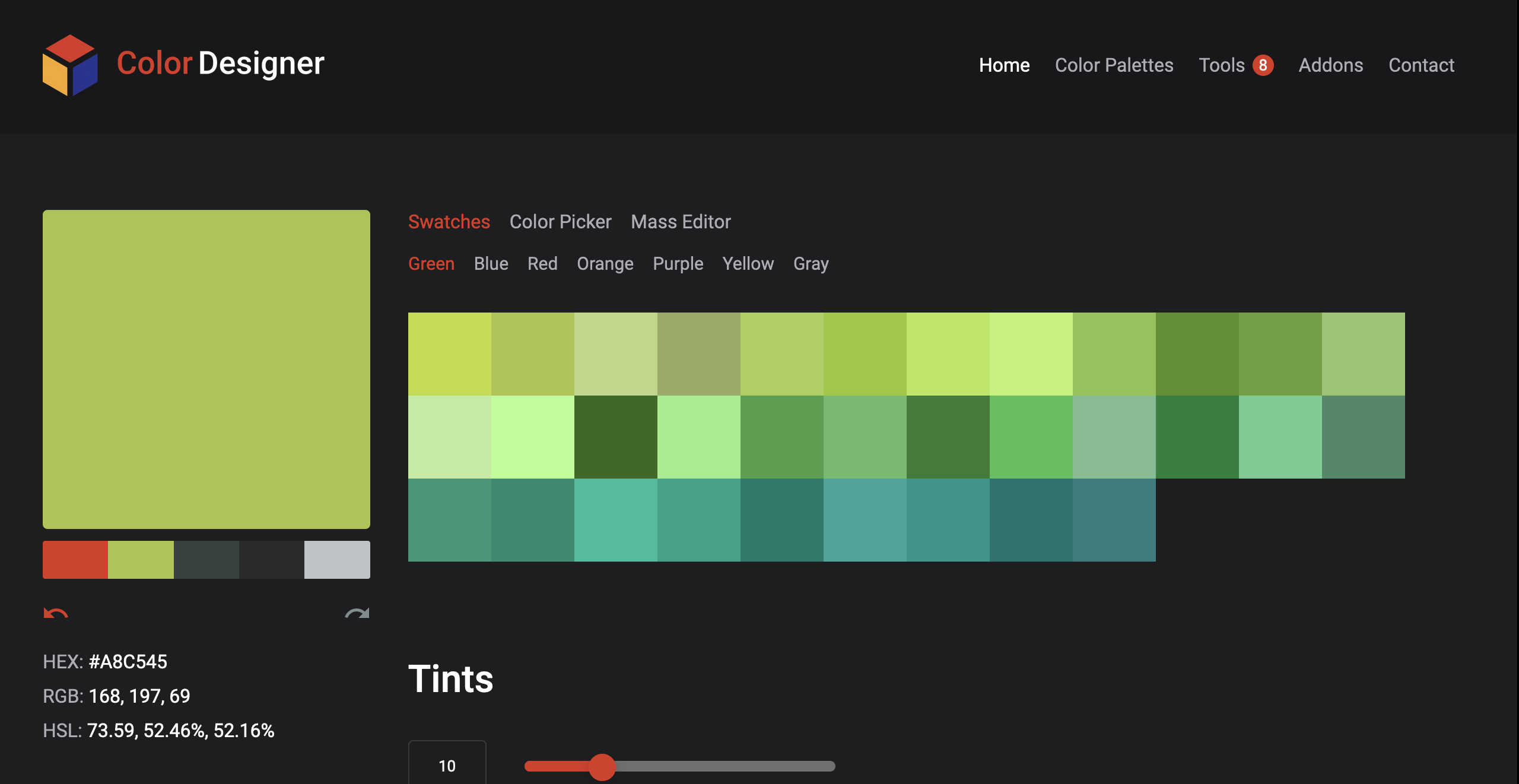
ColorDesigner is not just one tool, but eight.

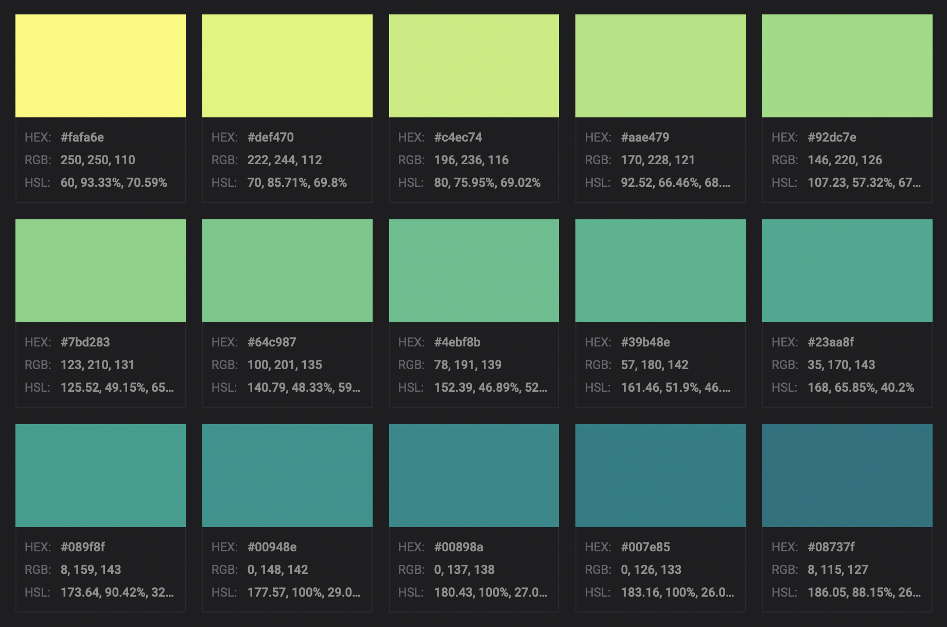
I especially like the gradient tool because of its beautiful default colors:

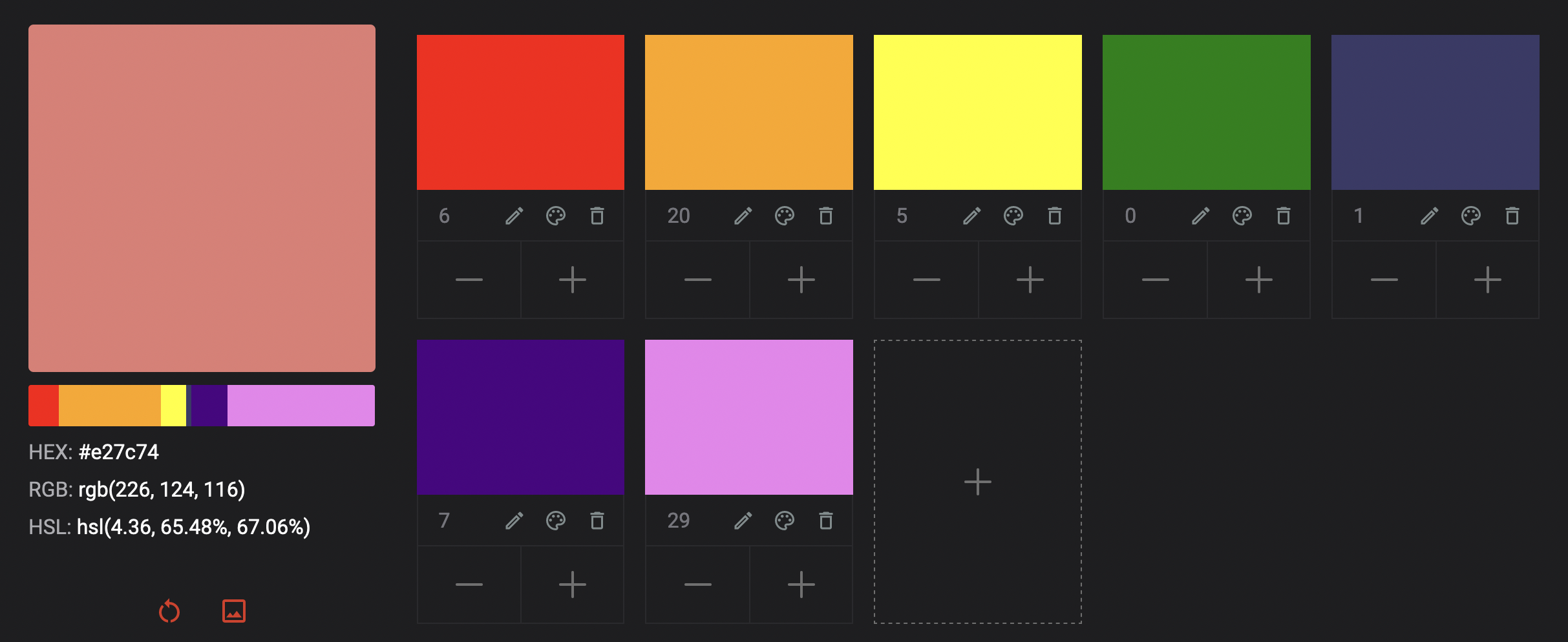
And I find the color mixer tool super neat – it’s something I haven’t seen before and it’s fun to play around with it:

By the way: These pure colors (red, yellow, orange, green, blue, purple) are called “simple colors”, and “all others” are called “sophisticated” (according to Mubeen M. Aslam in “Are You Selling the Right Colour? A Cross‐cultural Review of Colour as a Marketing Cue”). “Sophisticated colors”! I really like this phrase. “Sophisticated” is a beautiful word anyway – I’d love a common German word that starts with “Sophi(a)”. (I just learned that “sophisticated” exists in German, too…at least that’s what the most important German dictionary wants me to believe…but I don’t buy it. We just stole it from the English-speaking peeps. It feels wrong to say it in German.)
Anyway – “sophisticated colors”. I might use this word in my book once or twice. (More like twice.)
Open questions: Which papers should I read? Can I read all the papers about colors they are? Would that be a good idea?