

It’s winter, so it became grey in Berlin. Friends and family from Southern parts of Germany send me pictures of snowy trees and white landscapes, and all I can see when I look out of the window are desaturated browns and shades of greys.
What a great season to spend time thinking about color! 🎉
Today I spent lots of time reading more about Andrew Somers (Myndex on GitHub) and his quest to change the WCAG guidelines so that they include better color contrast calculations. I read through the whole Github issue and started writing it all up as a blog post.
I also went back to some color calculations I did half a year ago in R and used them to do some more. I marvelled at the magic (=time savings) of commenting your own code well, and created some charts first in ggplot2 and then in Datawrapper showing that perceived lightness isn’t the same as mathematical lightness.
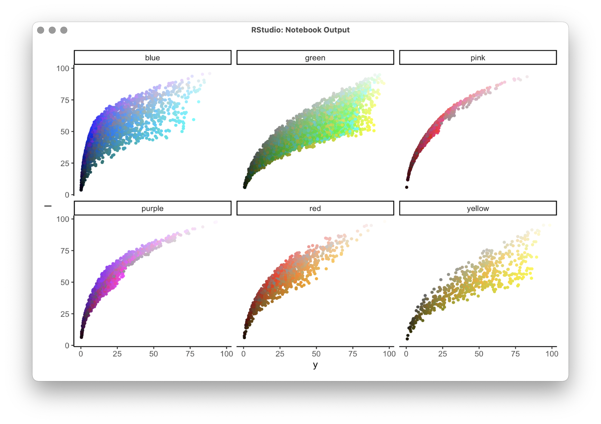
That was fun. I’ll probably fine-tune the chart(s) tomorrow.
Quote of the day: “But does that mean that red and blue text on dark backgrounds should be banned completely?” – “YES. Banned completely, they are not accessible, and problematic even for normal vision.” – Andrew Somers