Today I didn’t feel great, so I didn’t do as much as planned. I almost finished reading the chapter on color in Colin Ware’s “Information Visualization”; then watched some videos of people who explain how they pick colors for their illustrations…hoping I could learn a trick or two from them. And I think I did!
Almost all the videos talk about that when reducing brightness, one should also reduce the saturation, and the other way around. That’s because if things are dark, they’re often in the foreground, and hence also very saturated. Not saturated things (like hilly hills in the background) are often brighter.
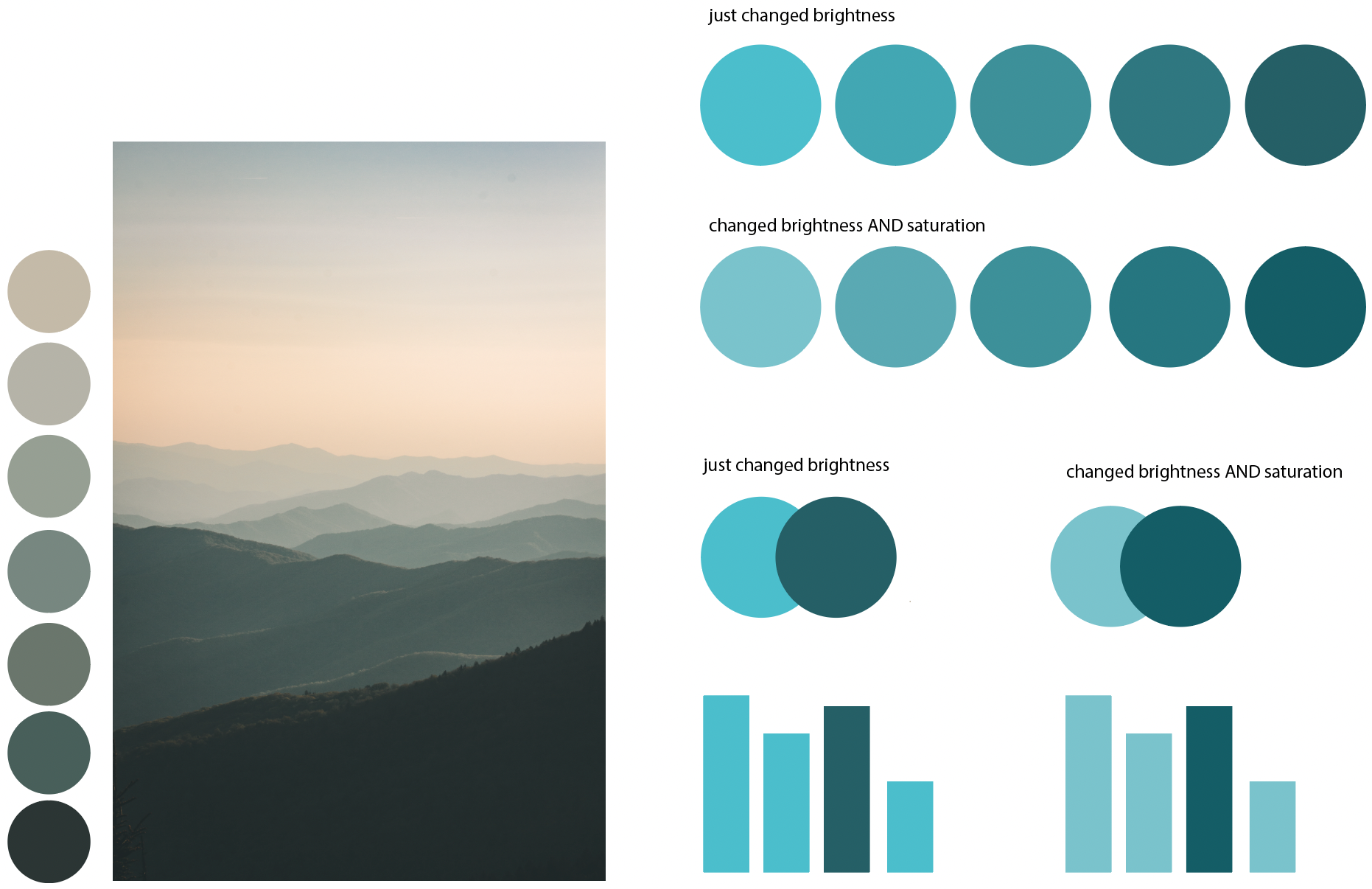
I’m not 100% sure if and how that applies to Datawrapper – because with data, you don’t necessarily want to envoke the idea of a background and foreground. You want people to believe that everything is on a plane, and that some things are simply bigger or taller or wider than others. If a data visualization implies that it’s threedimensional, you start to see it like that. Darker, saturated bars become taller just because they look like they’re in the foreground, and stuff in the foreground is bigger.
Hm. Interesting for sure.
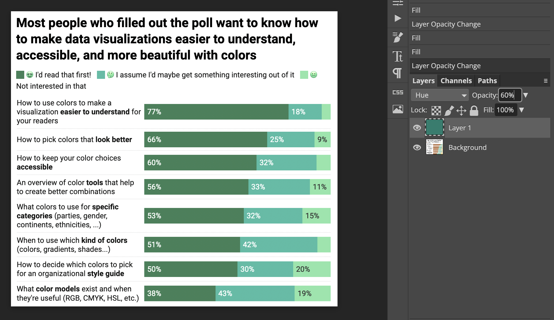
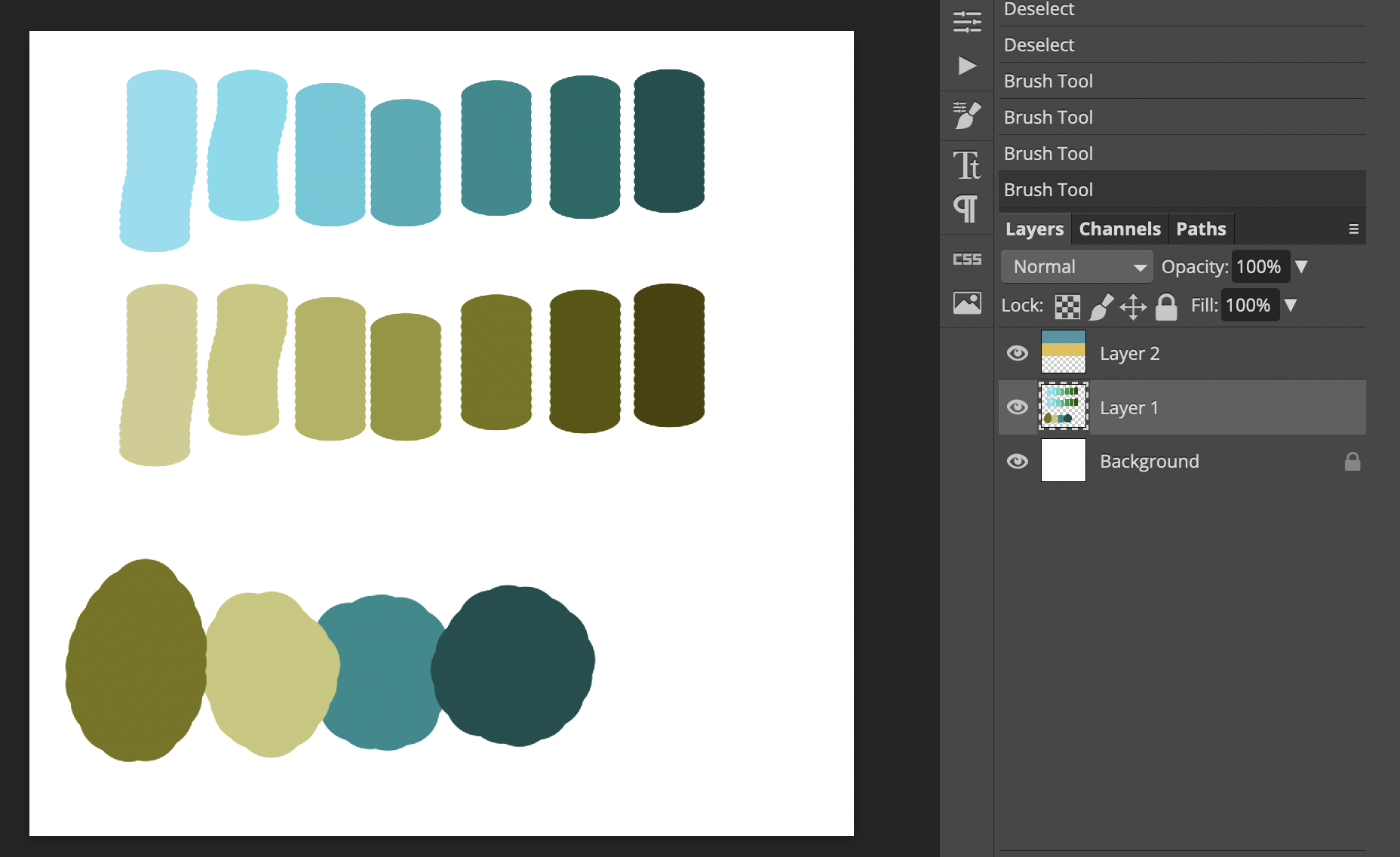
I also played around with solutions to “how to fix bad color palettes”. People on the internet seem to use a layer with color set to “Overlay”, but that messes with the lightness of the colors. I found today that a better way is to use a layer set to “Hue” and lay it over the data visualization. Changing the opacity until it looks less dull but not ugly yet again worked well for me.
Highlight of the day: Five of the ten people I emailed last Thursday scheduled calls with me in January! I’m super happy about that. And I’m excited to meet them all!