Good day today! I had a lot of time to actually write. And I had another interview – this time with two people from Finland who created a color palette for a data vis style guide.
One question that came up in the talk: “Can choropleth maps be accessible?” If we define “accessibility” as “every elements needs to have 3:1 contrast ratio to other elements”, then…things get tricky.
Let’s have a look at this map:
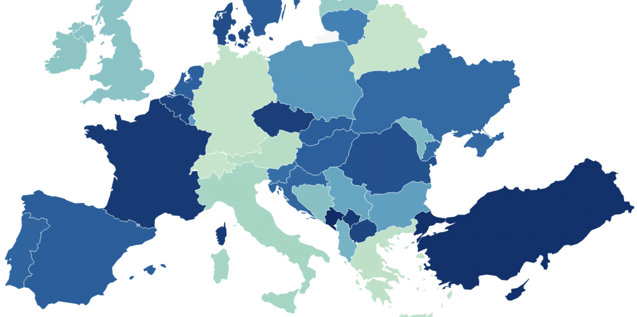
It’s a classic Choropleth map. Germany has one of the lowest values and therefore brightest colors in this map. We can see that Austria is a bit darker, and Italy seems to have an even higher number than both Germany and Austria.
But nope, that light green doesn’t have a 3:1 ratio to white.
We need to get all the way darker until Germany becomes medium-blue. This, my friends, is an accessible map, according to WCAG2:
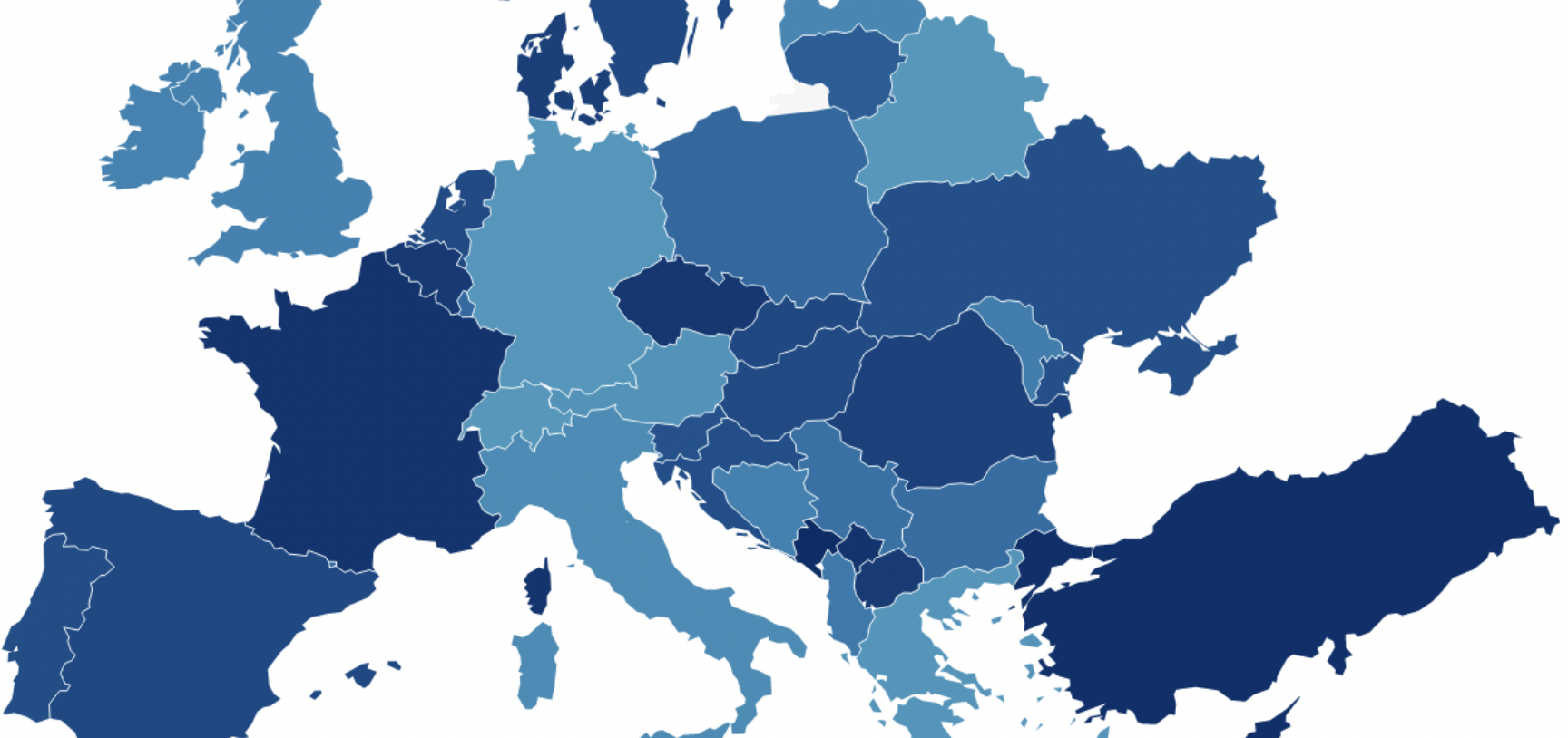
You’ll probably notice what I noticed: This one doesn’t show as much visual difference between the countries. The value of Italy is not as obviously bigger than Germany’s than in first map.
So the difference to the background is bigger – but that makes the difference between the countries smaller. Which makes this map…less accessible?
🤔
It’s the weekend for me now. I’ll be back next Monday!