
Thanks to all the graphic reporters who map what’s going on in Ukraine on this sad day. 🧵 Here’s a thread of their maps. My screenshots will be outdated soon, so click the links for the updated versions. If you know of other sources, add them.
Likes: 1256 | Retweets: 478
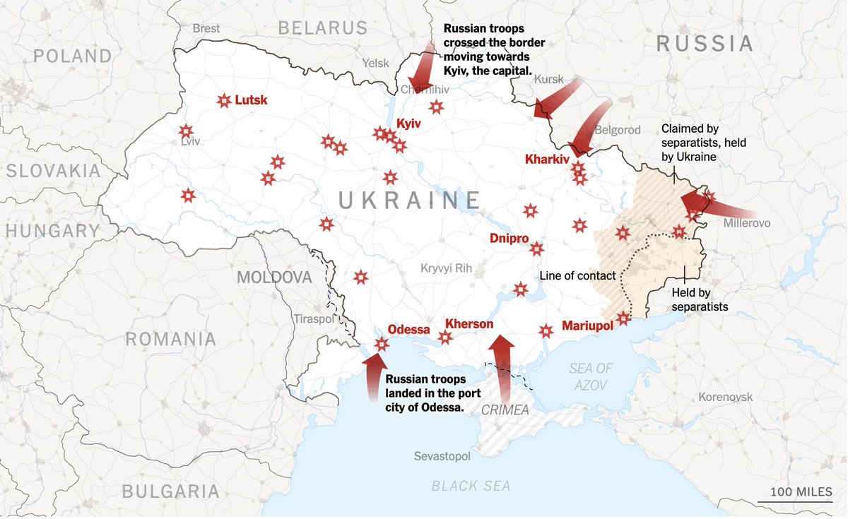
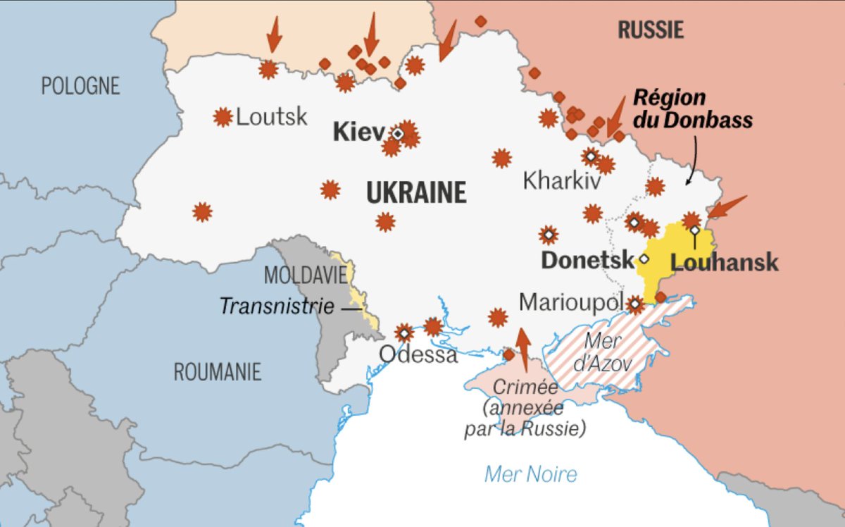
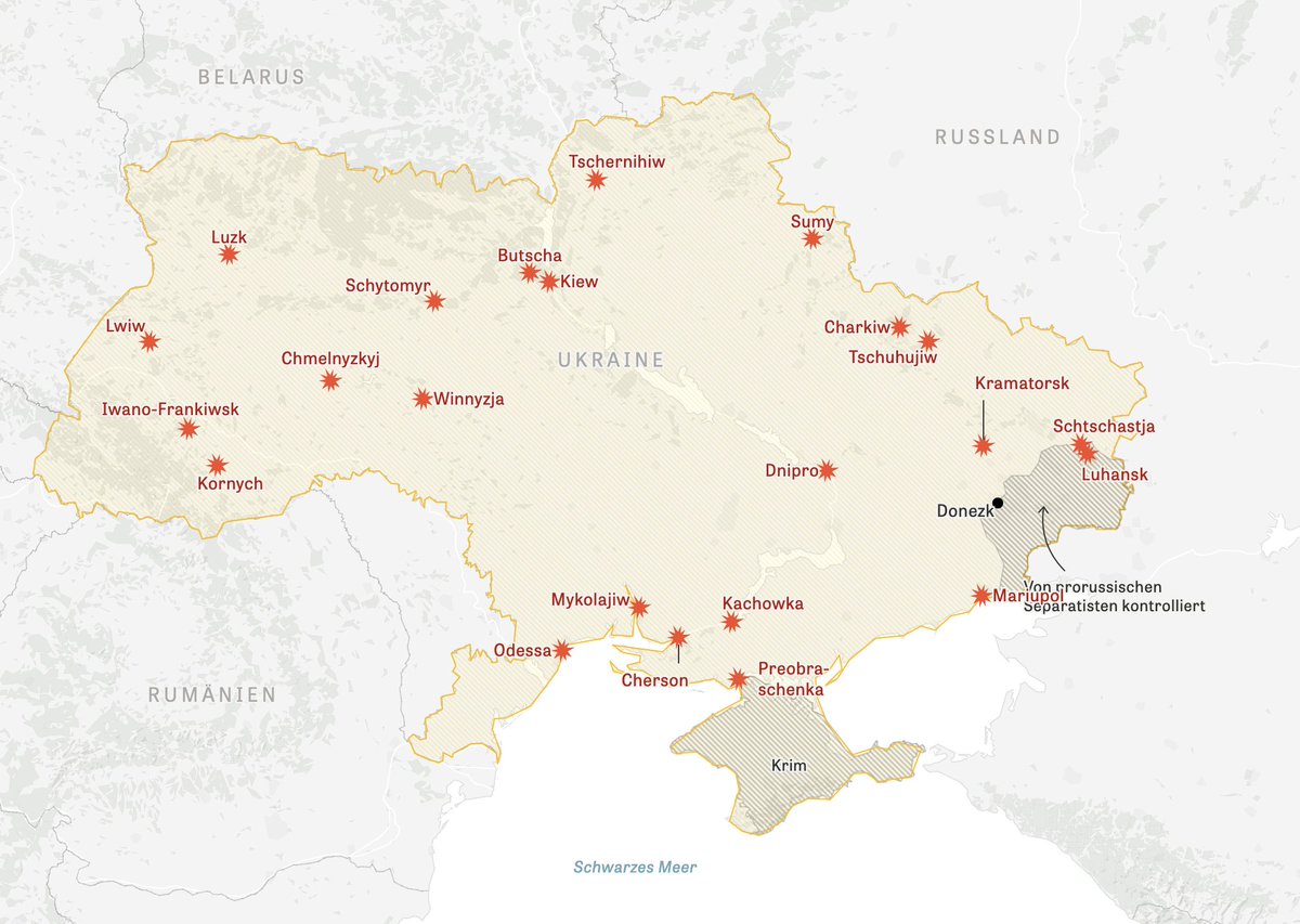
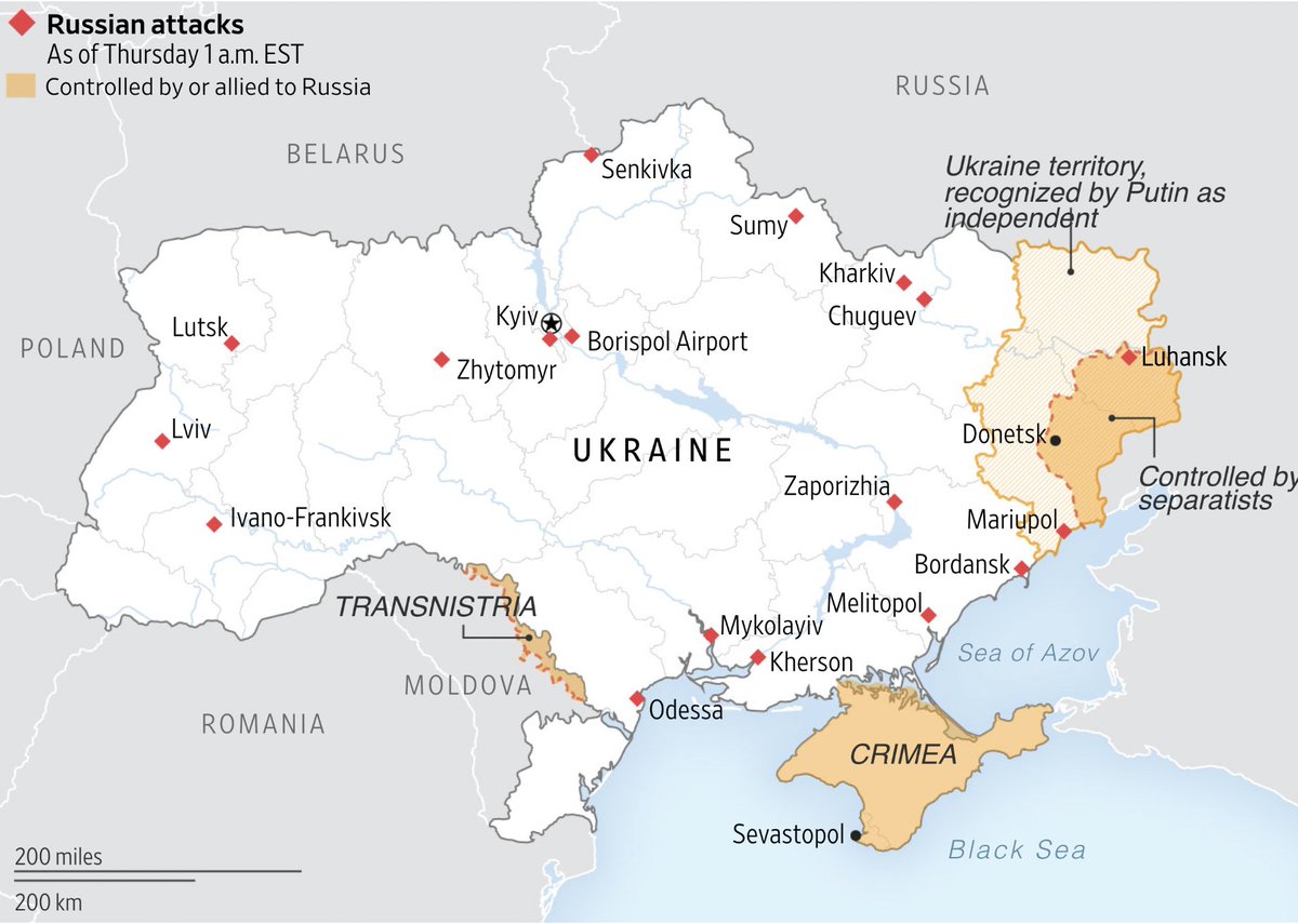
1️⃣ New York Times: nytimes.com/interactive/20… 2️⃣ Le Monde: lemonde.fr/international/… 3️⃣ ZEIT Online: zeit.de/politik/auslan… 4️⃣ Wall Street Journal: wsj.com/articles/russi…
Likes: 59 | Retweets: 19
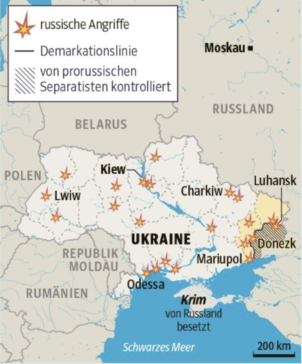
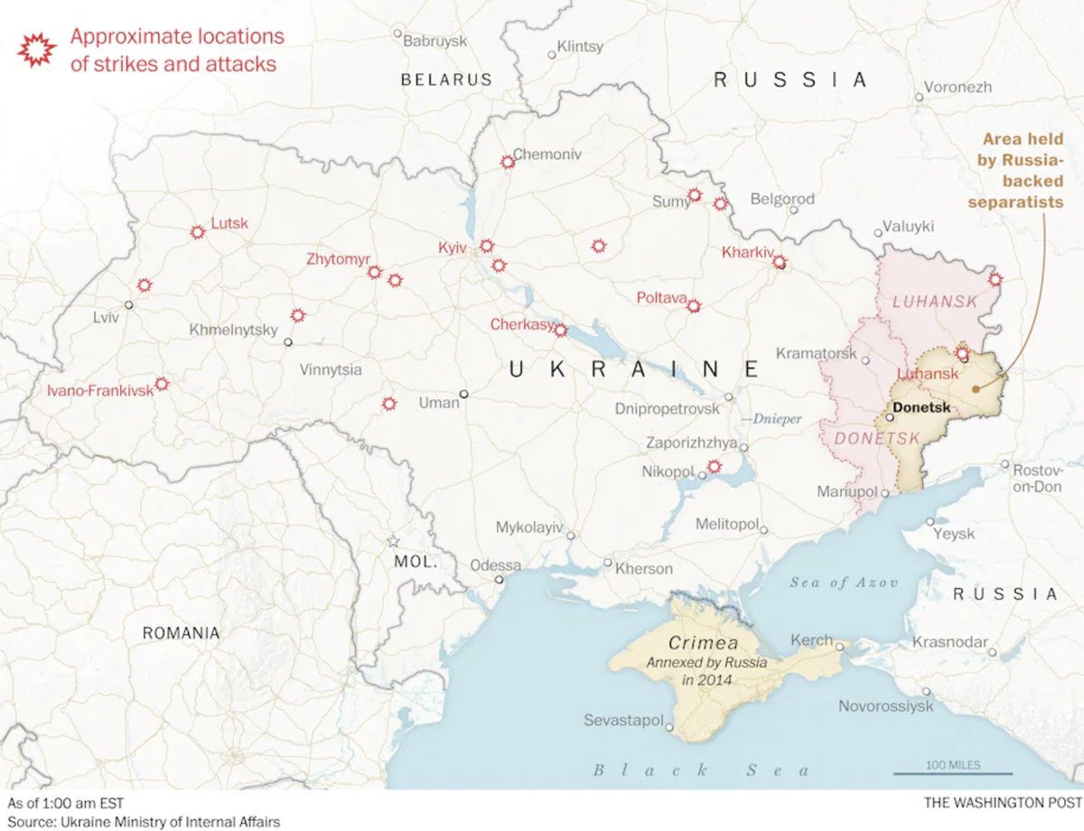
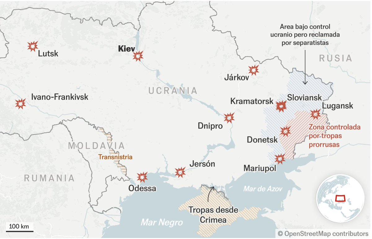
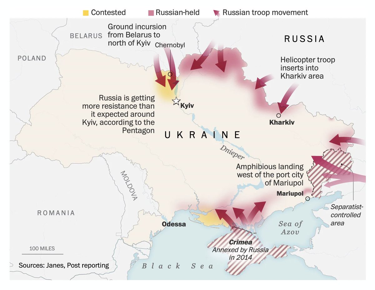
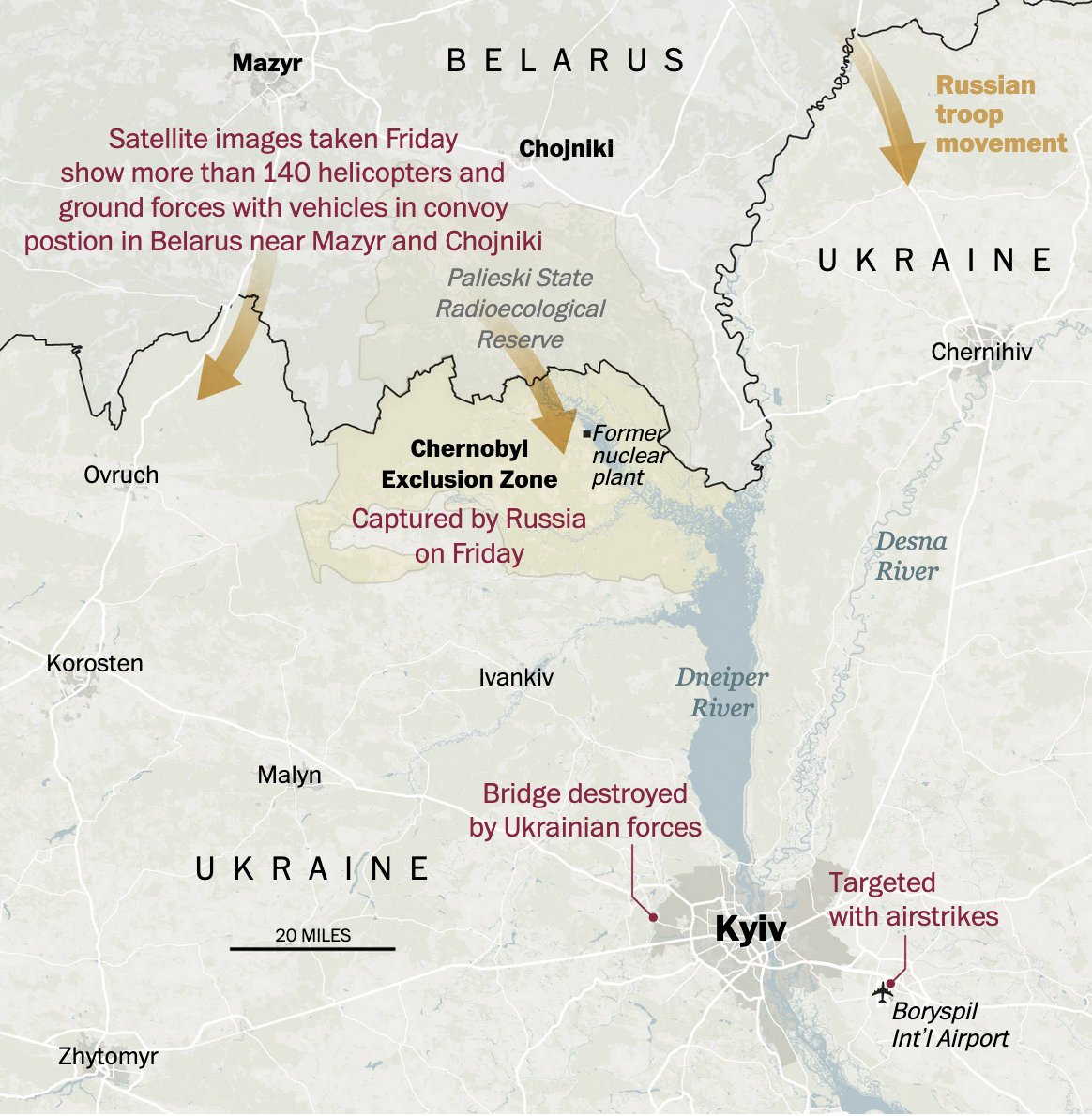
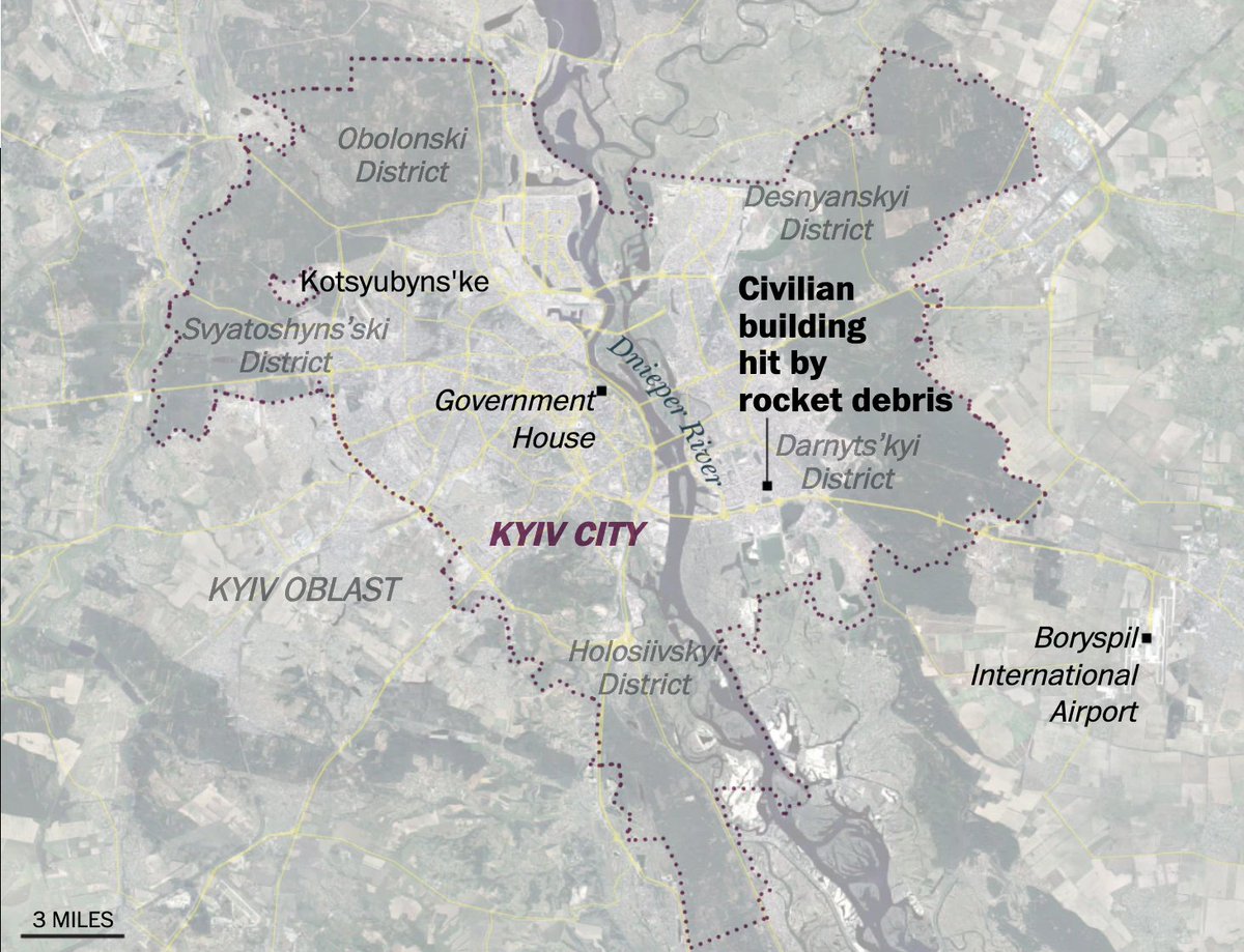
1️⃣ Süddeutsche Zeitung: sueddeutsche.de/politik/ukrain… 2️⃣ The Washington Post: washingtonpost.com/world/2022/02/… 3️⃣ EL PAÍS: elpais.com/internacional/… 4️⃣ Bloomberg: bloomberg.com/graphics/2022-…
Likes: 32 | Retweets: 7
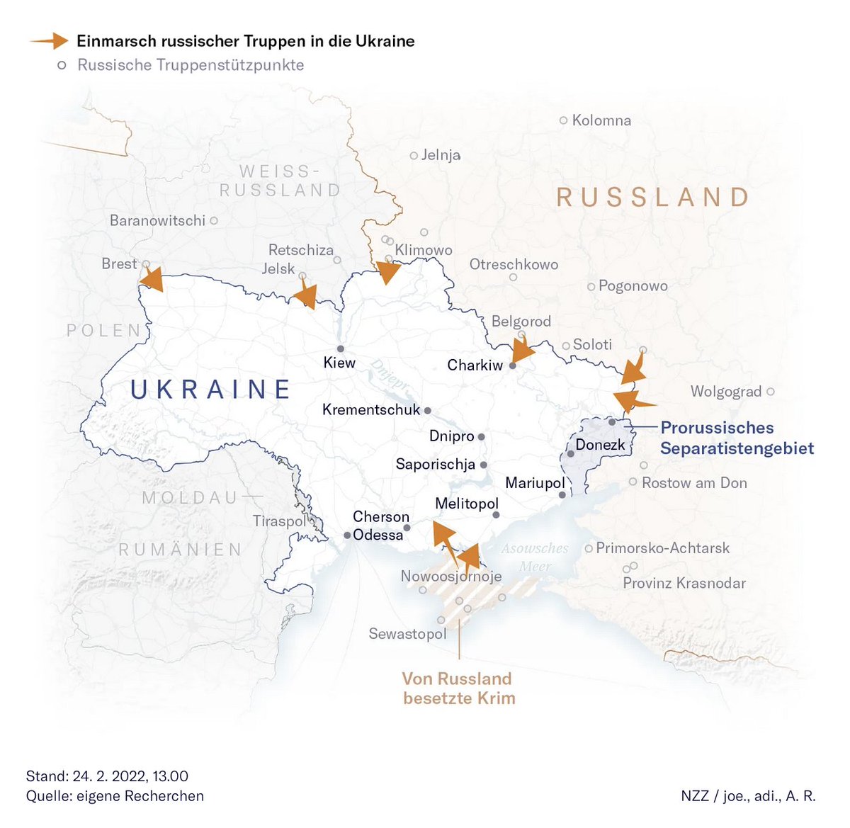
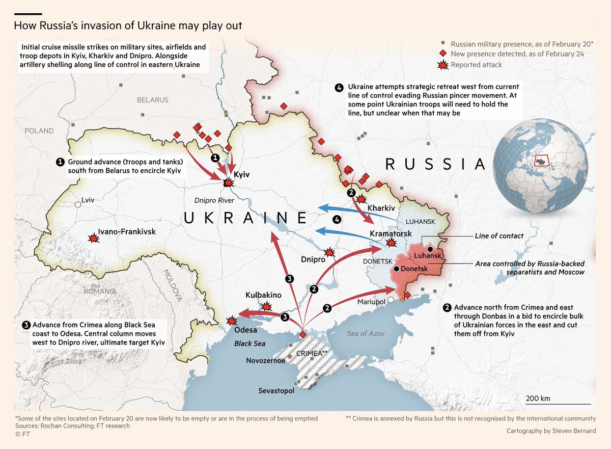
1️⃣ Neue Zürcher Zeitung: nzz.ch/international/… 2️⃣ Financial Times: ft.com/content/07bbc5… 3️⃣ Axios: axios.com/ukraine-russia… 4️⃣ SPIEGEL: spiegel.de/ausland/russla…
Likes: 31 | Retweets: 8
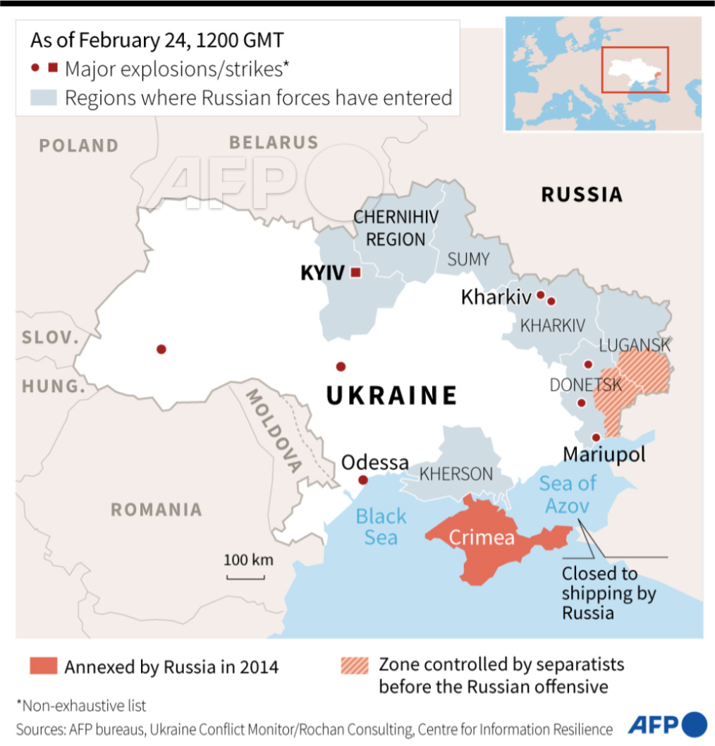
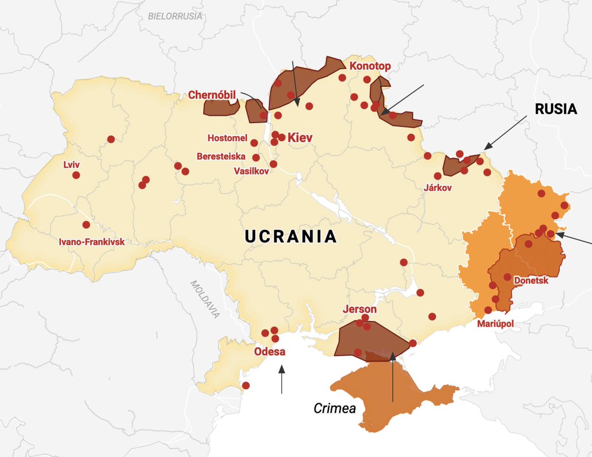
1️⃣ AFP: x.com/AFP/status/149… 2️⃣ El Diario: eldiario.es/internacional/… 3️⃣ El Mundo: elmundo.es/internacional/… (you’ll find some great maps in there) 4️⃣ Folha de S.Paulo: www1.folha.uol.com.br/mundo/2022/02/…
Likes: 19 | Retweets: 5
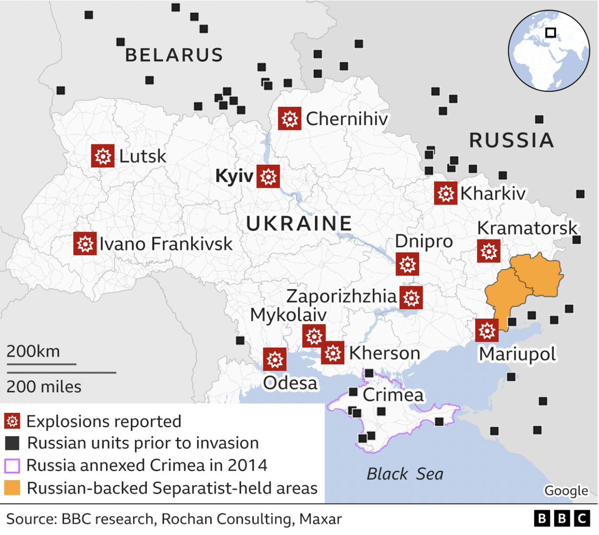
1️⃣ BBC: bbc.com/news/world-eur… 2️⃣ El Confidencial: elconfidencial.com/mundo/2022-02-… (Thanks, @arixha!) 3️⃣ The Telegraph: telegraph.co.uk/world-news/202… 4️⃣ Sky News: news.sky.com/story/ukraine-…
Likes: 25 | Retweets: 6
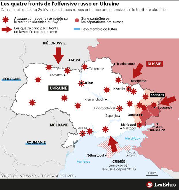
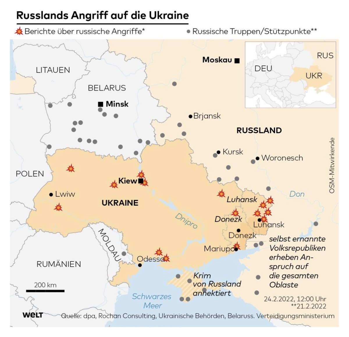
1️⃣ Les Echos: lesechos.fr/monde/enjeux-i… 2️⃣ The Times: thetimes.co.uk/article/russia… 3️⃣ WELT: welt.de/politik/auslan… (Thanks, @M_T_Tiro!) 4️⃣ Newtral: newtral.es/mapa-conflicto… (Thanks, @adrimaqueda!)
Likes: 22 | Retweets: 6
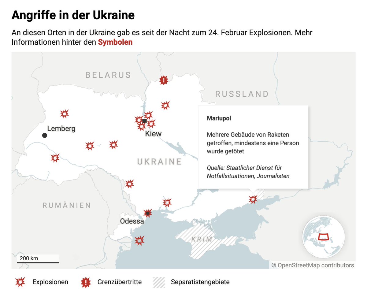
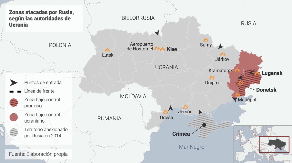
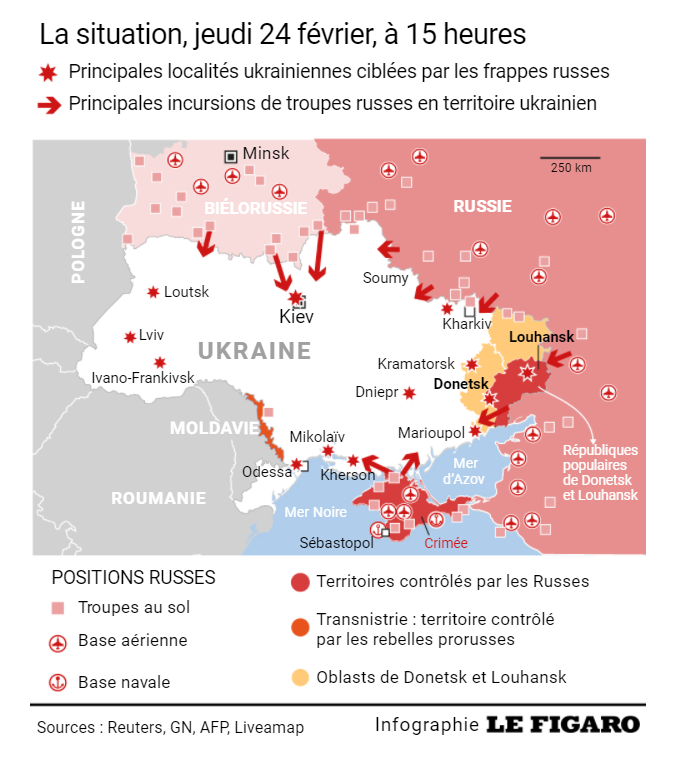
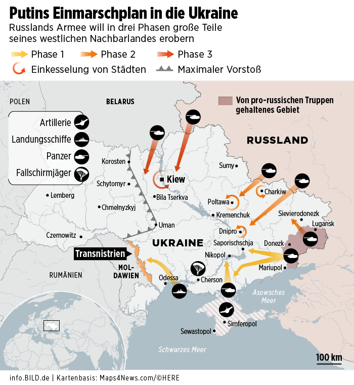
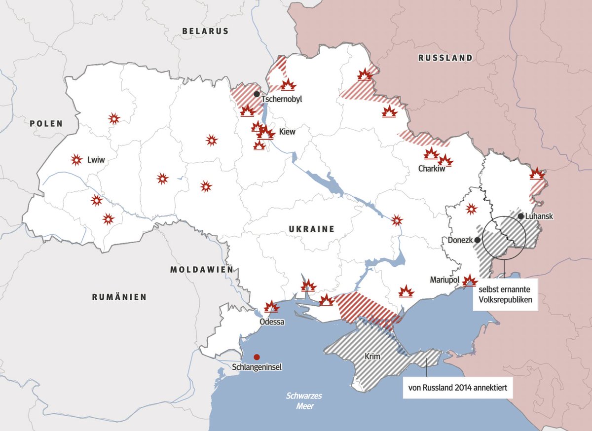
1️⃣ taz: taz.de/Nachrichten-zu… 2️⃣ RTVE: rtve.es/noticias/20220… (Thanks, @PauGuisado!) 3️⃣ Le Figaro: lefigaro.fr/international/… 4️⃣ BILD: bild.de/politik/auslan…
Likes: 25 | Retweets: 4
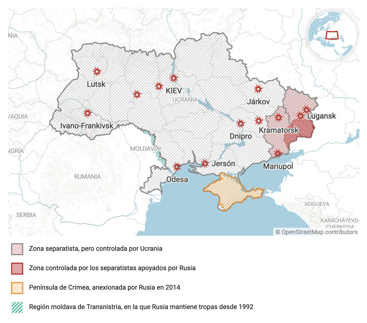
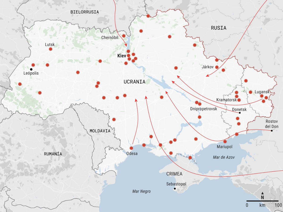
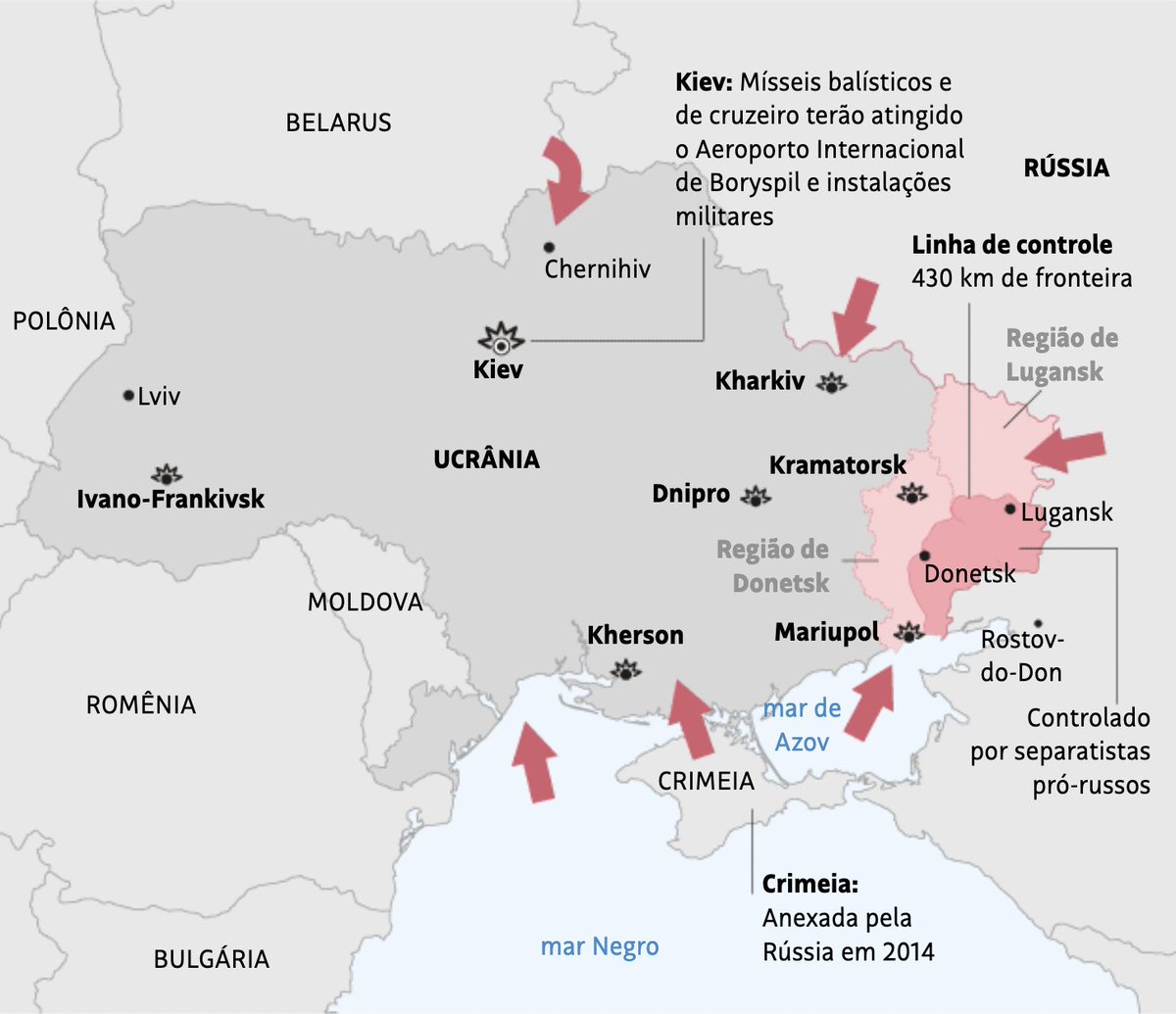
@PauGuisado Some more maps about the Ukraine conflict, collected by @yanchen00. Thank you so much! x.com/yanchen00/stat…
Likes: 20 | Retweets: 0
@PauGuisado @yanchen00 A few maps just from tabloids:
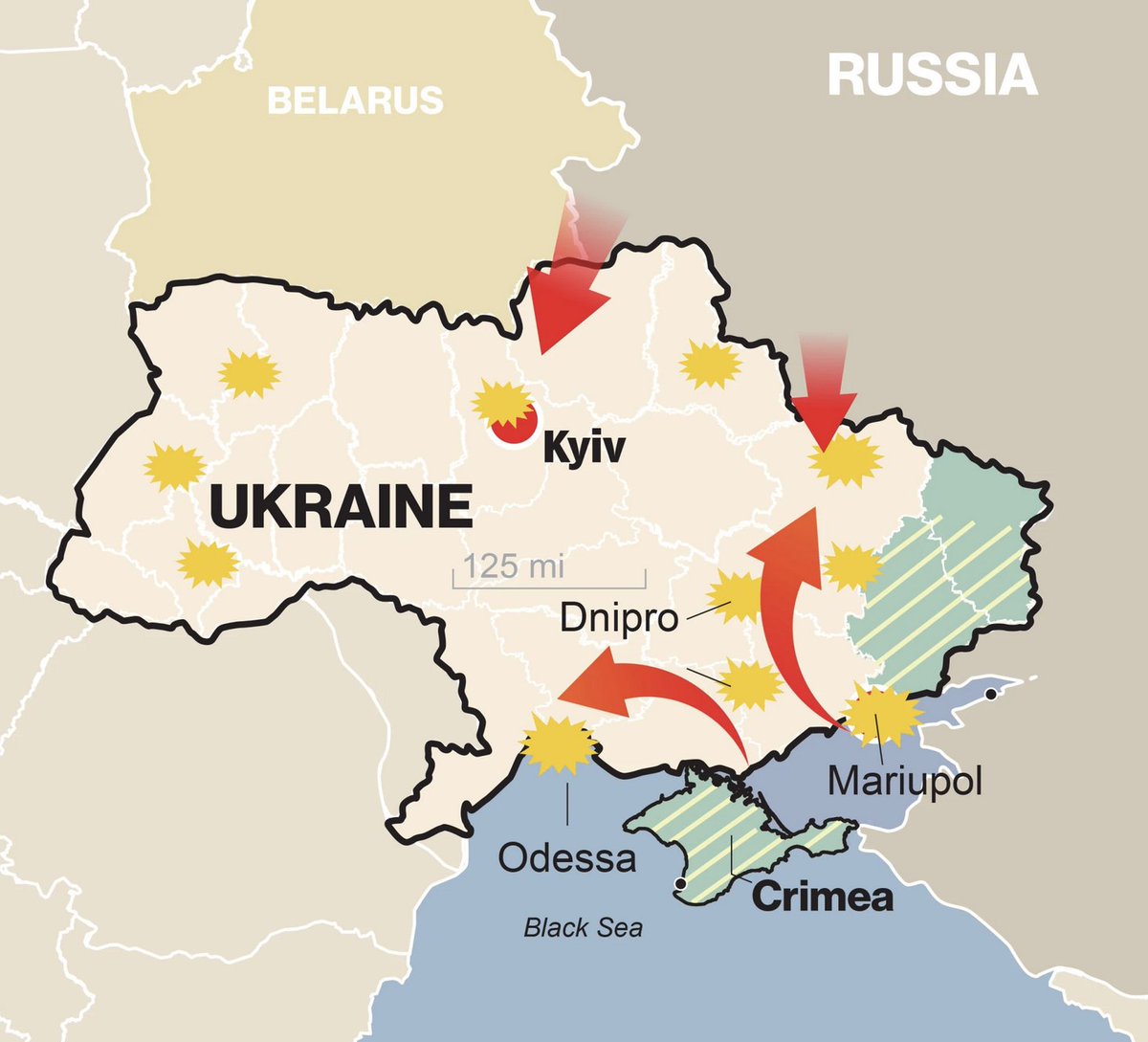
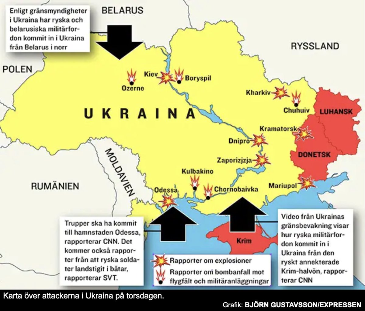
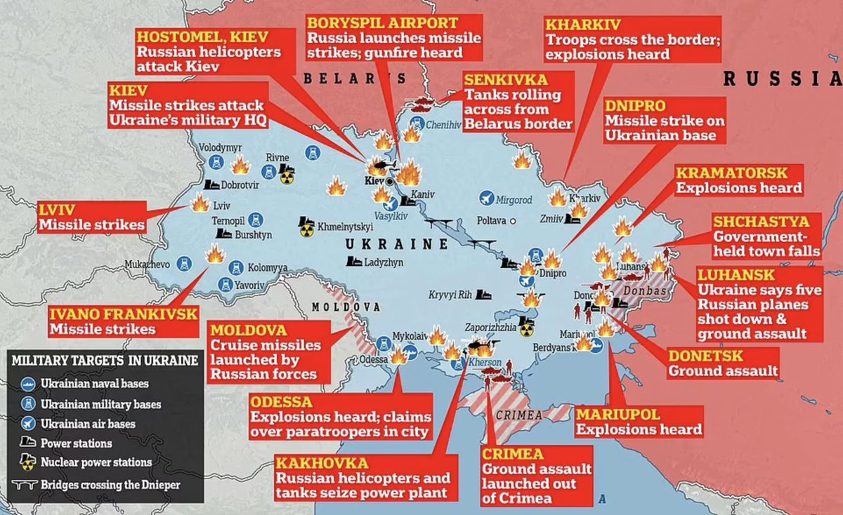
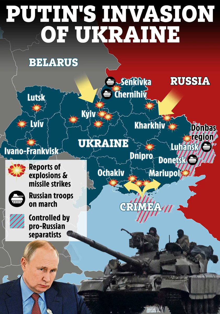
1️⃣ New York Post: nypost.com/2022/02/24/ukr… 2️⃣ Expressen: expressen.se/nyheter/putin-… 3️⃣ Daily Mail: dailymail.co.uk/news/article-1… 4️⃣ The Sun: thesun.co.uk/news/17756778/…
Likes: 14 | Retweets: 0
Are we done after 35 maps? We are not:
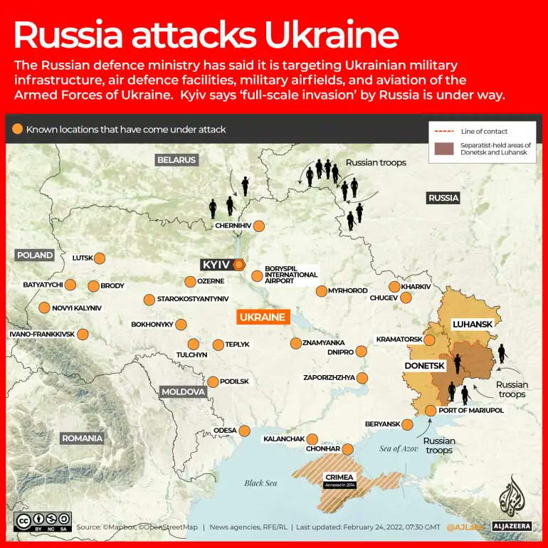
1️⃣ Al Jazeera: aljazeera.com/news/2022/2/24… 2️⃣ Der Standard: derstandard.at/story/20001336… (Thanks, @KohrsRobin!) 3️⃣ El Español: elespanol.com/mundo/europa/2… (Thanks, @Linasmithg!) 4️⃣ Business Insider: businessinsider.com/map-of-explosi… (Thanks, @skyegould!)
Likes: 27 | Retweets: 8
There’s more:
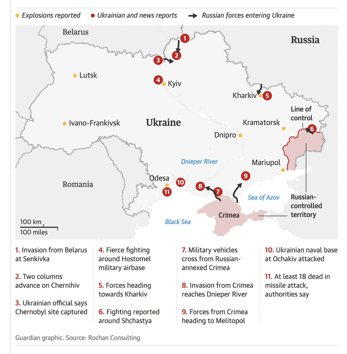
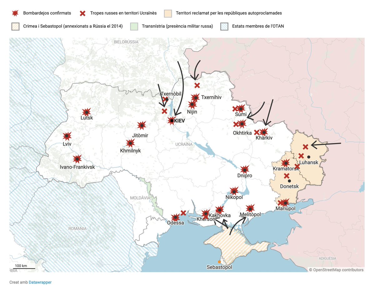
1️⃣ The Guardian: amp.theguardian.com/world/2022/feb… 2️⃣ NBC News: nbcnews.com/politics/polit… (Thanks, @joemurph!) 3️⃣ Ara: ara.cat/internacional/… (Thanks, @Margaabella!) 4️⃣ Sky TG24: tg24.sky.it/mondo/2022/02/… (Thanks, @dambrosioandrea!)
Likes: 17 | Retweets: 5
And a few more:
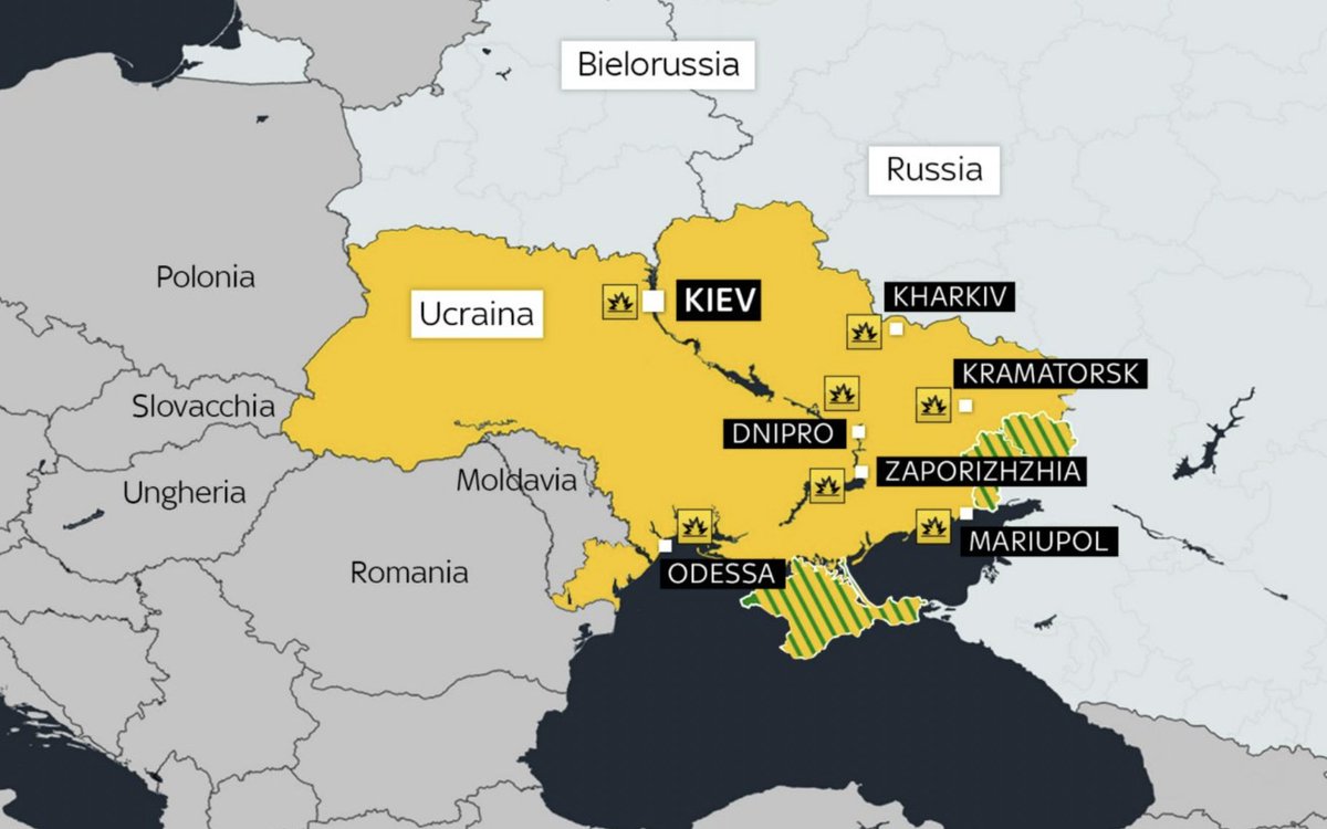
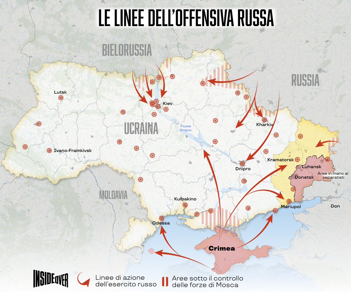
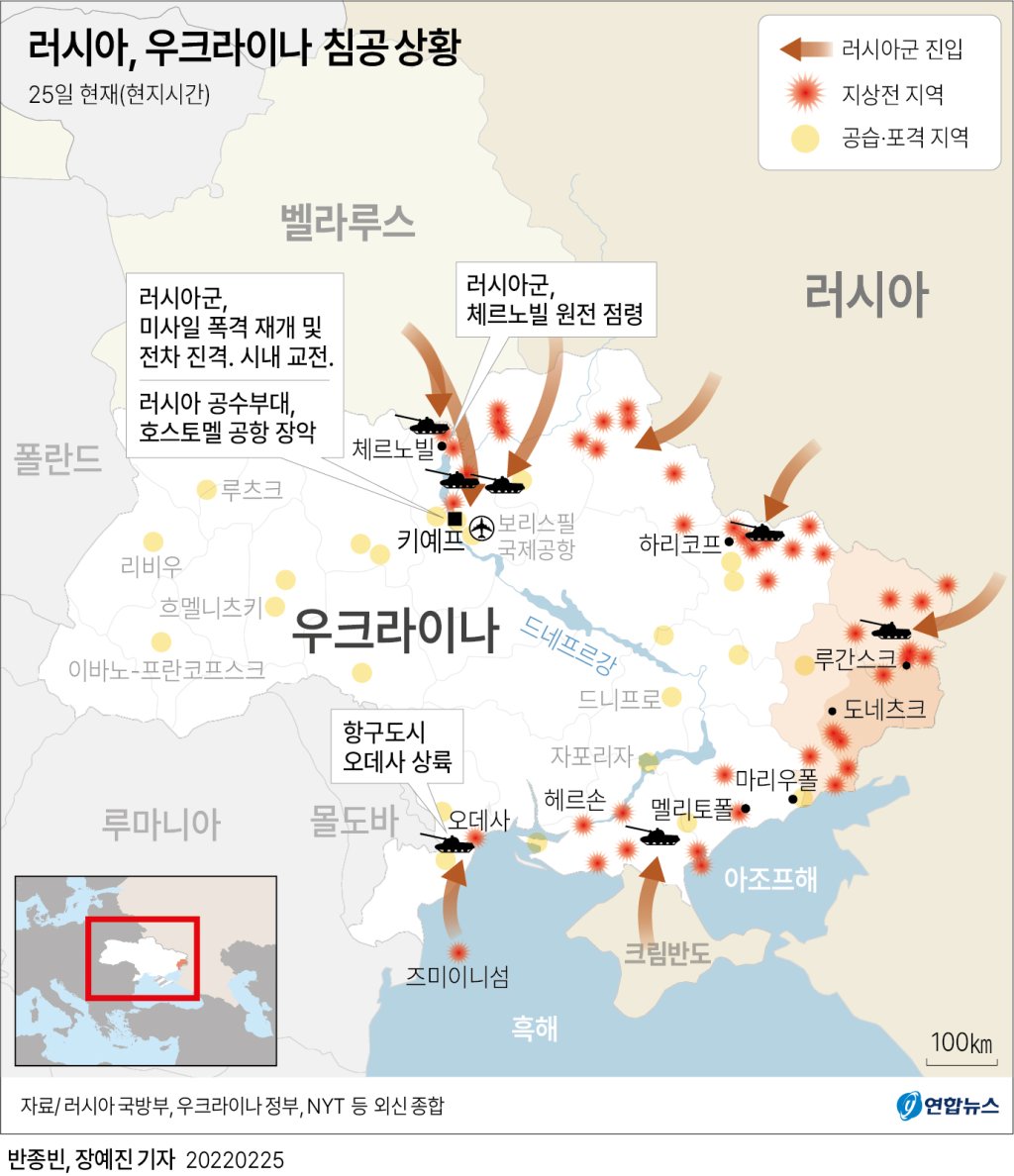
1️⃣ InsideOver: it.insideover.com/guerra/i-russi… (Thanks, @AlbertoBellotto!) 2️⃣ Berliner Morgenpost: morgenpost.de/politik/articl… 3️⃣ El Periódico de España: epe.es/es/internacion… (Thanks, @nachotronic!) 4️⃣ Yonhap: m.yna.co.kr/view/GYH202202… (Thanks, @CiscoRucinski!)
Likes: 5 | Retweets: 3
Some news organizations started collections of data visualizations – mostly maps – that explain the situation in Ukraine. Here are a few of them:
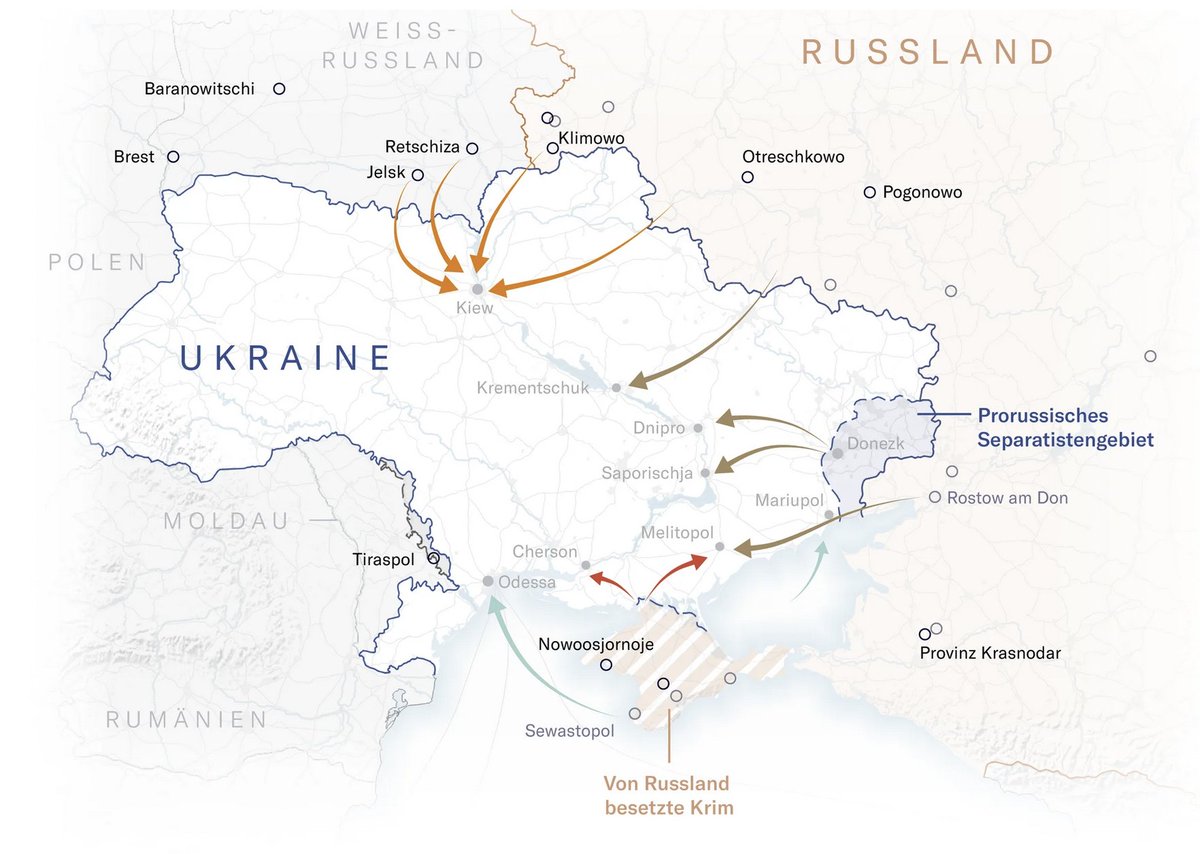
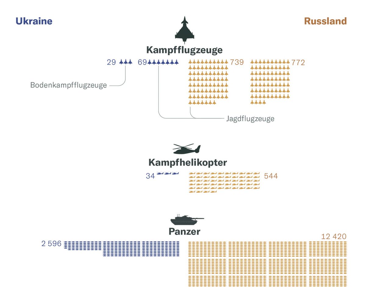
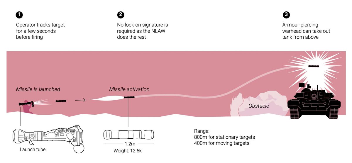
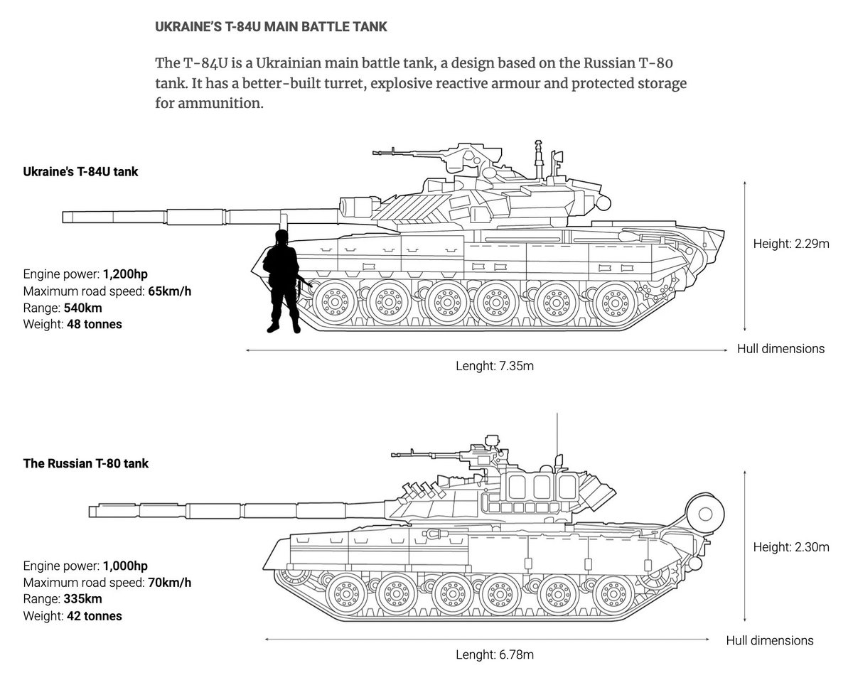
The Swiss Neue Zürcher Zeitung (@nzzvisuals) with a comparison of war material and an interactive map: nzz.ch/visuals/ukrain…
Likes: 15 | Retweets: 8
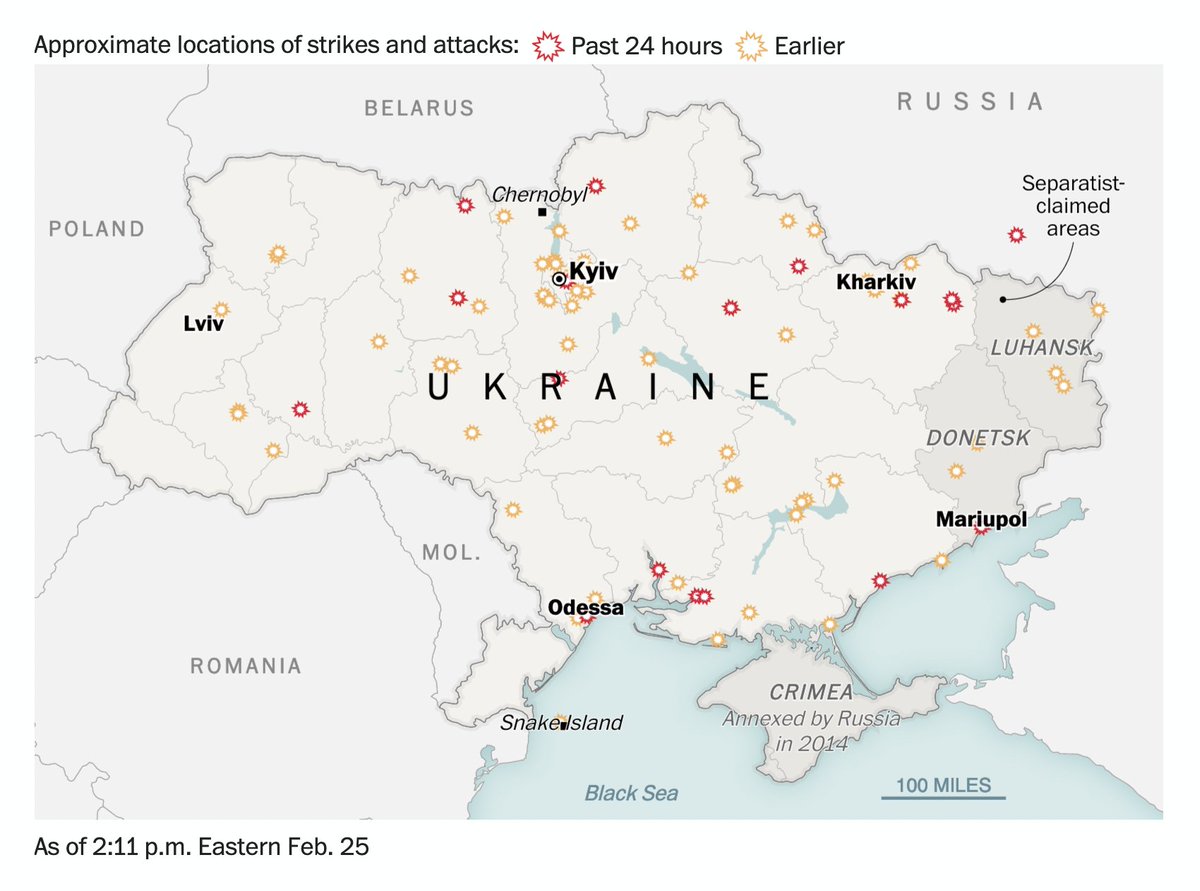
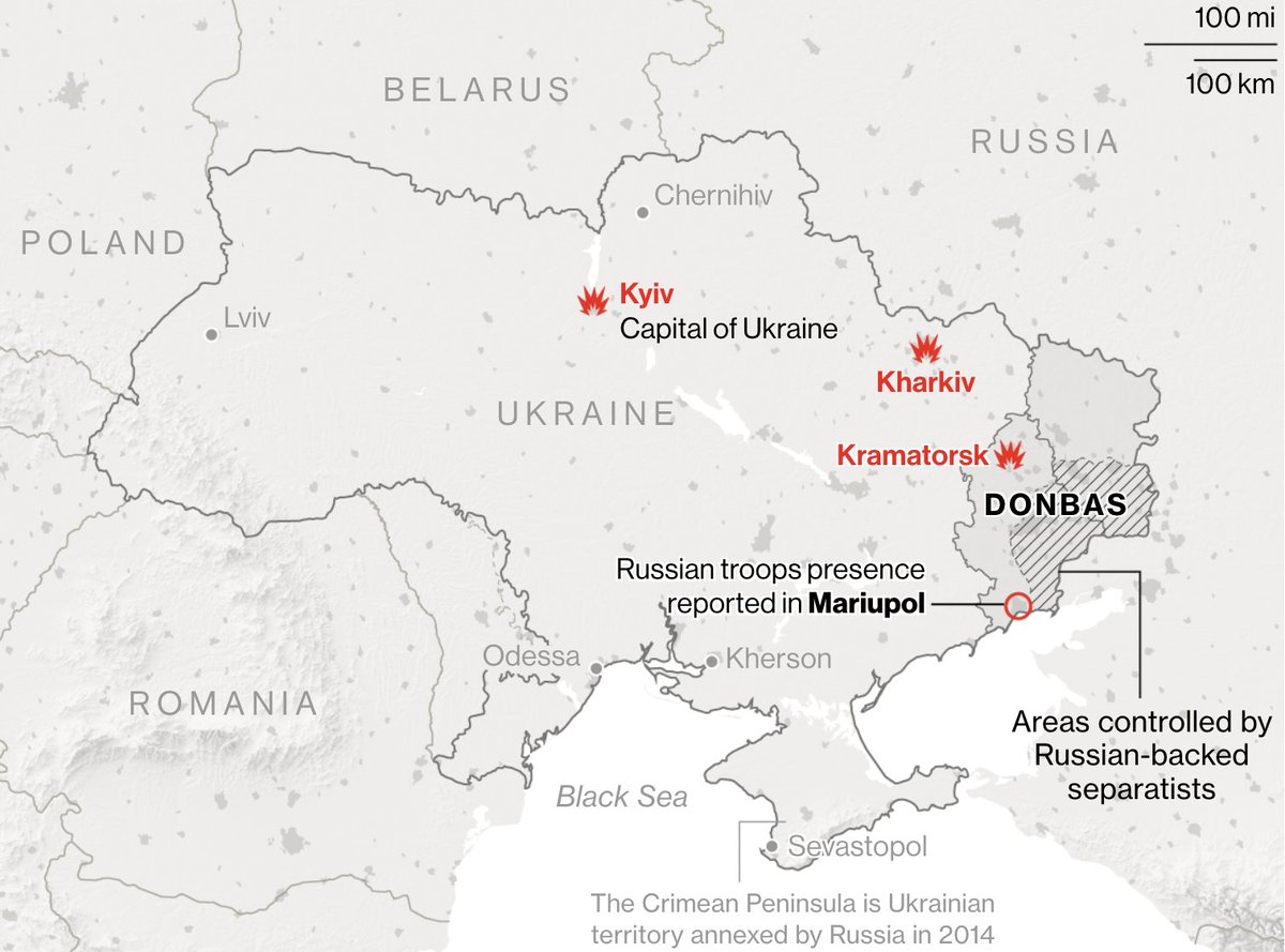
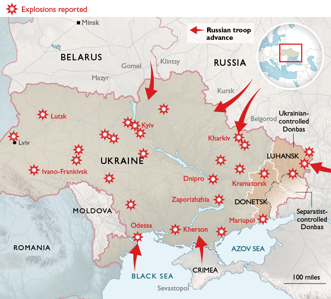
The Washington Post (@PostGraphics) with an interesting and hopefully updating view on strikes and attacks in the past 24 hours vs before that: washingtonpost.com/world/2022/02/…
Likes: 8 | Retweets: 5
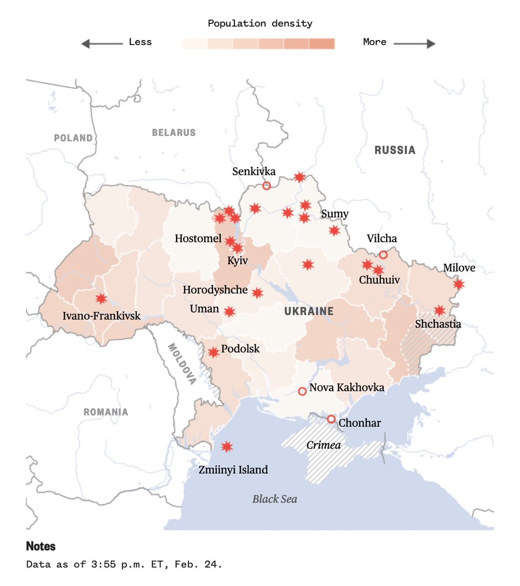
The New York Times (@nytgraphics) shows its maps in a timeline instead of updating them all: nytimes.com/interactive/20…
Likes: 14 | Retweets: 5
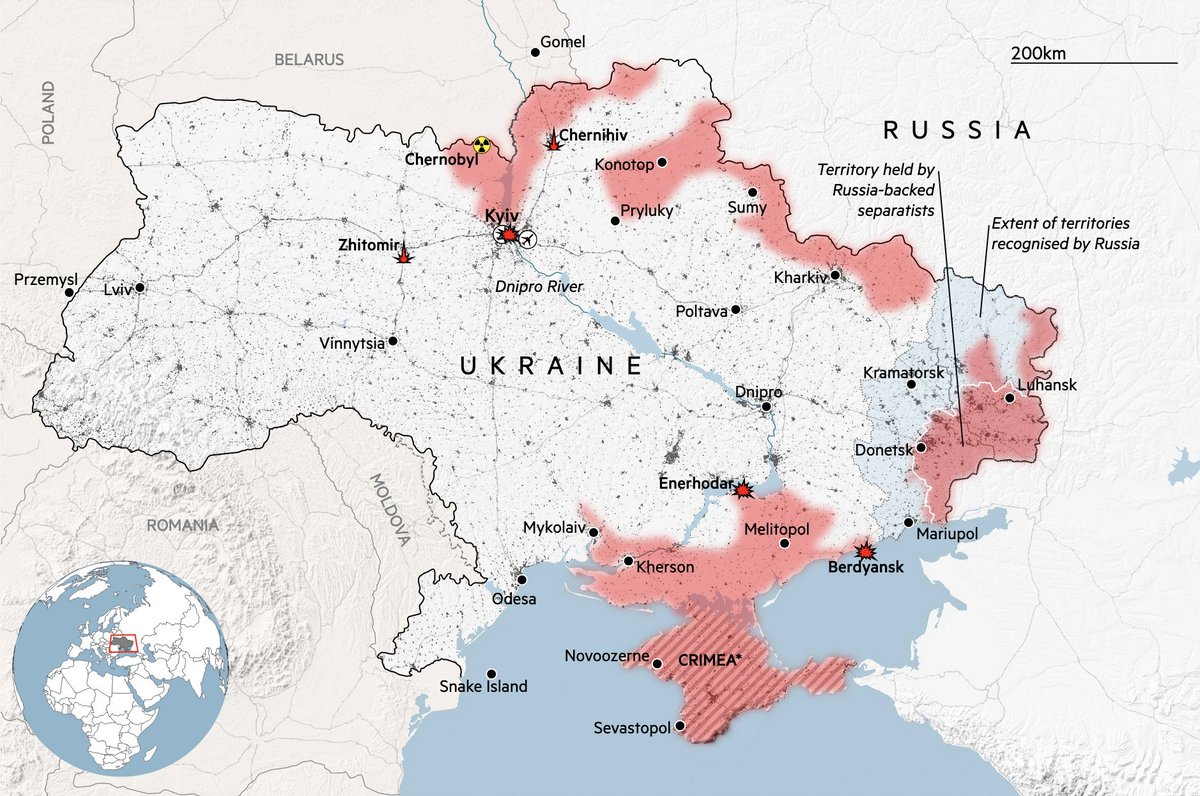
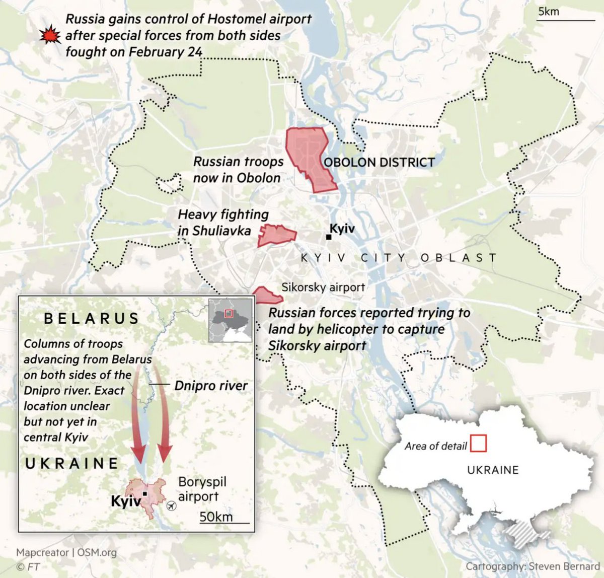
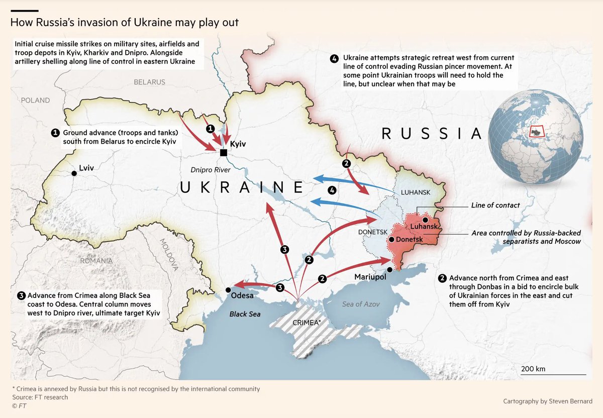
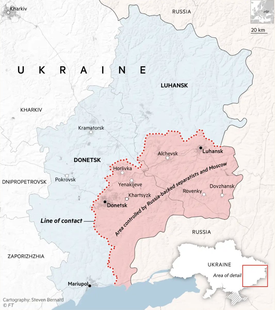
The Financial Times (@ftdata) collects daily updates in their “visual guide” here: ft.com/content/4351d5…
Likes: 23 | Retweets: 5
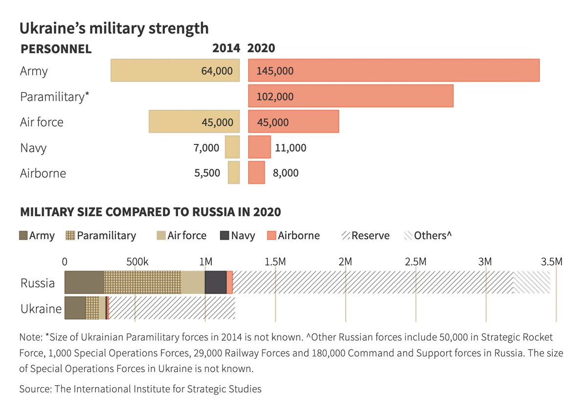
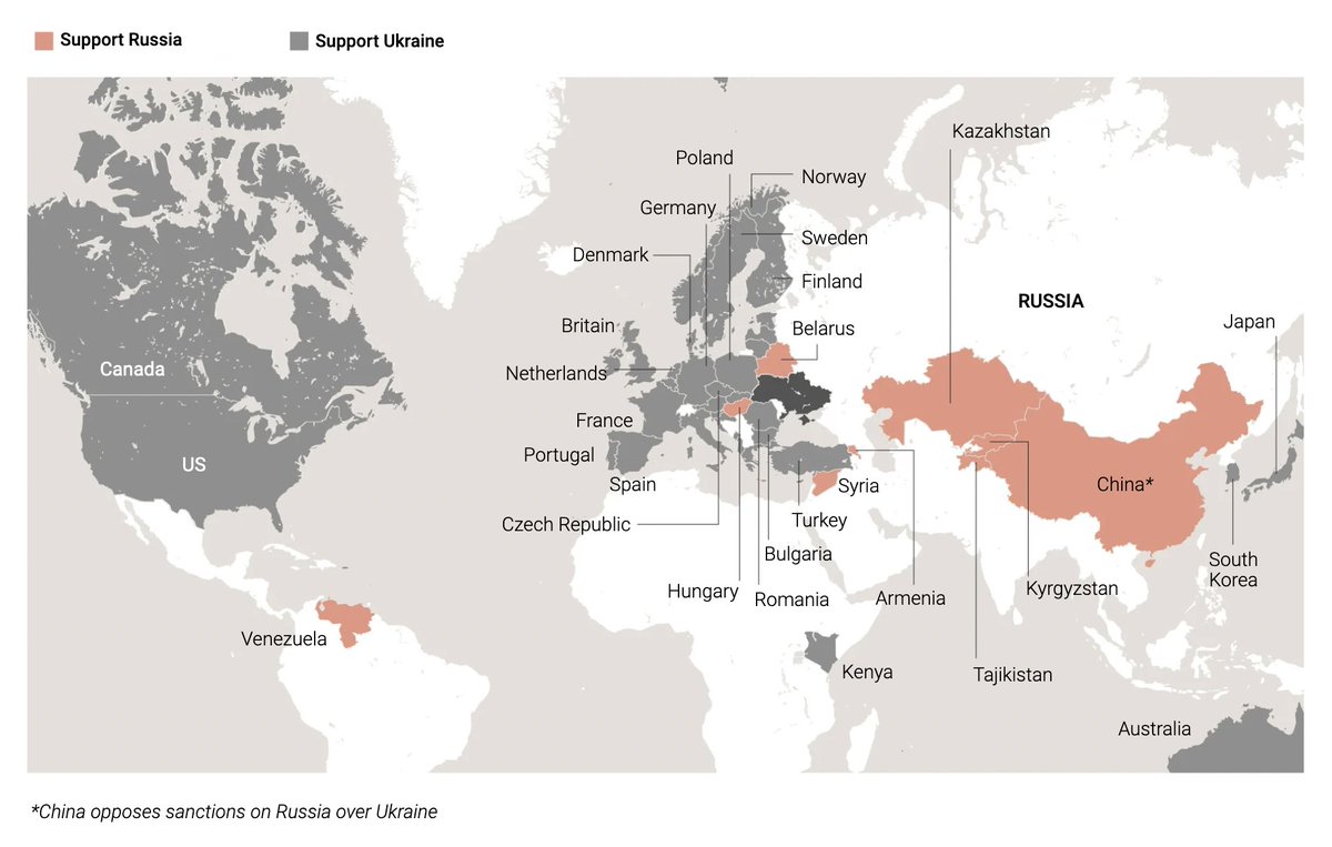
Reuters’s (@ReutersGraphics) site comes with a big, updating map – but also a “sanctions tracker” and additional data visualizations like a military size comparison. Useful: The local time in Kyiv and in Moscow at the top. graphics.reuters.com/UKRAINE-CRISIS…
Likes: 32 | Retweets: 16
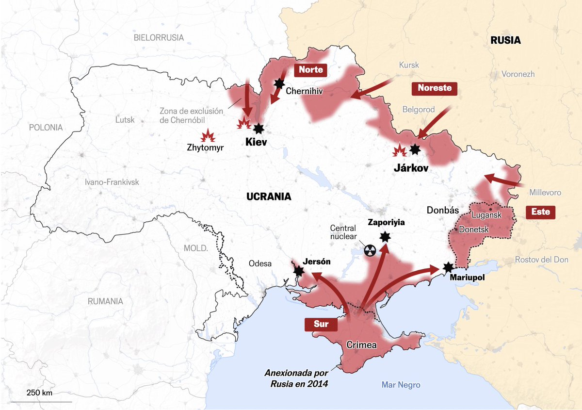
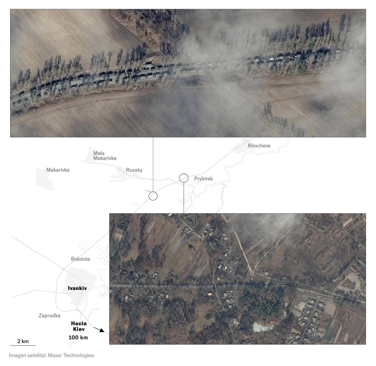
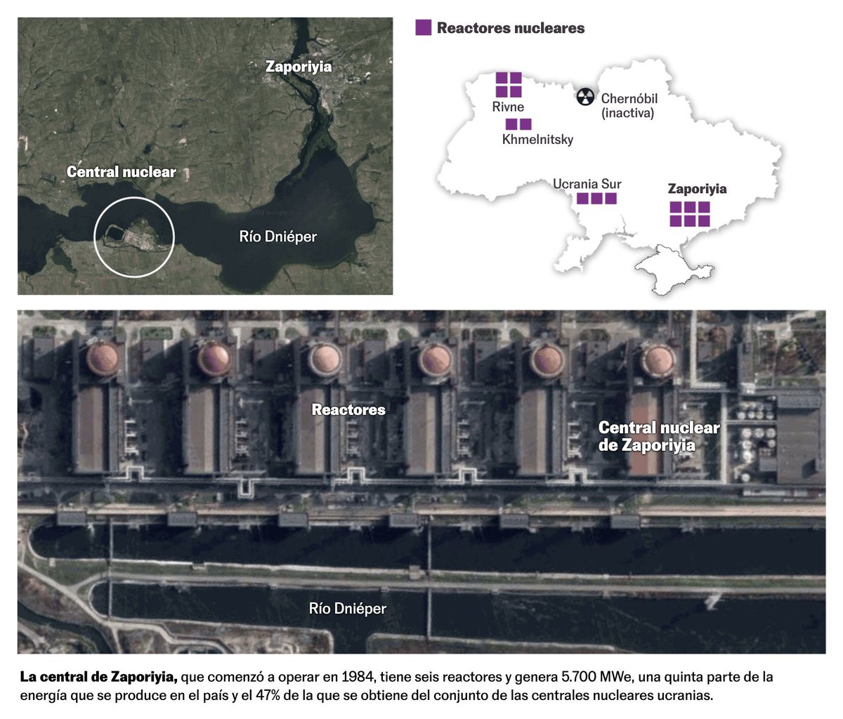
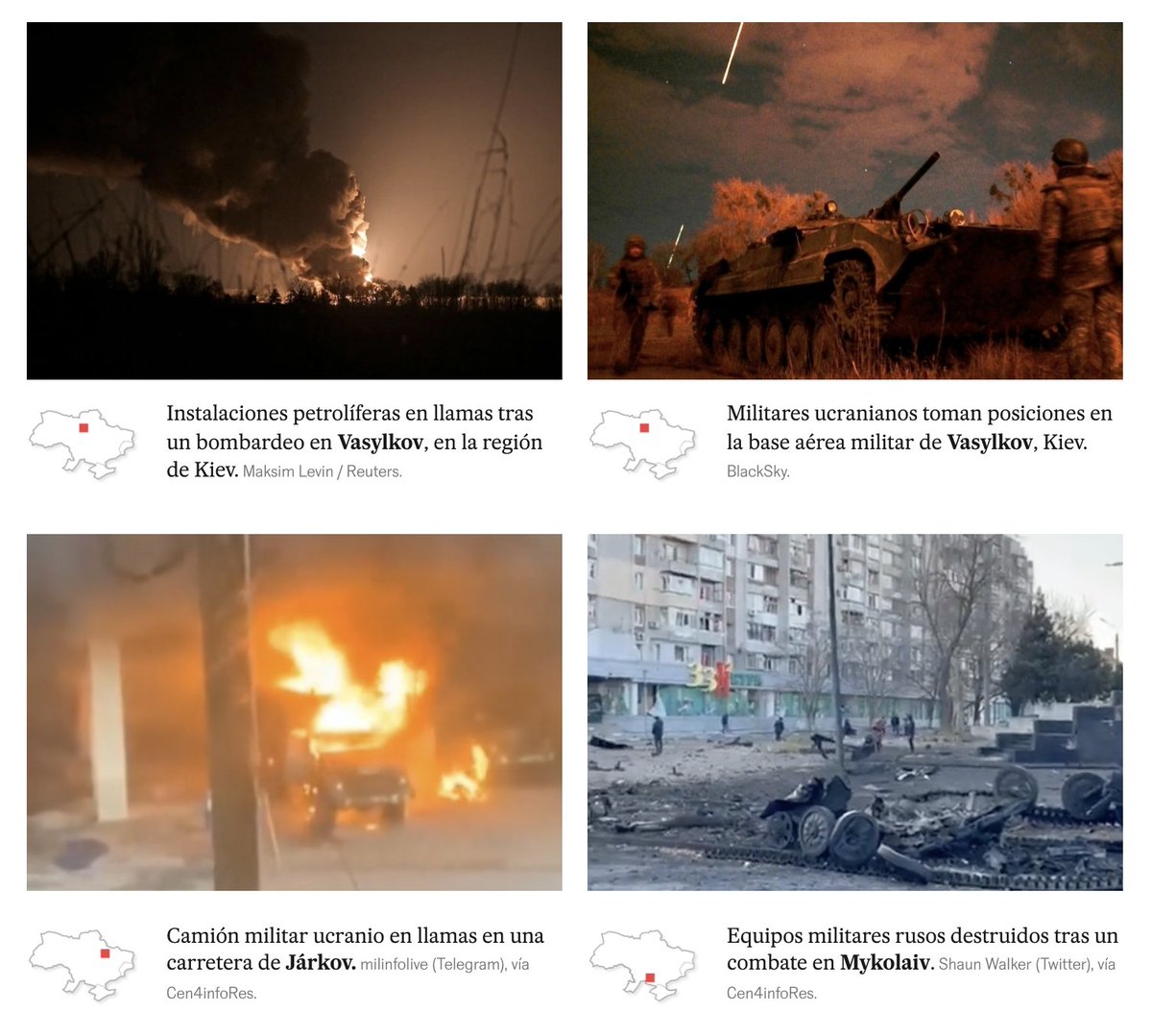
El País (@el_pais/@Mariano_Zafra’s team) combines satellite images/photos with maps effectively: elpais.com/internacional/…
Likes: 23 | Retweets: 3
The South China Morning Post (@SCMPgraphics) use maps and their consistently great illustrations to update on and explain the war in Ukraine: multimedia.scmp.com/infographics/n…
Likes: 26 | Retweets: 3
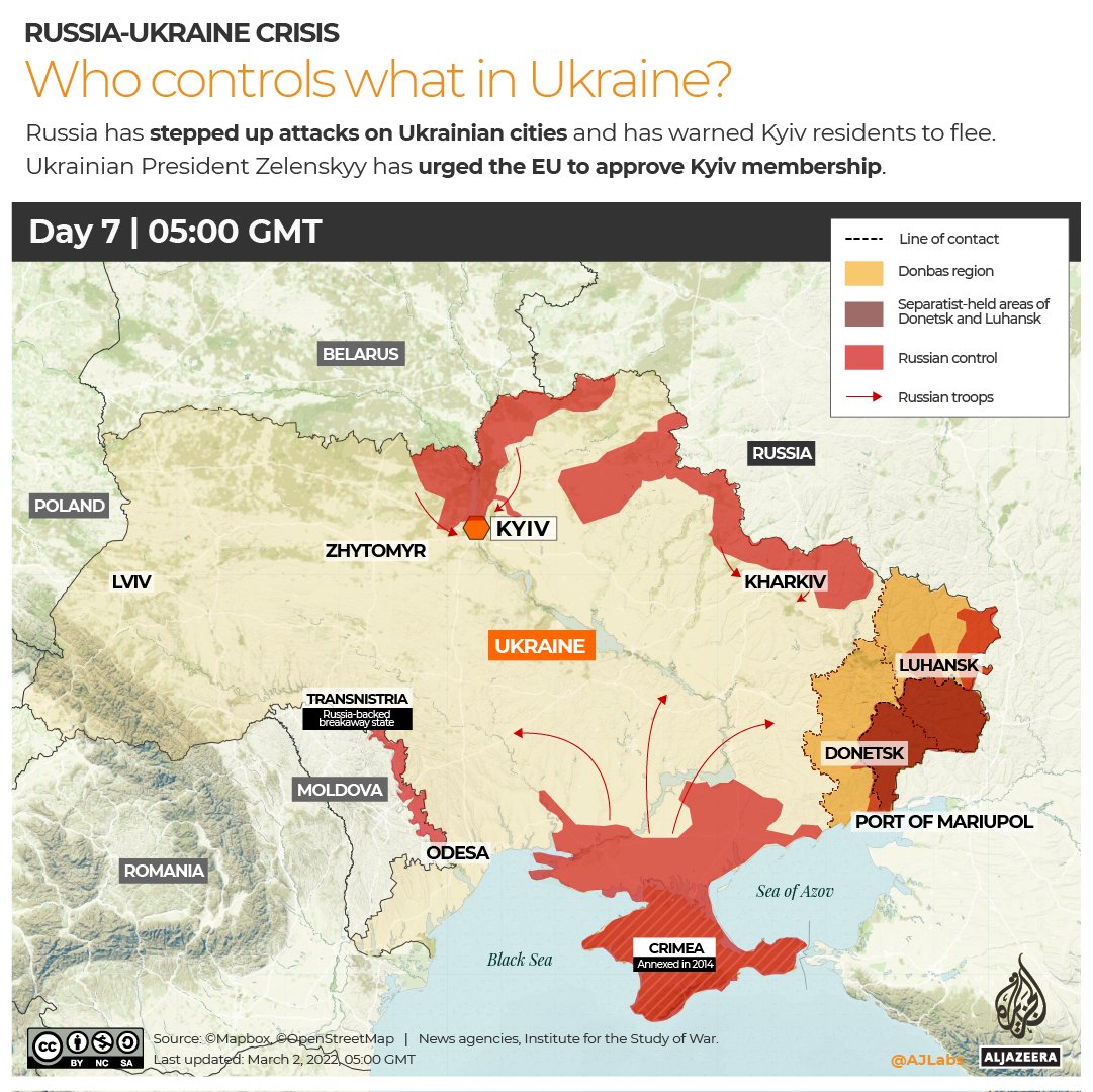
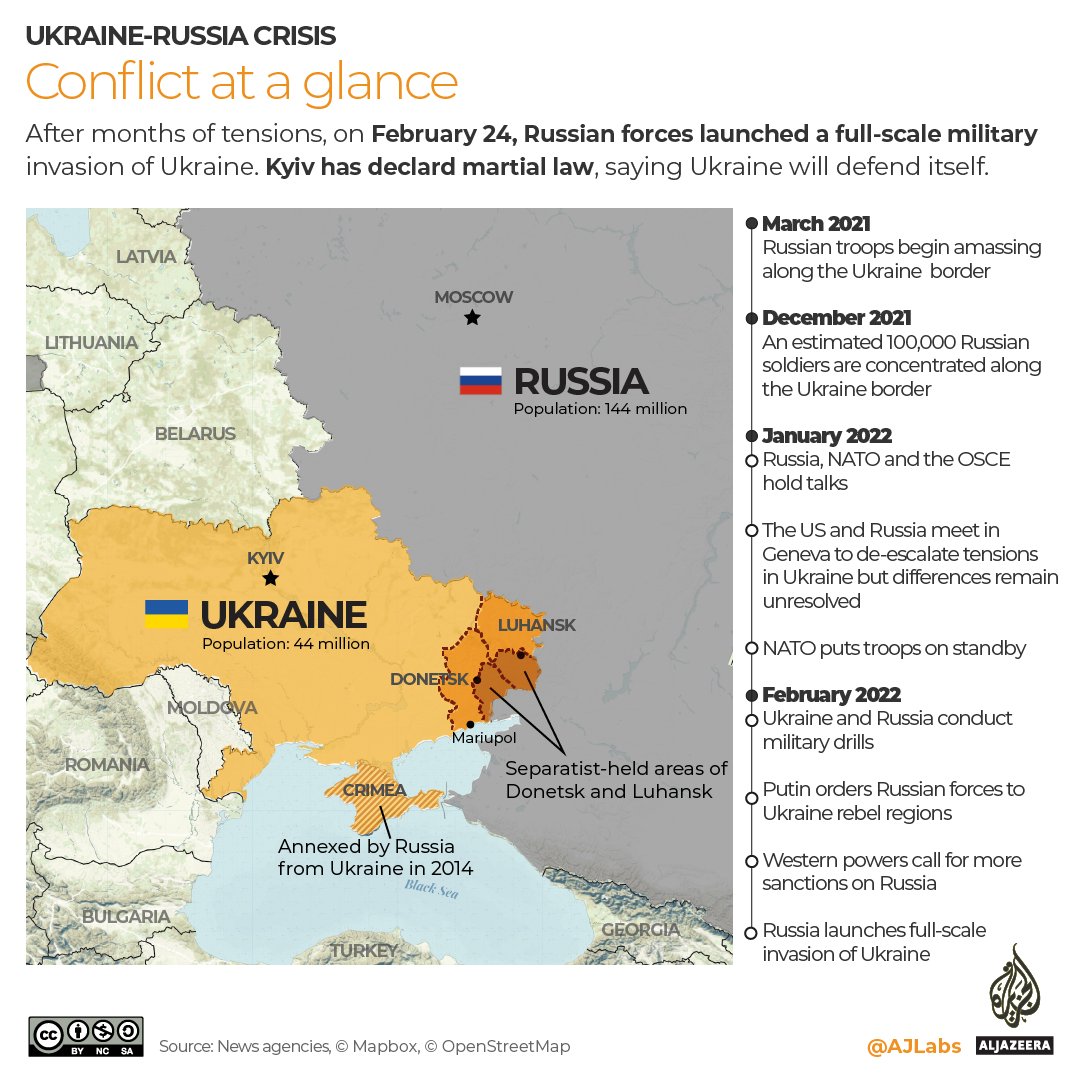
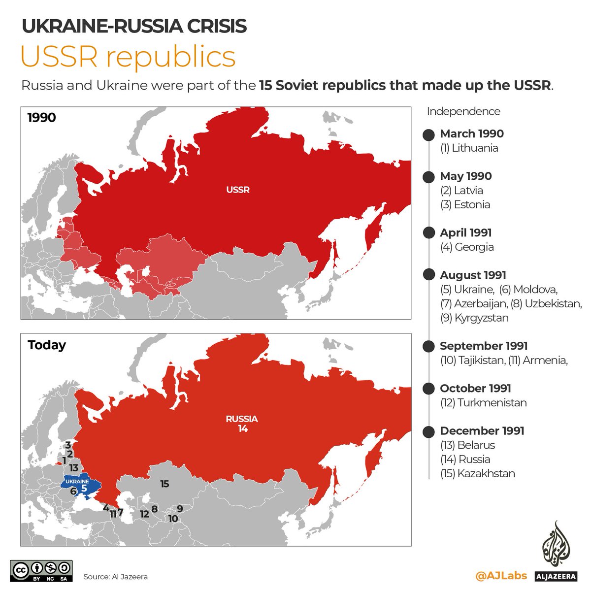
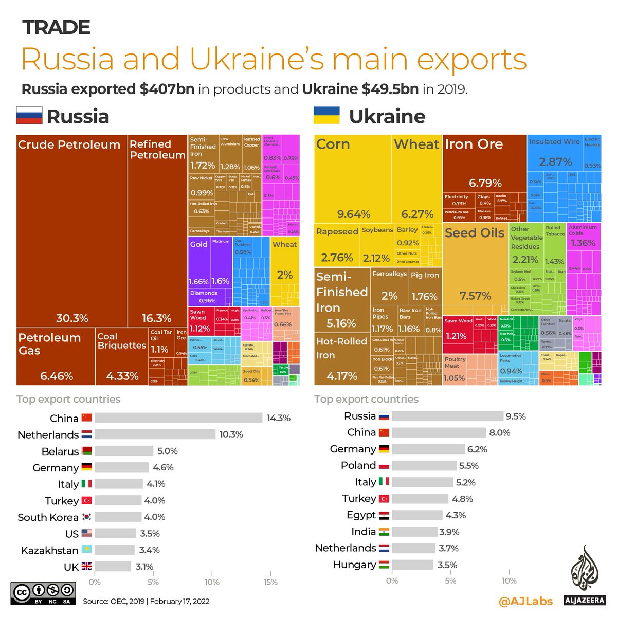
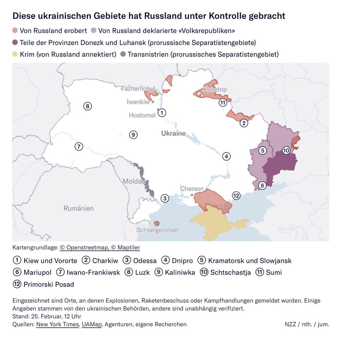
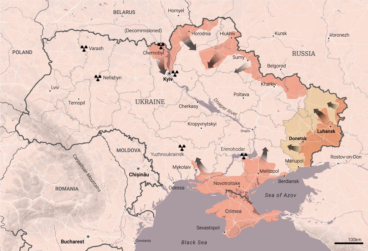
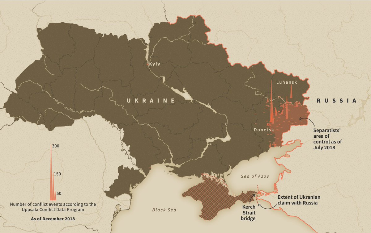
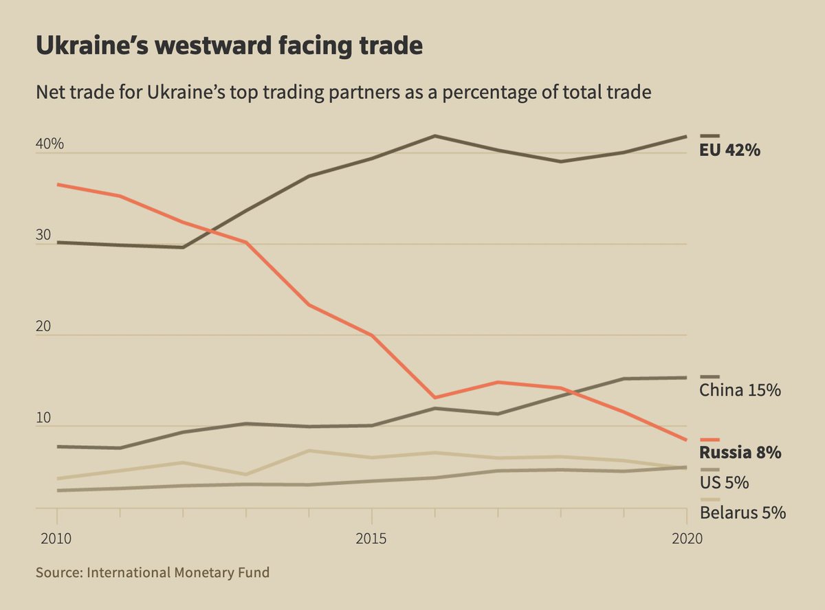
Al Jazeera (@AJEnglish) updates several maps on “who controls what in Ukraine.” Scroll down for eight helpful visual explainers of how the conflict came to be, and of the economics of Russia and Ukraine: aljazeera.com/news/2022/2/28…
Likes: 17 | Retweets: 2

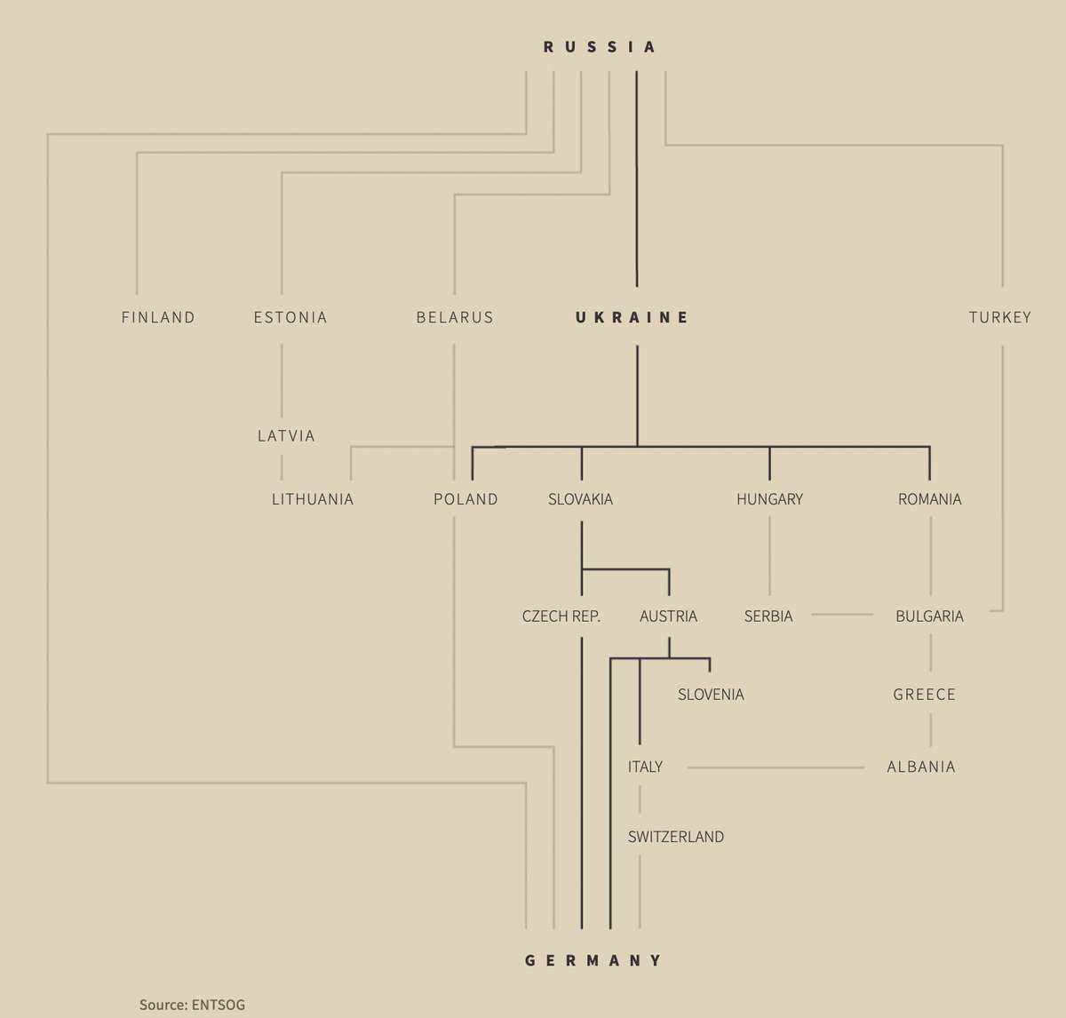
For more context information, here are two @ReutersGraphics stories full of excellent visuals, published already a few weeks ago: 👉 “On the edge of war”: graphics.reuters.com/RUSSIA-UKRAINE… 👉 “Russian gas threat in Europe”: graphics.reuters.com/UKRAINE-CRISIS…
Likes: 26 | Retweets: 5
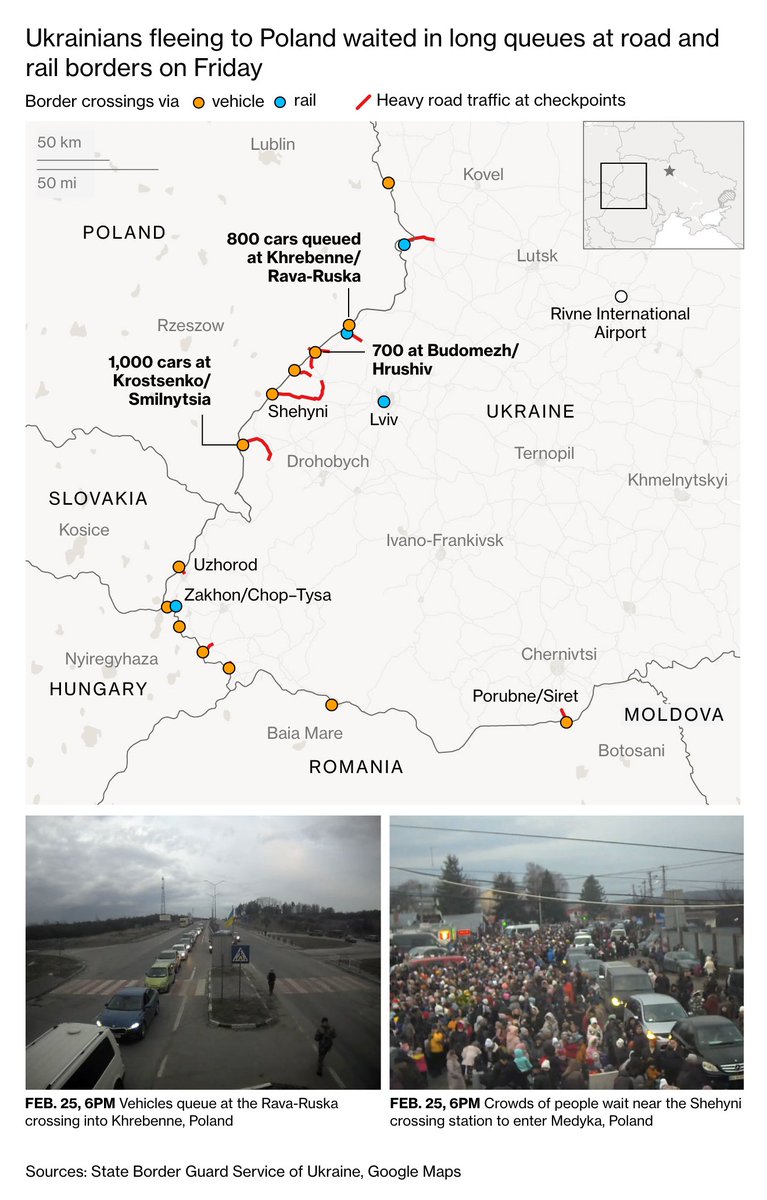
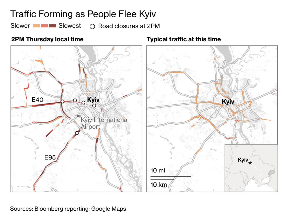
Bloomberg (@BBGVisualData) has updated their dedicated page on the Russia-Ukraine conflict since February 18, with especially insightful graphics on the movement of fleeing people: bloomberg.com/graphics/2022-…
Likes: 17 | Retweets: 2