
I’m back from my 2nd summer vacation! We went to a region in Germany with a lot of rocks and forest and goats and tranquility and old castle ruins and perfect weather, and it was really, really nice.
Today I came back to a lot of applications for the Writer and the Evangelist jobs – but also to my beloved book on colors in data vis. I started writing about the different ways to create a color palette, but was quickly interrupted by an idea: The easiest way to create a color palette is simply to use one that’s created for data vis. But which ones are good? (Meaning, good enough for my use case.) To answer this question, I want to analyze the most popular categorical color palettes created by others. Here’s a first attempt (not with the final design):
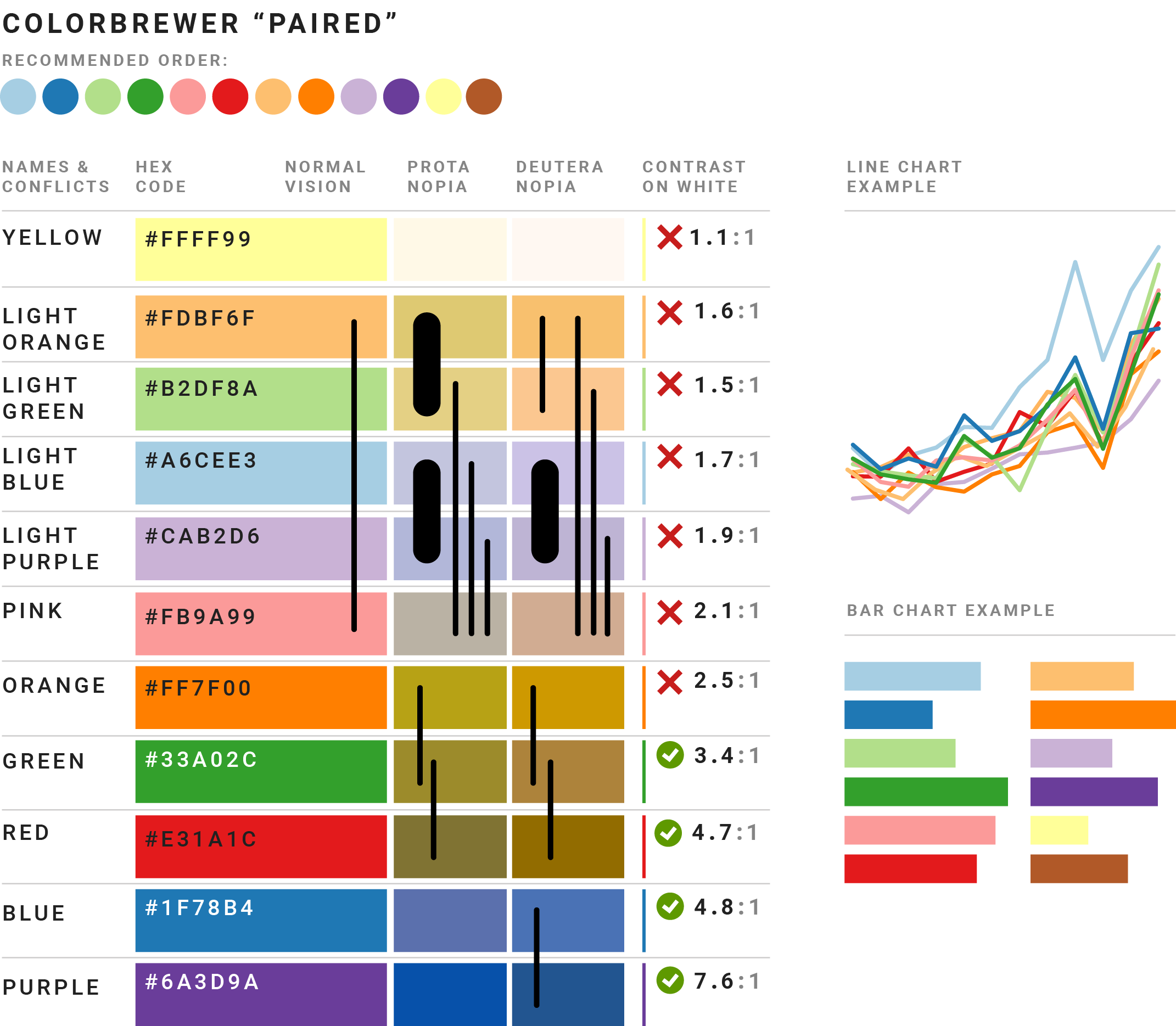
The design concept is close to the excellent Viz Palette – which I recommend a lot in the book, so it makes sense to stick with one way of e.g. showing distinguishability. For people who need to comply to the WCAG, I added the contrast ratios. And I show the “recommended order” at the top: A palette might not be accessible for ten different categories, but for five, it might work great.