Today I did some research into how to create a color palette. Like, what should (or can) you do, exactly, when you sit down and try to come up with a few nice colors that you can use for e.g. a bar chart or line chart…and have no clue how to go about it?
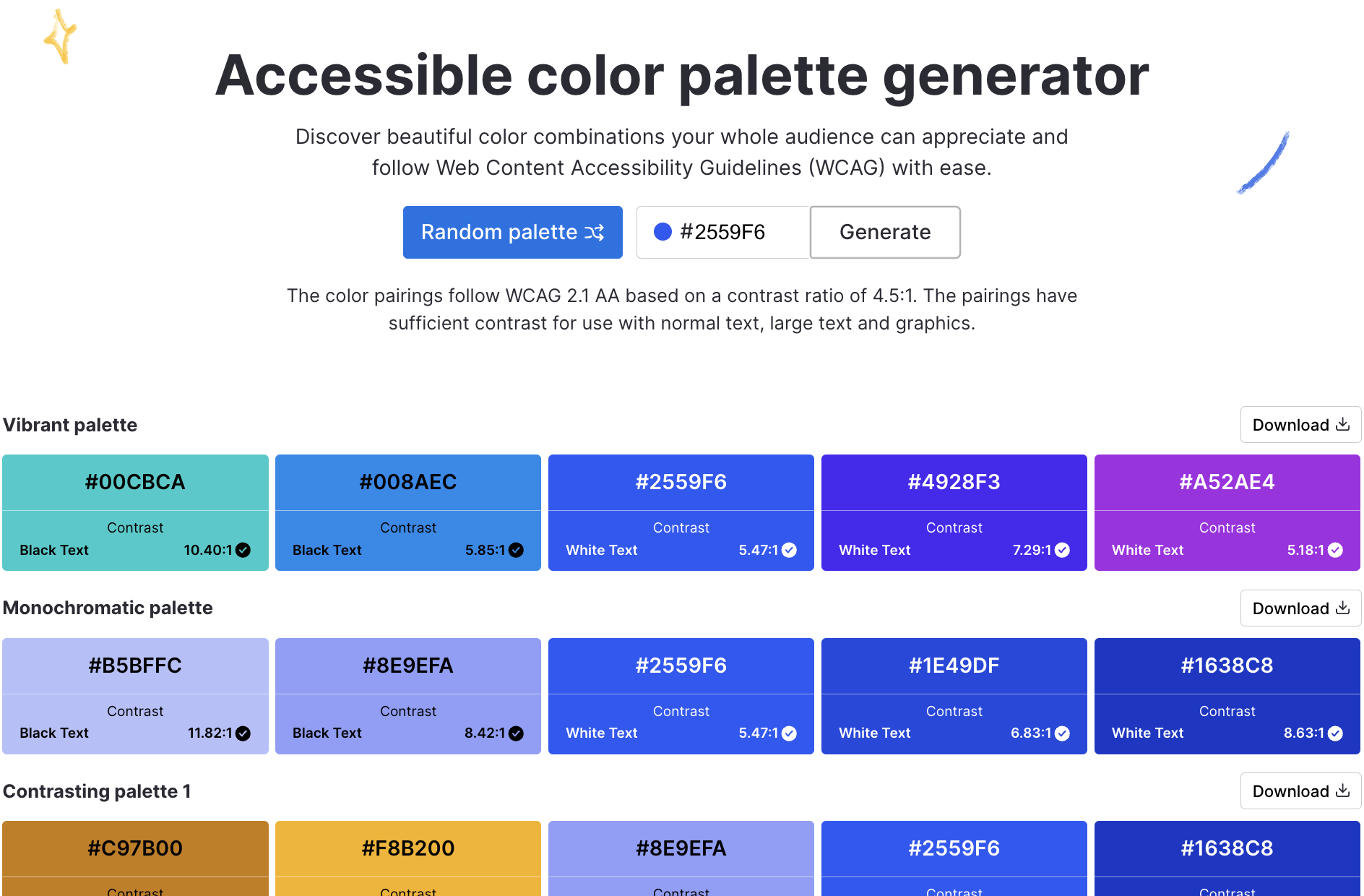
While doing that research, I stumbled upon a color palette generator I had no idea existed (but it’s such a good and obvious idea!): The Accessible color palette generator by Venngage, an infographics creator:
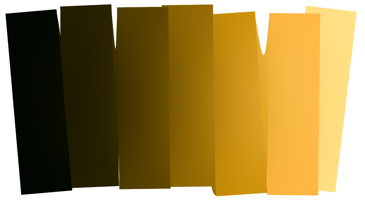
Through a comment in a blog post, I also got pointed to FettePalette by David Aerne. In German, that translates to “fat palette”), which is a cool implementation of an idea called “hue shifting”. David created a lot of small color applications, as you can see in his portfolio – like AutoAlbers, which you can see above. Very, very cool.