Is time going up or down in a chart?
Two weeks ago, Tuna Acisu, researcher at Our World in Data, was looking for a scientist who, after the death of the researcher who has done so before, would continue to track the peak blossom of a specific cherry tree species — Yamazakura (Prunus jamasakura) — in a specific place: Arashiyama, Kyoto.
All so that Our World in Data could keep updating their chart that shows the day of the year with the peak cherry tree blossom. (I love Our World in Data.)
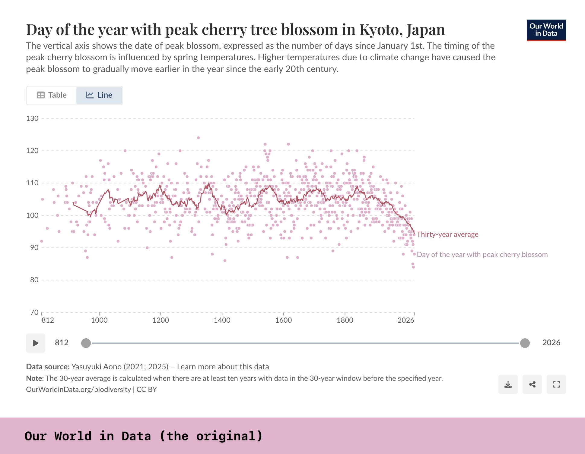
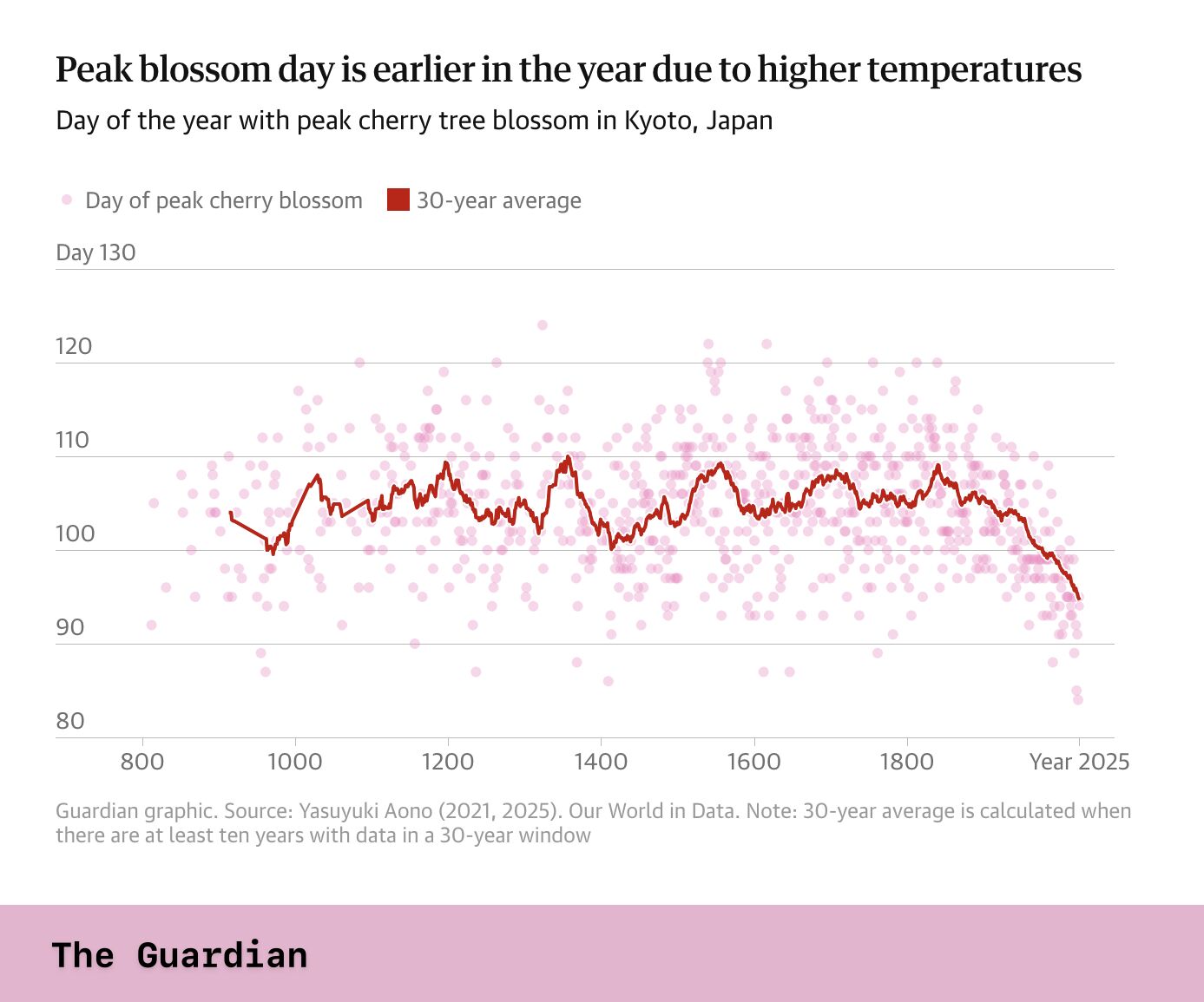
They found somebody (yay!). Than The Guardian and The New York Times both reported on it. And they both showed the chart, after redesigning it slightly.
The Guardian changed the text a bit, but kept it mostly as is.
The New York Times showed the dates instead of the number of days since January – which is smart, because we think in dates, not “days since the start of the year.” And: they flipped it. April 1st is on the top, May 1st is on the bottom. The year is “going down”, and cherry blossom peaks are “going up”, similar to the temperature in climate charts.

Which made me wonder: Do we have a shared understanding of where “earlier” and “later” is on a y-axis? Or is this something we can decide depending on the impression we want to leave and the statement we want to make?