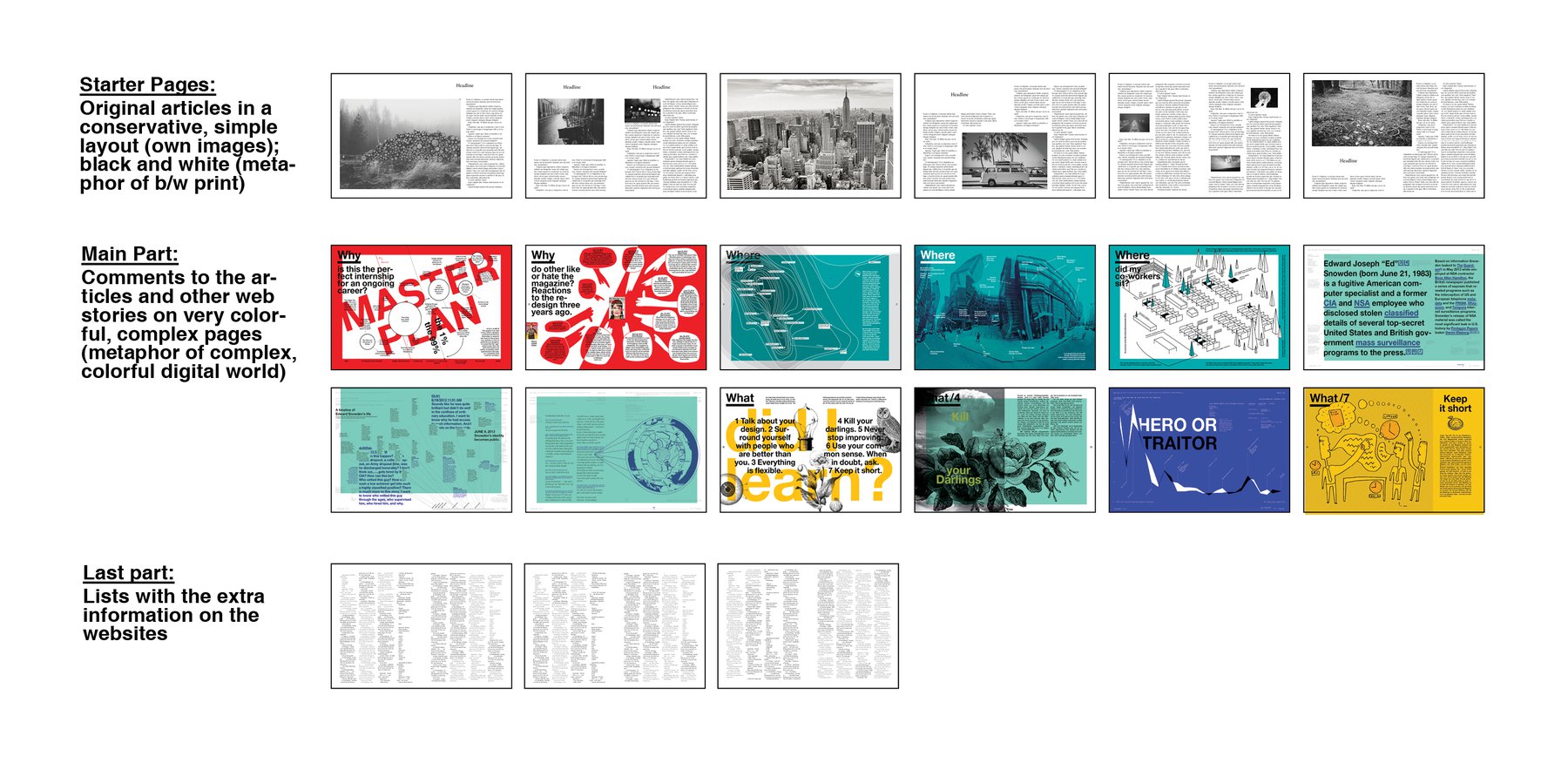
A few days/week ago, I had a conflict; somewhere mentioned in one of these long posts: I didn’t know if I should design three completely different magazines regarding the style - or if I should be consequent with only one style. I answered this question with deciding for the first option: To be diverse; to try different styles.
Now I dared to consider another possibility: To bring more than one style in a magazine. Well, why is a magazine designed only in one, recognizable style? I’ll tell ya: To be recognizable. Magazines are brands (as mentioned by Franchi in his book “Designing News”), and brands need a specific (design) language.
What I’ll (maybe) try to establish, is a brand identity which language IS the bi-style. To be clear: That’s two styles in ONE magazine.
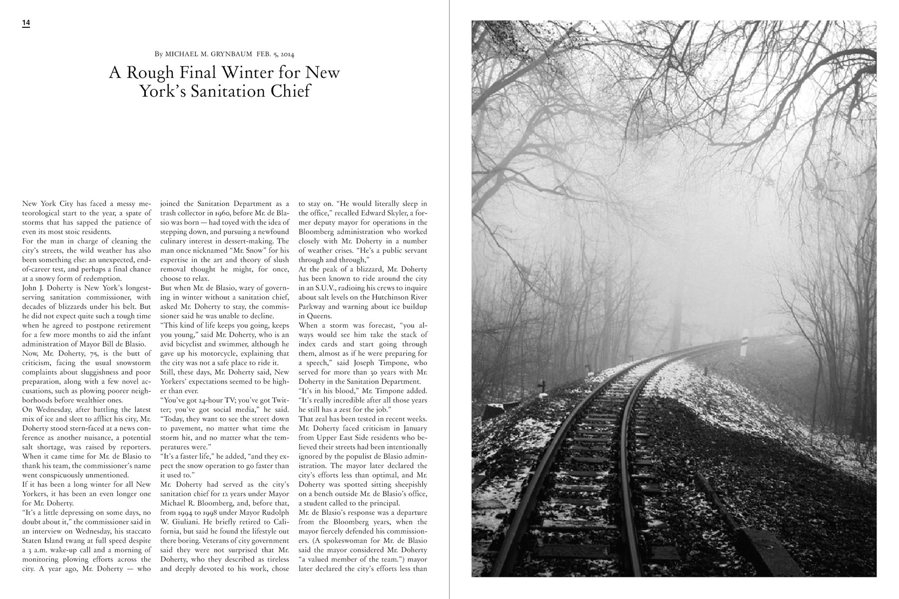
The two styles are sketched above: On the first few pages it will be the “a lot of white space - conservative” style. And it will be in black and white; as a tribute to the beginnings of photography and newspaper printing (and my own design layouts almost ten years ago). The content will be the text that I actually already dropped: The original articles to which comments are written.
The comments itself, and a lot of other stories that are published not as a response to an article like Tumblr posts, reddit entries, wikipedia articles etc. can be found in the main part. It’s designed in the “Little white space - experimental” style that I’ve already practised in my “magazine” about the internship at Bloomberg Businessweek and on some pages of the two dotview magazines.
The rest of the magazine will be black and white again (so that’s the frame) and will probably present a lot of lists and words: The rubbish; the remainder of the actual dotview magazine, sidebards, footer and header of the website I will take the content from.
I’m not sure about the last part, but in total this structure will give the magazine an exciting contrast in style (I hope).