Exactly one month ago I started this blog with the words: “And it starts.” Today is another start: The offical one. My Master’s Thesis Working Period (or however you can call that) started today. I have exactly 18 weeks from now one to…change the world. Or at least to do something nice that I’ll like at the end.
And I have four weeks to produce a magazine about money on the web. I digged some crazy stories about money-making out of the web in the last couple of days and can’t wait to actual put them into a form. But, business before pleasure, I first have to make the decision for a typeface.
I just don’t like choosing a typeface. I’ve always had friends who are real experts in typography, so I went to them to ask for help. In the beginning I still thought I can master this field as they did. But it’s a little bit demotivating if you and your typo expert friend are looking on a typeface and they see things that you just can’t see. I come to them with six or so font samples and some favourites in mind - and I leave with the knowledge that I like exactly the “bad” typefaces. (It isn’t helping that I like “dark” typefaces like Quadraat, Vollkorn or even Georgia - and they like light ones.)
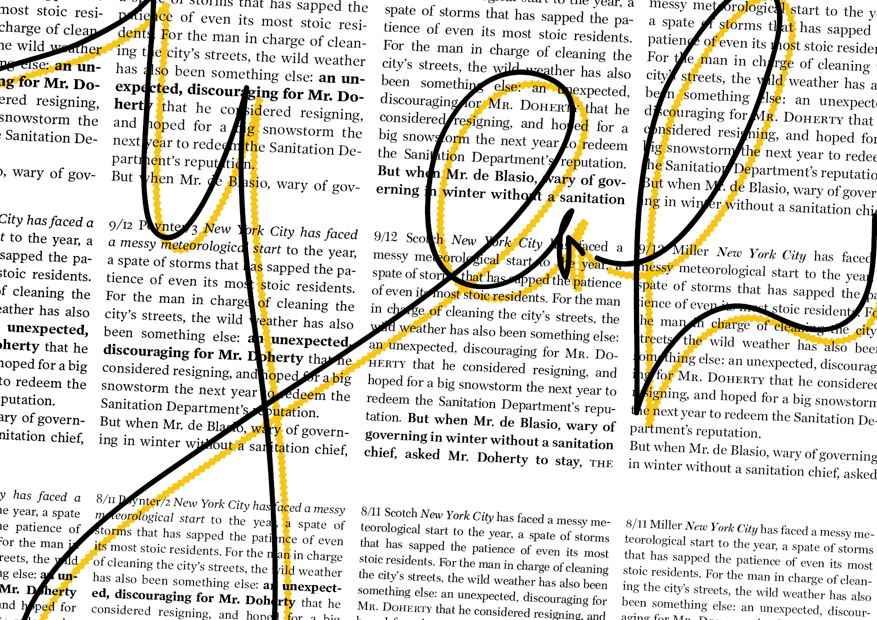
So today I flipped through the book “Schriftwechsel”, that features a lot of excellent typefaces and talks about them in a lovely way. Since the typeface I’m looking for is supposed to be for a newspaper-ish style, I also did some research into typical newspaper typefaces. At the moment I’m a huge fan of the Scotch, the Poynter (both very dark!) and the Miller. The Poynter is just gorgeous with its Italic, but the Scotch and Miller reminds me more of a Newspaper font. Let’s see how I’ll decide.