Today was a good and productive day (DeskTime Manager tells me that I was at my desk 11,5h; 9h of them productive). I made the decision for a type face - the very classic Miller; not so much can go wrong with something like this - and afterwards started to lay out a grid.
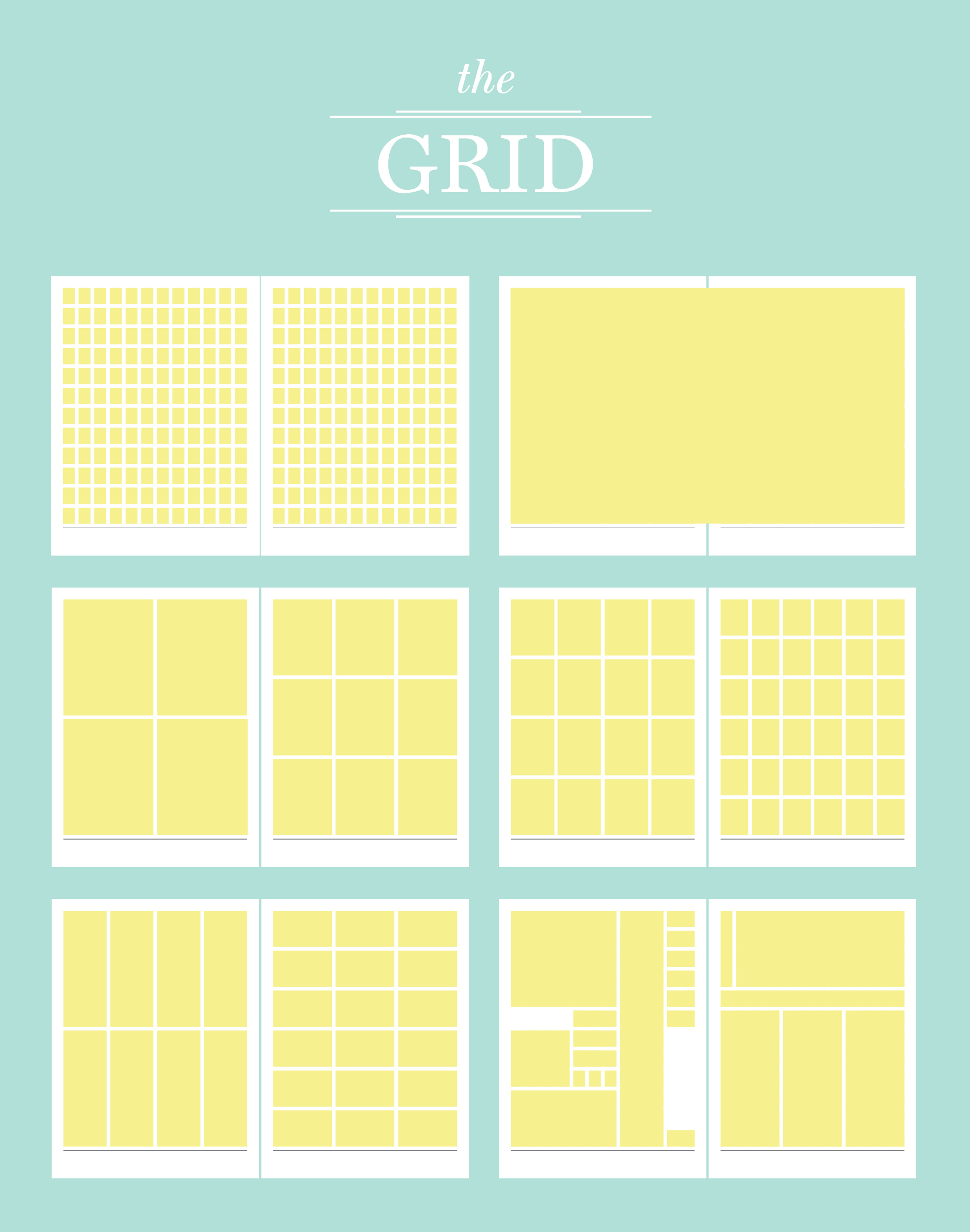
During my library visits in the last few days I became fan of Karl Gerstner’s grid for the magazine CAPITAL, but I saw a problem with the fact that it’s only a square grid. So I found this tutorial for designing a “Complex Grid”, that “streches” Gerstner’s grid. After working through this tutorial and adjusting it to my “design task”, I finally found myself with the grid that I show at the top of this post: 12 columns and 12 rows, which can be used in a very (maybe too?) flexible way.
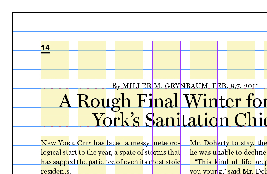
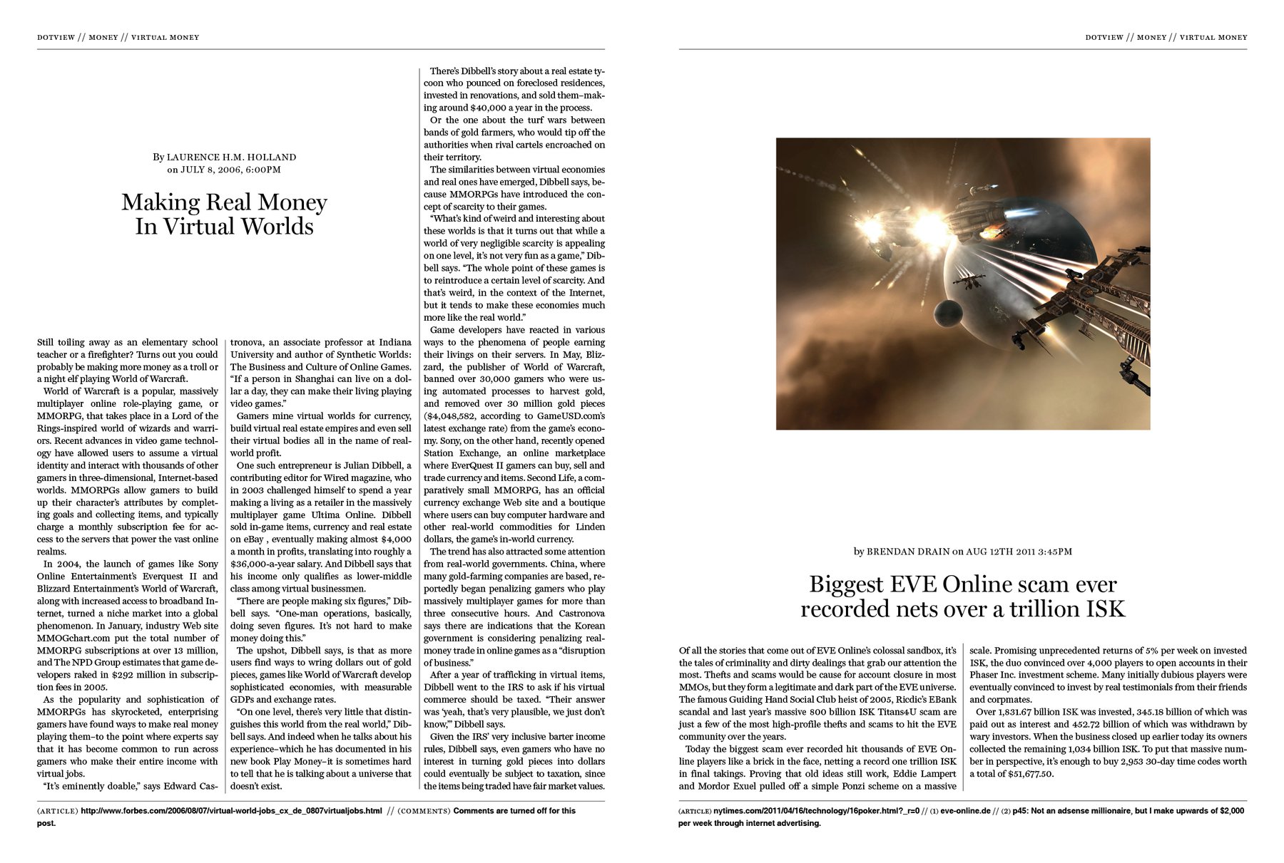
The rest of the day I started to use this grid. It’s actually more a grid for the first part of the magazine - the newspaper-like part -; the second part will be a very confuse, complex mixture of lots of font sizes, images, borders etc; inspired e.g. by the Whole Earth Catalog. Regarding the contrast between the two parts, I have currently the dilemma that I actually want to make the first part more newspaper-like. But that would mean more borders, different headline font sizes and packed pages. But exactly this kind of crowded style I want to use in the second part. I’m afraid that the contrast between the two parts won’t be enough. But on the other hand I doubt that anybody will regognize the first part as newspaper-like when I don’t design it newspaper-like. I wonder how I will solve this.
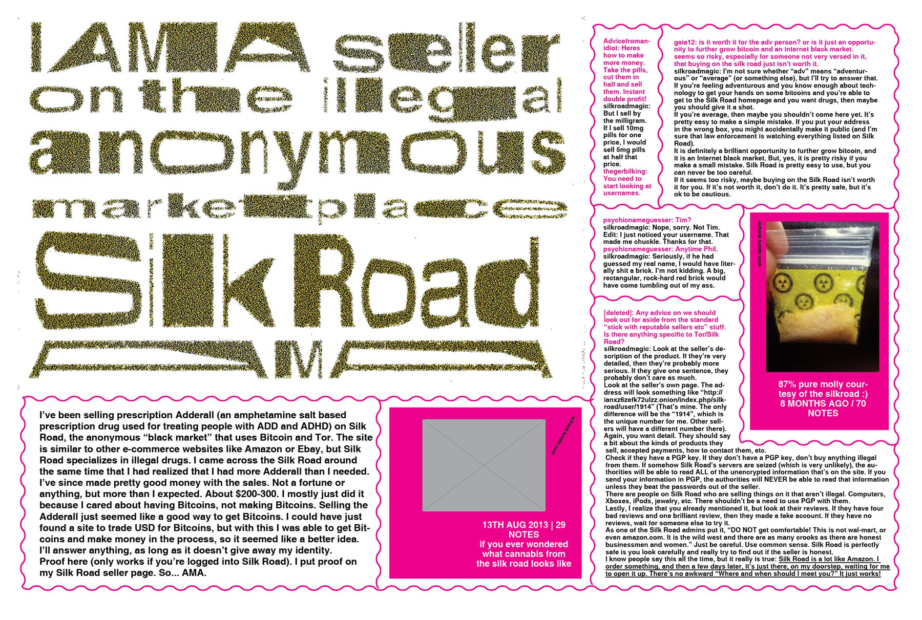
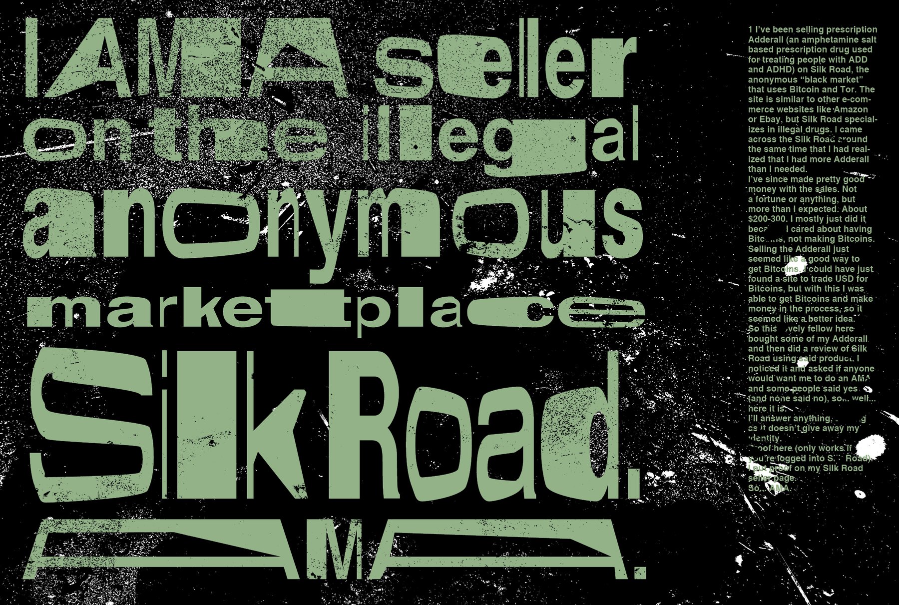
I also found very interesting that I already have a communication problem with the first web article I want to visualize: The story about a dealer on the Silk Road (in the dark, dark web). I have the problem that all my stories are very strong; about topics that already provoke a lot of associations in the readers’ mind. So when I say “drugs”, what to you think: Of the dirty side of meeting in back alleys? Of the white and clinical side of the pills and their production? Or of the rainbow color psychedelic side of the effects of (some) drugs? And first and foremost: Which side should I communicate? Is it better to decide and communicate something clear and consequent, or should I design a compromise? Should I even go for something so obvious? Or is it better to bring images of beautiful landscapes of the real Silk Road - to set a contrast (as N. suggested)? I noticed that it’s maybe sometimes easier to communicate something unknown for the reader; to introduce associations instead of reacting to them.