The second day on which I’m doing drafts for the second magazine. And I feel like I’m coming closer. The last drafts were a little bit too complex for a hyper-minimal magazine; and regarding this aspect, the drafts I did today are better.
What I’ve learned today: It’s super hard to be dynamic and flexible and exciting with your designs and at the same time minimalistic - but it’s do-able as a normal graphic designer. However, it’s even harder to be minimalistic AND original and innovative. Of course, you can be innovative with your layout (the composition of the your elements), but who will notice? I’m always looking at nice ways to position elements, but often even I don’t notice while I’m reading a magazine. I notice the elements themselves, sure. The colors. The extraordinary beautiful typefaces used. I notice if there is a very consequent rule applied to the whole layout; like “have a rectangle at the top with links to other pages”. But I don’t pay so much attention to what’s going on on every single page composition-wise; what the Designer at the specific moment of laying out the text thought.
This has consequences. I think I’m not so bad in the composition of elements on a spread. In fact, I think that’s what I can do best in terms of graphic design. But today it occurred to me: It doesn’t matter. It’s a nice magic trick, nothing more. What matters are, and that’s my hypothesis today, IDEAS or FACTS. And that was the problem with my last magazine (one of the problems): To much composition, too little ideas or facts.
What do I mean with ideas? Look at every single issue of the Bloomberg Businessweek, and you know. They’re doing IDEAS extremely well. They take the topic of an article, and then they try to communicate this topic with visual ideas. Mostly they distort type, but they also take photos and draw on the photos to reinforce the idea, or illustrate the idea.
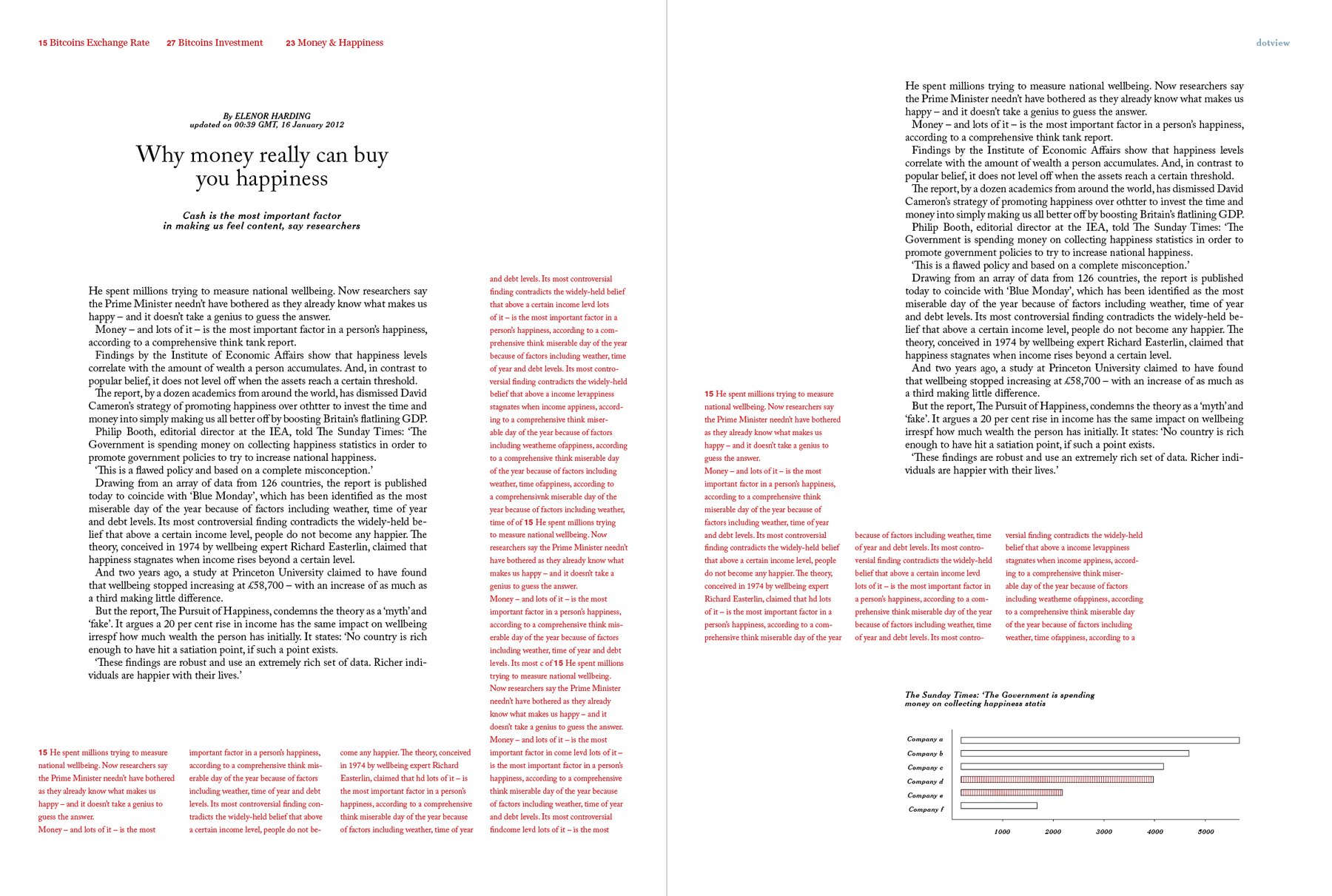
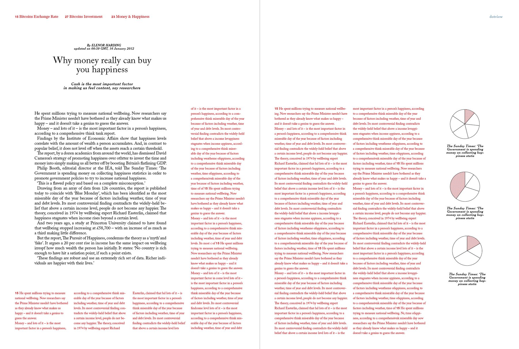
What do I mean with facts? I mean Information Graphics. That’s simple. Information Graphics became huge in the last few years, and I think one reason for this is that they can appear as an image, although the content is journalistic. So an information graphic can communicate more specific facts than a photo, but if you put it on a page, it’s not only a text desert anymore.
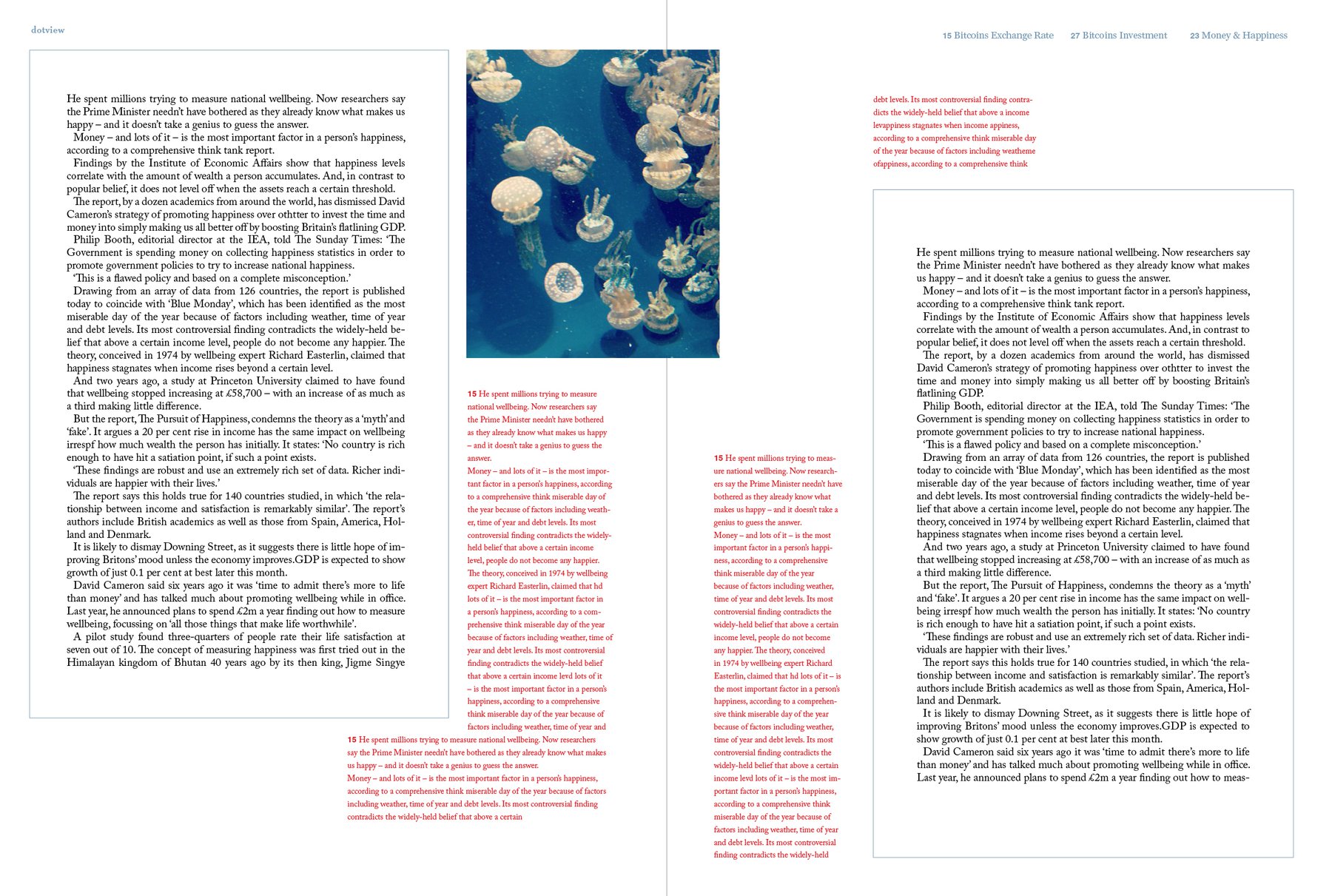
I don’t like photos so much. Photos can bring you in a certain mood, which is nice. Magazines like CEREAL use this a lot to calm your mind and to bring you in a relaxed emotional state where you can really enjoy the content of their articles. Good idea.
But photos are the opposite of white space; graphics? I don’t think so. At the top I included a page of the American Illustration 32 book which I designed for Bloomberg Businessweek. And it just looks so minimal. I think that’s good. Although I really wanted to improve my photographic skills - I decided that I won’t and that I’m instead going with info graphics in the next 3 ½ weeks.
I basically had the choice: Do I want to try taking pictures, dealing with pictures, choosing pictures - although I’m just not good in this? Or do I want to embrace my not-so-bad skills in creating information graphics? I decided for the latter one. Not only because it’s easier for me, and it will look better in the end, and I will have more fun doing it - but also because the topic (I remind you: It’s money) just WANTS information graphics. And not pictures of money bills. And even more money bills.