Today was supposed to be a nice day - and indeed, it was a nice day. My plan for today was to design the first info graphic for the magazine. I haven’t decided yet about type and margin details for the whole magazine, but i thought I “reward” myself for the last days with doing an info graphic. So this morning I jumped out of my bed in anticipation (you know, theoretically) and was really looking forward to it.
I like every part of doing an info graphic. I like looking for the most interesting data. I like to use and learn new formulas in Excel or Google Fusion Tables. I like using Pivot Tables and Tableau to explore the data; to see if there is a statement that I could visualize. I like thinking about how you can bring all the interesting data on paper. I like the challenge that you first have to think or you’re loosing a lot of time while moving elements from one corner to another. And I like the result.
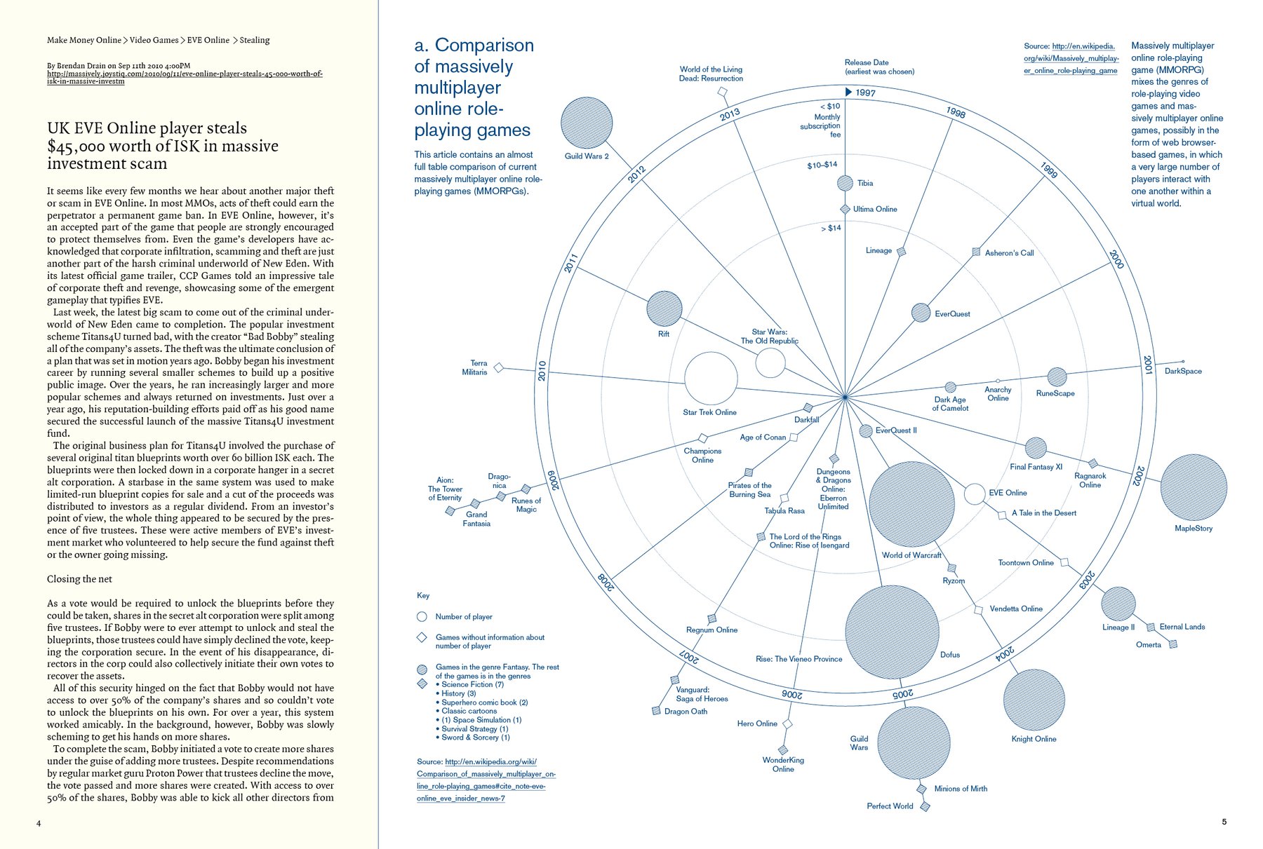
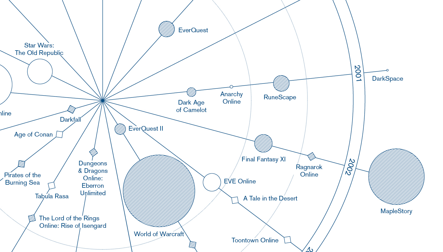
Today the part with Tableau was …well, I couldn’t use it, because Tableau is just for Windows and my Windows computer is still broken. And I had to notice that the on this Mac installed Excel is crap. So I used Google Spreadsheets and Fusion Tables. But firstly, of course, I was looking for data - with Google Tables, a search engine that looks for tables; pretty cool. For my project I prefer data from Wikipedia (because of the user-generated aspect), so I chose a list with a comparison of massively multiplayer online role-playing games. (Wikipedia has quite interesting lists. Like this list of numbers. And there is more on this list of lists.) Directly in Google Tables I pulled two tables into Google Fusion and merged them together. This was the easy part.
Then I encountered two old problems; the a) date inconsistency and b) the English-German-Comma-And-Point-Dilemma. The first one (like “month-day-year” and “year, month, the day”) is often annoying, especially if Excel doesn’t understand that there is a date in a cell; but it’s easy to solve with some cell formatting, cell splitting and automatic deleting of certain letters in a bulk of cells (or does anyone have better trick for this?). But the English-German-Comma-And-Point-Dilemma was really tricky today. The problem is that spreadsheet programs in German thinks that 4,500 means 4.5, because the function of comma and point are exactly the opposite in the German language. So I tried to change the language of the software - didn’t work. I tried to enter a new formatting for the cells - didn’t work. Of course I could have fixed the 50 numbers or so per hand, but I prefer the automatic version as a matter of principle. I’m sure I’ll encounter this problem again, and then I want to know how to solve it.
Sadly, I don’t even know how I solved it in this case. I think it was displayed correctly in the Fusion Tables, but there the date column was still wrong and I couldn’t change it. I think I then downloaded the csv from the Fusion Table tool and when I uploaded it to Google Spreadsheet, magically the commas were removed.
Well, and after this not-so-easy part I had a lot of fun with lines. The end result doesn’t look so much different from my drafts - I knew exactly which kind of look I wanted to achieve; I only struggled with the division of the information. Somewhere in between the process I had a super confusing circle with a lot of lines going from the dates to the circles that where located all ofter the paper. But I really like the radar look now. Maybe it’s still a little bit too …not minimalistic; more white space around the circle would do a good job. But for that I would need to reduce the font size or the circles, and I have good reasons to refuse both. The disadvantages would be bigger than the advantages. I also hope to have a minimalistic contrast to a little bit more clustered pages like the graphic one with spreads like the other one I’m showing at the top.