Yesterday I spent the whole day analyzing the feedback I’ve got so far - and in the same breath I prepared the slides for my presentation at Facing Pages; I will show some of them as soon as they are finalized.
And because the “learning goal” of this magazine includes to pay a lot of attention to the structure of the articles, I began to think about exactly this today. I transferred the “old-media” content (the newspaper part) from the last magazine into the new one, to see how much space it needs. And it needs more than 64 pages. So I will cut it down (I think).
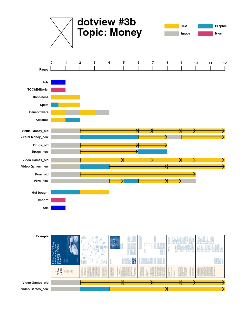
Above one can see the structure I have so far: The magazine starts light with short articles. Then the first “article bulk” starts; let’s call them…sections. I will have four sections (or five, including the “Get bought” part - not decided yet). All sections start with an opener. At the left side are the old-media articles, on the right side the user-generated content - but the two “streams” are not synchronized entirely, so that a old-media article can end while the user-generated content goes on. (I tried to visualize this principle with the thumbs at the bottom.)
My focus in the magazine is on the information graphics (the turquoise bars); there are top 1 priority. That means, when I have to loose a user-generated content to include an info graphic that I feel is necessary to understand the topic better, I will.