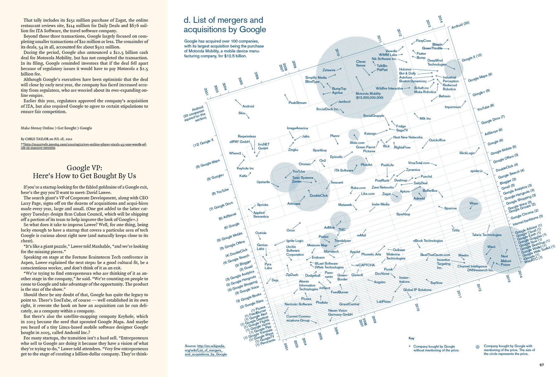
Oh wow. And I thought the last info graphic was clustered. Important lesson learned today: Sometimes it’s good to cut information. This morning I thought “I can’t cut”, because, you know, the List of merger and acquisitions by Google IS that long. But no reader will read all this. And this chart thing doesn’t tell you a lot when you look at it (actually, I had this exact same problem with the “Google Mergers” graphic in the last magazine). So I will remove some data points as soon as I have time again.
But I really like the concept of this info graphic: You can see a) when Google bought b) which company it bought c) for which product Google bought the company d) since when this product exists e) how much money Google spend on the company f) how many companies Google acquired for each product and g) how many companies Google bought in each year. And you can see each of these information VISUALLY. See, the time line IS the bar of a stacked bar chart in which each “year length” represents the number of companies acquired.
Today I also presented N. my Facing Pages presentation and got great feedback about it. So tomorrow I will iterate this…tomorrow night the Facing Pages team wants to have the presentation, so I have a deadline that I have to meet.