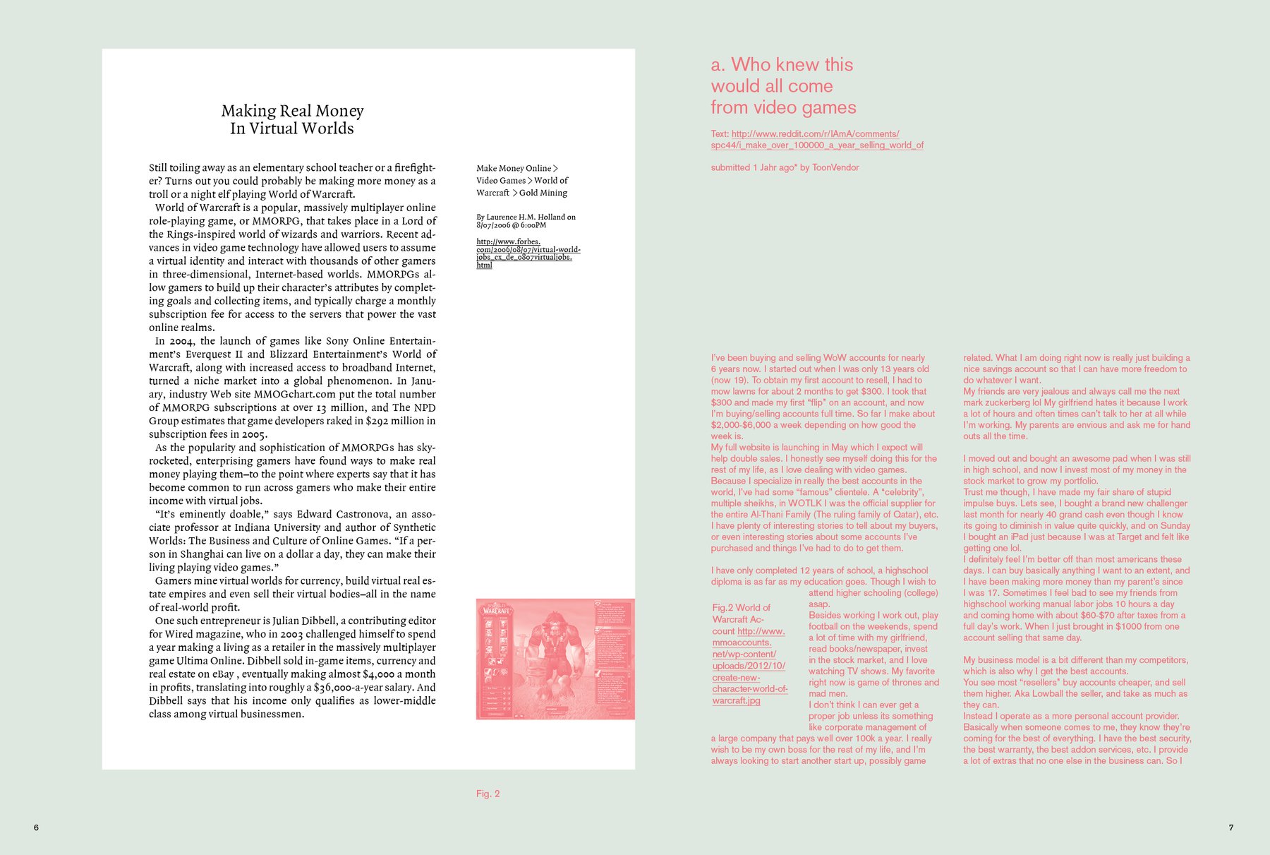
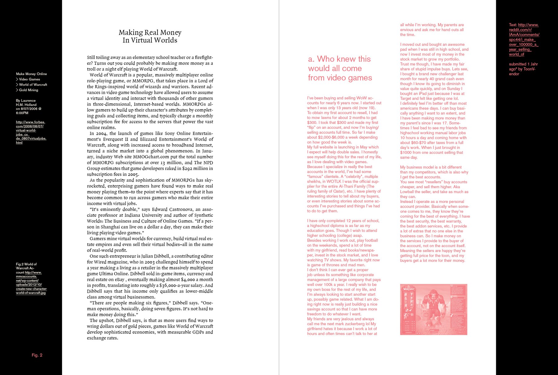
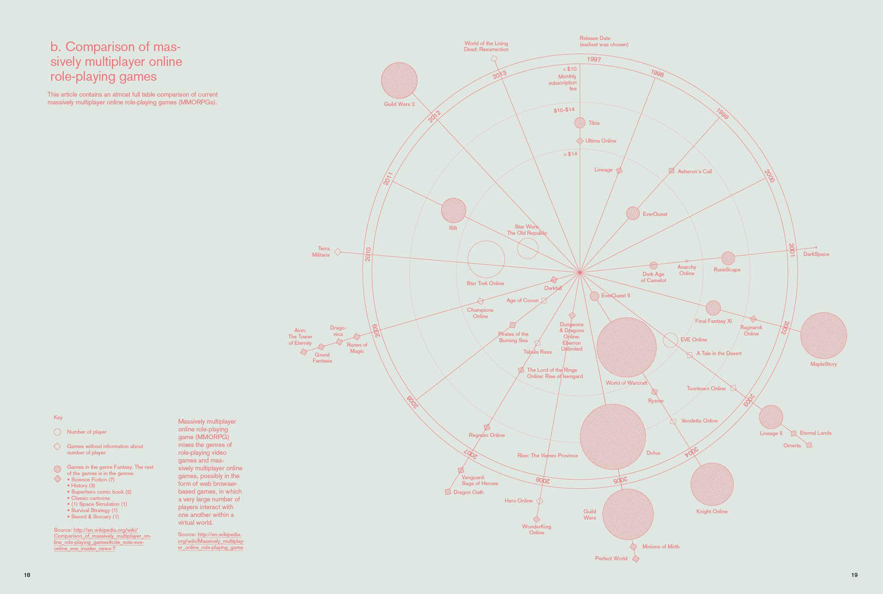
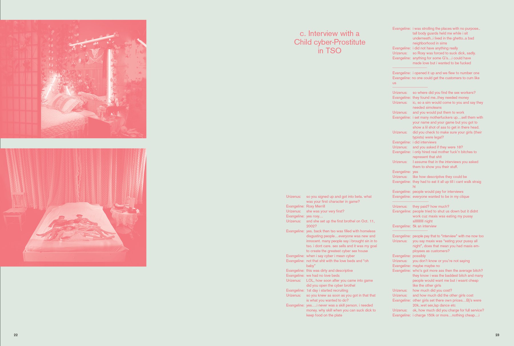
What you see is what you get: More space. More margins. Bigger type. More simplicity, hopefully! So the last three pages here are very similar to the idea mentioned in the last two weeks; but I made it a little bit more extrem. I actually want the old-media content in the highest contrast possible (black-white) and the rest in the lowest contrast possible (green-red is NOT the perfect solution here). And because I want to give it more space, I removed the white box at the left side of some pages. So the white boxes with the old-media content will only appear at the beginning and the end of each new-media story. It’s their frame. Does this make sense? I don’t know, because between reading two sentences of the same old-media story, the reader can be forced to flip two pages. Hm.
So the second image here shows another approach: Just end one story after another, but have this margin to make it somehow special. The margin is nice, because it makes the magazine format thinner and gives space for all the references to websites.
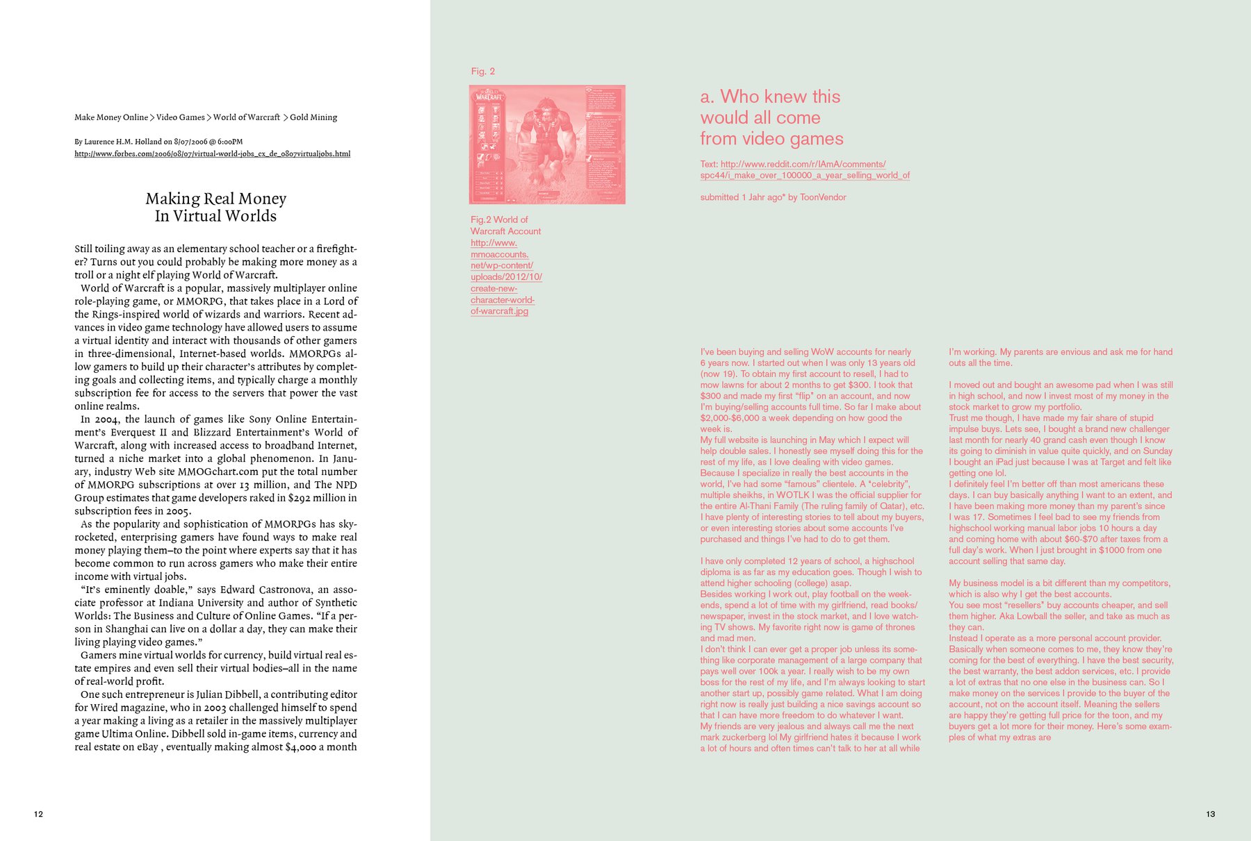
And at the top is a third idea: Just print the old-media stuff on another format and bind it in between. Although that would mean a too strong separation, in my opinion; and that’s exactly what I had in the first magazine already. Hmm…I feel like I need to think more about the integration of the old- and new-media part. And I really need to go to bed.