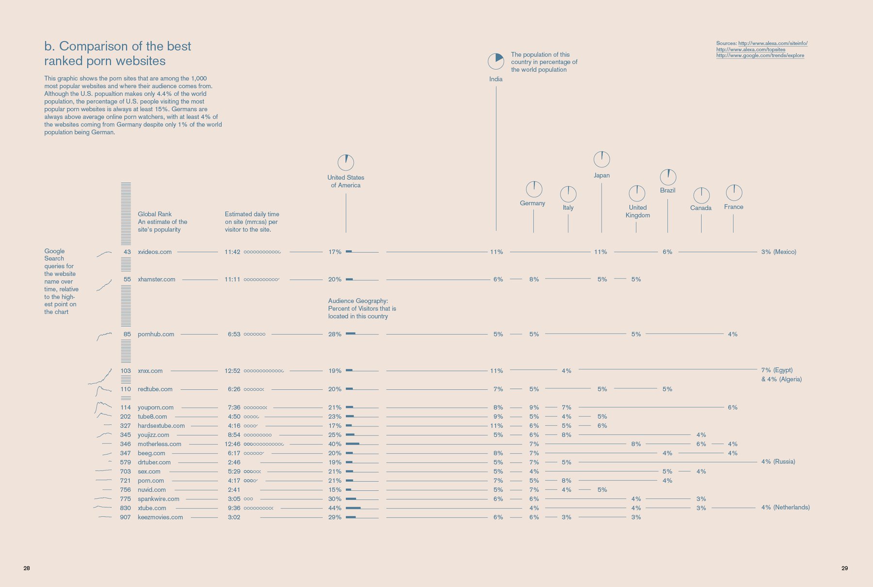
Today I worked on the third graphic. It’s actually an anti-graphic; it’s not so much a graphic, but a table with little trend charts in the beginning and little percentage-stacked bars in the middle. I can’t deny that the a story about cancer research in the last PORT impressed me a lot: They just put a spreadsheet with hundreds of numbers on a whole page. I didn’t read it (which isn’t a good sign, of course), but it communicated: “We really care and we don’t want to skip these numbers just because we can’t present them as a fancy graphic. We think that our readers are intelligent and that they will care, too - so we print the numbers.”
The other info graphic I designed so far for this magazine (and that I already showed twice on this blog) - I feel like it’s on the border to be too complex for this magazine (but perfect for the next magazine). Anyway, I will keep it for the magazine. Just saying. Can’t be minimalistic enough, such a graphic for a minimalistic magazine. I’m not 100% satisfied with the graphic you can see here, but at least it’s more reduced in it’s appearance.
Tomorrow, by the way, everything will change. The semester break at my university is over. I’ve never had on, because I HAD to start my master’s thesis in February. But with all the students floating back to Weimar, the lonely nights in the Mac Pool here at the university will be over. The building will be packed again, with seminars and projects; and the hordes of tourists groups will get competition in student crowds occupying the meadows in the Goethe Park. Because of an sense of tradition I will attend the project presentation tomorrow morning, where every professor is explaining what they have planned for the students to do in the next three months. Summer semester, bring it on.