Today I prepared another presentation, in which I investigated this “minimalism” thing a little bit more (I will write about this tomorrow). And then I started detail work. And improved the layout of some spreads. And….I started thinking about the table of content.
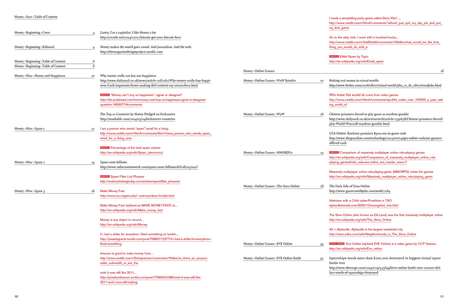
The idea for the TOC was to combine it with the source list from the last magazine, with all the links. At the top one can see how it would look if I would do this: Not so nice.
Especially when you think about what one should expect from a TOC: Of course it’s also important as a incentive to buy this magazine and to get interested in the content (so it would be nice to highlight some stories in the TOC with images or so.) But personally, I also appreciate it as an overview: What is the most important story in the magazine? How many pages are spend on each story? With this in mind, my TOC must look like an info graphic (on only one page?) - I guess that’s something I will start tomorrow. It’s a nice challenge: Combining creating an incentive and giving an overview. I have high expectations for it. TOCs can look very nice, and mine should be no exception.
And I guess I will somehow separate the TOC from the source list again. Sigh. Half of the magazine will be the actual content; the other half will be the explanation of the content…