I proudly present two double pages I designed today. See how they don’t fit together – at all? Beautiful, isn’t it?
You know what: I’m actually super happy about it. A few years ago I thought of a structure, a type face, a grid – let’s just say: a system – and then I stayed in it. I couldn’t break out. And so every one of my designs was dull and boring. Every page was the same.
So that’s book design, right? Why didn’t I just stay in book design; designing each page beautifully, but boring?
Two reasons, my friends! First of all, I don’t like details so much, but the overall layout and composition of a page. (Maybe you’ve noticed.) And that’s more important in magazine design than in book design. Secondly, precisely because I like to stay in my system, I liked the challenge to break out. Actually, I felt pretty early in my university life that I needed to break out more.
So I did. And on the axis between “too much system” and “too much breaking out”, I’m moving slowly but steadily towards “too much breaking out” – yep, TOO much towards …too much. Meaning, I should pretty quickly move backwards. Meaning, I should do this in the next week; because the next week is my last week working on this magazine. But I’m confident. Now that I have proof that I feel well breaking out, I can break in again.
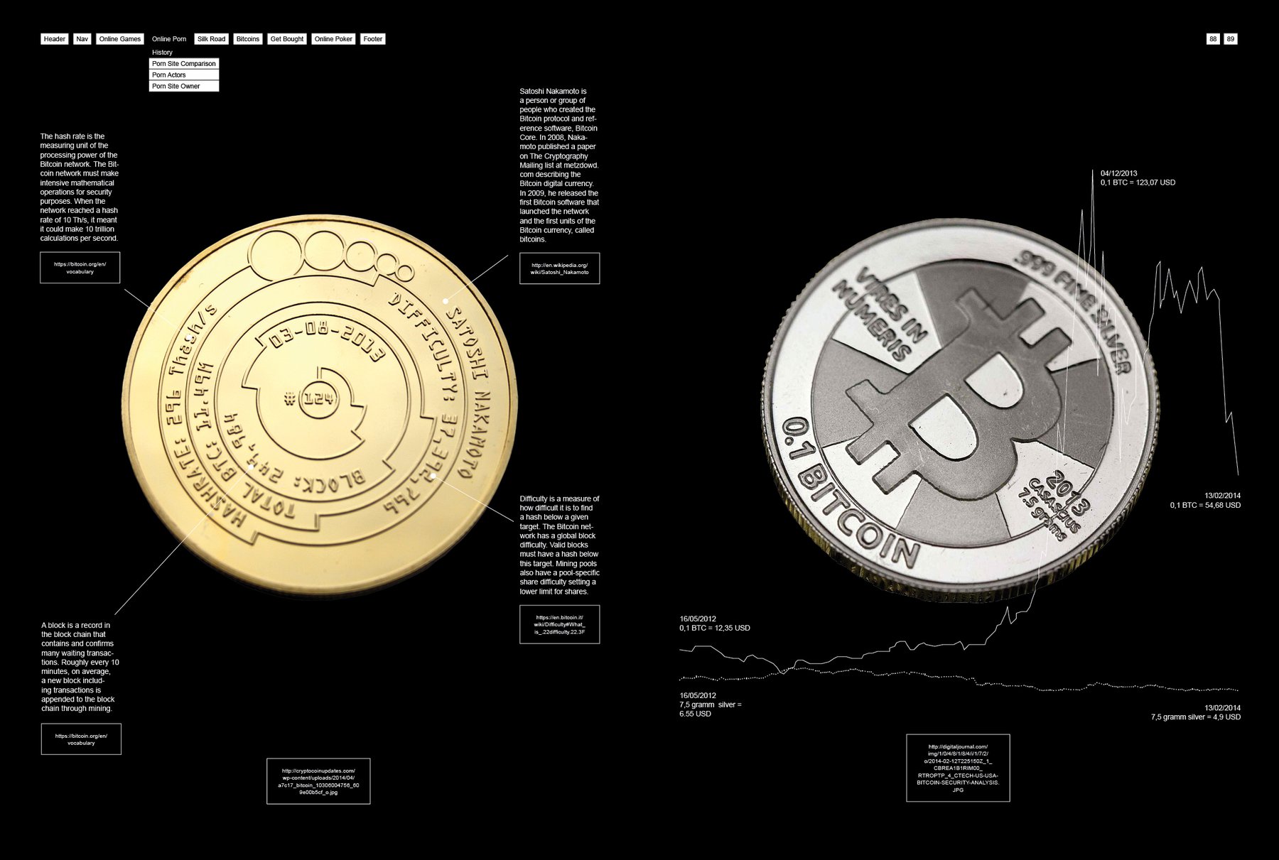
By the way: You see this graph on the top right page? It looks so simple, but it took me at least one hour to pull it together. The idea behind it: On the Bitcoin coin there you can see the material – 7.5 grams silver – and the value – 0.1 Bitcoins – of the coin. And I wanted a graphic that compares these two values; exactly these two. So I took the Kilo price for silver and the Bitcoin price and did some math.