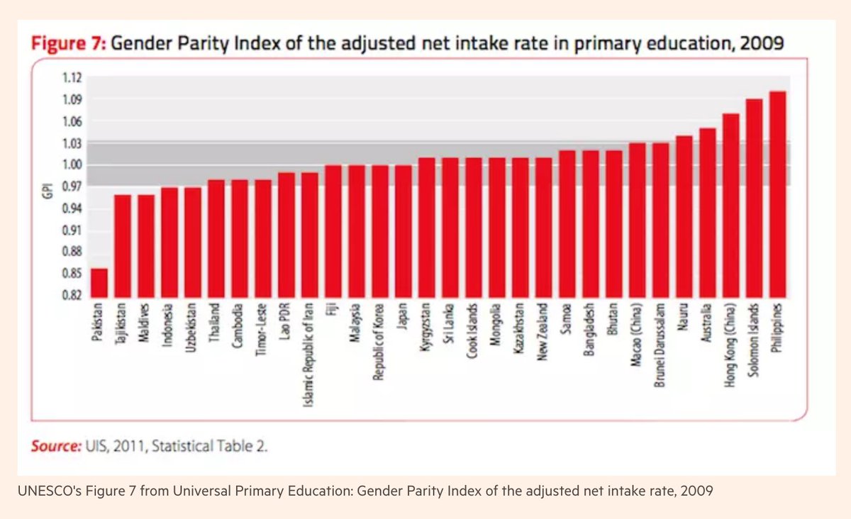
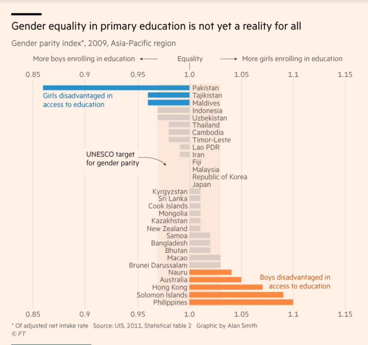
Great #dataviz article (too bad it’s hidden behind a paywall), in which @theboysmithy redesigns a UNESCO chart step by step: ft.com/content/3b59f6…
Best line IMO: “Adopt a ‘fewer but better’ mantra when it comes to incorporating [charts] in reports.”
Likes: 62 | Retweets: 20