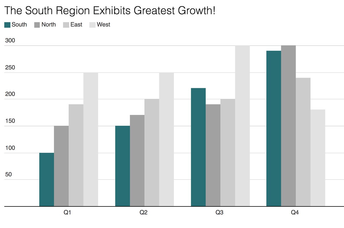
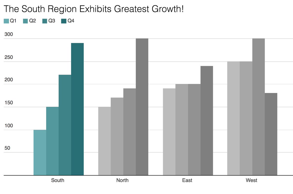
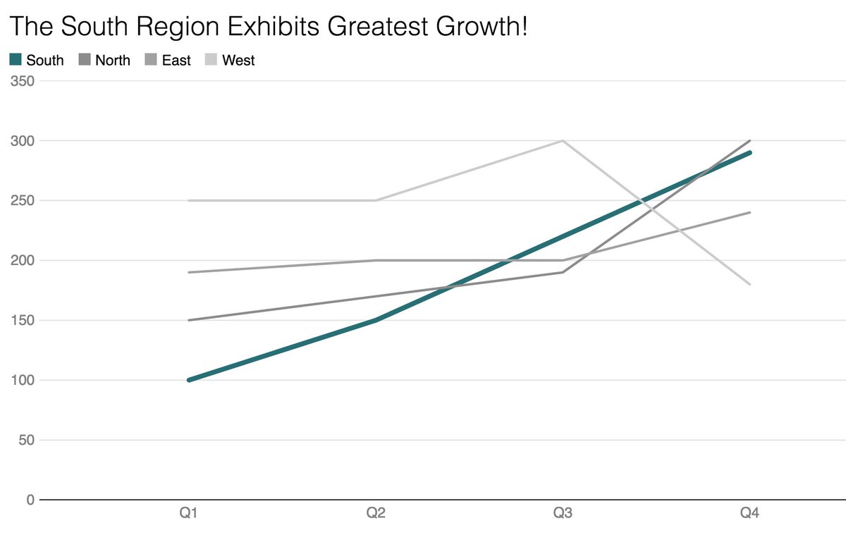
#dataviz peeps, what do you think: Which of these chart types works best for the statement in the headline? (Data & headline from Stephen Few’s “Show Me the Numbers”, p. 214.)
Likes: 19 | Retweets: 2
Wow, that was quick. Thanks! The line chart wins. The grouped bar charts lose.
Likes: 6 | Retweets: 0