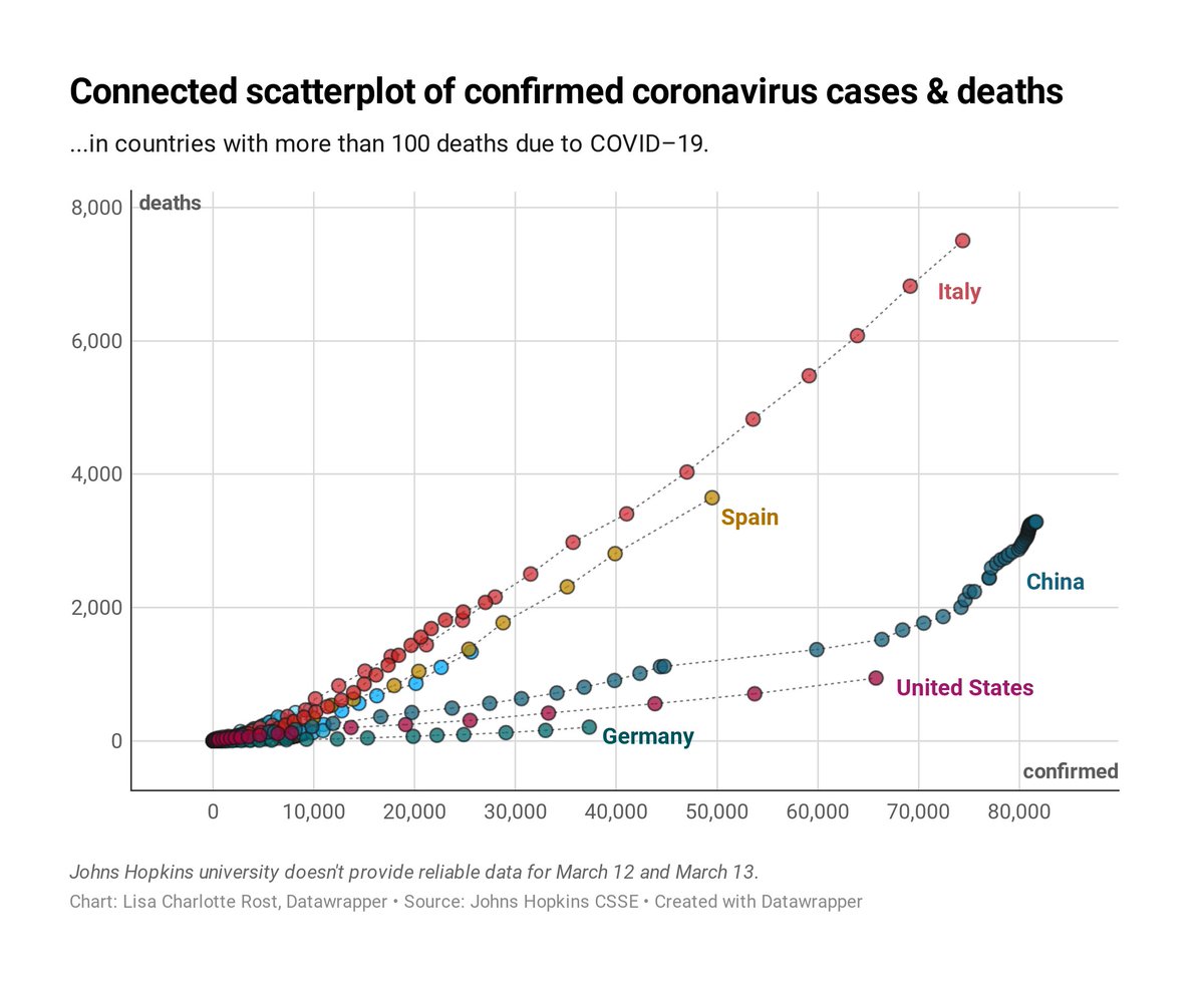
I don’t think this chart is particularly useful to understand the data, so I won’t include it in our #COVID19 chart collection (blog.datawrapper.de/coronaviruscha…). But I do think it offers an interesting perspective on China.
You can get some hover tooltips here: [datawrapper.de//0j5Tg/](https://www.datawrapper.de//0j5Tg/)
Likes: 15 | Retweets: 1