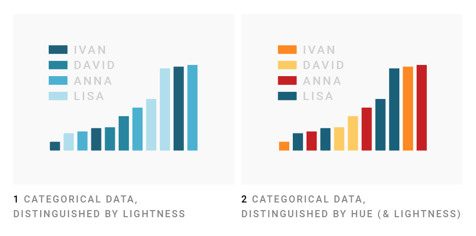
Dear #dataviz peeps, let’s discuss: Is it ok to differentiate between categories with lightness, or should we use hues?
Different data viz book authors seem to have different opinions.
Likes: 275 | Retweets: 51
Dona Wong writes in her great book, “The Wall Street Journal Guide to Information Graphics”, that shades of one colors are ok. Combinations like blue and orange are not.
While @visualisingdata writes on p257 in his fantastic Data Vis handbook, 2nd, that “you should not consider using variations in the lightness dimension” for differentiating categories – which means that we shouldn’t even combine hues like yellow and orange.
Mike Cisneros states something similar in @storywithdata’s latest blog post on picking colors: “For the most part, with categorical data, we should change the hue, and with continuous data or values, we should change the saturation or the lightness.” (storytellingwithdata.com/blog/2020/5/6/…)
I myself wrote on blog.datawrapper.de/colors/: “Since many readers will associate dark colors with ‘more’ and bright colors with ‘less’, shades imply a ranking of your categories. Use different hues for your categories to avoid that, and to be able to talk about these colors.”
But maybe I need to go back and revise this article? Maybe there’s research that’s useful in the discussion? Please help, @tamaramunzner @FILWD @AlbertoCairo @jburnmurdoch @sharoz, or whoever knows something. Thank you!