New Data Vis Dispatch! Once again we collected the best of last week’s big and small #dataviz: blog.datawrapper.de/data-vis-dispa…
This week, @rosemintzers and I focused on the IPCC climate report – and the attempts of lots of newsrooms to rebuilt their charts. Let’s compare them! 🧵
Likes: 105 | Retweets: 25
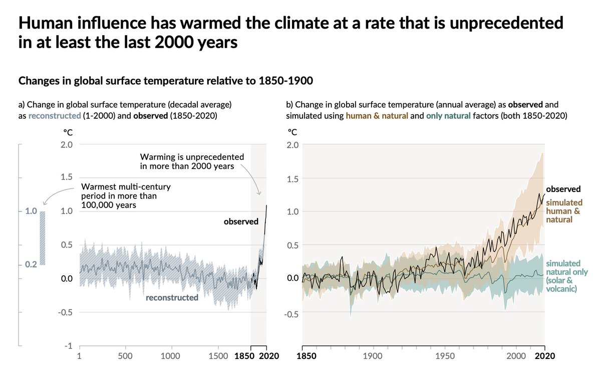
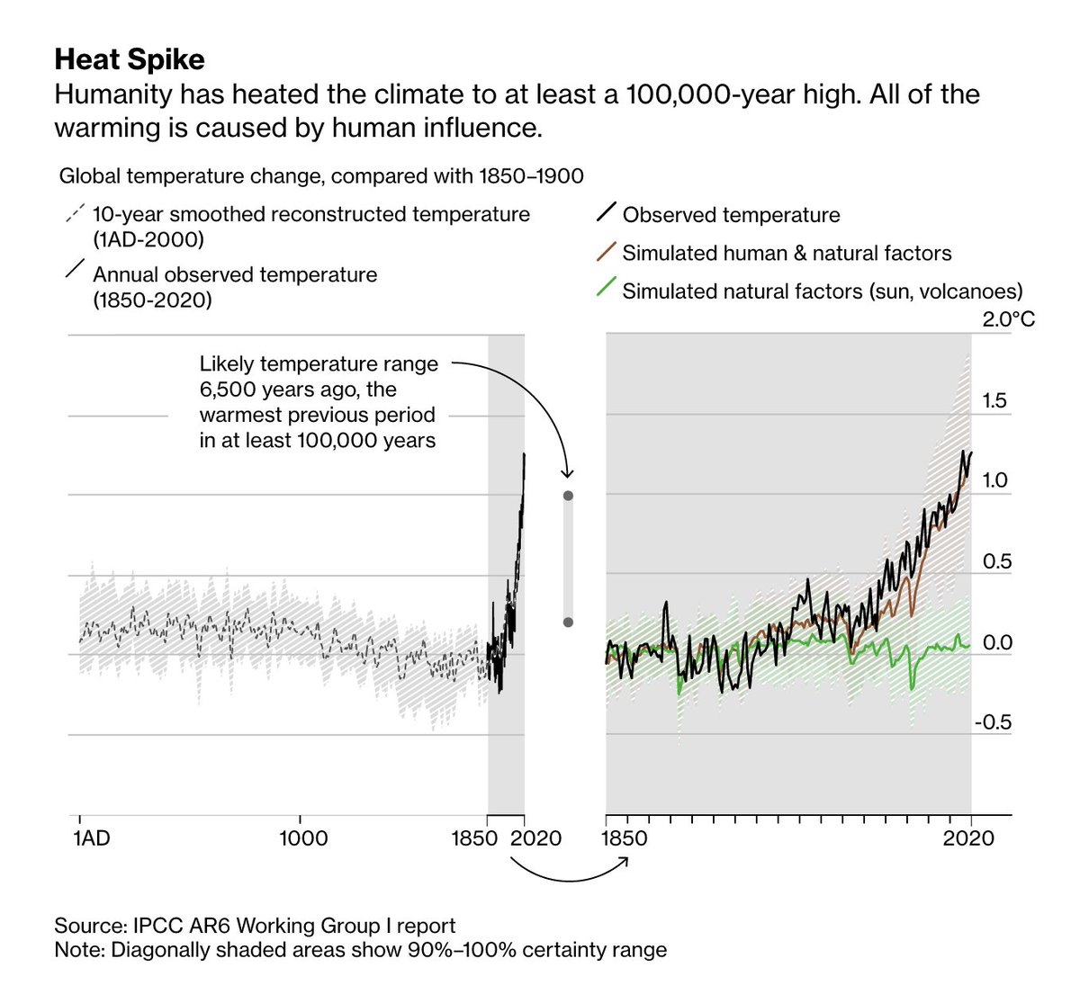
Fig. 1 in the IPCC report (p.7): History of global temperature change and causes of recent warming. A double chart! To my knowledge, only Bloomberg rebuilt it in full.
pic 1: IPCC ipcc.ch/report/sixth-a… pic 2: Bloomberg bloomberg.com/news/features/…
Likes: 2 | Retweets: 1
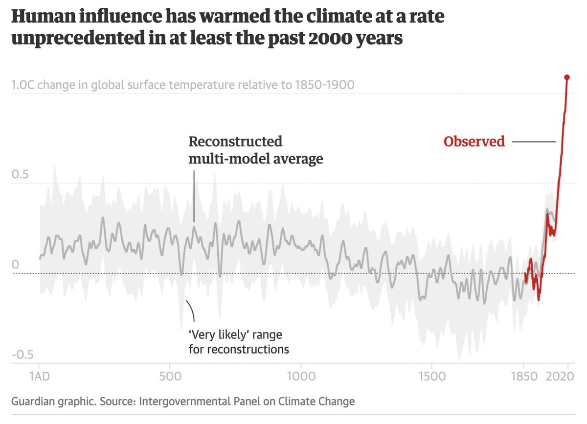
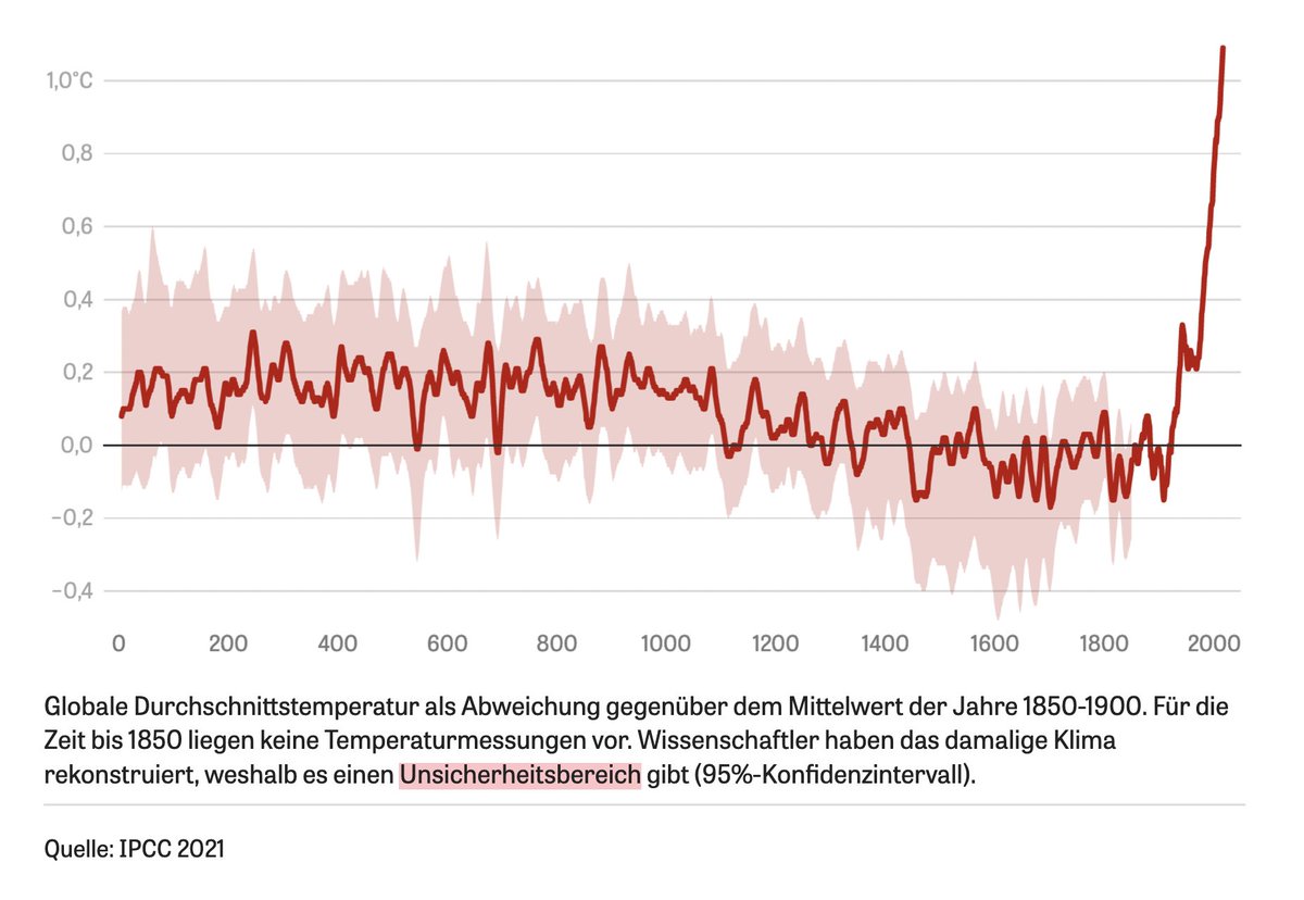
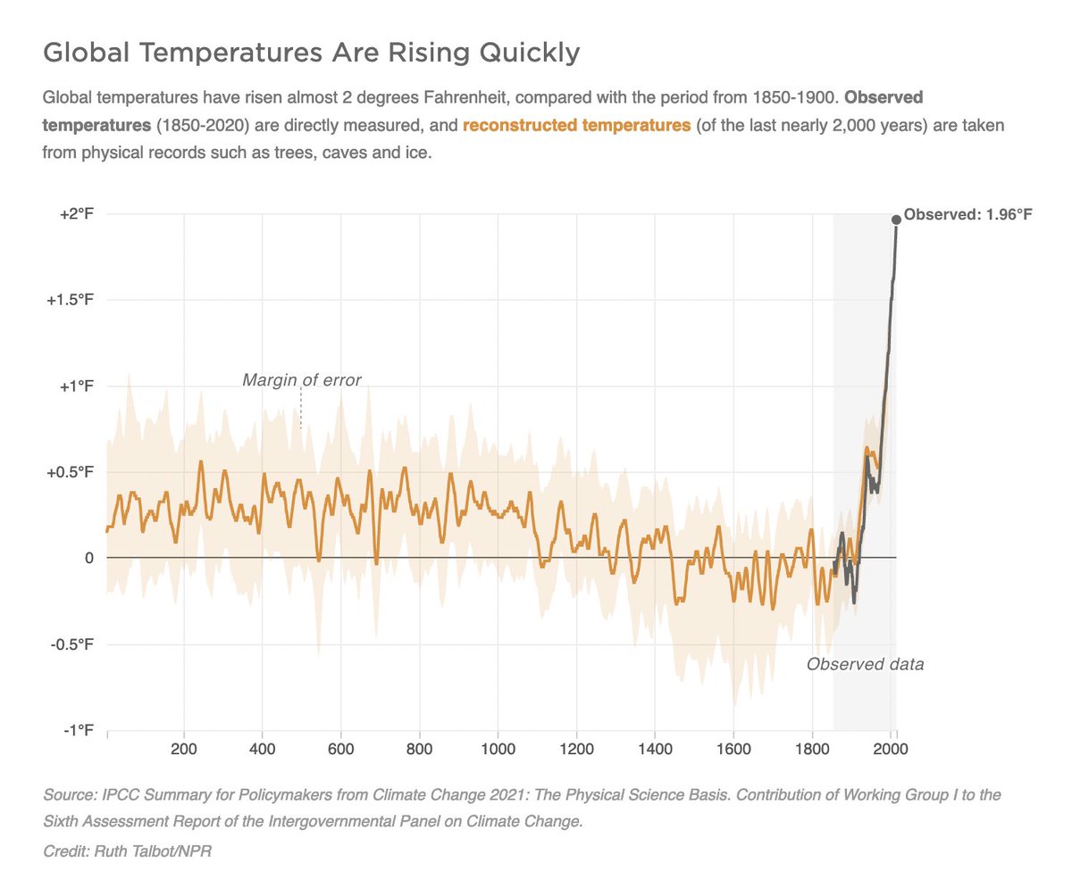
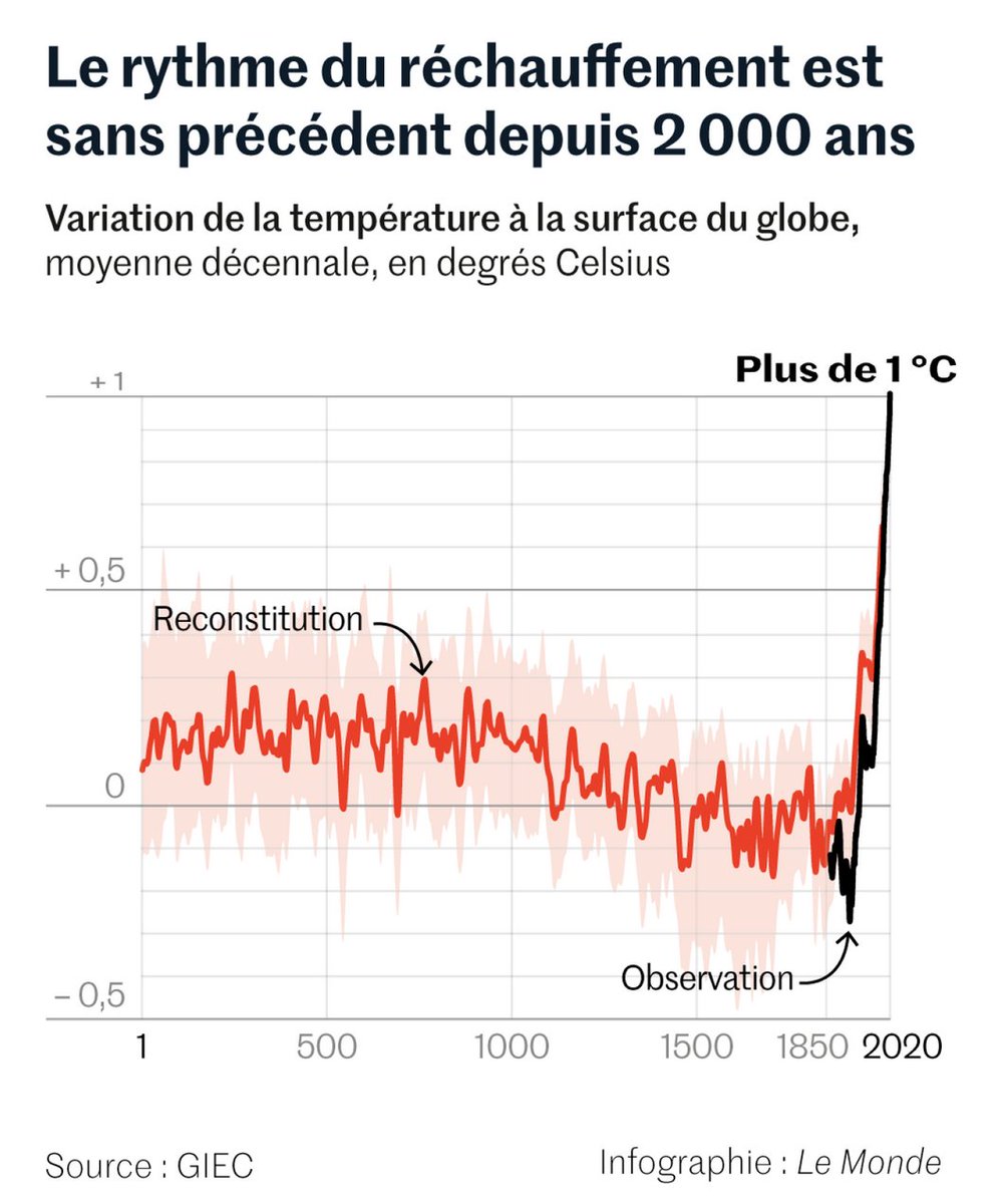
Most newsrooms showed only the left part of the double chart, the history of global temperature change:
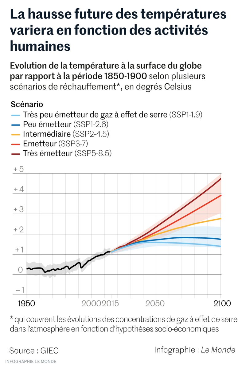
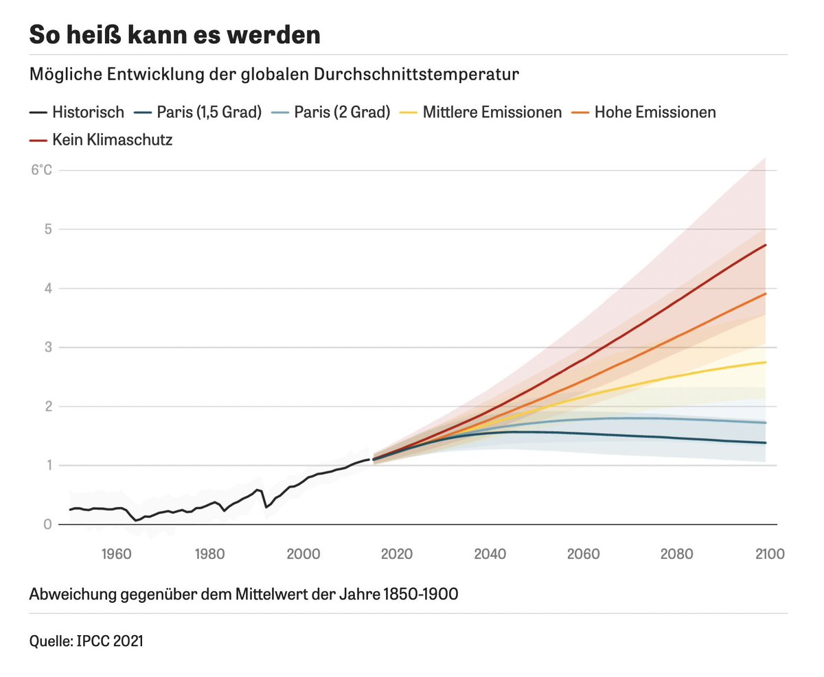
1: Guardian theguardian.com/science/2021/a… 2: ZEIT zeit.de/wissen/umwelt/… 3: NPR npr.org/2021/08/10/102… 4: Le Monde lemonde.fr/planete/articl… – good idea to highlight the 1°C!
Likes: 4 | Retweets: 1
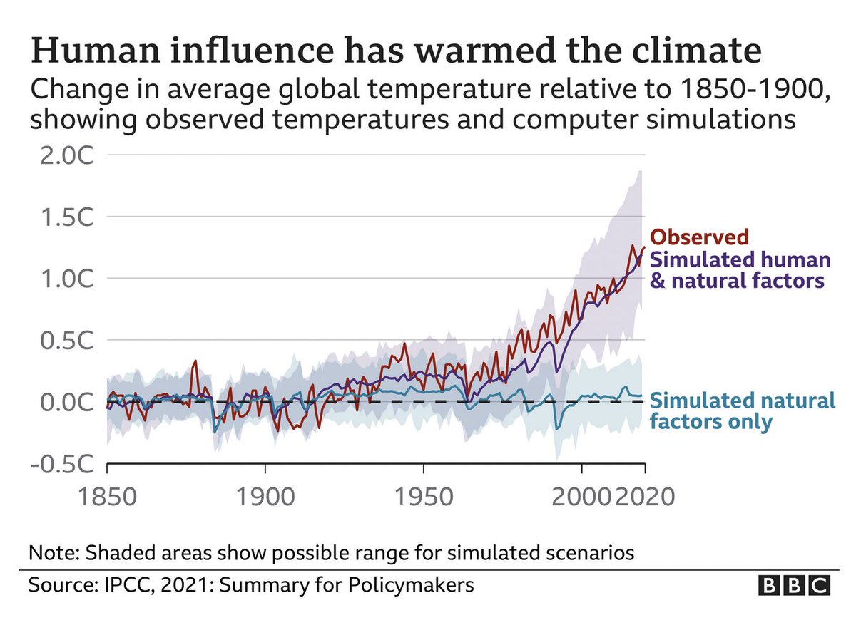
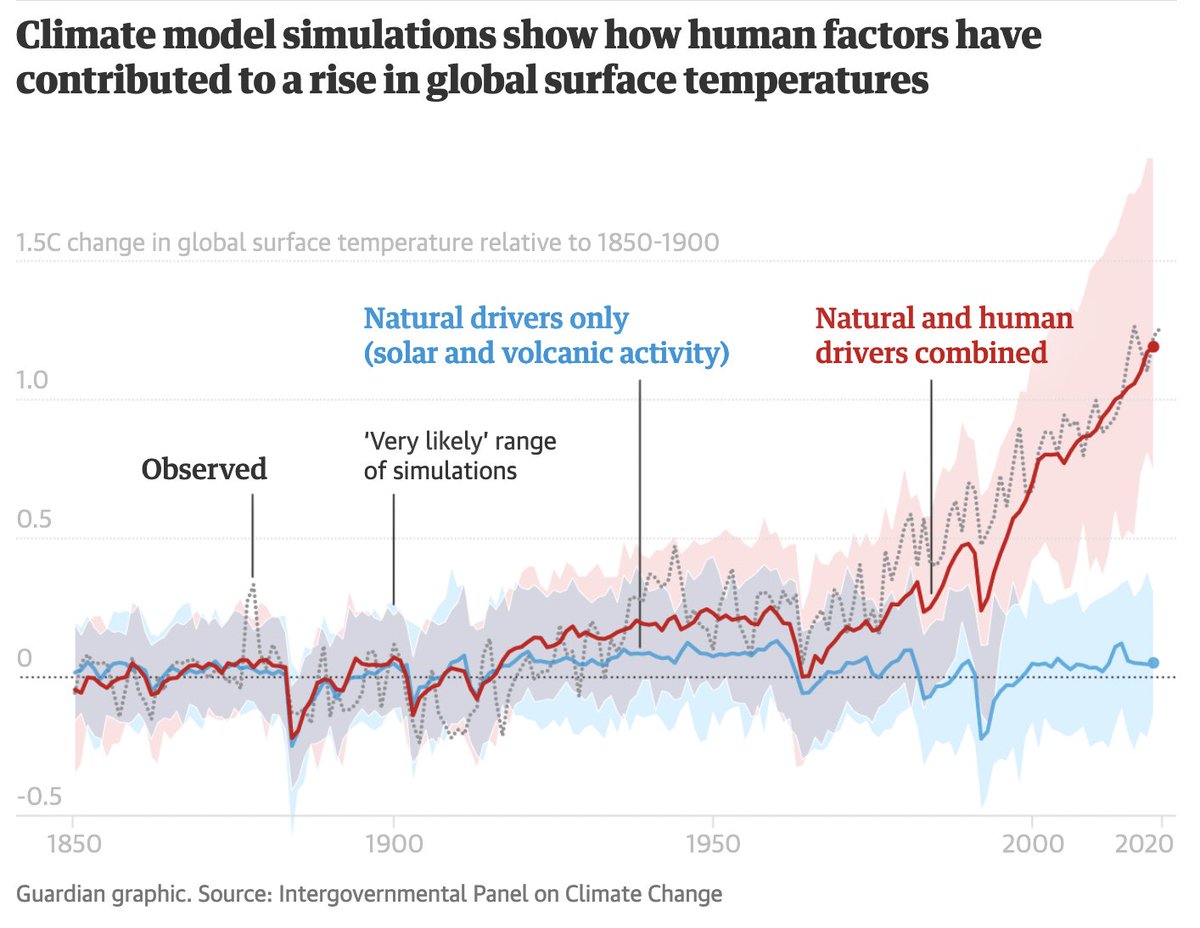
Only some newsrooms showed the causes of recent warming.
1: BBC bbc.com/news/science-e… 2: Guardian theguardian.com/science/2021/a…
Likes: 2 | Retweets: 0
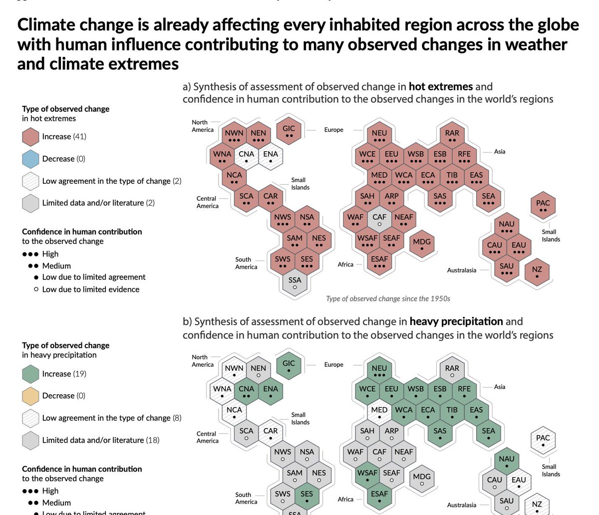
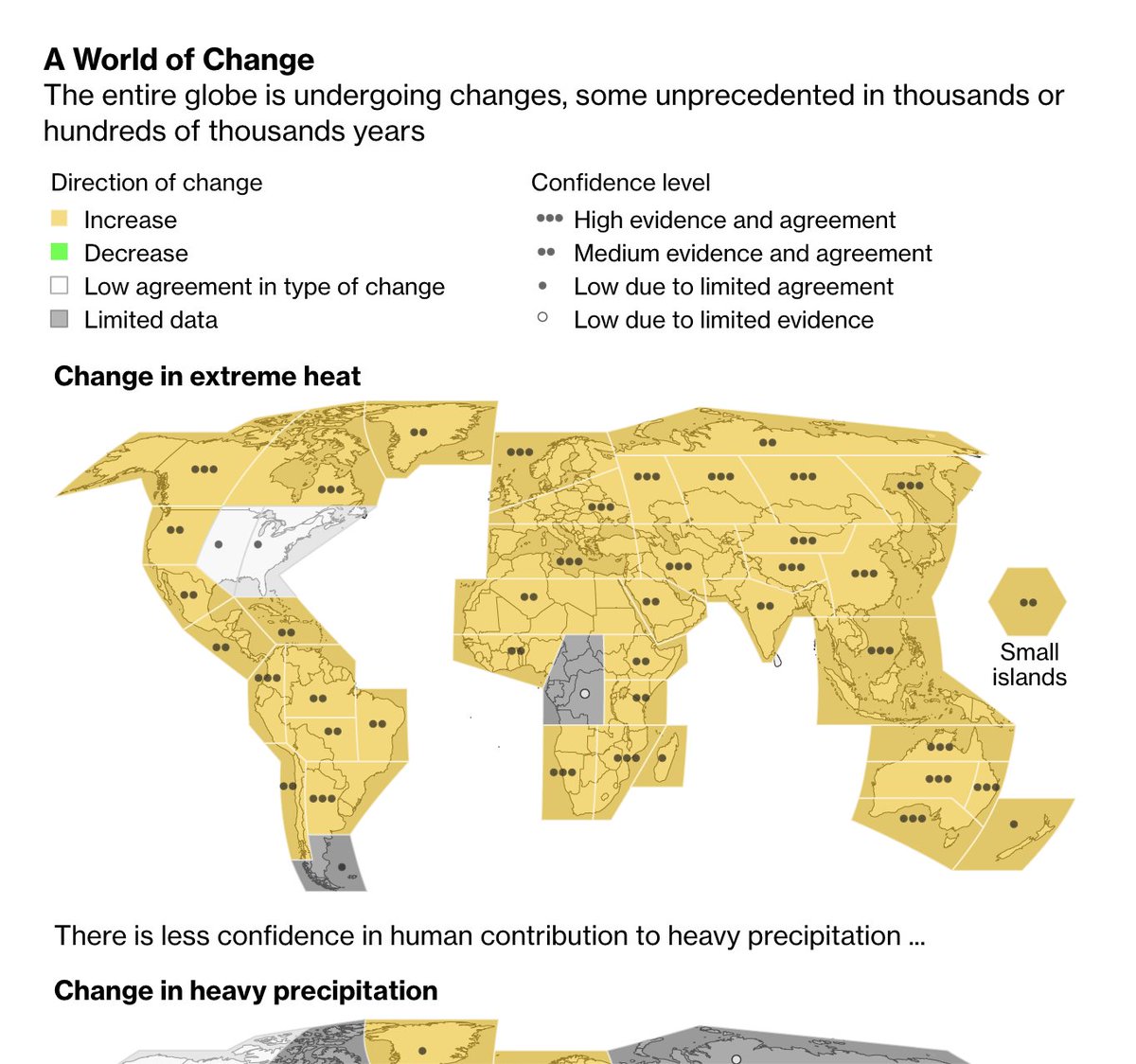
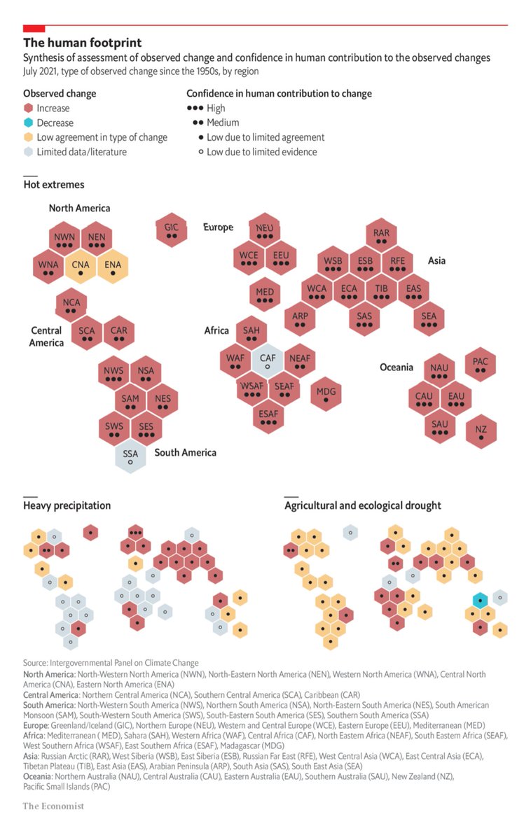
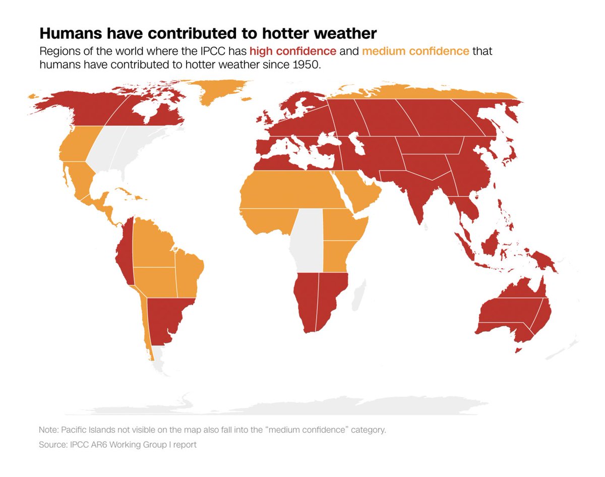
Fig. 3 in the IPCC report (p.13), Synthesis of assessed observed and attributable regional changes. A tricky one!
1: IPCC ipcc.ch/report/sixth-a… 2: Bloomberg bloomberg.com/news/features/… 3: Economist economist.com/graphic-detail… – closest to the original 4: CNN edition.cnn.com/interactive/20…
Likes: 2 | Retweets: 1
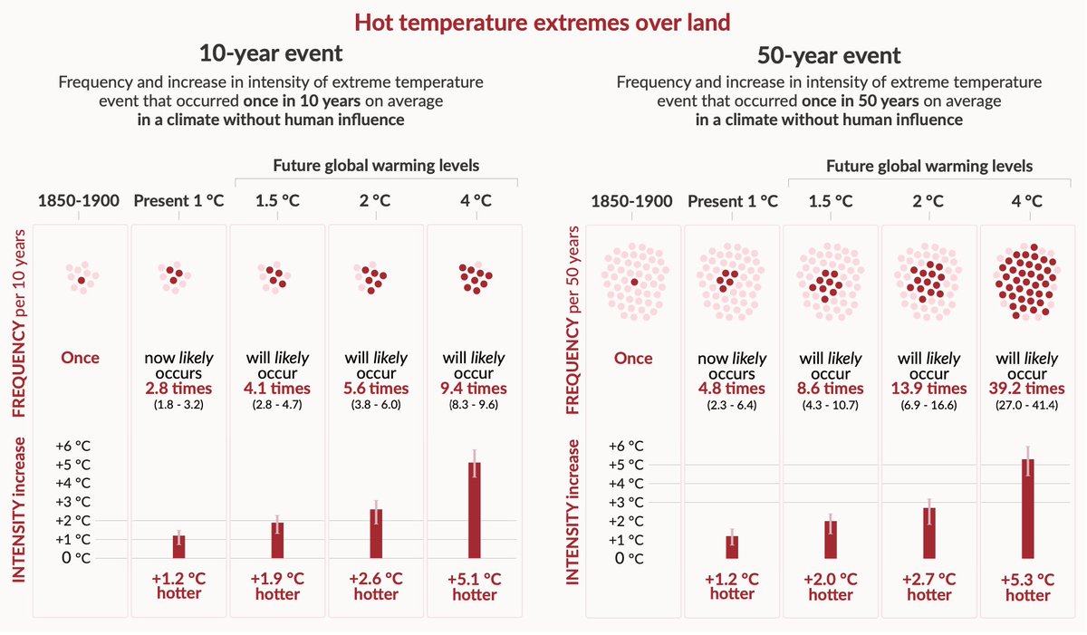
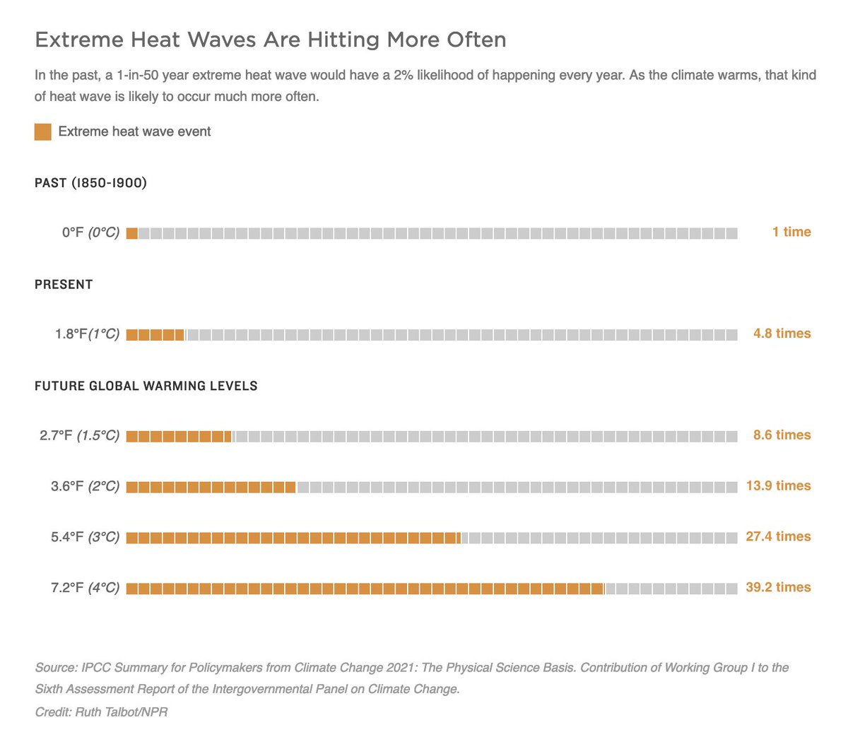
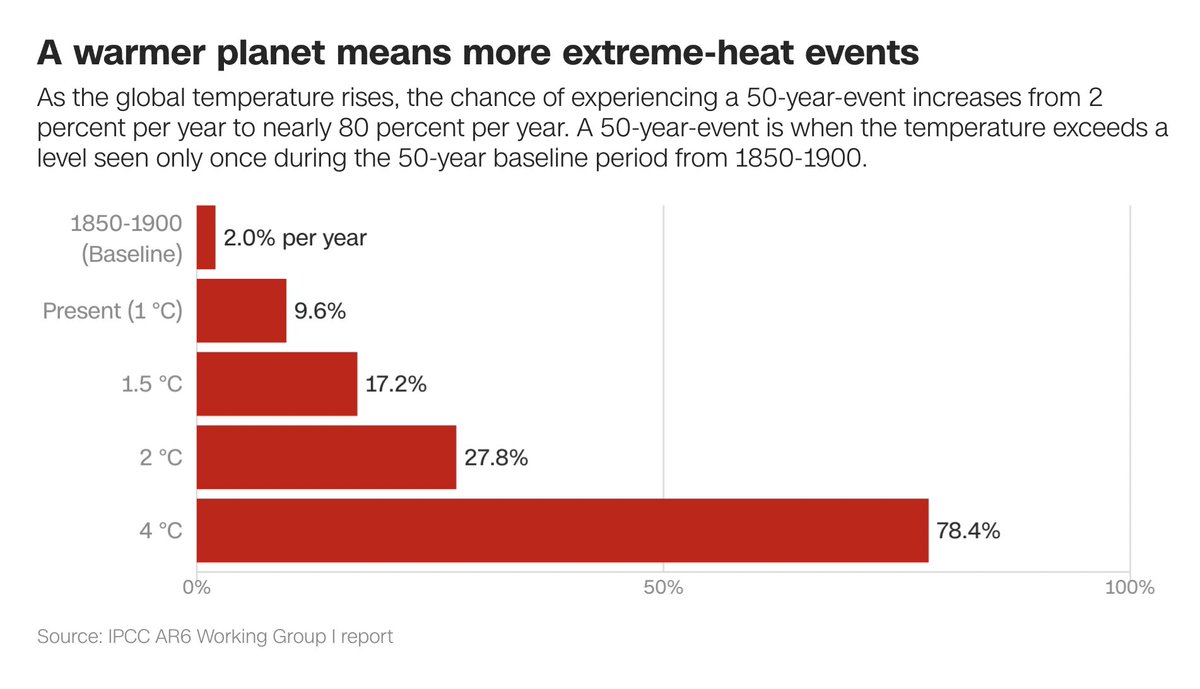
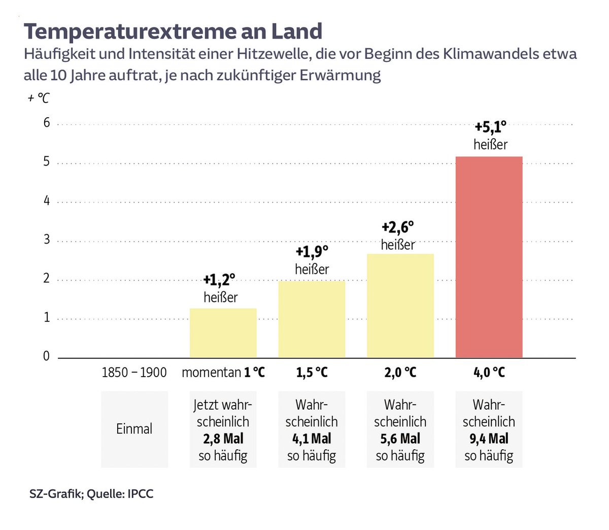
Fig. 6 in the IPCC report (p.24): Projected changes in the intensity & frequency of hot temperature extremes over land. Most visualized the right part.
1: IPCC ipcc.ch/report/sixth-a… 2: NPR npr.org/2021/08/10/102… 3: CNN edition.cnn.com/interactive/20… 4: SZ sueddeutsche.de/wissen/klimawa…
Likes: 1 | Retweets: 0
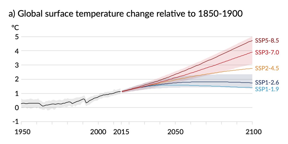
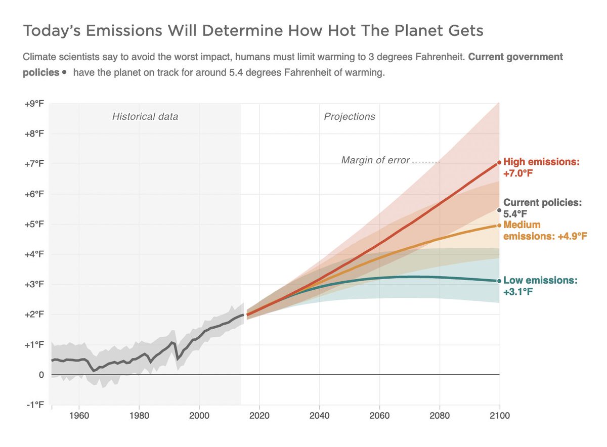
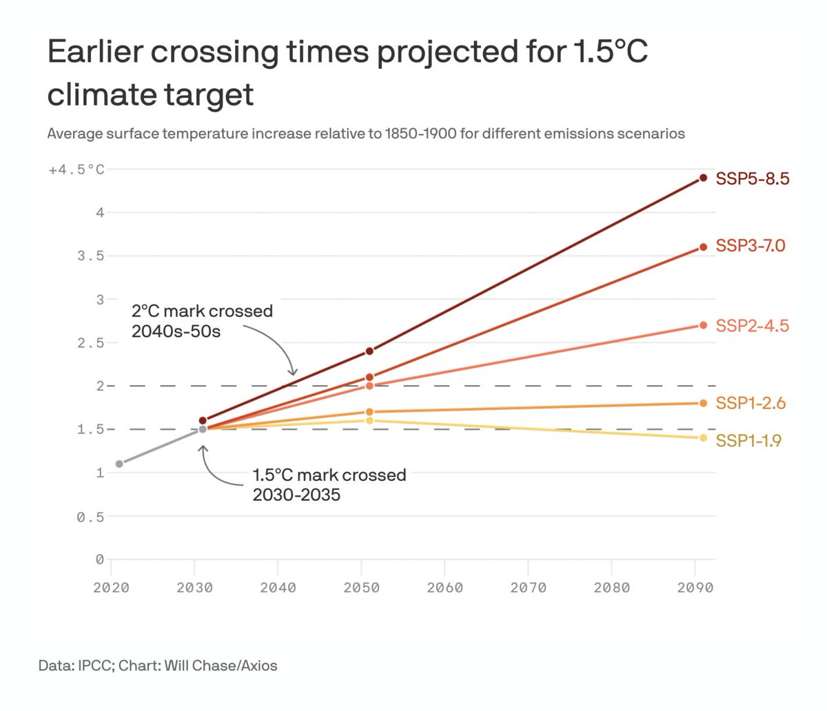
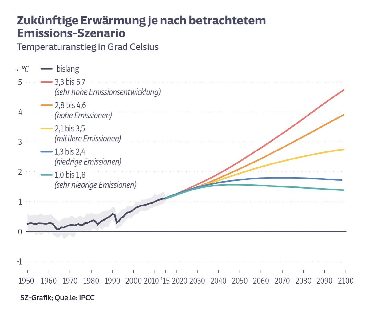
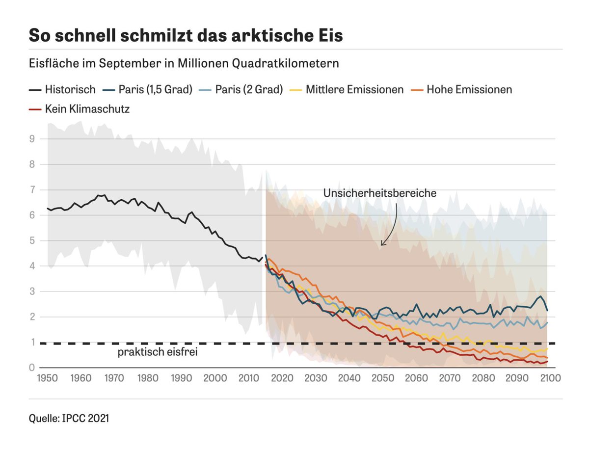
Fig. 8 in the IPCC report (p.30): Selected indicators of global climate change. Maybe the most rebuilt chart in the whole report.
1: IPCC ipcc.ch/report/sixth-a… 2: NPR npr.org/2021/08/10/102… 3: Axios axios.com/un-climate-rep… 4: SZ sueddeutsche.de/wissen/klimawa…
(more in next tweet)
Likes: 3 | Retweets: 1
5: Le Monde lemonde.fr/planete/articl… 6: ZEIT zeit.de/wissen/umwelt/… 7: Telegraph telegraph.co.uk/environment/20… – kudos for trying a different kind of visualization here!
Note that most newsrooms stuck to the IPCC colors.
Likes: 2 | Retweets: 0
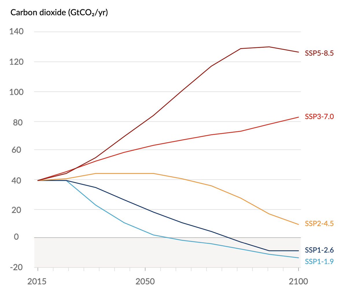
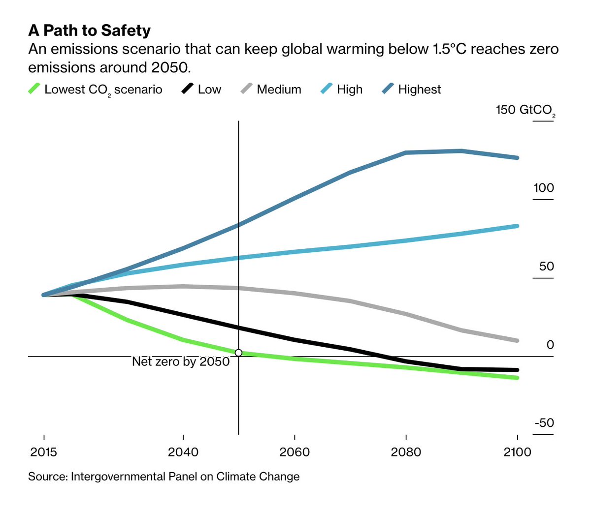
These are not all visualizations by the IPCC and newsrooms about the report.
Here are a few more: 1 & 3: IPCC ipcc.ch/report/sixth-a… 2: ZEIT zeit.de/wissen/umwelt/… 4: Bloomberg bloomberg.com/news/features/…
Likes: 3 | Retweets: 0
I’m impressed by the quality of the IPCC visualizations – most newsrooms changed very little when rebuilding them, which is always a good sign.
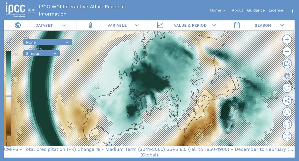
If you haven’t seen it, I can recommend playing around with the IPCC Atlas, their great, new exploratory tool: interactive-atlas.ipcc.ch/regional-infor…
Likes: 12 | Retweets: 1